mADE WITH HAND HEART & EYE


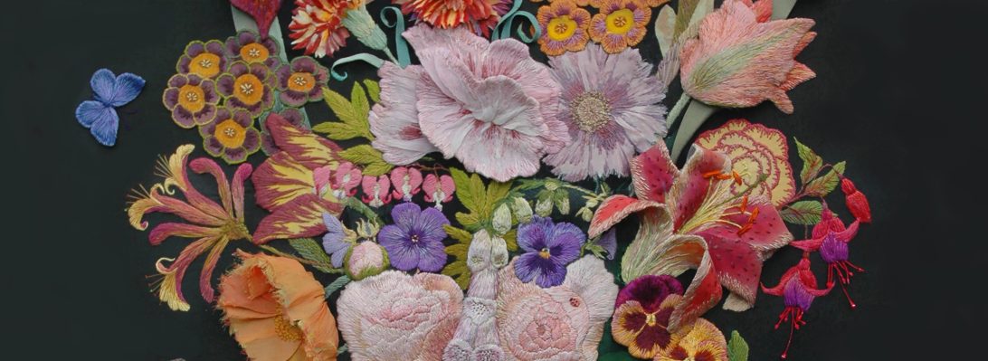
“I am a professional textile designer – I stitch stuff by hand. My work embodies the embroidery traditions of craftsmanship and symbolism. I draw and stitch the world around me – in full colour. Real flowers, interiors, windows and gardens are re-assembled into stitched pictures or interior textiles. My intention is to record, delight and amuse; and sometimes to alert and provoke those who choose to look further.”
Follow me on
Enter your email to get my latest newsletter.