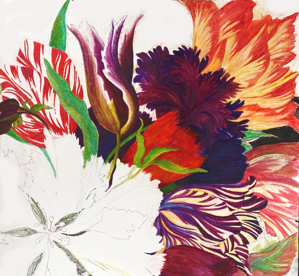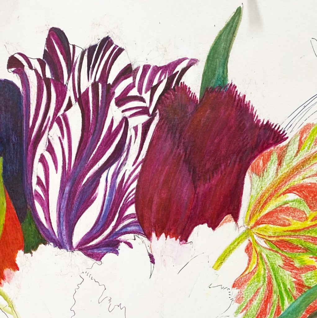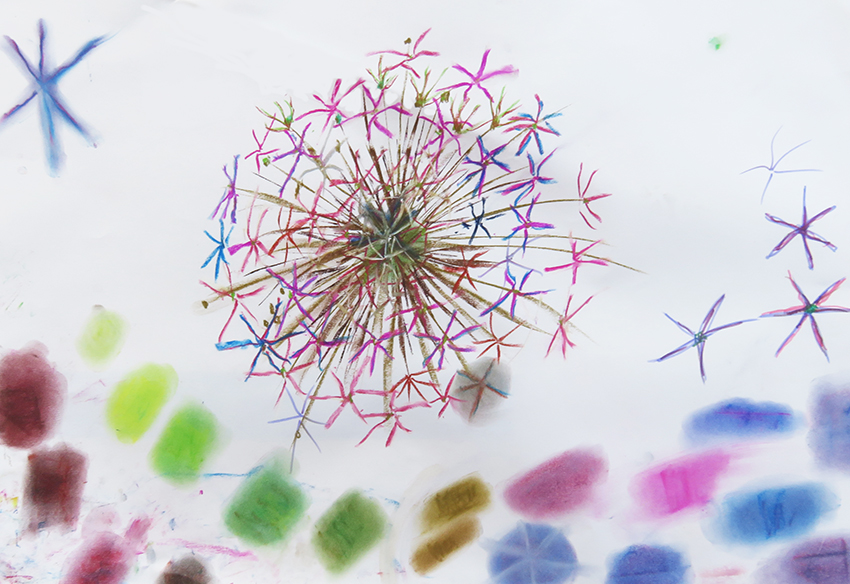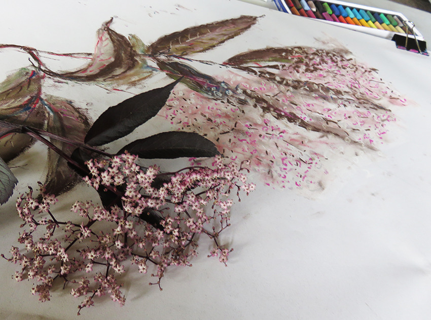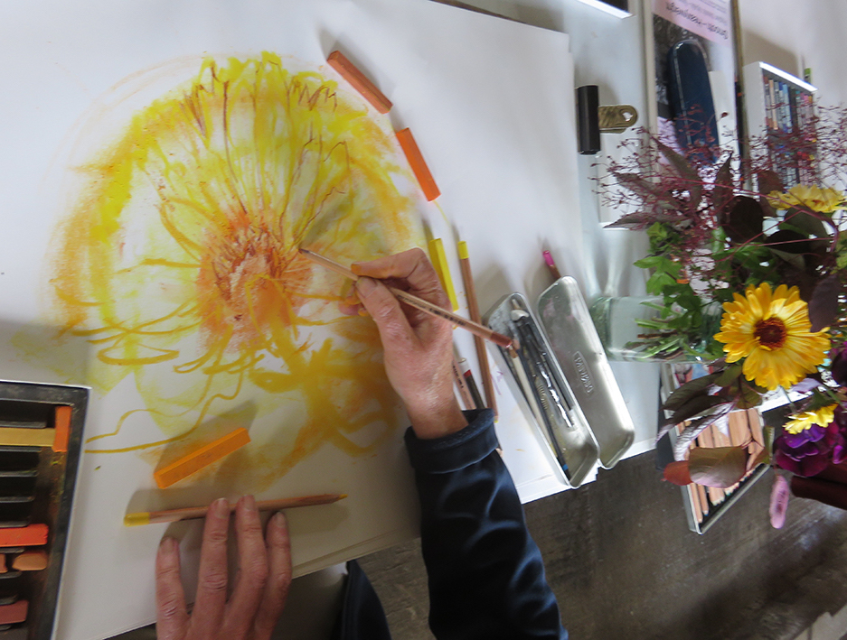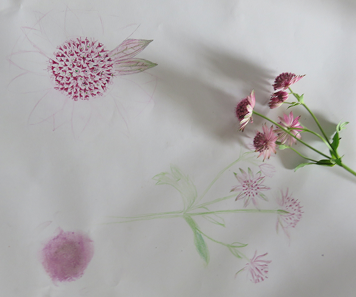
Drawing English garden Flowers

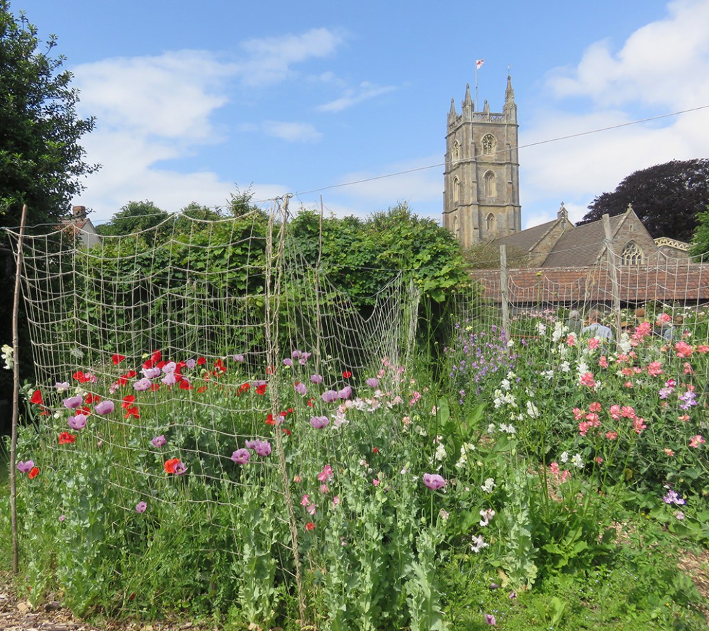
Court House Farm cutting garden , Sweet Peas and Opium Poppies, and the parish church next door.

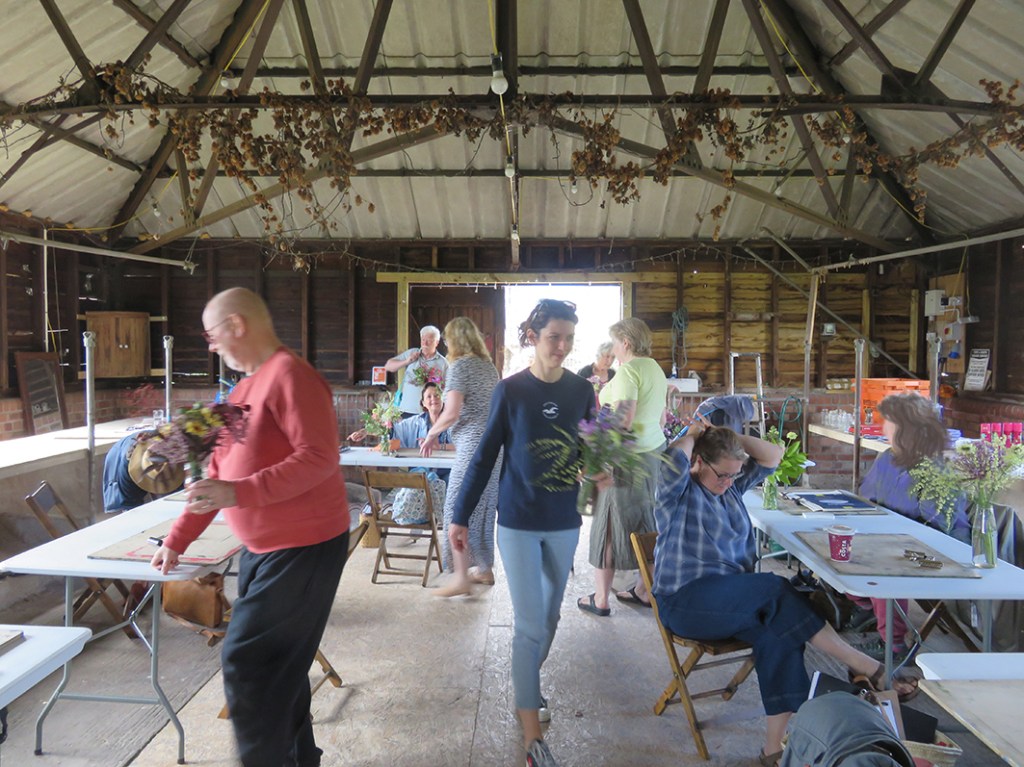
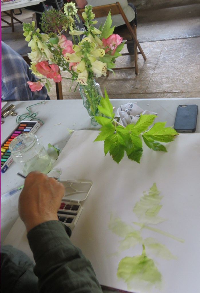
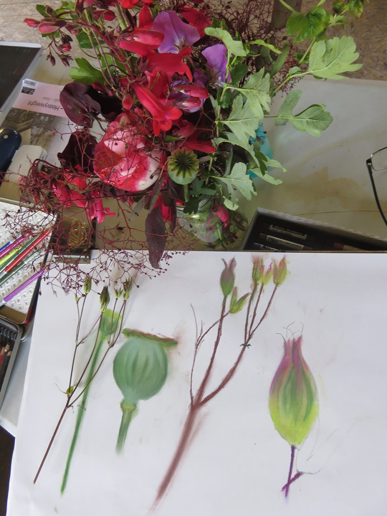
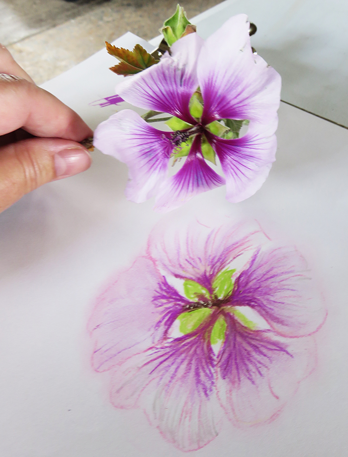
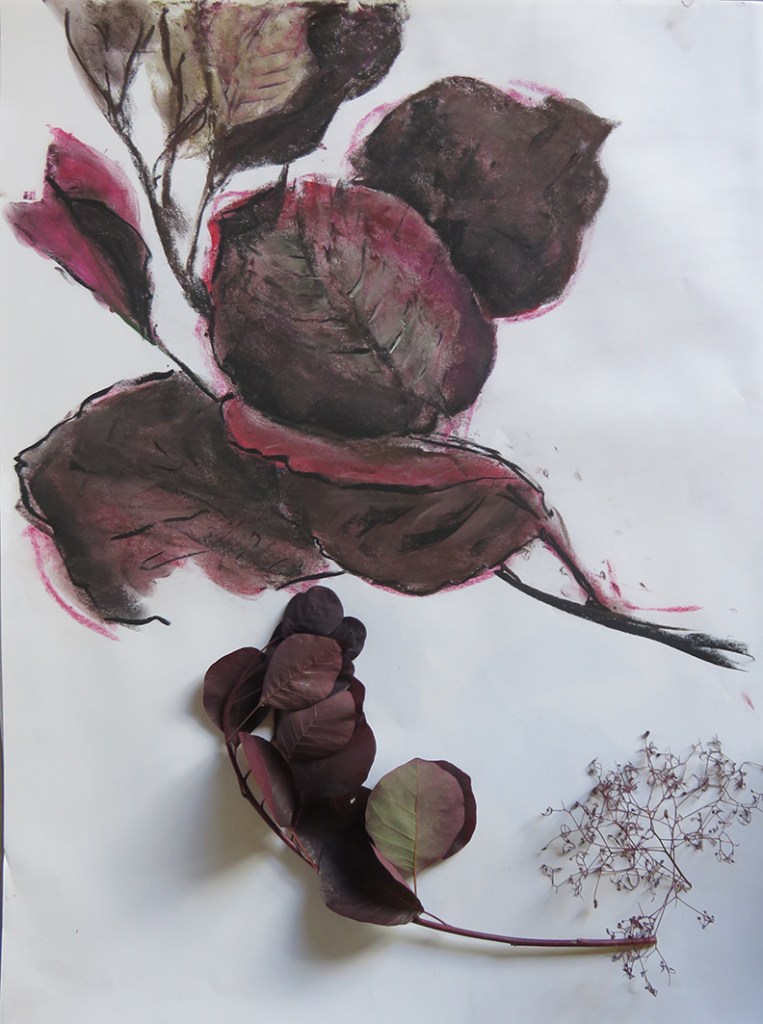
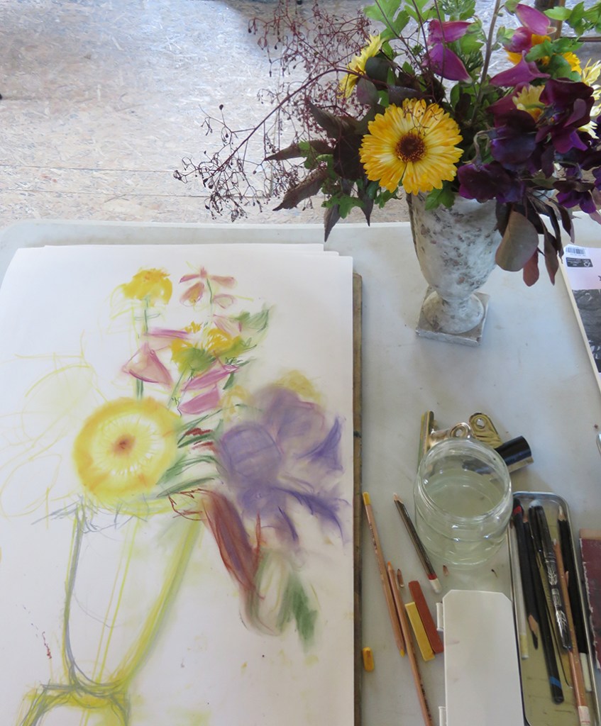
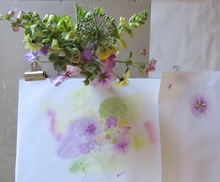
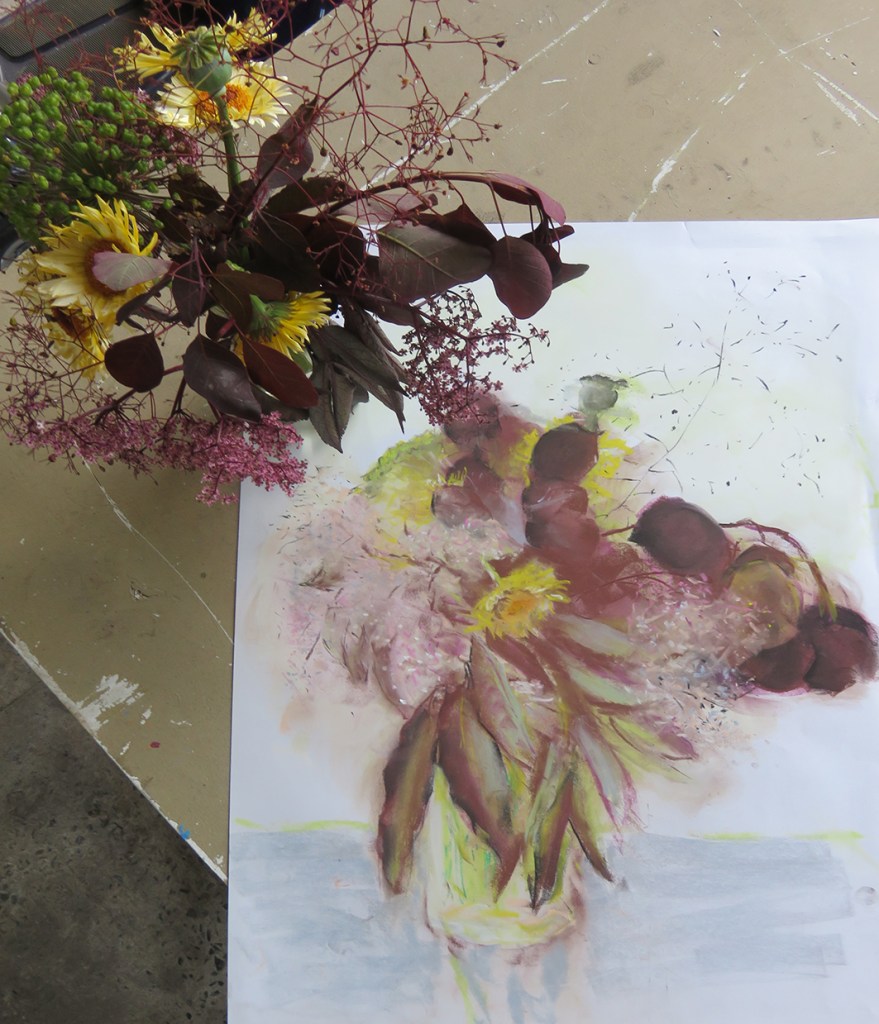
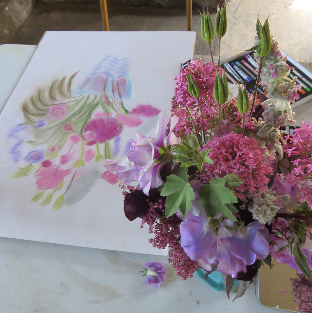
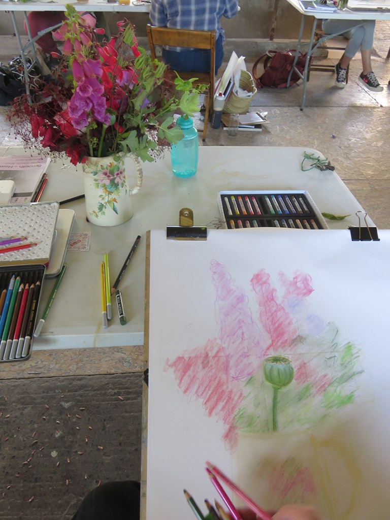
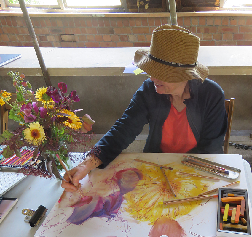
A perfect English summer’s day in June, and here we are for an RWA drawing school class: Drawing Flowers at Court House Farm. I have 12 people to introduce my own tried and trusted drawing methods of capturing the colours and forms of a bunch of flowers – well that is the morning’s workshop…try my way and see how/if it works for you – if it doesn’t you have at least learnt this method doesn’t work for you! *

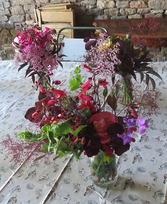
Helen Read the owner and designer of the cutting garden had, that morning, hand picked a selection of flowers in differently coloured bunches, and they were waiting in the large open barn for the students to choose from.

Then back to their tables to start the class…..

I wanted to quickly establish my basic advice to get everyone started, so that I could assess how best to help each student individually…the class had been pitched at all levels of drawing experience, including absolute beginners, and a mixed group they certainly were. But fascinating to work with.

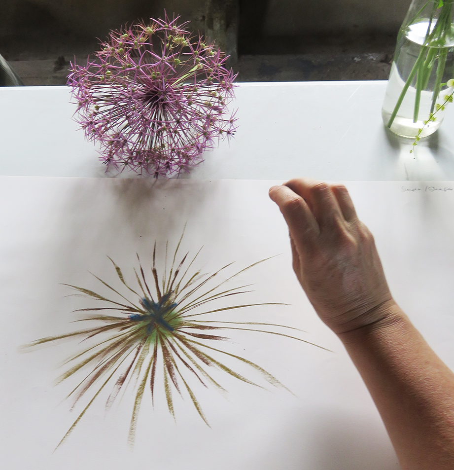
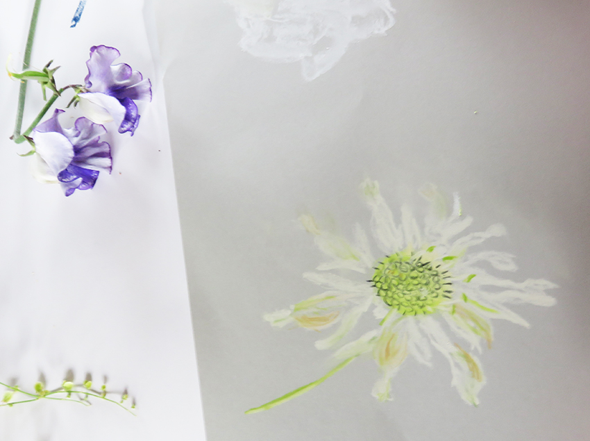
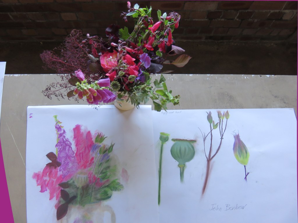
I started by asking each person to choose their favourite item from the bunch, write at the top of the page what had made them choose it, then draw it in full colour on a large sheet of white paper using only the media I had stipulated for the course, pastel crayons, pastel sticks, watercolours….

The students ranged from a few complete beginners to people who may never had tackled flowers in this way before, but who obviously were experienced enough to adapt their own methods to my strictures. I kept visiting each table and discussing the drawings – either suggesting to them to move on or to really look more carefully at the details and colour. Mixing colours together to get exactly the right shade and tone is a major skill to develop for drawing what you see.

Some people are quick and make bold statements with bravado..others take a long time and seem very nervous of showing the results and most often people who are nervous draw small. I always advise people find their own size and pace for their drawings. I think it is a fundamental concern for developing your own work

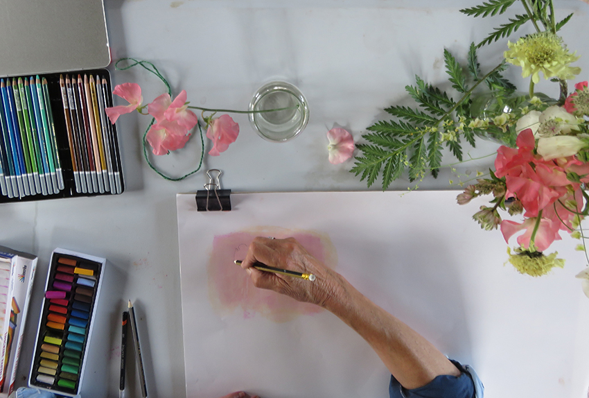
After a short lunch break, I asked them to draw the whole bunch, either building on the knowledge gained in the morning for the beginners, or just doing their own thing; hopefully there would be a mixture of the 2 ways of working.

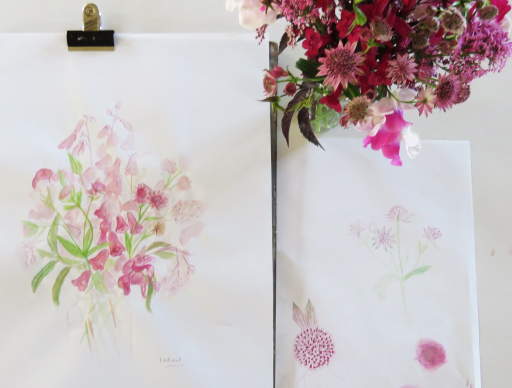
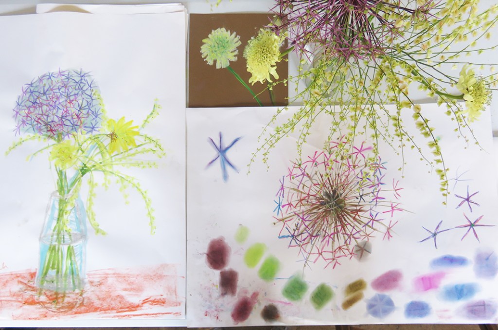
The results were as varied as the students themselves…

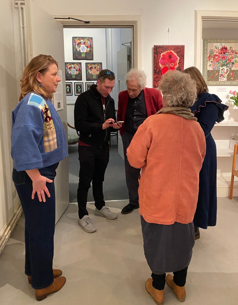
The lessons in developing colours certainly had been taken on by everyone. At the end of the day everyone put out all their drawings around the barn and we all enjoyed a really good look at what had been achieved -a true mixture of different visions of what they had put in front of them – truly observational drawing but with character of either the flowers but often the maker.

and then an image of a student just enjoying the day…almost as much as I did!

*I was taken at my word and one of the group decided to leave at lunchtime saying he had learnt that it wasn’t for him…and as I have been requested to crop out an image of one of the participants for reasons of anonymity I am not giving the list of the participants….privacy needs to be respected.

Rainbow Flowers – after winifred?

Here I am on my birthday in July with the posy that would change my work

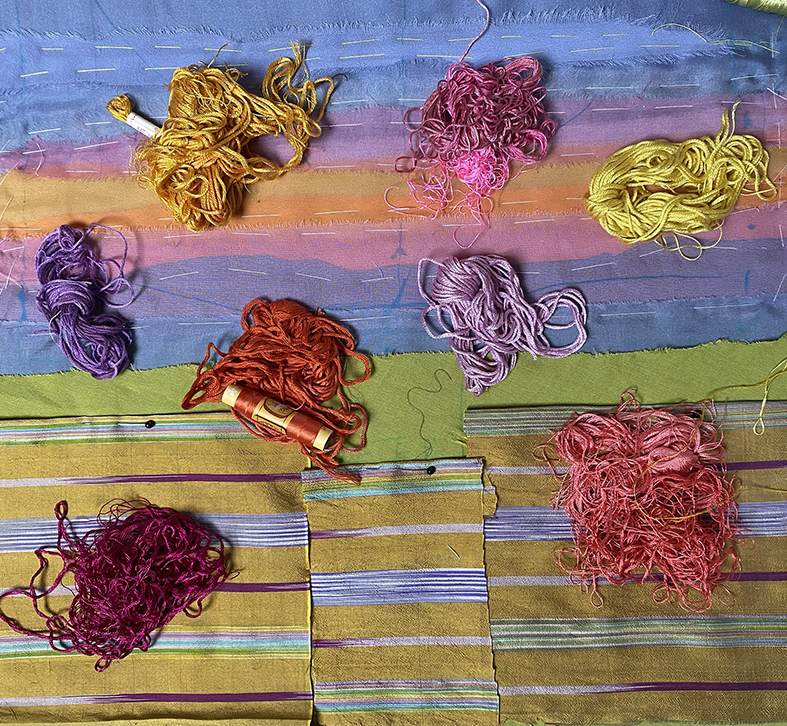
For several months, since March, I have been working on a new stitched sky – an image combining 2 photographs, the first of a wonderful brooding grey sky with different shades either side of the bow, and another of Denney Island in leaf in the middle of the Severn Estuary, they were made during different spring-times and are rare sights so I wanted to capture them.

As usual I got going quickly and decided to work by drawing onto photographs of the emerging work using photoshop…well it partly worked – but really it is always better for me to work directly from my drawn ideas. Nevertheless I quickly layered fine silk chiffons onto the sky and sea areas adding several layers of shot cottons and a brilliant green silk georgette for the salt marsh – to enhance the curious green foliage on Denney Island

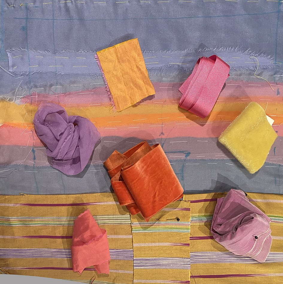
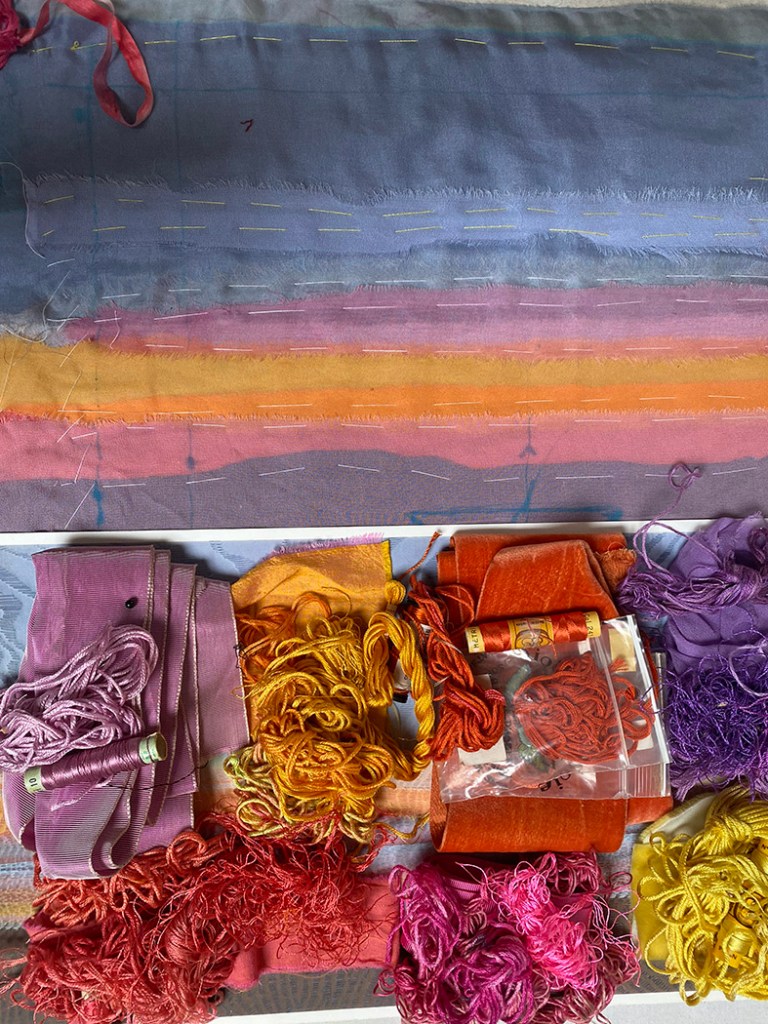
I worked on the piece for several weeks, well 2 months an and off, putting in and pulling out the rainbow – it proved hard to get it to glow but not become a garish boring band of colours: I wanted this rainbow to be part of the sky, not sit on top of it.

I was working at the same time on my patchwork room so needed some distraction from the finishing -off chores. BUT I was getting no-where with this rainbow , so put it away and started reading instead.

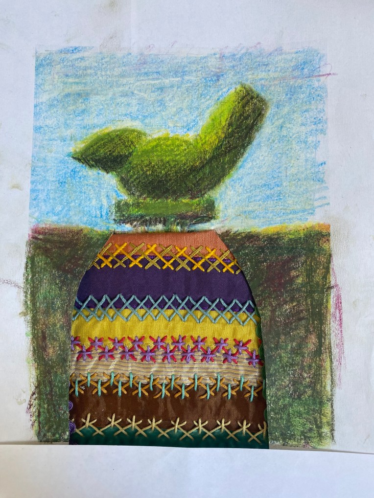
my favourite read was “My Name is Red” by Orhan Pamuk, as it is at heart a treatise on how “Persian” book illustrations where developed by different studios of specialised artists, and how trade with the West, notably Venice, brought in the whole notion of realistic images using perspective and observation of the real people and landscapes. I found several books in my shelves and spent hours just enjoying the exuberance of the work: I was definitely on the side of the symbolic flat pattern making of the illustrators – I realised that I was too hung up showing what I saw in the natural world not what I see in my head. I decided to add some decorative fabrics to my work and searched for some symbolic

I stated to realise that I could rekindle the rainbow embroidery with extra patterned fabrics – my old silk fabrics were dragged out and I found my drawings of Iris for the Flora Embroideries, she was the messenger of the Greek gods and of course the rainbow……things started to feel interesting again.

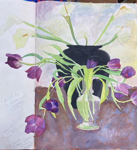
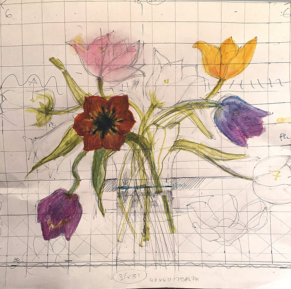
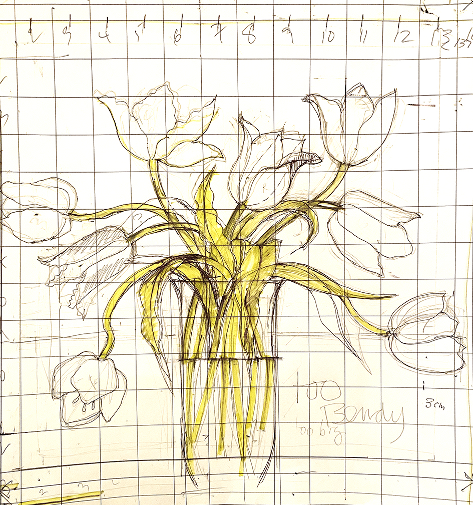
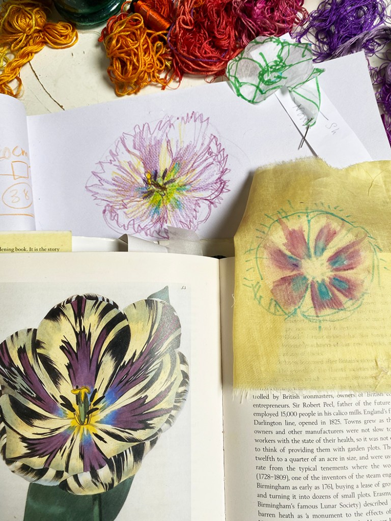
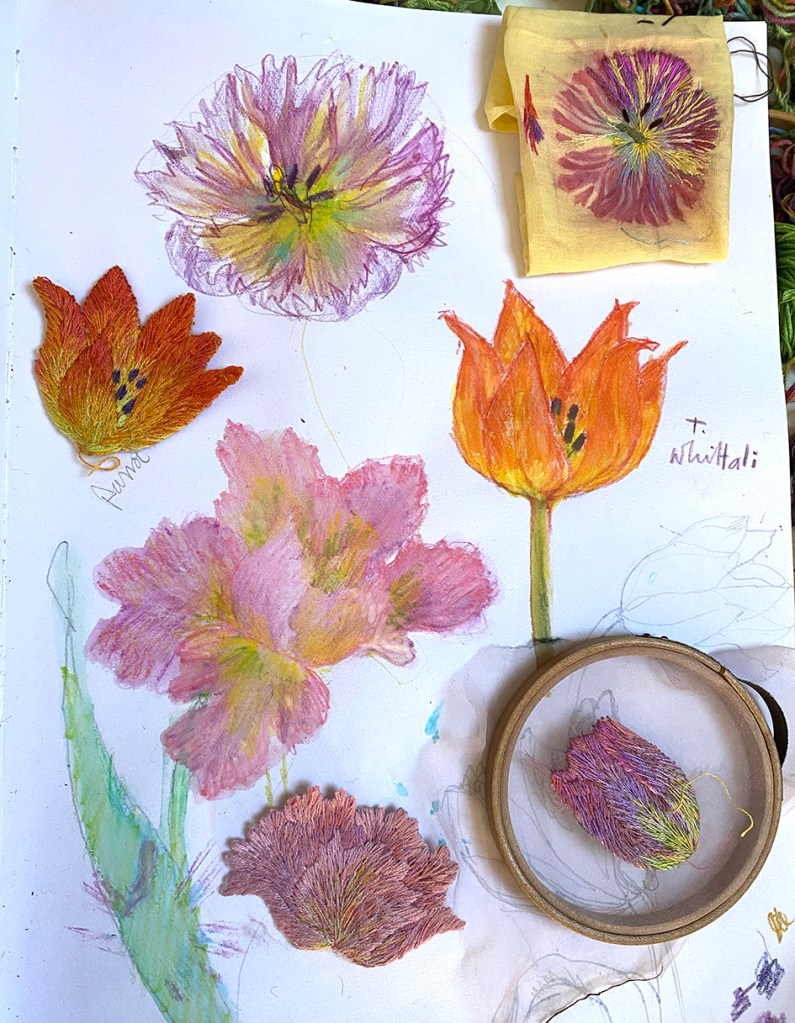
THEN I received this lovely posy on my birthday from my friend and colleague Jane-Marie Mahy she had bought it at Court House Farm and I drew it.

During my break from the stitched sky, I also bought a book about the wonderful paintings by Winifred Nicholson, “Liberation of Colour” – initially because of her interest in painting colour prisms, but it was the flowers and the looseness fo the paint that I admired most

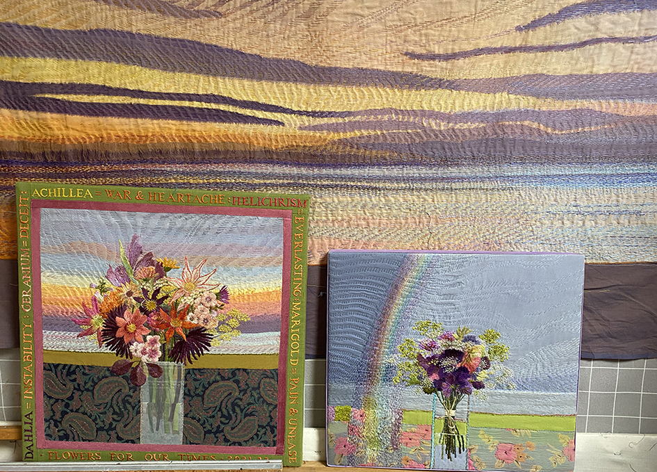
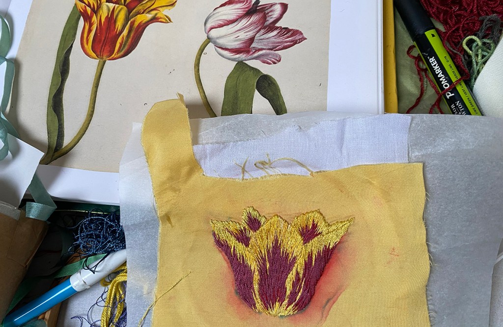
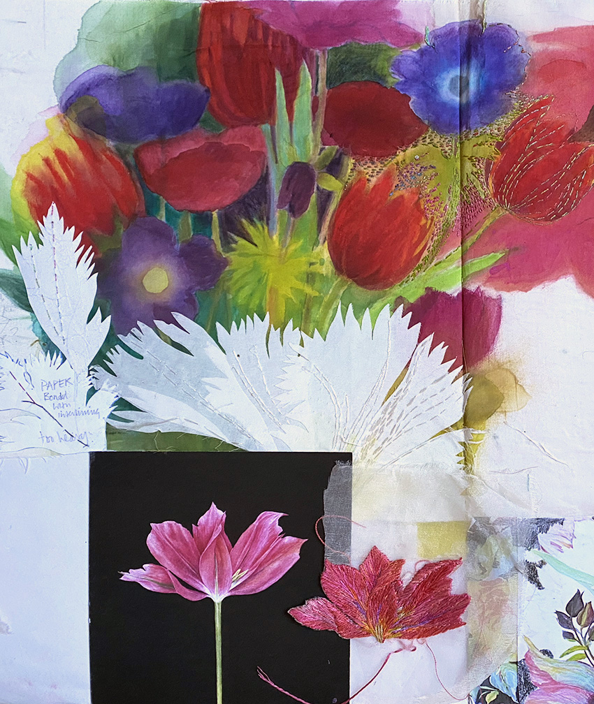
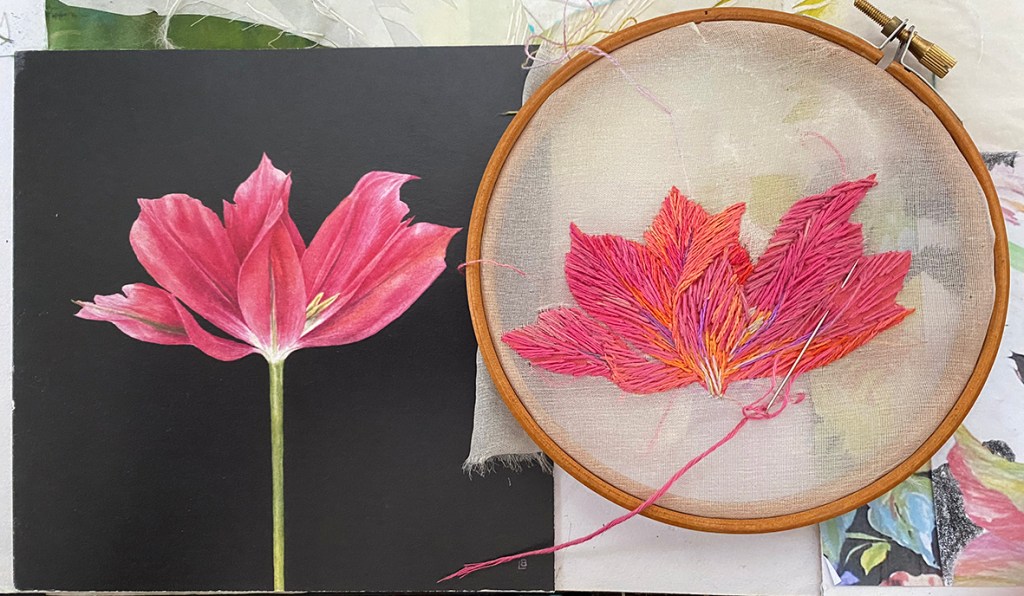
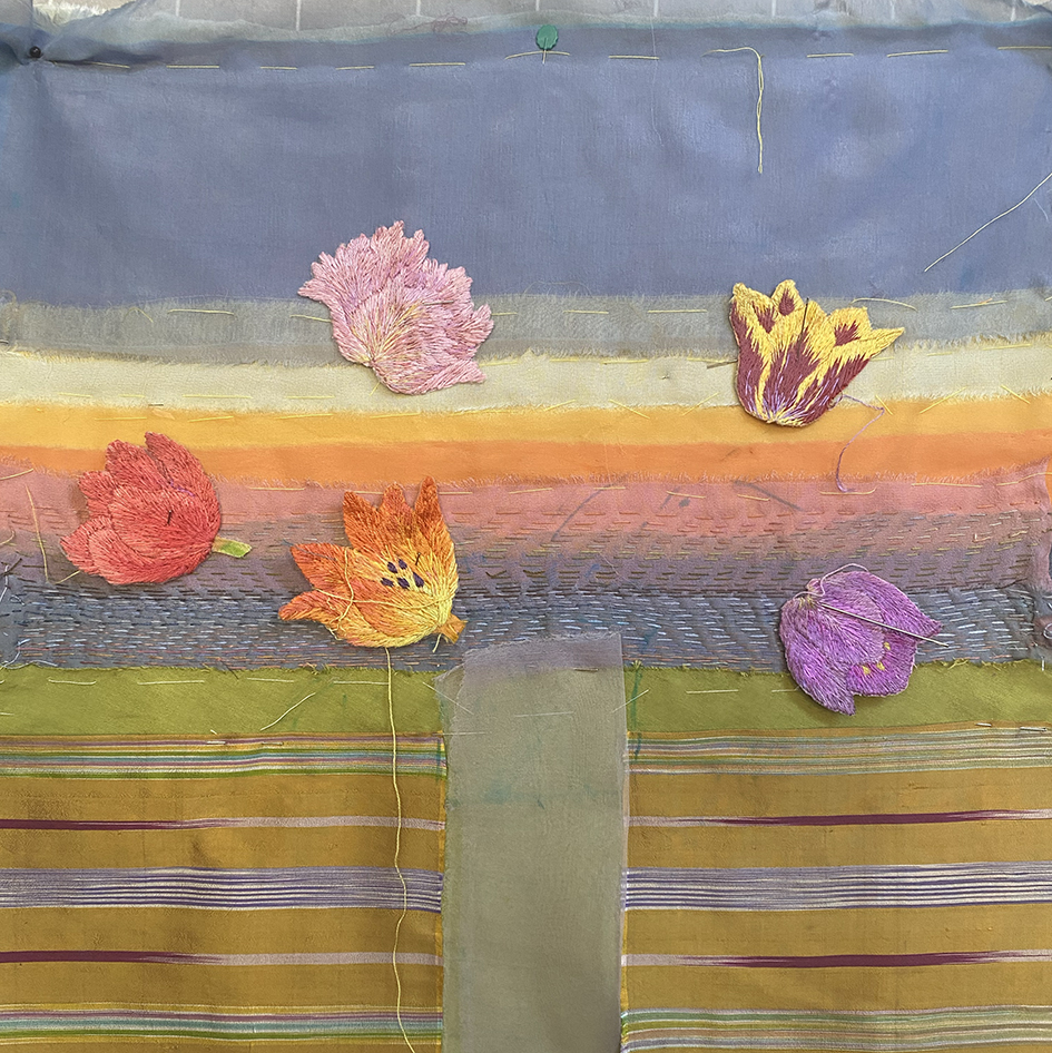
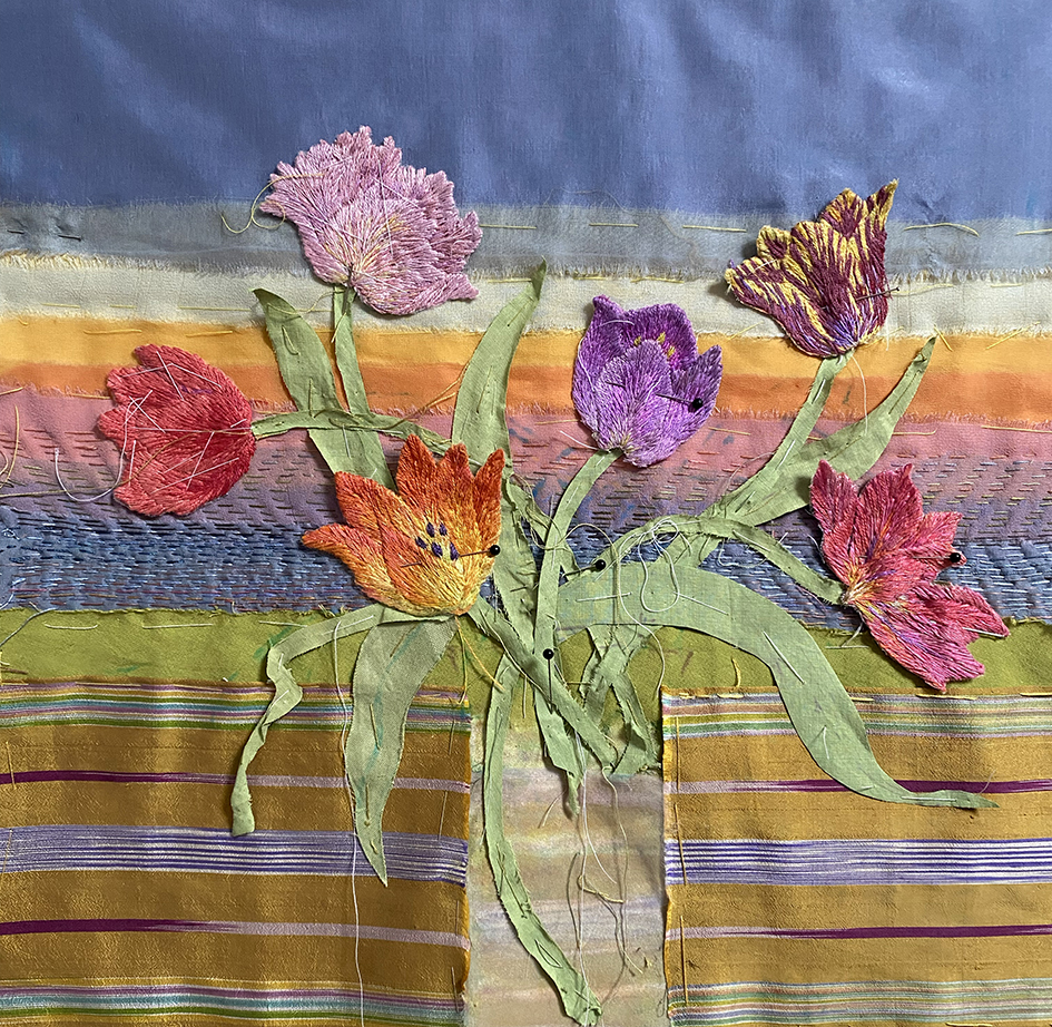
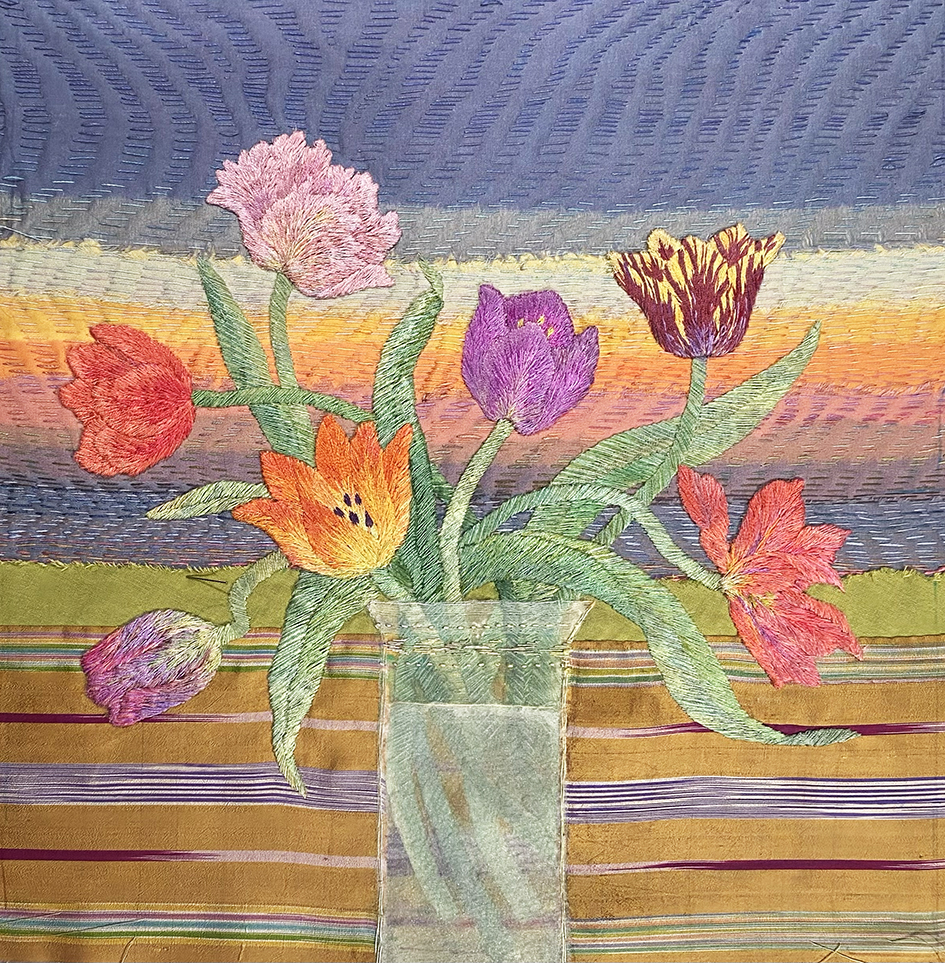
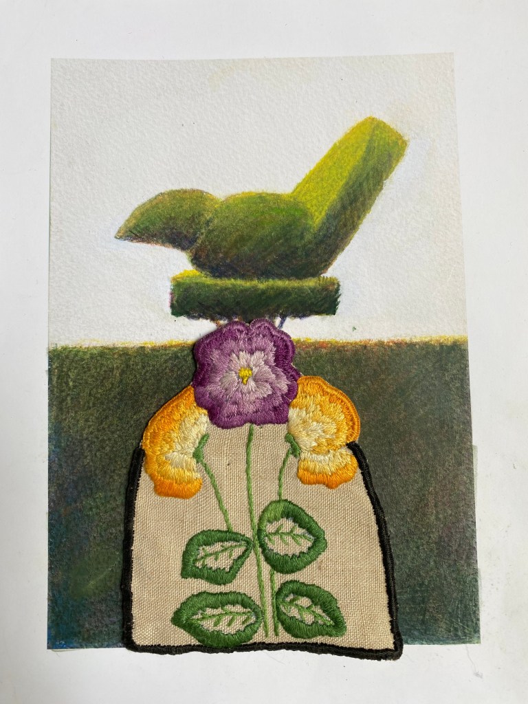
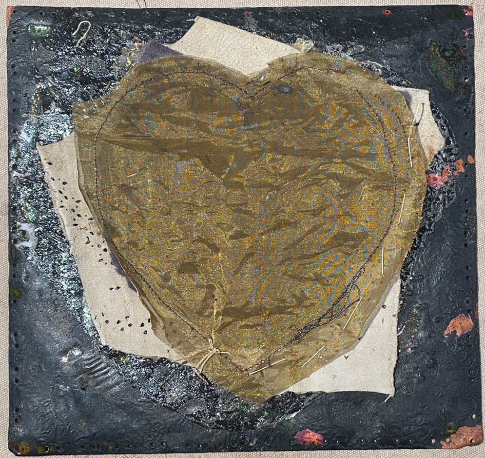
and then it was so obvious what I had to do with the rainbow sky – embroider the posy and applique it onto the Kantha stitched sky….easy peasy – not!

above the initial embroidery coloured ground is painted onto a fine cotton fabric, checked for size before continuing to be stitched into position onto the stitched sky.

And here it is – the finished work ” After Winifred” stretched and about to be bound with velvet ribbon and off to the printers to make an edition of giclee prints for sale in time for Court House Farm’s open garden event, Art in the Garden where I am exhibiting and talking about the making of the Kantha Stitched Skies for The Portishead Art Festival. www.portisheadartsfestival.co.uk.

My Patchwork Quilted Room – Da Da.

Here is the open door into my completed ( well just a few more pictures to put up) patch-work room, using fabrics from the Kaffe Fassett Collective. It has taken 6 months to achieve. I started 2020 during the last Covid 19 lockdown in England and we are still not entirely unlocked mid way through 2021.

I aim to take you around the room to see how it all has come together, here the door from the porch has a vitreous enamelled finger plate – now I want to make more of these for inside the room…the enamelled fireplace can be seen with our old furniture and carpets safely back into place.

turning left is the view into the small panelled room, our 2 Irish Terriers and the enamelled fire surround – see previous post for making this….luckily my much loved vintage Deco glass shade tones perfectly…now how did that happen?

Above are 3 views of the chimney corner with 2 different totally different Flag representations. the row of flags at the sea side is an old painting by Stephen Jacobson next to a ghostly silk organza flag by Nigel Hurlstone. this piece of work proved pivotal for me to see how the room could hang together using cooler colours

Once we had started to put the room back together our 2 Irish terriers, Maeve and Murphy took a particular if very relaxed interest in it.

I found on Ebay a beautiful discounted Zoffany silk striped fabric and bought enough to make 4 very large padded curtains for the big Victorian windows in the room. The fabric cost me about 4 times the amount I had spent on the rest of the room…but they work well once I had trimmed them with some vintage woven ribbon that I over – dyed to suit the colour of the paintwork – as you do! And then I found these mazing brass tie backs on-line at my favourite store for just about everything decorative, Anthropology.

Continuing around the room…

In the the corner between the windows hangs an old (and much loved by me) painting by my husband, Stephen Jacobson, of my father’s greenhouse that he built in my family’s garden on the Wirral in north west of England.

From the photographs I have posted so far it is hard to see that the patchworks are all padded and quilted, but it is evident that my ‘in the ditch’ sewing notbetter placed than my hammering in the copper tacks that fasten the fabric to the battens. On the tiled table is a flowery flower vase by Tean Kirby.

the opposite end of the room to the fireplace with the bay window looking out on the overgrown garden

one of a pair of window seats with an old canvas work cushion sample and the luxurious silk curtains and brass tie backs. Then to the other new thing I bought for the room – the glamorous mauve velvet mini chaise – from a TK Maxx sale!!!!!! Well I had to balance the spend on the curtains.

Coming Into Port – Stephen Jacobson

Above is ‘ Coming Into Port’ – I leapt on this for the room when it came back early from a “closed for Covid” exhibition and it fitted perfectly. Basically our house serves as a venue for our joint work. I made the large cushion especially – it uses all the major colours of the room, and in fact the whole house, in my wonky version of Flame Stitch; and I have been commissioned to make a design from this by Ehrman Tapestry so look out for it next year if you stitch canvas cushions.

So here we are at the porch door again – and the gingers are waiting for us – well actually for Stephen with the biscuits to get them to pose….

and that is it – at last after so long – finished enough for people to see it – with the doors and windows open and only 4 visitors at a time!

My Covid Project: Patchwork Enamel Fireplace

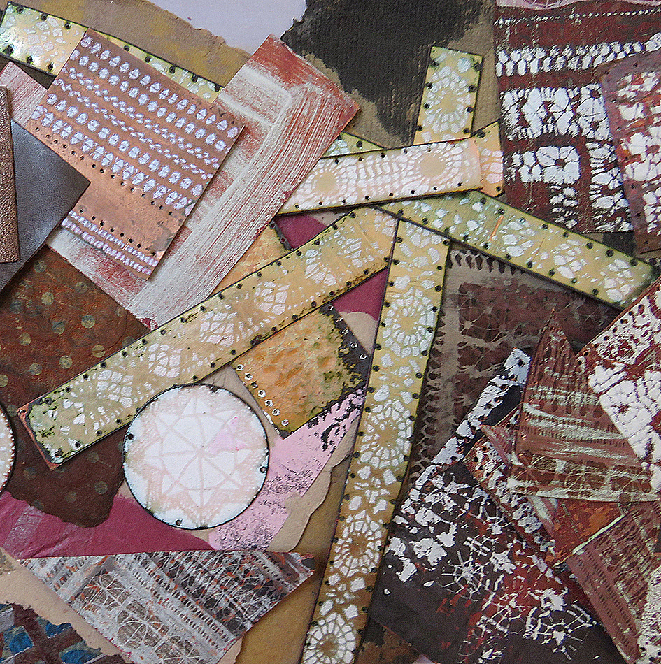
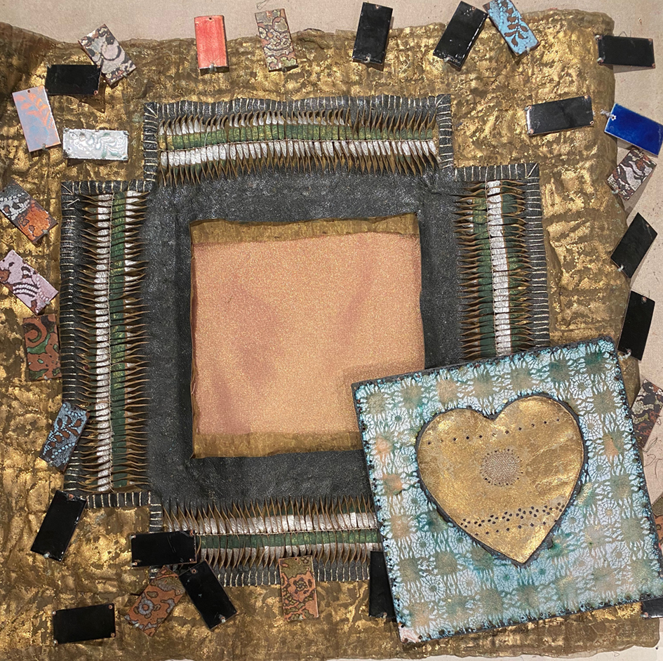
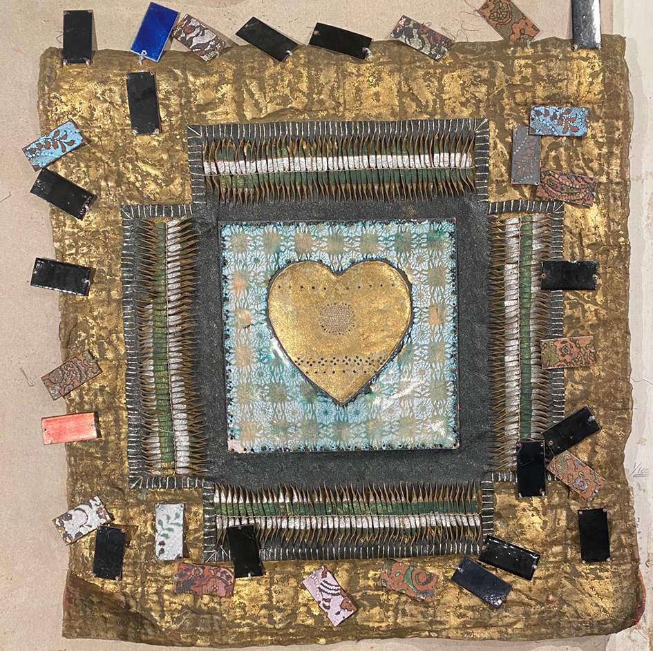
The patchwork walls are almost completed, just some finessing needed so time to think of the fire grate. We measure carefully and then cut 20 copper tiles ready to be decorated – using my favourite Drawn Threadwork stencils. I started to scribble lots of ‘back of the envelope’ ideas as to design layouts – but decided to just make the stencils and then see how they best worked together.

An assortment of design, scribbled ideas for the enamelled copper tiles ideas

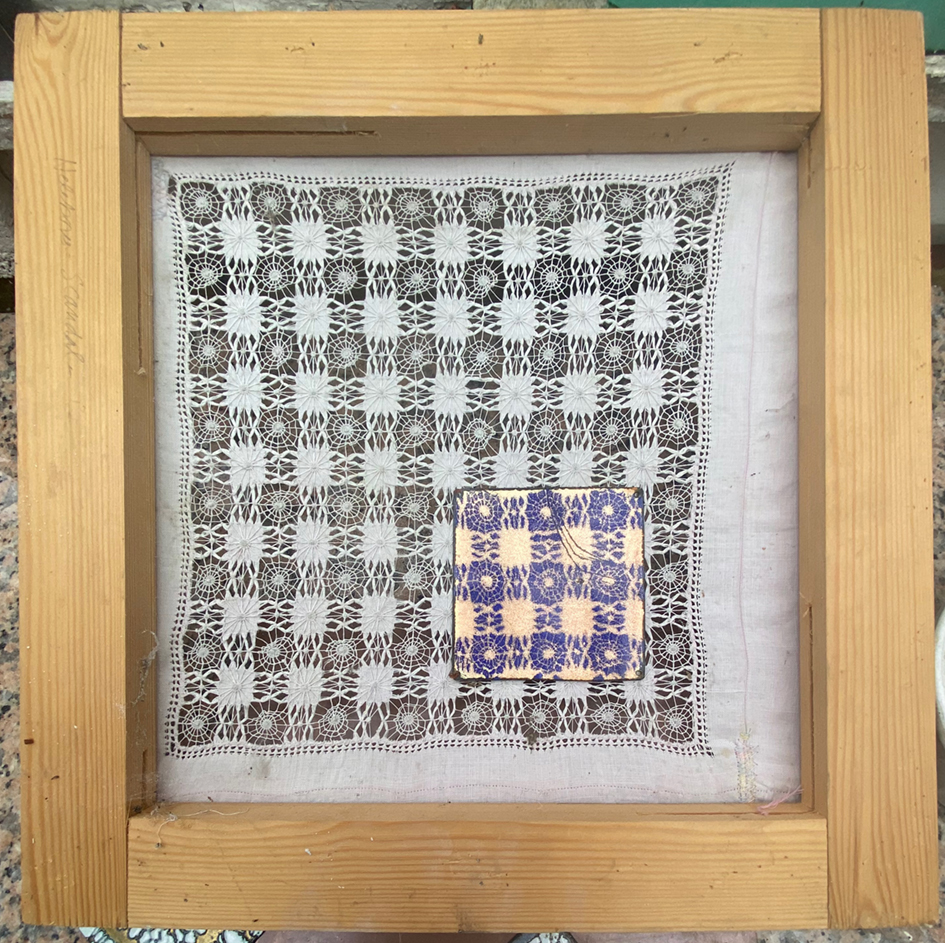
I found a small table cloth ( in my stash) with very large scaled drawn thread-work embroidery that would be suitable for this making many variations from just 2 basic designs. I needed 2 stencils one square for the corners of the grate and a striped version for the longer lengths. Initially I thought it needed to be made larger to fit the cut copper tiles so I had to extend the stencil. I appliqued extra pieces of embroidery, using a machine for strength (for when it is stretched on a frame) then cut away the linen beneath it.

meanwhile the rest of the copper tiles have been cut and checked for how they fit together – like everything else in this very old house nothing it straight or even.

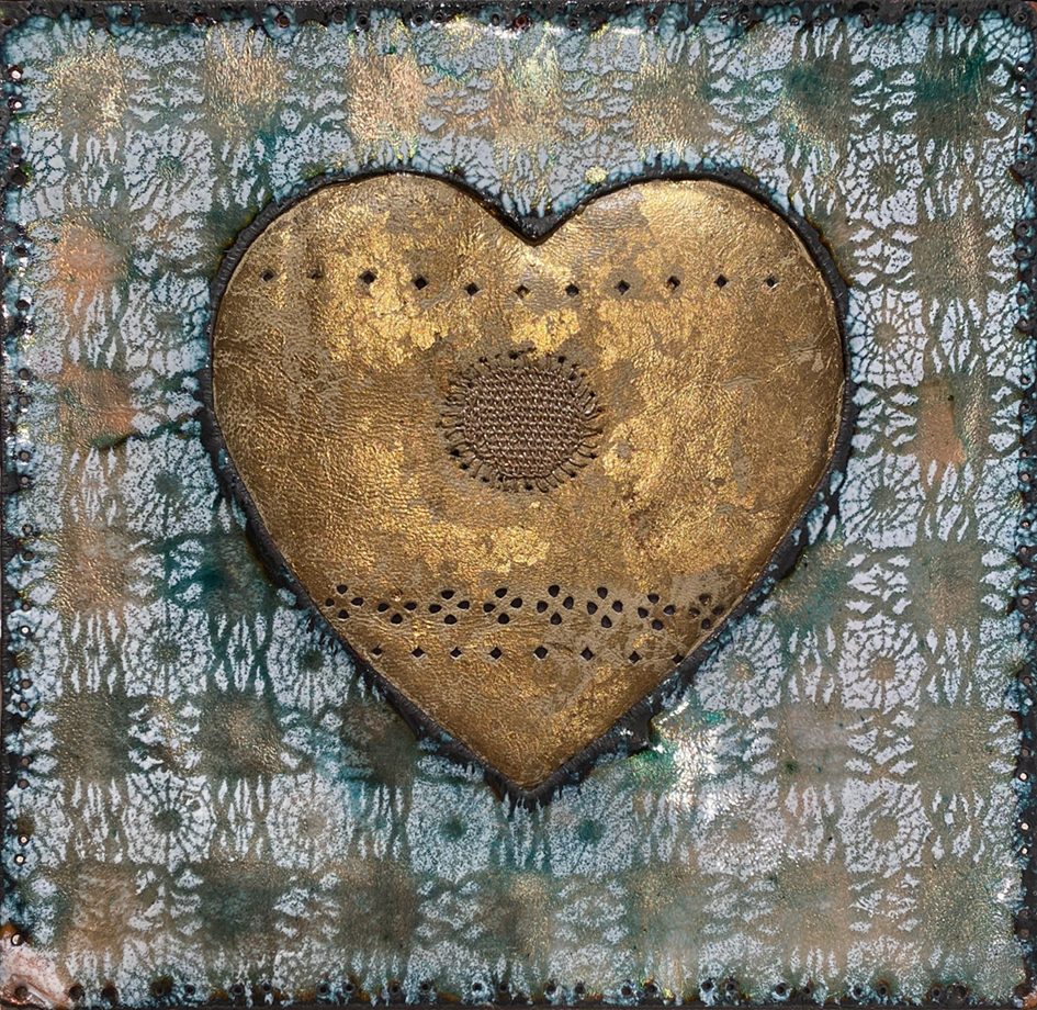
i had wanted to verdigris the tiles but decided to stick with what I knew, so I started sampling the enamelling colours. It is a few years sinceI have enamelled anything but remember the colours that will best look like verdigris – I match the pale greens and blues to a naturally verdigris copper strip I found in the studio

samples of copper enamel colours to make a similar effect to the real verdigris copper strip, the first set of hearth tiles placed in position for deciding the final design

after the gas stove had been replaced in its original position, I continued to adhere the top set of tiles in their allotted places. They make a very uneven but harmonic set of colours…so then I needed to re-paint the surrounding columns and wooden skirting to blend in with the rest of the room.

finally I ran around the house searching for the pieces I could put on the new mantlepiece – my old mirrored glass candle holders fit in very well. The small separate enamelled strips of copper are leftovers from cutting the tiles, plus anything else I could find in the studio that could be fired with the remains of the vitreous enamel colours – real make do and mend patch-working.

My next post will show the whole room complete with art works, cushions and flowers!

My Covid Project – Getting There:

Sunday 7th March : Downstairs sitting room

So, by the beginning of March I had at last finished stitching all the patchwork panels, and between long bouts of quilting them, I managed to paint all the woodwork and window reveals in the sitting room.

Sunday 7th April : Upstairs studio

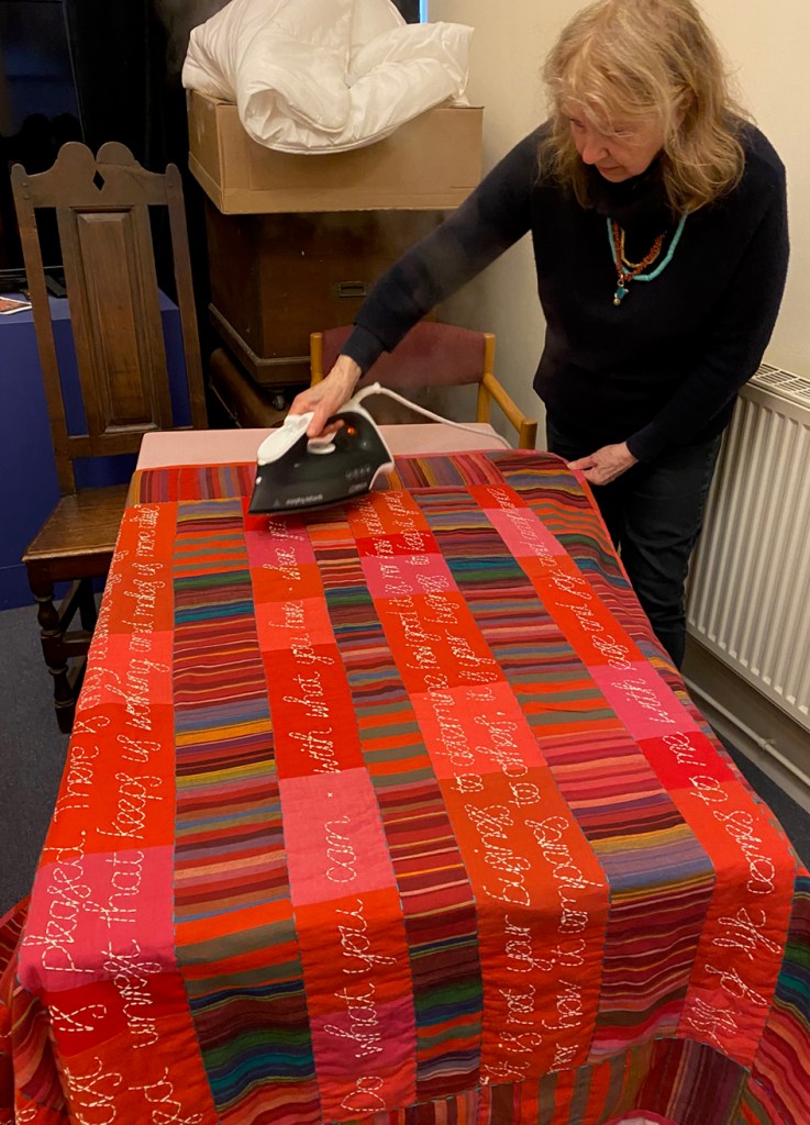
I had decided to make a strippy quilt for the chimney wall, partly to save time but really to overcome the problem of awkward door frames and lots of corners. I calculated the width of the strips on each wall, even taking into account my inexact machine sewing I managed to get them fairly evenly spaced. Well 4 cans of spray starch and a hot iron helped.

I seem to be a lot better at stretching the panels than I am at machine sewing them. We decided to work around the room from the least visible area. I wanted the walls to look like a total piece of fabric or a massive quilt that is just wrapped around the walls like a cocoon – but I had to make some adjustments to the finishing as things progressed….we sort of started with a vague plan trusting to nouse to see us through…..Things were beginning to take shape but I soon hit a construction problem, my errant stitching had made some of the panels far too big and they needed to be trimmed after stretching and folding, securing them neatly was difficult now that they were padded.

Above, the edges of the panels are secured with iron-on fusible web tape and staples to vertical battens before stretching across the entire wall. Then the diamond corners are further secured to horizontal battens with copper tacks.

The large window wall panel was joined to the alcove panel to assist tight and neat stretching into the corner- making it up as we go along!

Having negotiated the large wall panel I now assessed the look of what we had covered so far but was still concerned about the strength of pattern overwhelming everything else in the room ( we have very faded vintage furniture, carpets and fabrics in the house and I did not want to start making new covers and buying more carpets). I tried to think of ways to make the patterns less brilliant… I remembered a patchwork organza flag made by my old colleague and friend, Nigel Hurlstone. It was in a massive pale oak frame, sadly too wide for this alcove, I removed the flag and held it in front of the bright wall, the central stripe was the same size as the strips – it was meant to be.

I asked his permission for showing this de-framed (but as he gave this to me as a present for helping him decorate his first flat about 15 years ago) I thought he may agree and he did. The thing is that the addition of this piece of work suddenly changed the atmosphere of the room, it became more relaxed and so did I!

Over the next 2 weeks we worked our way around the whole room stretching, stapling, tapping copper tacks, while dealing with light switches and plugs using a combination of glues, bondaweb strips, an iron and spray starch.

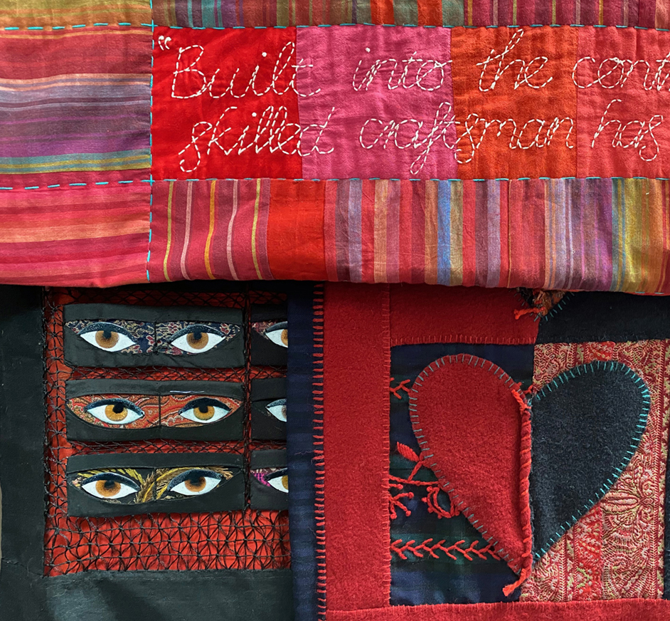
finally the room is covered, just one last strip to join it all together – under the window. Now to start finishing, covering the staples with wooden picture rails and skirting boards and quadrant in the corners. BUT before we finally put the mirror back into position I write this dedication on the chimney breast -I am hoping it will be many many years before this house is sold and some one else uncovers it!

and here I am again before sorting out the rest of the room – flag in place and now to make tiles for the fireplace and then there are the curtains……possibly one more post ?

Cold Feet

It is the last day of February and have been working for 2 months making my patchwork wall coverings. When I started this blog I vowed to show the journey of the work that I design and make – to explain the problems and possibly the solutions……but this latest project has been keeping me awake and I am still not certain that I will get it sorted and onto the sitting room walls. I am suffering a severe case of Cold Feet!

After I had stitched a wall full of the original design I kept feeling that there was just too much going on – all those colours and stripes and collisions of patterns (all the things I normally love) just looked like porridge – multi coloured porridge – something had to go….What went was the yellow stripes – leaving me with Mauve, Blue and Green strips – this took quite a lot of grief and several days ( and nights) to decide to change things – somehow the well-honed critical faculty I use for all projects, professional as well as personal, has deserted me during lockdown. But once I had pulled apart the original piece and made another wall-full, things started to look possible. I made another design chart this time with repeating patterns built in – once a textile designer…….

the new highly coloured “working drawings” for the main sitting room walls

Things get back on track by mid January – the first panel is on the studio wall padded and quilted using the new walking-foot on my favourite old Bernina sewing machine.

By February the work gets properly underway – a whole stitched wall – full – but still very uncertain about this entire idea.

I try these first panels around the room seeing how the whole thing will look – trying to imagine it without those brilliant pink walls is hard…and how will it look behind all our pictures – yikes – it really needs to accommodate paintings and other art works that cover every other wall of this house…I start to realise that what it needs is more GREEN.

Trying the panels on other sitting room walls – it needs more GREEN to reflect the garden

back to photoshop to play with a version of favourite “Green Blue” or is it Blue Green” by Farrow and Ball which is used throughout the house

I decide that if all else fails the patchworks will look lovely in one of the bedrooms. But this still leaves us the problem of the damp disfigured walls and meanwhile the rest of room is being demolished …. did I mention we are cutting and making verdigris copper tiles for the fireplace?

Lockdown Patchwork Project

Determined to make the most of the new year 2021 winter lockdown in the UK, I decided to cover my damp (although supposedly cured) and now ruined sitting room walls…….with patchwork!

And with real fabric. the left-overs from my work organising quilt making in the UK for Kaffe Fassett‘s books of patchwork and quilting designs. Below are 2 of my favourite quilts from previous books that I have worked on and which I referenced for both colour and patten.

Patchwork is part of my professional textile practice and I have always used it for all types of furnishings, from wall papers for Heart Space Studios to my old but still glamorous dining room curtains.

Now I chose fabrics that reflected the colours in the rest of the house: basically turquoisey blues, buttery yellows, mauves and greens – I like colours to blend through the rooms. I had painted the hot pink walls for a New Year’s Day party 2 years ago….as you do!

I really loved the first fat version on my studio quilt wall above, but seeing it in situ was another thing. I wanted to cover the whole room and suddenly I felt totally overwhelmed by colour and pattern – the photoshopped version confirmed my misgivings…..it just hit me in the face and made me feel hot and sticky!!!!!

photoshopped version of sitting room walls!!!!!

The larger size of the fabric pieces, 21inches in length, made the patterns fight one another; in the smaller pieces used for quilts the patterns meld together as the eye sees so many at once AND there is only 1 quilt per room. Here there will be at least 6 large quilt sized pieces from floor to ceiling on all walls. Back to the studio.

And back to the oldest and simplest way of softening and unifying coloured fabrics – dip them in brewed tea. Above see the different shades to be had using: top = 1 bag, middle = 2 bags, lower = 2 bags boiled. It is a shame to kill the brilliant singing colours of the Kaffe Fassett Collective’s fabrics but hey ho! These wall coverings will take months to make and mount on the walls and then we have to live with them for ever…….I am not doing this again!

Back in my studio sorting out newer softer colours. Meanwhile the Kaffe Fassett Studios had kindly sent me lots more fabric strips based on my original sample….dipping a few of them in week tea I placed them on top of the quilt wall – wow this looks like a mad Japanese kimono design! Should I introduce stripes?

I am now 3 weeks into this sampling phase, I am still uncertain about the design on the wall. My Christmas star light reigns over chaos.

Time to get a grip! sort out the separately coloured triangles and tidy up

I set them all out on the table ready to start work – tomorrow. Looking at the fabrics the next day they appeared to look so calm totally unlike the design on the wall. Maybe it is the Covid experience of the last 10 months but now I seem to want calm from my colours. I looked at the table and my eyes just glided over the strips of colours – back to the quilt wall again – to organise the diamonds into stripes.

Now my eyes tend to glide up and down rather than dotting about to see other diamond combinations. But that is as far as I can take this designing phase: there comes a time to every project when you just have to commit, and we are now into the first week of the new year. So I am simply sewing one single coloured strip at a time, and when I have finished them I can start to play with the design again – it should see me through until I get vaccinated.

nexus – meetings at the edge: exhibition

IMG_6545

The night before the private view I had a dream that a giant version of the work featured on the poster ( see above) was writhing around the gallery walls and flashing strobe lights, while all the other pieces of work in the exhibition were equally massive and glowing while moving to – for want of a better word –  ‘disco’ music: I thought –  oh no! my poor flat patchwork!

cover ex
reassuringly  static ‘ Entangle Tiles ‘ by Lynne Maclachlan

The featured work by Lynne Machlachan was on display with her other wonderful constructions in blends of strong colours they undulated around the walls and in the air. A panel of photographs showed them  being worn, I hesitate to call them jewelry…

On reflection I feel that this work set an atmosphere for the exhibition; clear, strong, flat colour, immaculate attention to surface detail, and a definite sense of playfulness were qualities I enjoyed throughout the rooms. The only strobe effects were caused by overlapping patterns on a smaller scale in many exhibits.

IMG_6486
strobe effect in metal in tiny scale by Andrew Lamb

Whether  by intention of the makers or sympathetic lighting on the part of the curators, the play of light and shadow were fascinating.  I constantly returned to view the works of 2 makers who collaborated to show small woven metal constructions, Jonathan Cleaver and David Poston,

neux ex3
weave1
views of the woven metal works from different angles with metal jewelry work by

Even when I viewed  larger scale works that had became almost installations in the way they were exhibited, the same themes of flat brilliant colour and clean elegant construction were apparent – and the use of this singing yellow and metal together.

IMG_6480
Rajesh Gogna metal appliances with attitude

colour and pattern throughout the exhibition links very disparate materials and ideas

nexus ex2
machine embroidered coat by Jacky Puzey echoes the metal sculpture beyond

The machine embroideries of Jacky Puzey echo both colour and form when seen against the metal sculptures. Her large dramatic panel of birds is a real master class in placing together disparate materials and media so that they flow easily one into the another.

IMG_6464
machine embroidered parrots in thread and feathers. Jacky Puzey
joining
detail of embroidery and fusion with feathers – harder than it looks here!

The degree of skill on view within the exhibition is made apparent in different ways, certainly to change or add new materials to your original practice makes you concentrate on the “joins” and here nearly every piece of work combined either 2 or more materials or the makers had transferred the techniques of one discipline to another…or they made juxtapositions of natural with man made found objects – never easy.

thimble
3 Sea Thimbles by Romilly Saumerez Smith

Ancient bronze thimbles carry coral and sea urchin spines, like tiny offerings to the goddess of stitch! And there were boxes made from a metal shield mount, still with tracings of old patterning mounted with diamonds.

One of the major themes of the exhibition is the transformation of one material to describe another and there were many examples including my own.

annalorenz

One of the advantages of Private Views is to meet up with other exhibitors, I often find that talking to people work who work totally differently to me are always stimulating. I was introduced to Valeria Nascimento and we spent some time together discussing our very different work. as we walked we both stopped and gazed at the work of Anna LorenzIt is intriguing; you just can’t guess the material ( well I am a maker and stimulated by materials) It looks like unglazed porcelain or paper porcelain, or unfired porcelain, or paper or felt or…. or….but it is news print; and it is perforated, but how? Valeria and I were looking behind it, inside its layers and I took this image of the gradated shadow it threw – so much a part of its complete and compelling mystery.

Arriving at Valeria’s work I realised that I had photographed it as soon as I walked into the gallery, drawn to the far wall of what looked like bleached shells and sea creatures.

valeria sea
porcelain ruffs and spirals

Her table of porcelain jewelry in stark blacks and whites really intrigued me, the fluffy neck pendants and the massive rings and brooches are not to my personal taste but their presence and implication of natural forms through simple and sympathetic use of her media, just made me want to hold them – and that’s why we go to exhibitions isn’t it – to extend our imaginations and ideas.

sea creaturesSea creatures emerged as inspiration in the beaded work of Wanshu Li, translucent and iridescent tentacles of colour made up large rings and bracelets.

sea photo
photographs of jewellery by Wanshu Li

and accompanying her work were high contrast photographs underlining the quality of deep sea beings… looking at this work made me see a fish in an adjacent vitrine.

fish
strange fish emerges from the glass work by Kate Haywood

Every once in a while you see work that just makes you jealous and wishing that you could have made  it – the work of Zoe Hillyard really stopped me in my tracks. First it was beautifully thought-through and formed, second it reminded of work that I had made previously, and third – I wished that I could have used it for an exhibition I co-curated some years ago – Mending at the Museum.

joining1
broken ans mended jar using fine fabric.

I had actually tried  a similar exercise when I was working on ‘mending’ ceramics – but it did not look like this; here are elegant breaks, refined textiles wrapped and stitched to perfection and the soft colouring entirely at one with the materials –  it is patch-worked!

I really appreciated this work, especially her dense stitching on the inside of the pieces, used to draw the fabric tight against the curves, she managed to make this as decorative as it was functional. Just so desirable and a perfect transference of materials and ideas – and she made the jars then smashed them herself!!

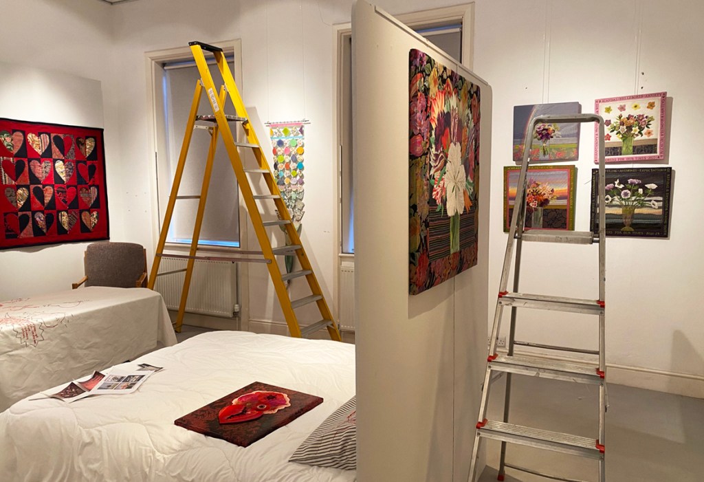
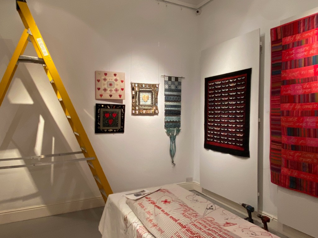
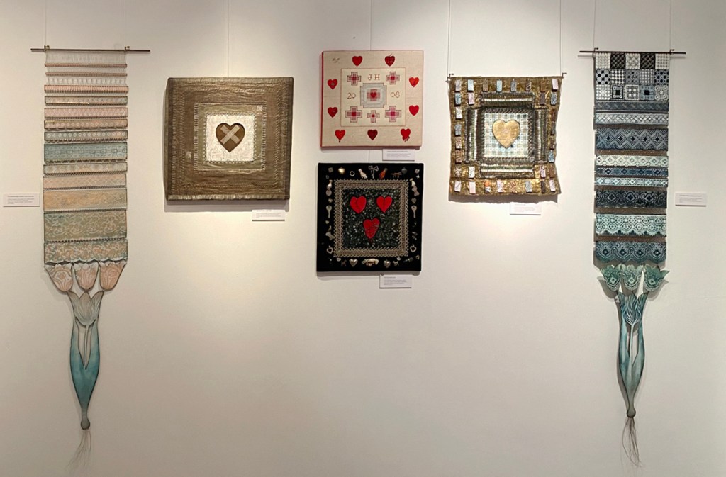
I cold go on and on about the ideas, images, thoughts and provocations elicited by this exhibition – but now show that finally, after months of work, the Patchwork Enamel was successfully  transported and hung and here it is complete with shadows…

shadowspw1

sleeping in the garden

garden1
the first fabrics chosen for the quilt using the planting story board.

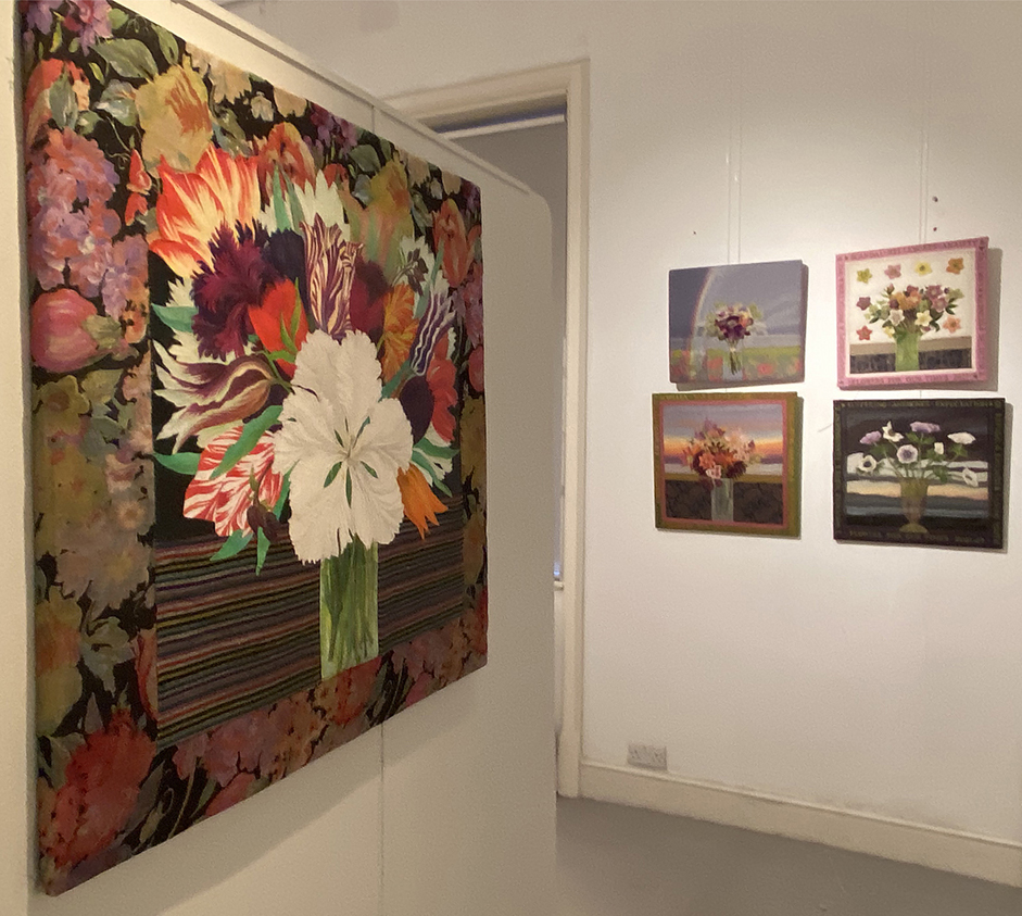
My latest commission is to design and make a patchwork quilt to be placed on a bed in a show garden for this year’s RHS Flower Show at Tatton Park. This is the idea of plants-woman and garden designer, Julie Dunn, And I think that her design is really intriguing – to make a garden for recuperation and healing, full of scented plants and herbs that aid relaxation plus a double bed in which to rest.

When Julie first contacted me, I responded by asking for her ideas for the atmosphere of the garden, particularly her chosen plants, so that I could give her some fabrics to consider.

mood board
original and amusing plants and atmosphere visuals for the garden

She had very definite ideas of the actual fabrics that she wanted – they were by Kaffe Fassett and they featured flowering plants, most notably Brassica – the classic fabric featuring flowers that looks like roses but are in fact cabbages.

3greeny mauves
1 co-ordinated fabrics surrounding the favoured Brassica fabric

I pulled together several colour “stories” to choose from. although they are similar they give very different overall tones – I wanted the quilt to reflect and augment the garden, not overwhelm it

1 greys
2 grey version of Brassica with co-ordinates

The sheer scale and incongruity of the bed in the small ‘Back to Back” gardens in the show,  means that it will dominate if we are not careful with the pattern and the colours

4 greenier mauves
3 brighter, green and mauve colourways

The large enveloping quilt needs to give a feeling of comfort and protection as well as being light-weight and warm whilst the sleeper is wrapped up in it. I already knew what the backing fabric would be – Dream, one of my favourite Kaffe Fassett fabrics.

dreams
“Dream” fabric design – which colour to choose for the backing?

Julie and I spent a day in my studio, and with her visuals pinned to the quilt wall, we started to develop a design together. I wanted a very simple quilt design with large scale patches, as although a decent hand-stitcher I am not a happy machine stitcher,  particularly with the precision needed for patchwork.

garden quilt 2

Working with the first of the colour-way choices shown above, I cut simple large scale heads from several shades of the Brassica fabric and simply made a chequer-board formation with them. This first attempt look too strongly coloured, but the simple square format was good as it showed the full ‘flower’ heads of the cabbages. But the simple deep pink strips looked too solid and they would dominate the entire quilt, we needed a  more subtle variation.  Cut  into triangular sections, the square becomes a diamond

g quilt 3
the next step of the design with the planing plans on quilt wall.

Julie was happier with this softer set of fabrics; strangely adding  more patterns and colours often makes a design more subtle, the secret is to work within a tonal  range – these red triangles dominate here – they may have to go eventually!

borders2
design development with more borders

I tried to balance the deep colour with a strong striped border but the dark blue stripes make the centre even more dominant. Julie wants the magenta red to stay as it is exactly the colour of a chosen Sanguisorba – I take her word for it.

g quilt 5
re-arranging the strips of fabric to build up the medallion design

working on through the afternoon we slowly we start to feel that the colours, although strong, are softened over all and now enough of the quilt is decided for me to carry on developing the design from here.

almost there
the colour balance is better, the flashes of magenta ‘Maple Stream’ leaves help.

The actual quilt needs to very large, Julie’s vision of it is to cover the bed almost to the floor, this useful as I see the bed to be a type of extending couch-  a day bed. Julie sees a four poster!

IMG_6393
the mood board for the bed element

We turn our minds to the application forms and read them extensively  and decide that I will illustrate the envisaged quilt on the envisaged bed in the envisaged garden…this I can do more easily than make the quilt, having illustrated all sorts of ‘envisaged’ designs for gardens, plants, embroideries, fabrics, enamels, clothes…..so I offered to illustrate the whole of the garden application.

sleep quilt
my first rough idea of how the bed will look when dressed.

We discuss the problem of the English weather, even in July, we will need a canopy. I imagine that you would not use the bed when it was raining, but at a pinch could hide under a canopy at the head of it – if we use a day bed. But the vision of a real romantic bed with curtains is still the main aim. This is when as a designer, you have to really listen carefully to the client – and try to find a compromise; a drawing, even a scrappy one often makes your point, the metal sub-structure of the canopy  will dominate the small garden.

quilt fabrics illo
the final illustration for the application.

Of course the one thing I  felt I must do was to inform Kaffe Fassett of our plans. So at our next quilt design meeting I showed him the scribbled design drawing and the other garden plans and asked for his “blessing” for the project and could he sponsor it with his fabrics? His immediate reaction was to offer more suggestions about the design using lots of other fabrics I could use.
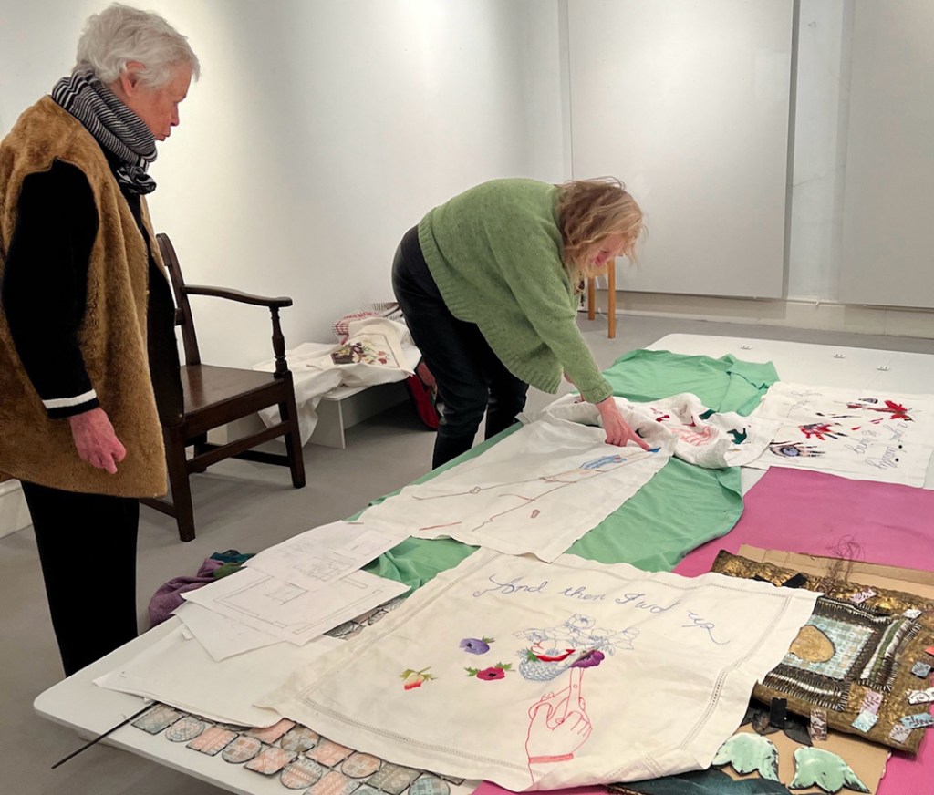
I am leaving the next stage of illustrating the garden for the application for another post – watch this space.