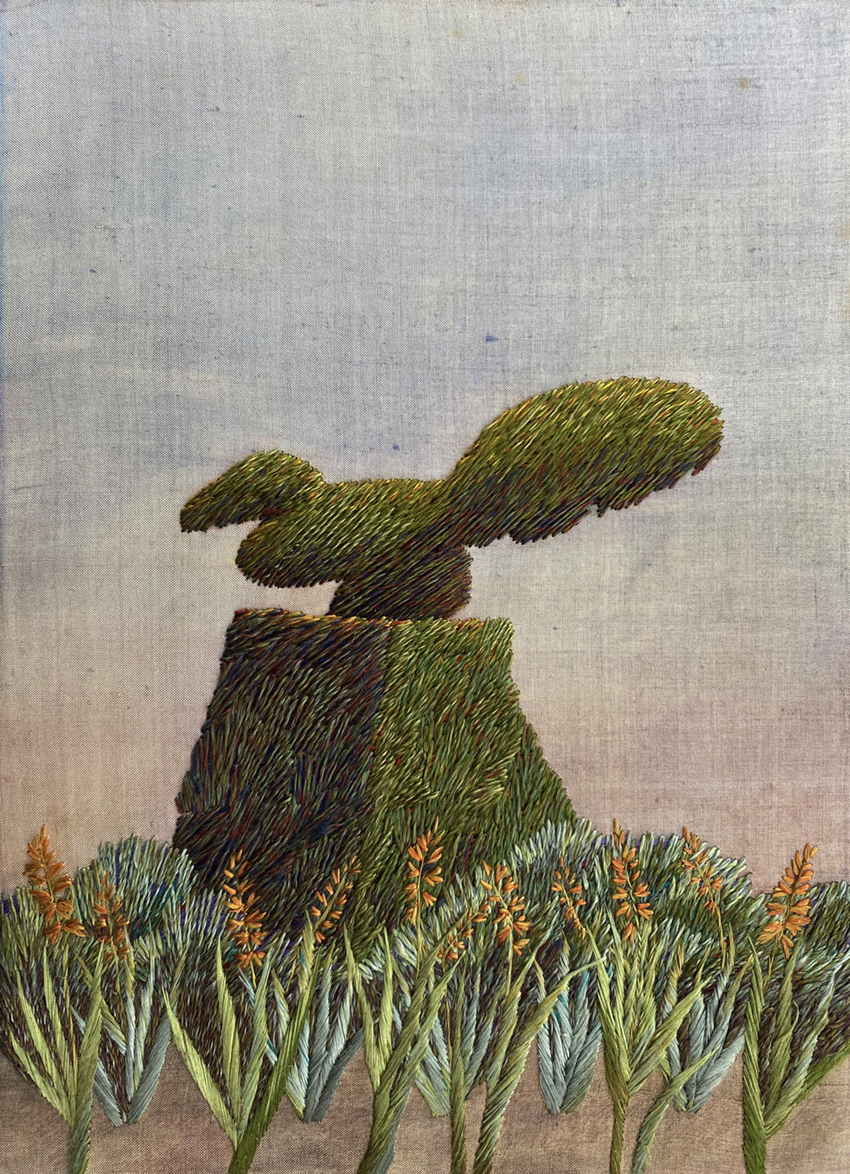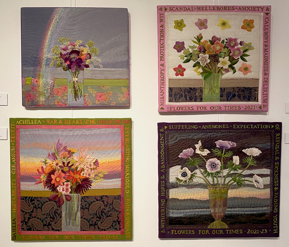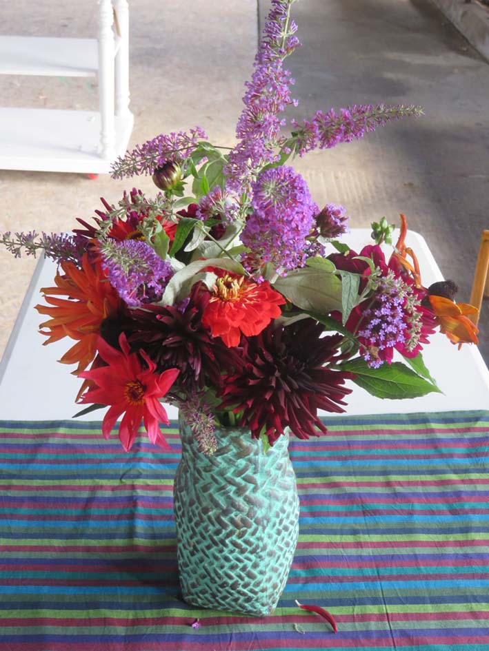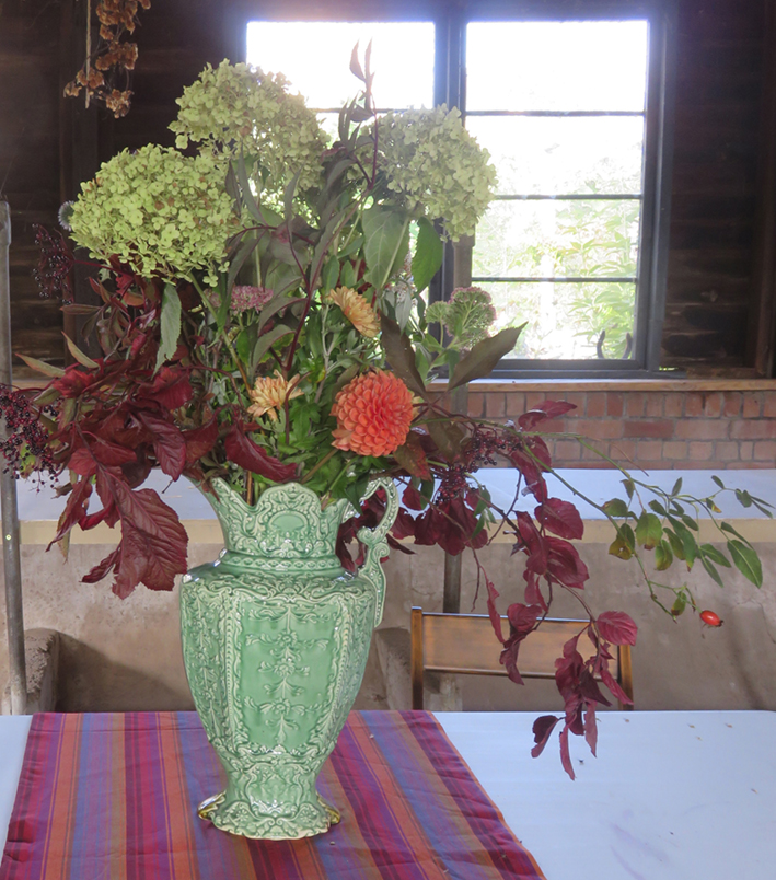
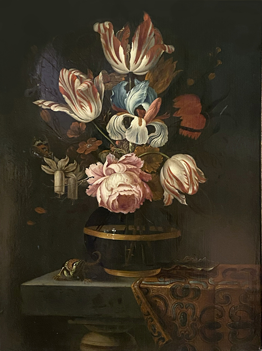
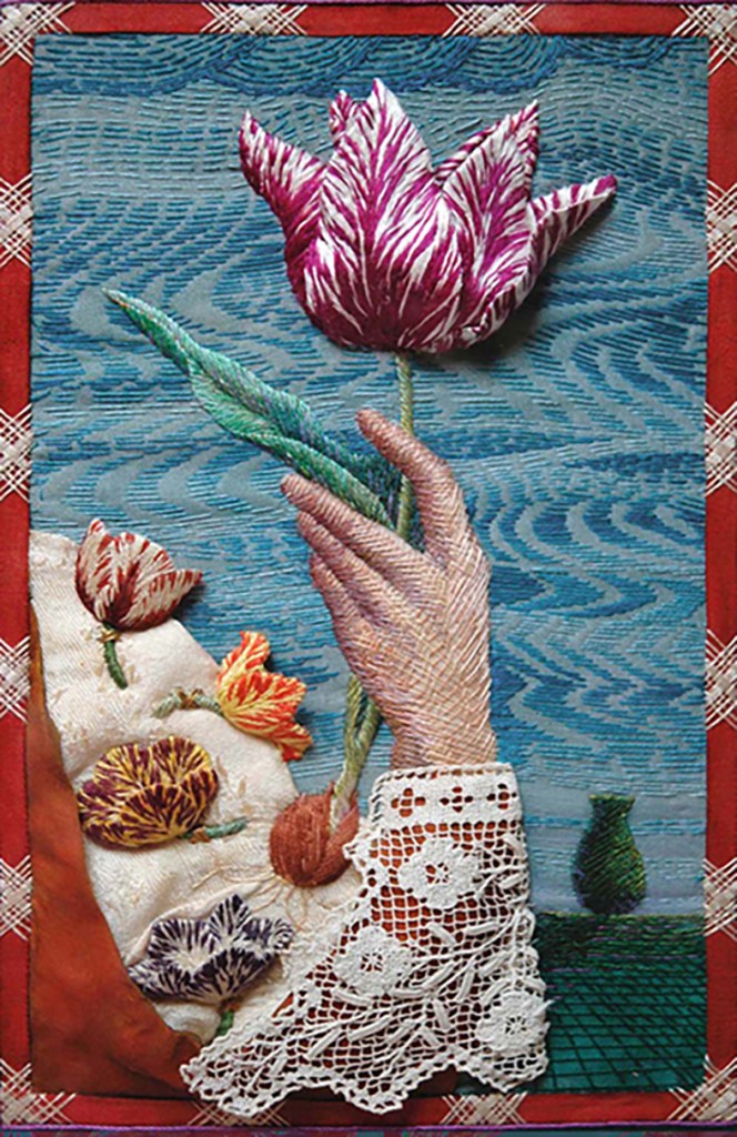
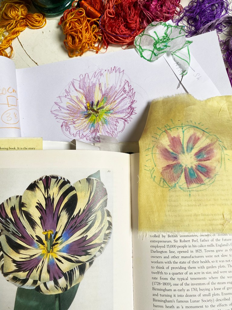
The classic 17th century Dutch paintings of fabulous flowers, but this arrangement probably did not really exist. The modest bunch above, features early spring Daffodils, with mid to late spring Tulips and Irises, and yes they can all grow in the same season, but the give away is the fully formed damask rose seen only in mid summer. It demonstrates how the artists worked: each flower was a sample of horticultural expertise, painted when it came into season, then there was a wait for the next bloom to come to perfection.
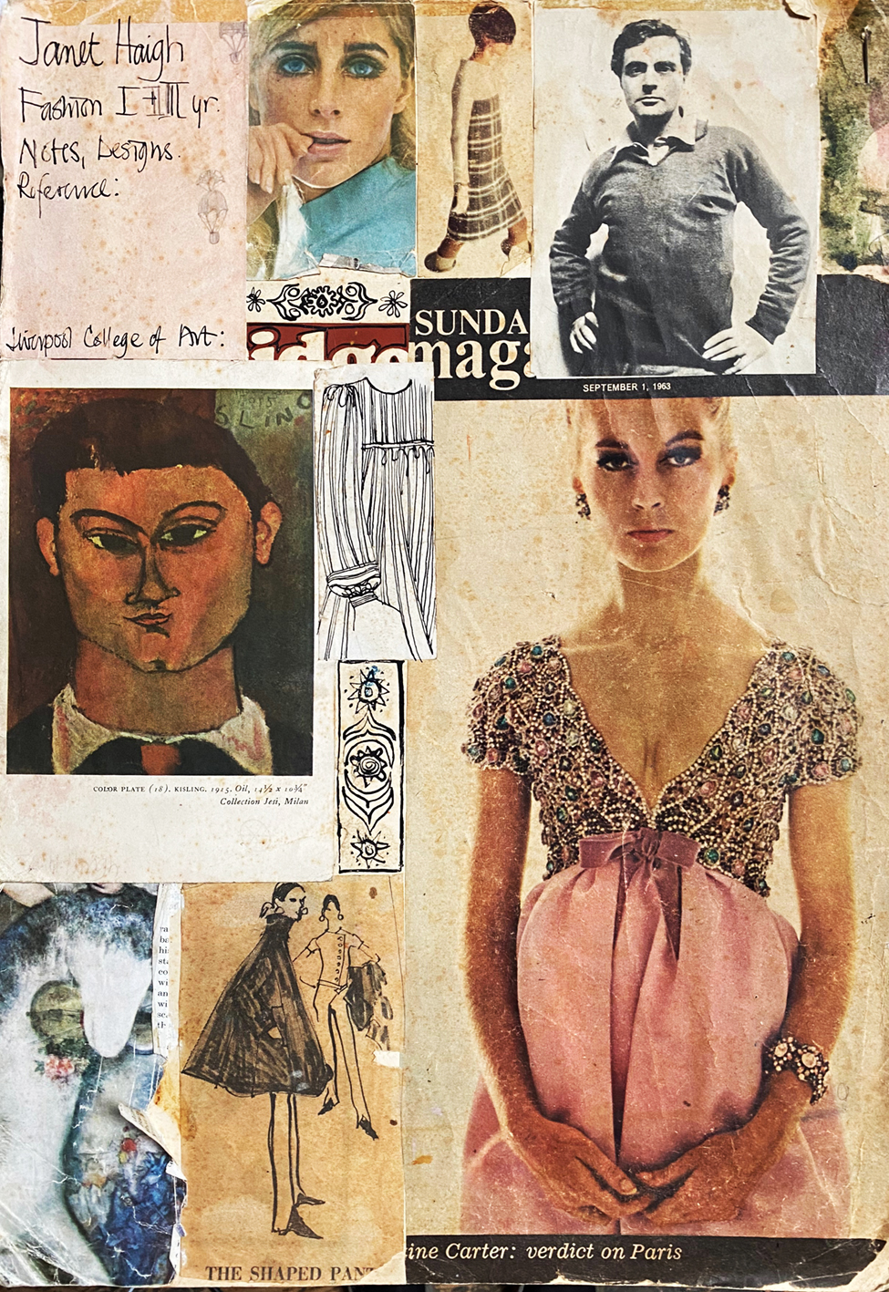
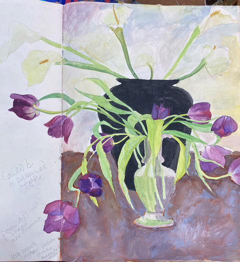
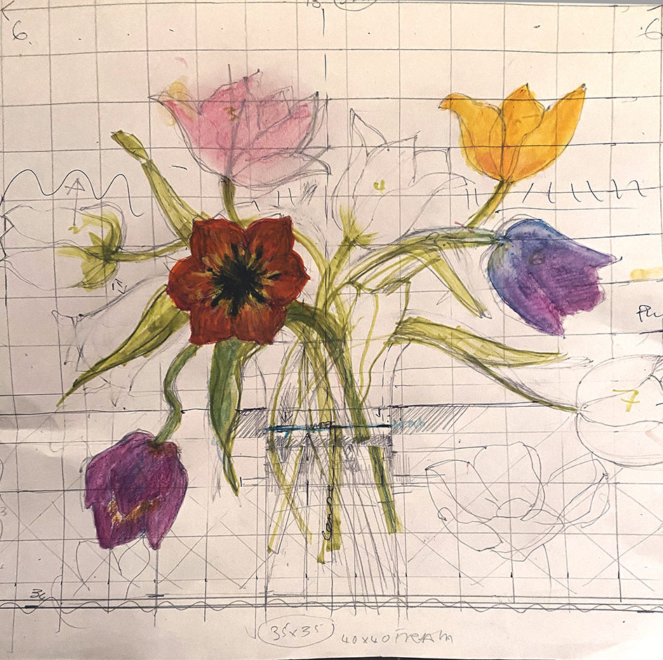
So last year when I was commissioned to embroider ” a vase of colourful tulips” during my Hidcote exhibition, and I realised that tulips would not be in season in October when I could start working on it. I decided to find tulips within my own work and remembered a very old sketch book with a vase of drooping purple tulips ( circa 1980). Always keep your sketch books!
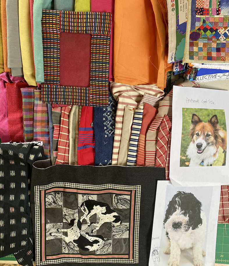
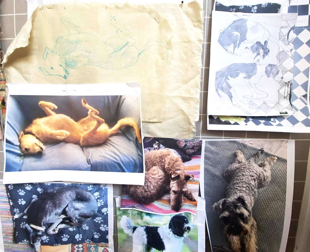
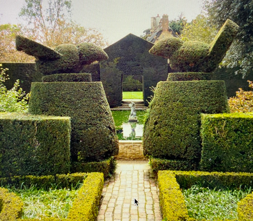
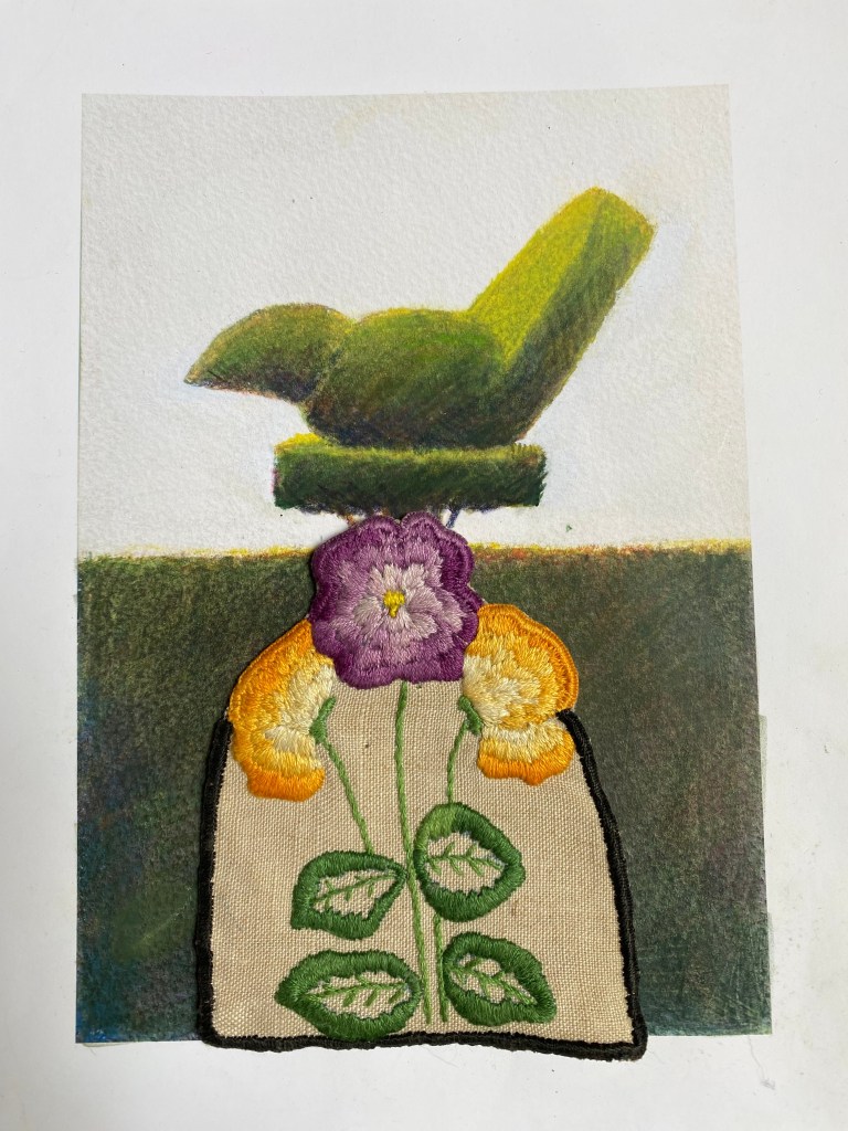
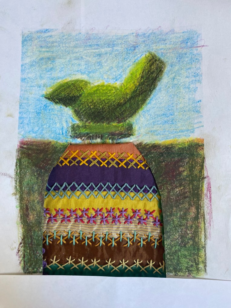
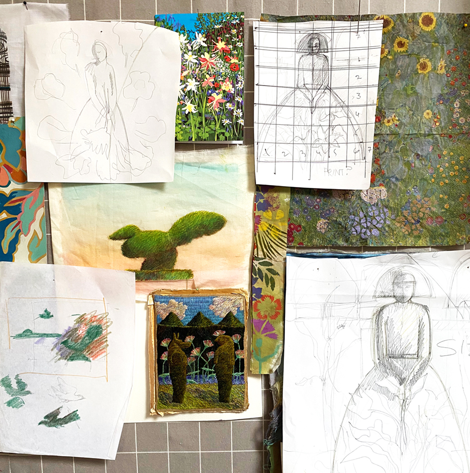
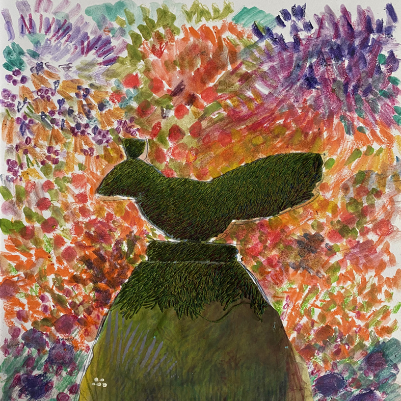
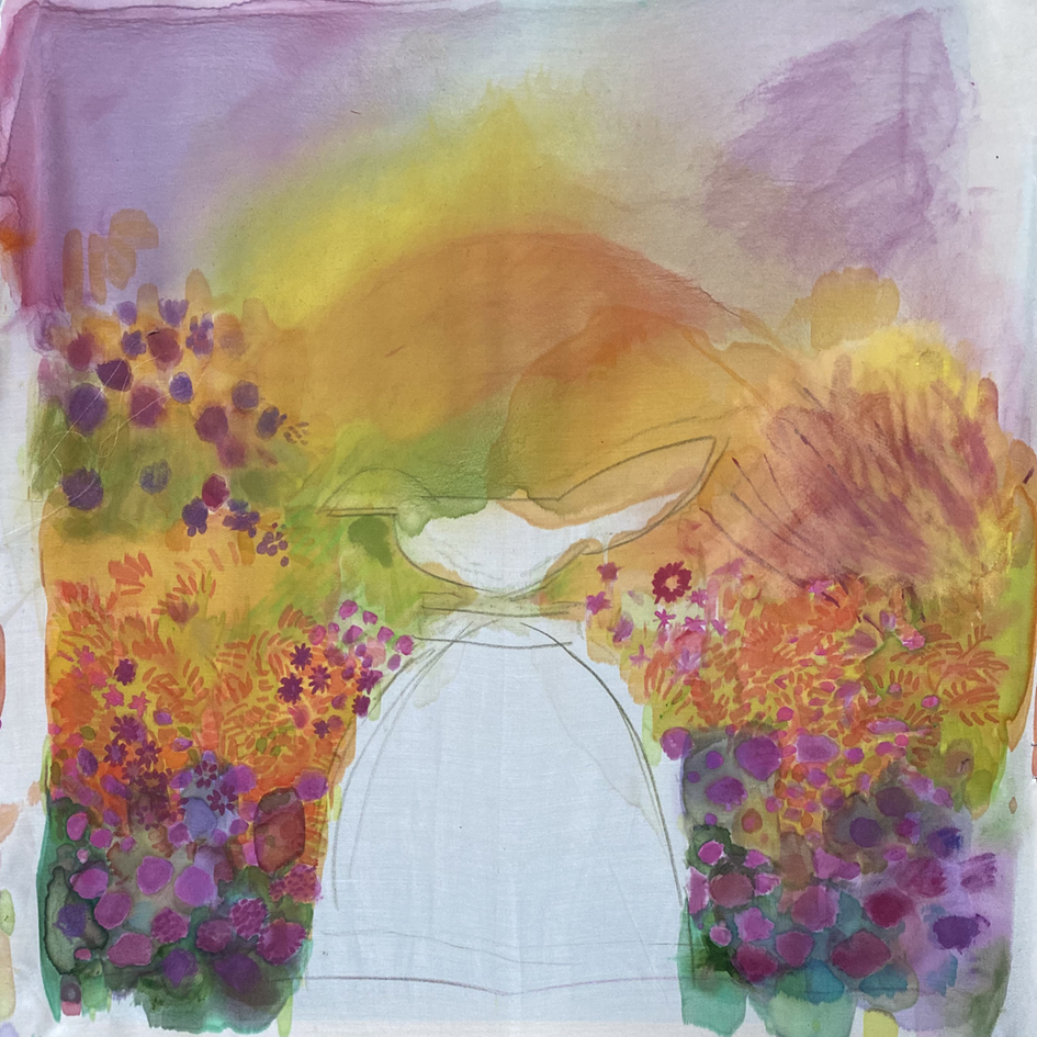
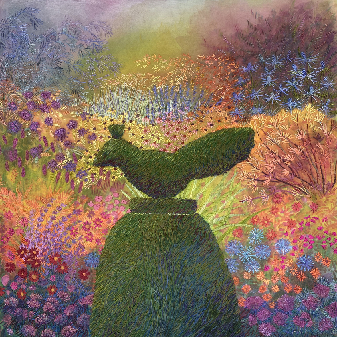
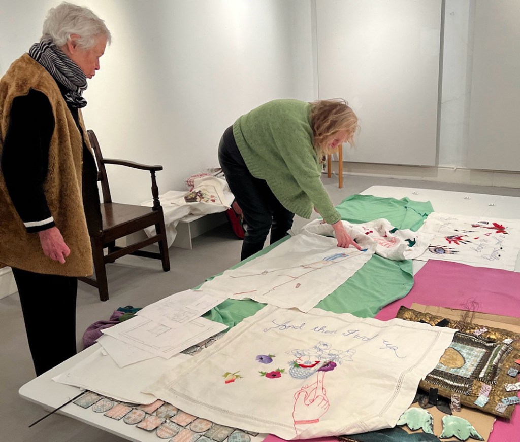
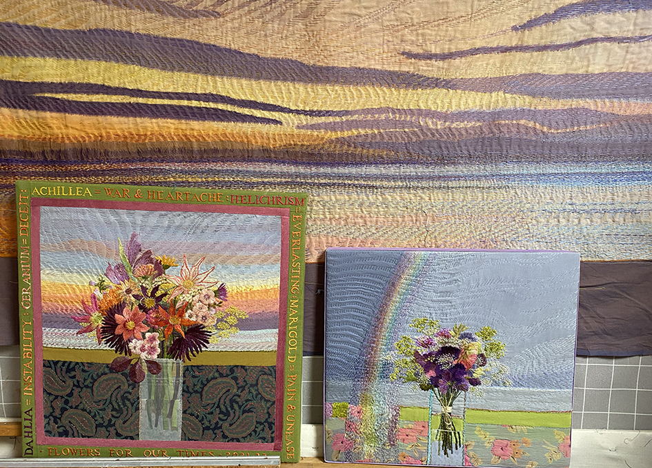
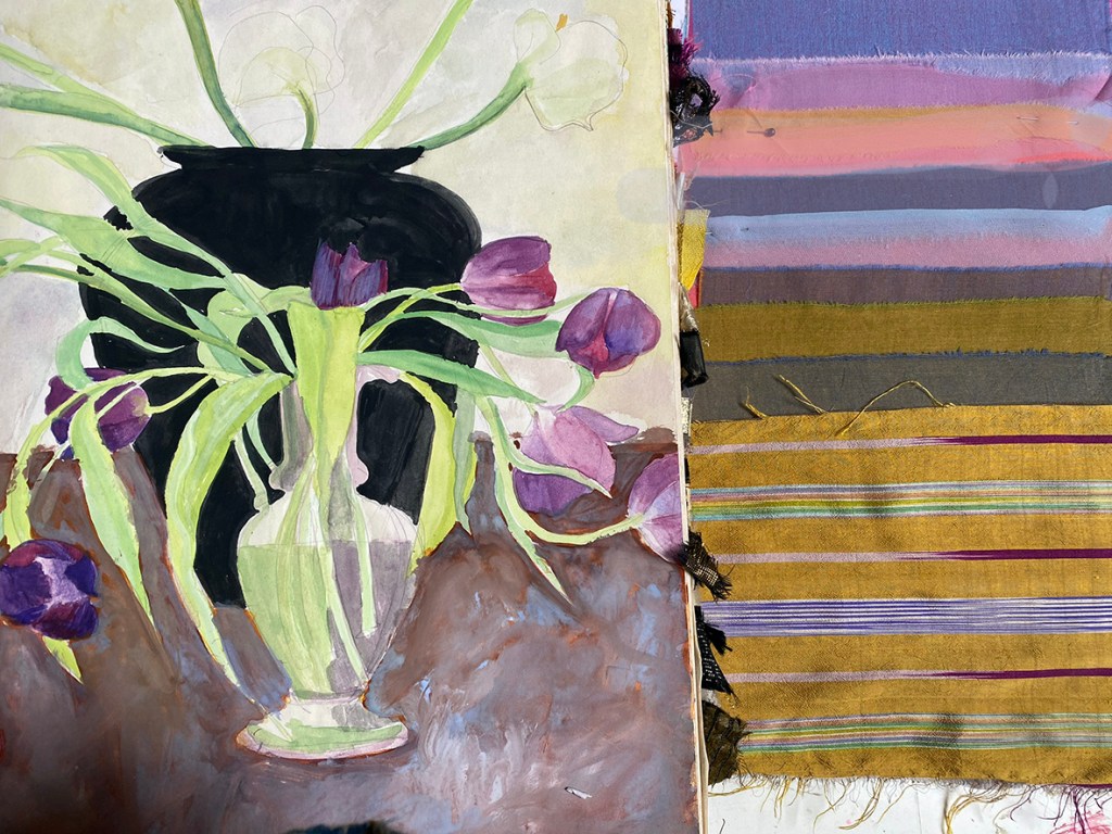
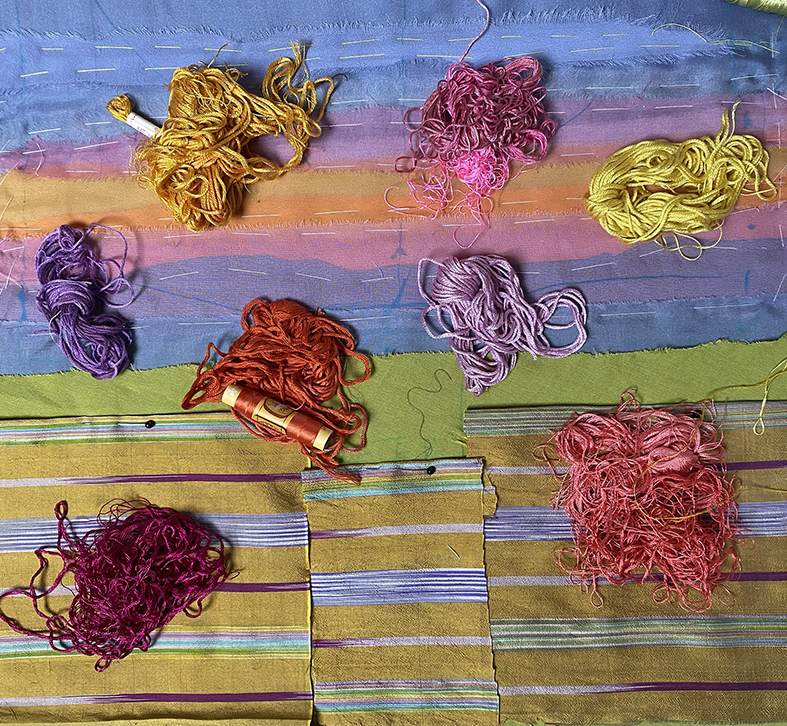
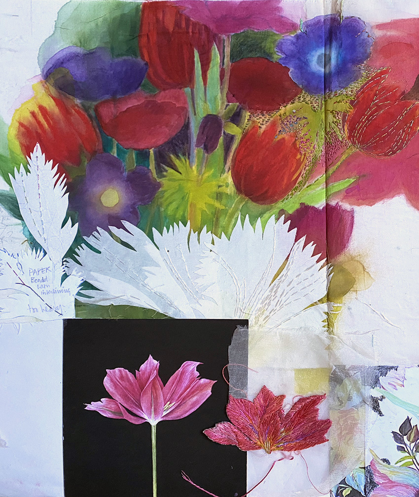
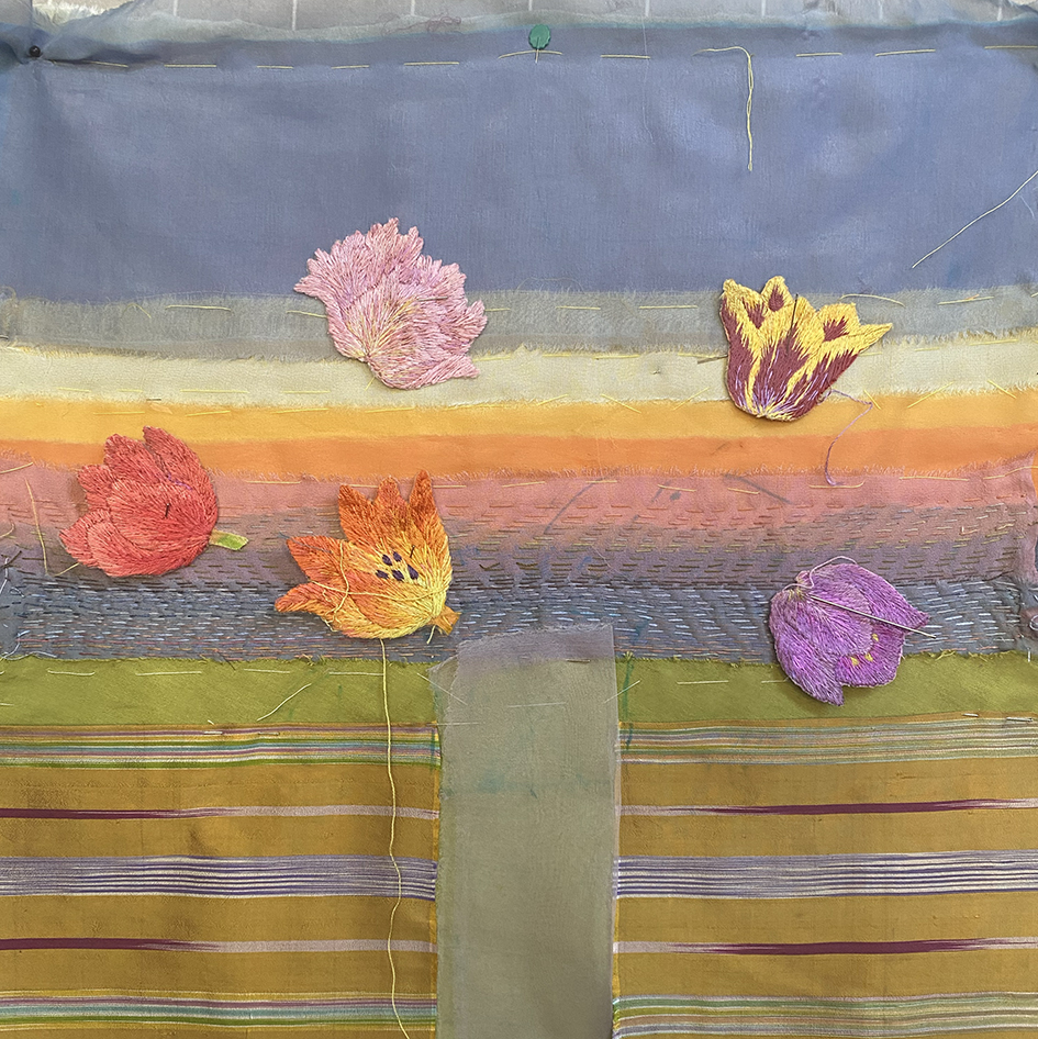
Above is the inspiration behind my latest commission. Below shows my studio wall with earlier flowers against stitched Kantha skies…with a sample of different fabrics to act as the background
Now I needed to choose some colourful tulips to put in a vase. I started with my sketch, below, of some striped tulips that I have used many times for different projects. It was at this point that I sent images of ideas and sampled fabrics to the buyer – for any feedback then with her agreement I went ahead and started on the actual panel. But with the stipulation of no other sighting until the piece is finished !!!!!!!!
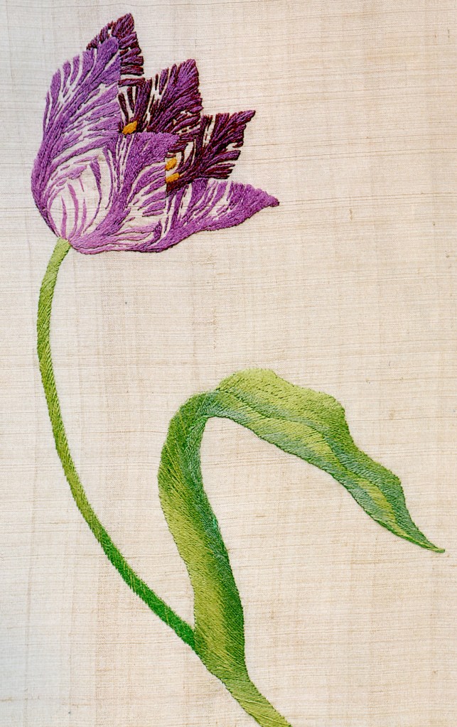
Here is the drawing used again for the front cover of one of my embroidery books, and on a detail of Tulipomania now used for a print in my shop,
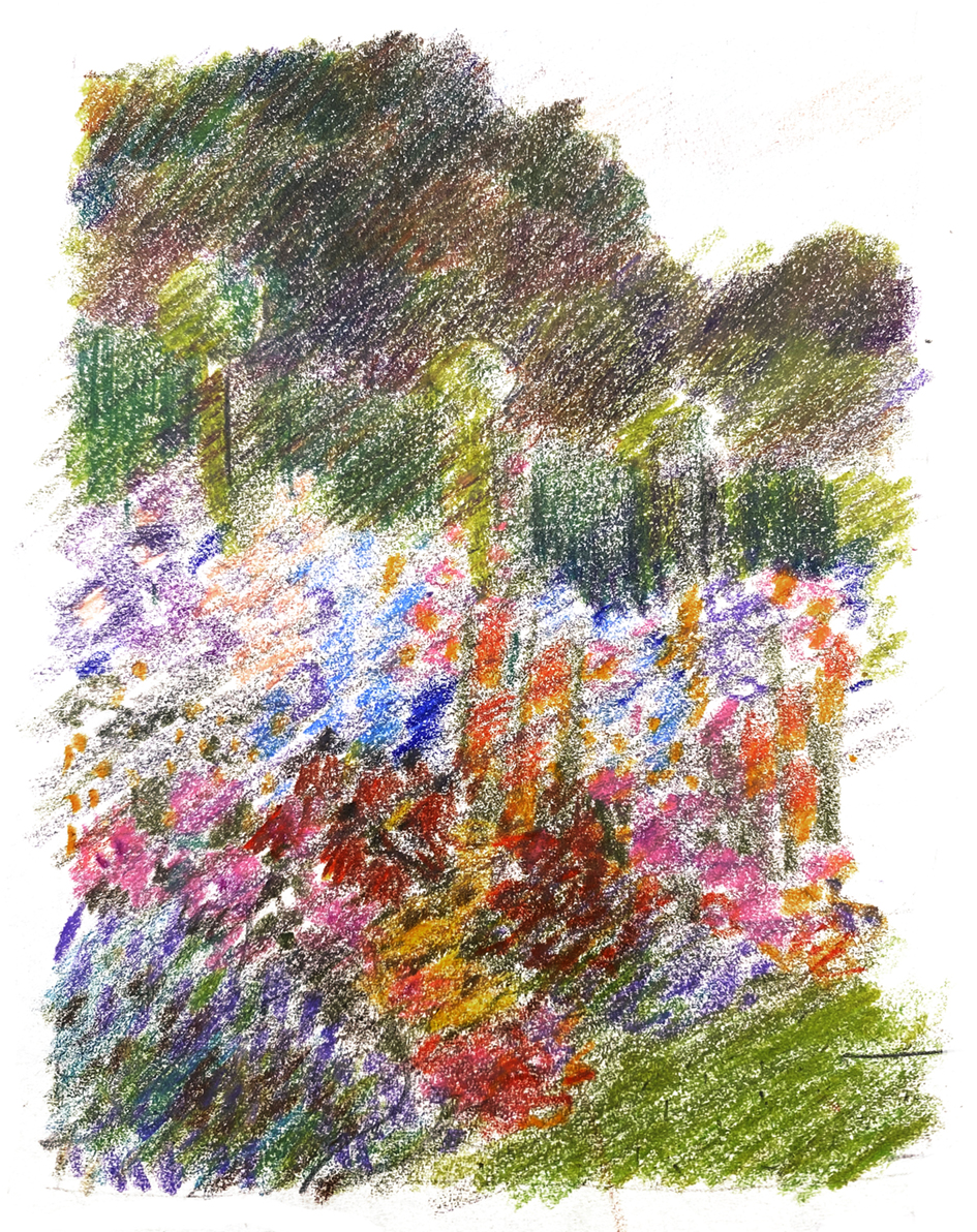
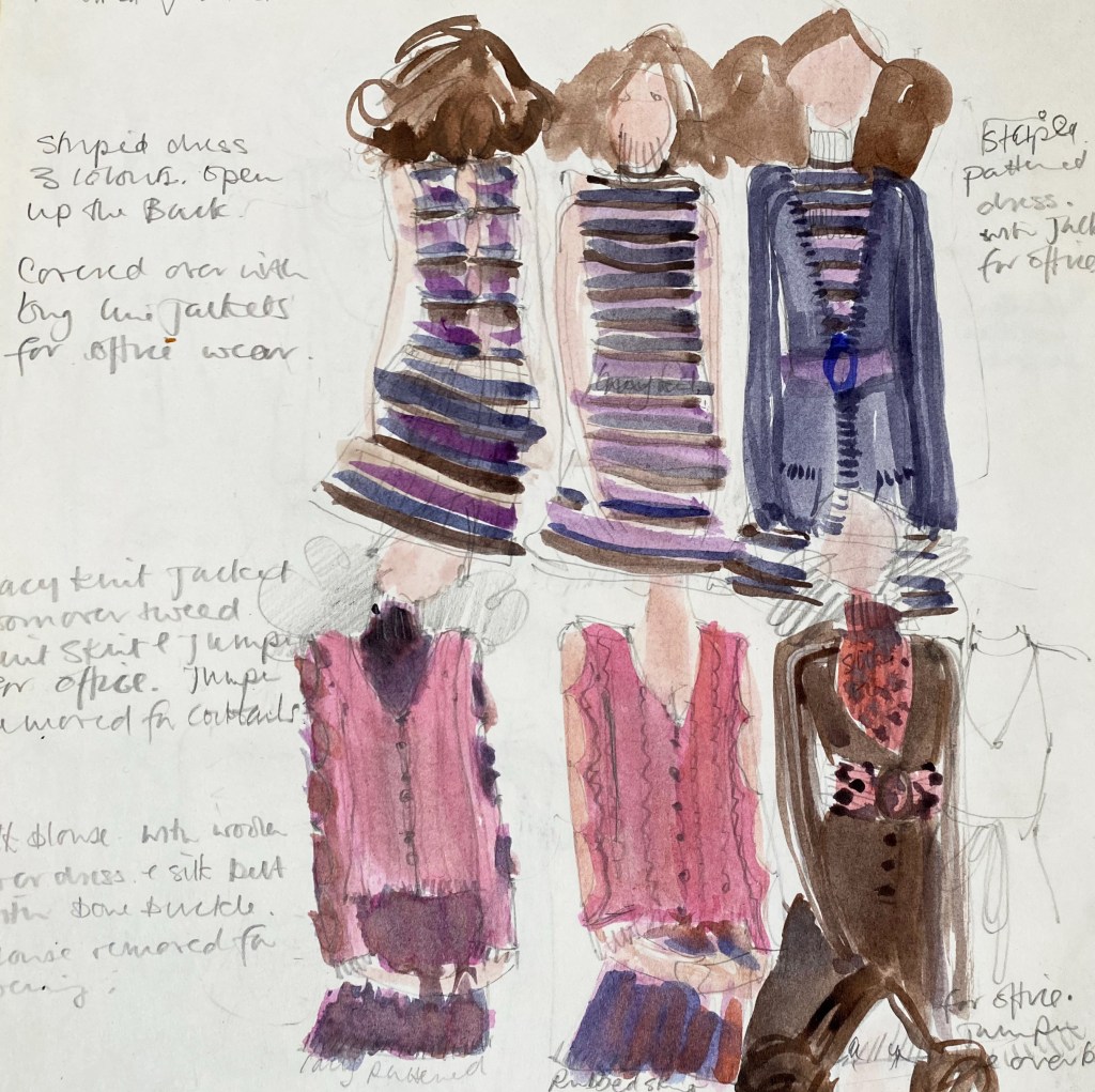
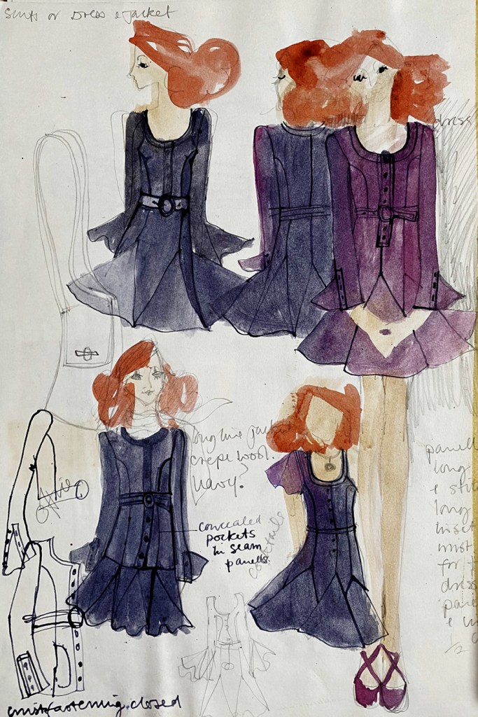
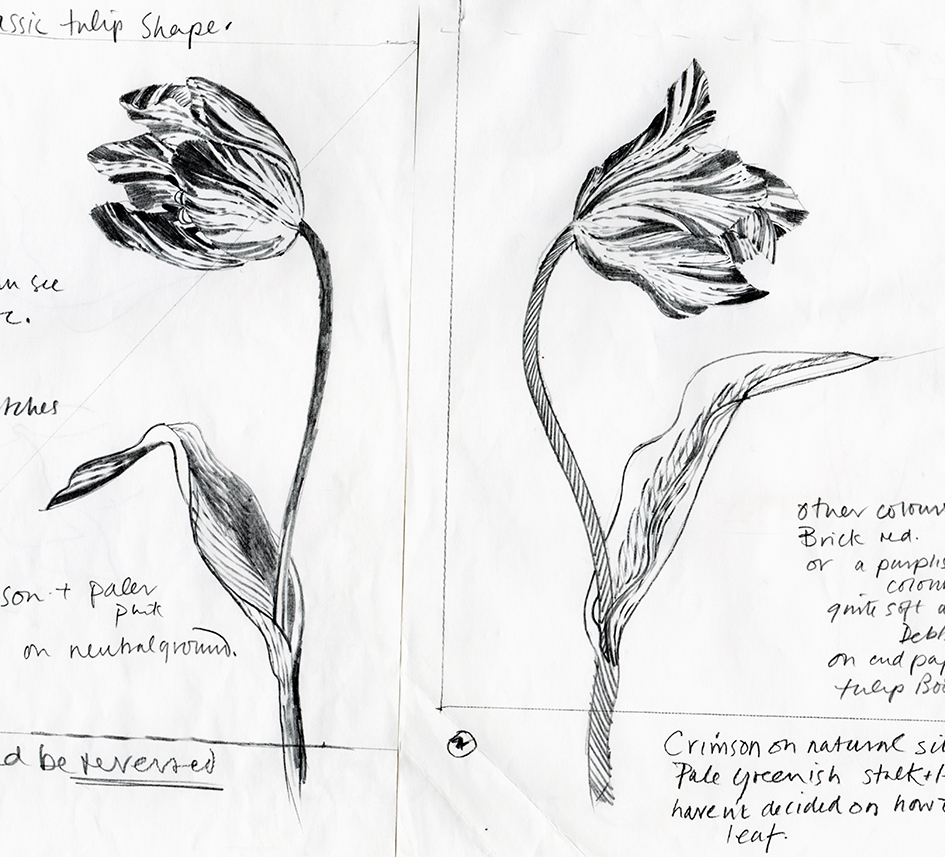
Below, designs for counted thread canvas work woollen embroideries – a good drawing goes a long way!
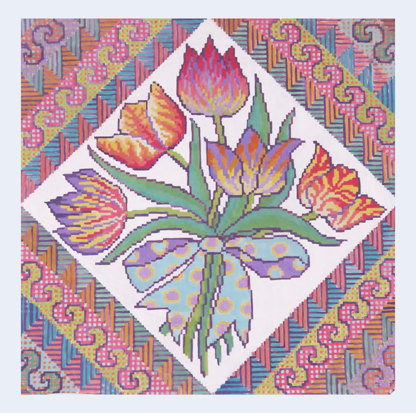
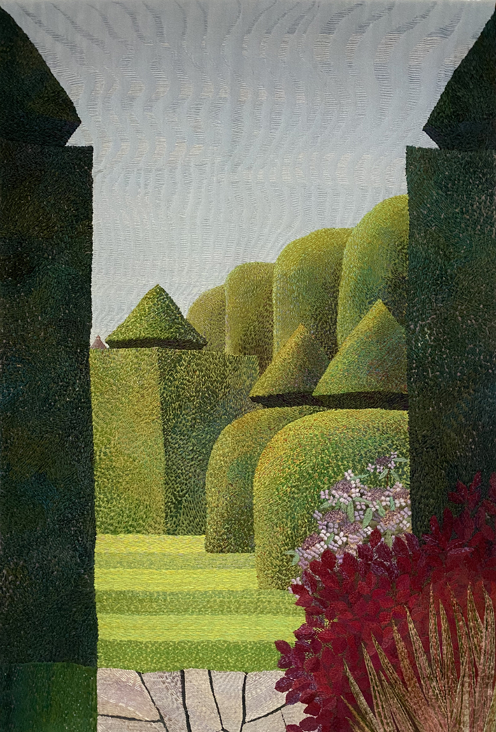
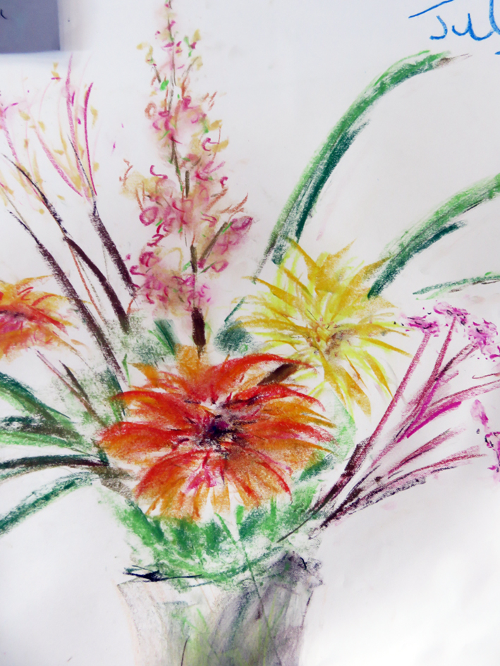
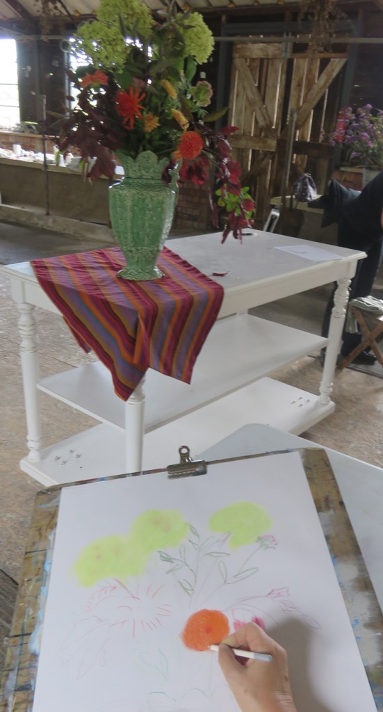
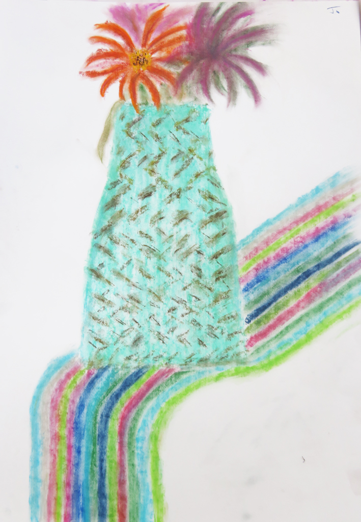
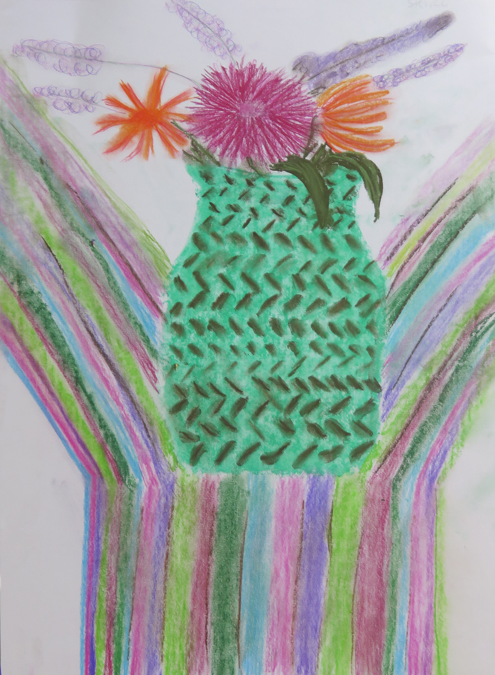
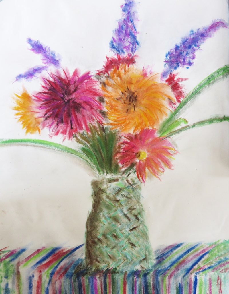
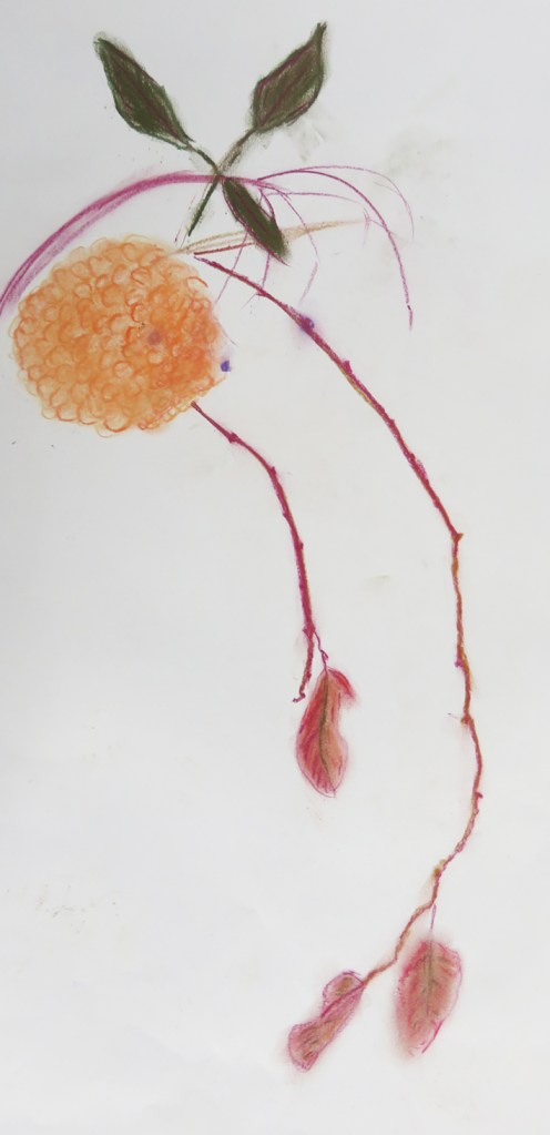
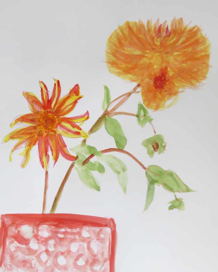
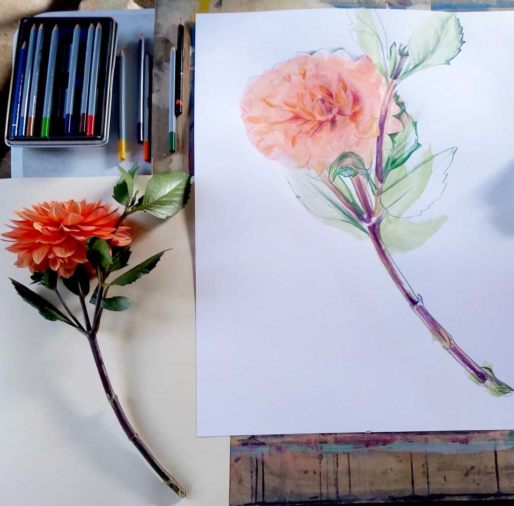
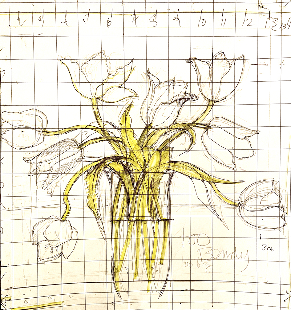
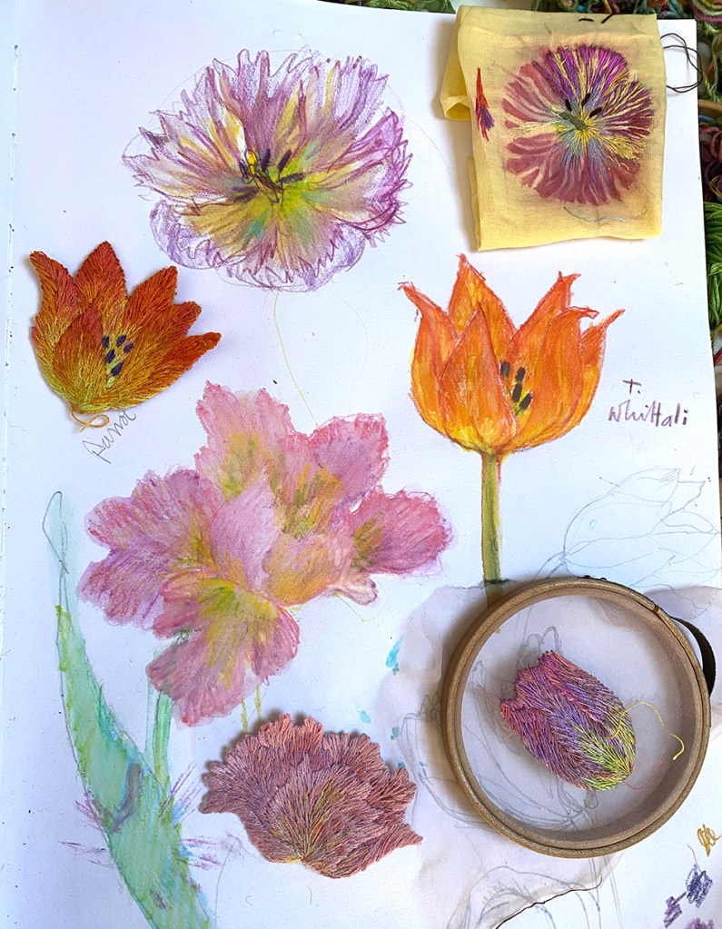
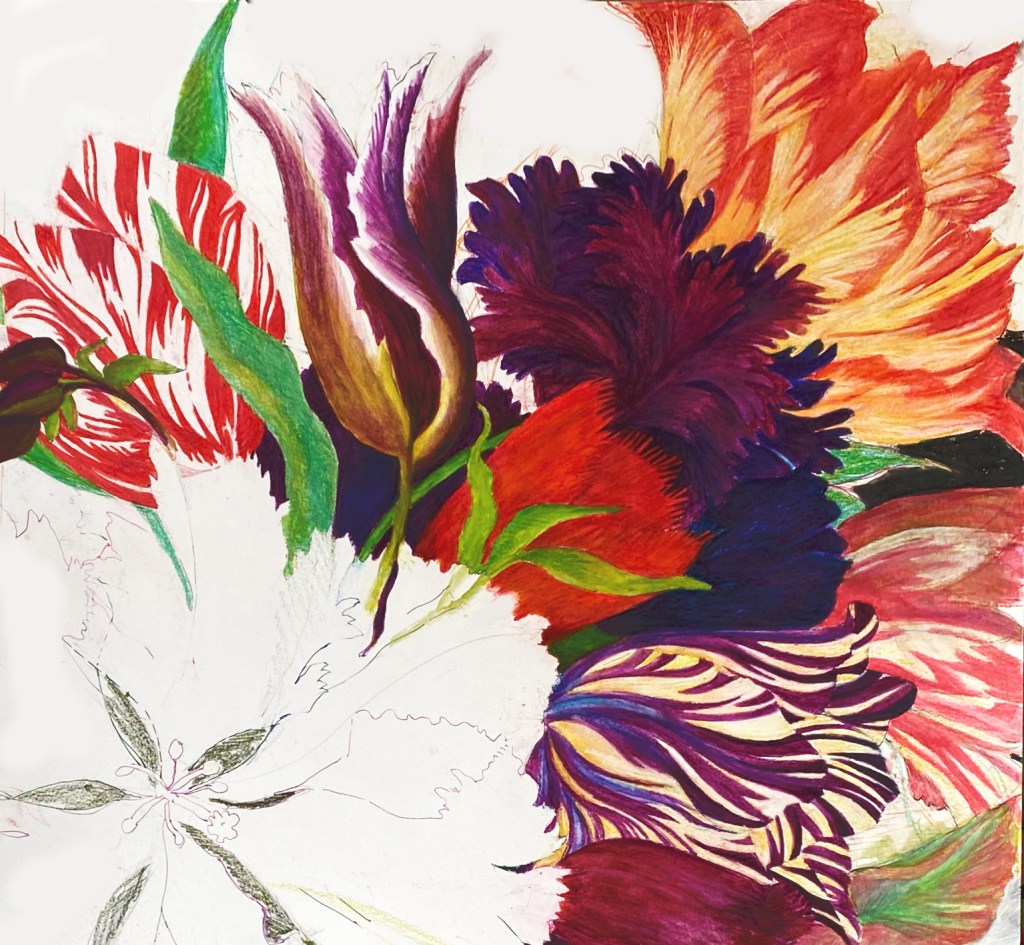
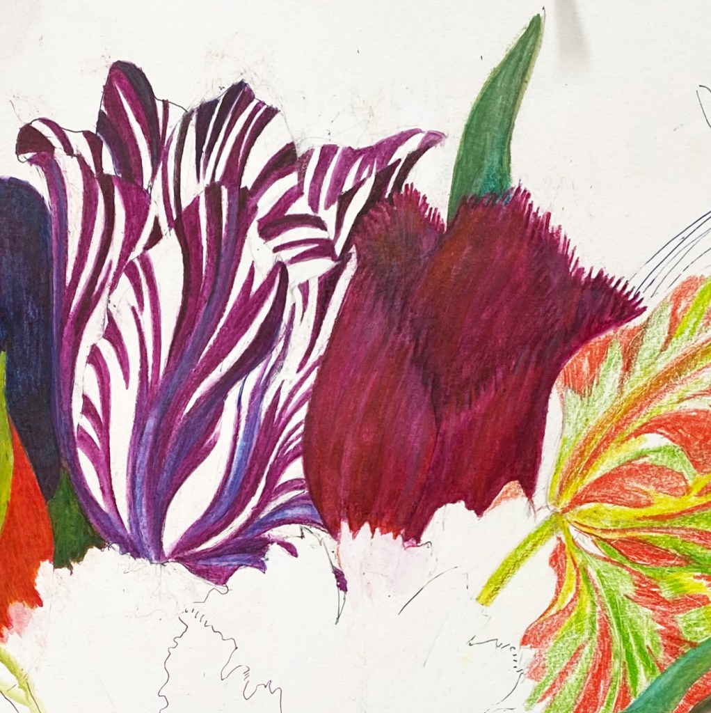
Now to flower arrangement – I am not good at arranging flowers and I really have to work hard at this aspect of my flower embroideries. I edited the tulips from the original early drawing as I did not have the time or space to stitch 10 flower heads in different colours and shapes. Below are 2 of many early drawings graphed for transference to the stitched ground.
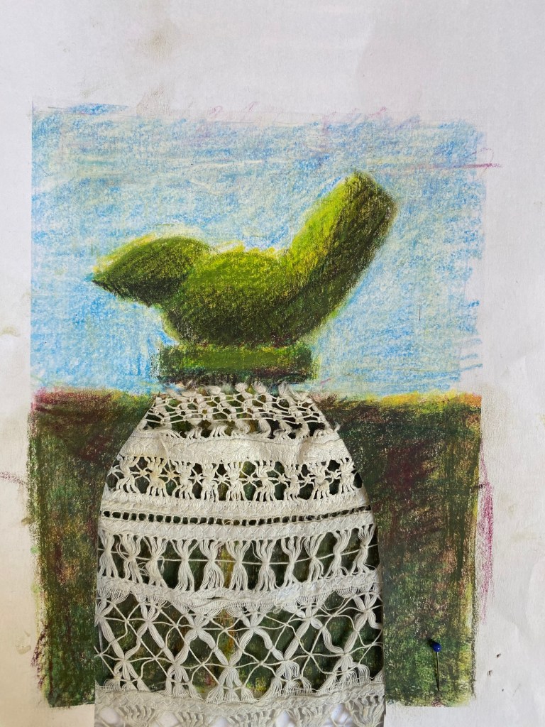
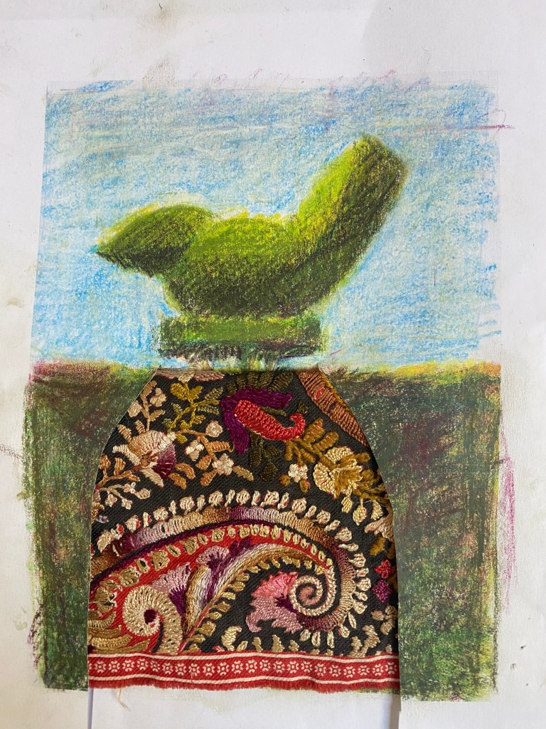
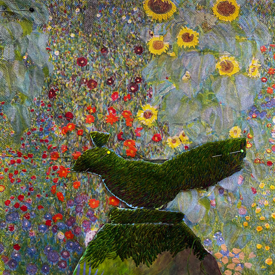
And to colour, the tulips need to work with the sky, and the sky is all organised, tacked ready for quilting between stitching the tulips.
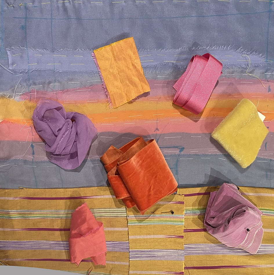
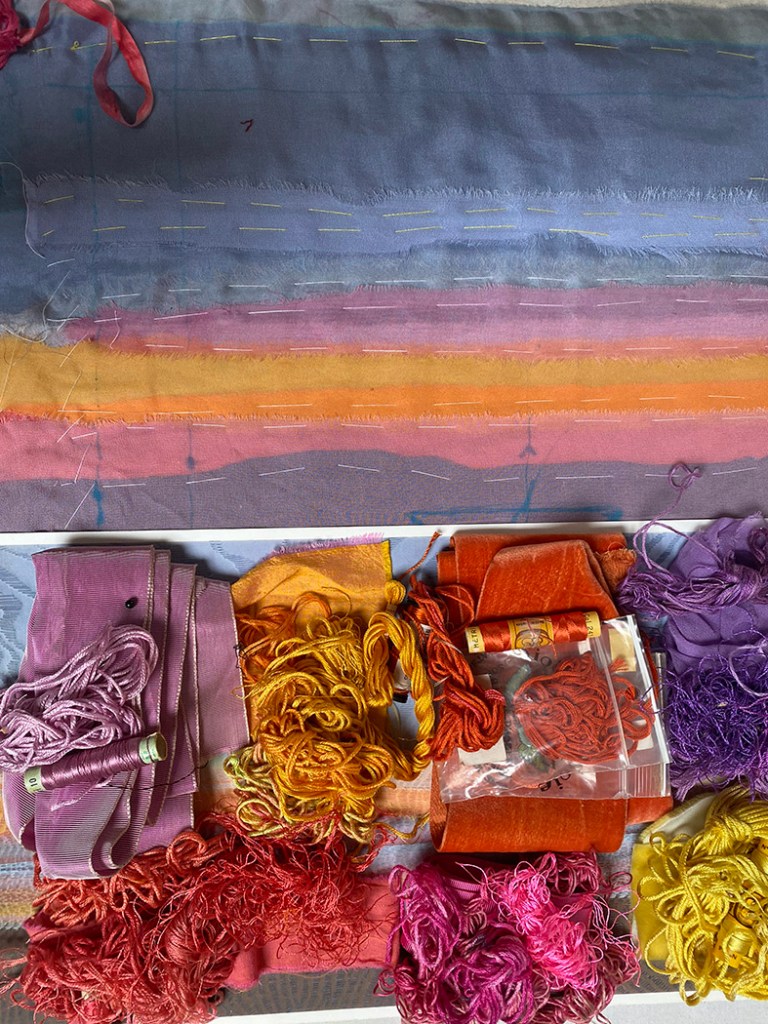
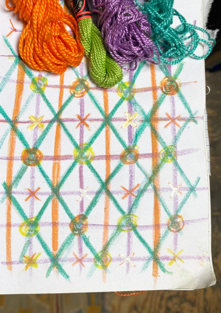
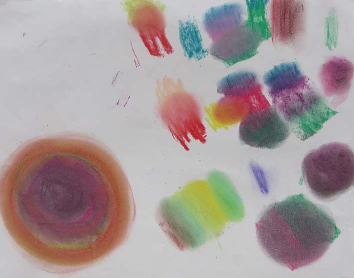
To enable me to gauge the placement of colours against the already glowing sky, I wrapped some silk ribbons to act as flower heads, found the silk threads to match them and took colour notifications – if only things work out so simply in reality – but I was starting this bouquet from scratch.
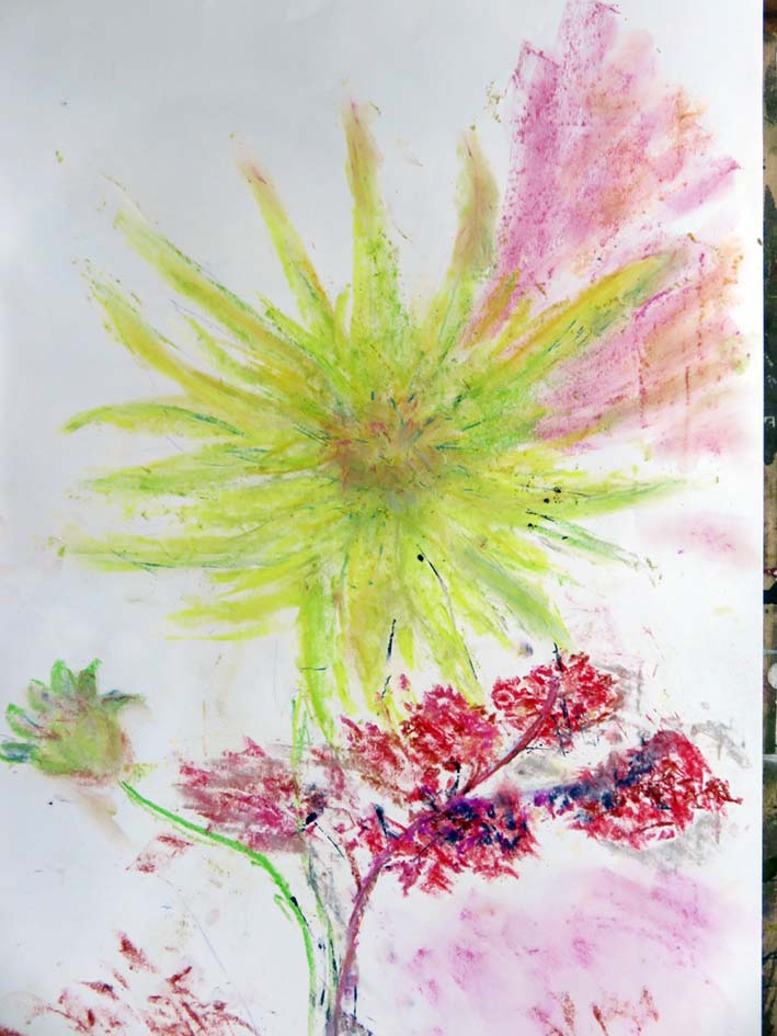
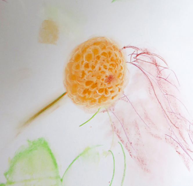
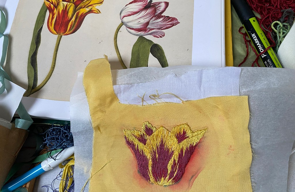
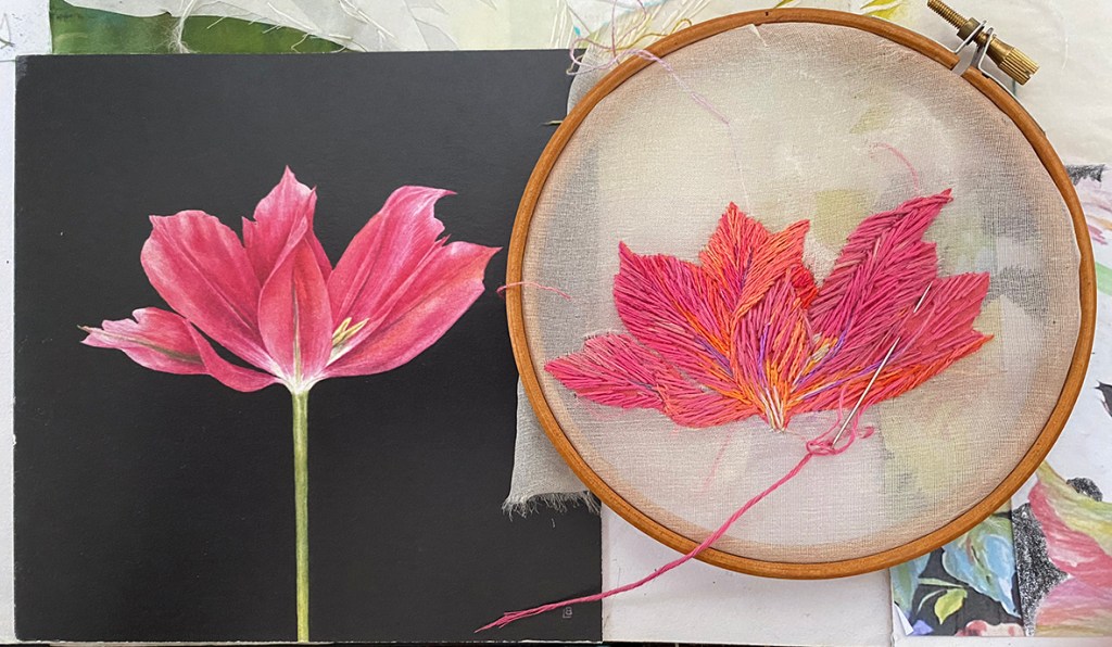
Drawing, redrawing, sampling and stitching one by one each tulip head is made,
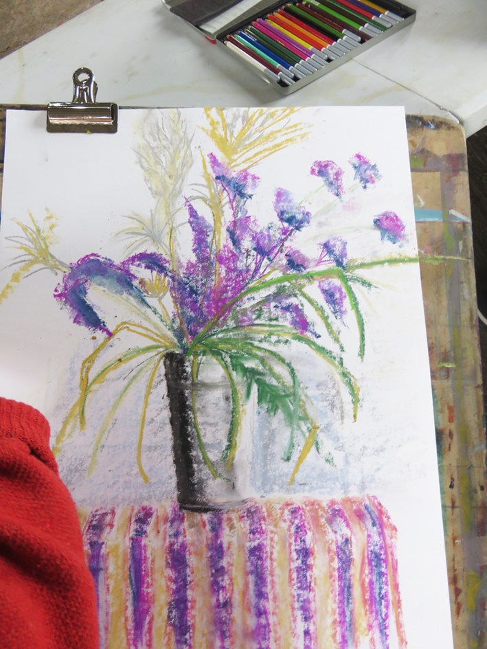
Below show older drawings in my current sketch book; plus my friend Lizzie Butler’s birthday card to me – I just copied it straight onto silk organza – with her permission of course!
When enough heads are made I start to arrange them on the background….and then the leaves. I just love to draw tulip leaves and their colours are so soft and gentle. I start with cut linen shapes from my original drawing in order to stitch over them to give definition; getting there.
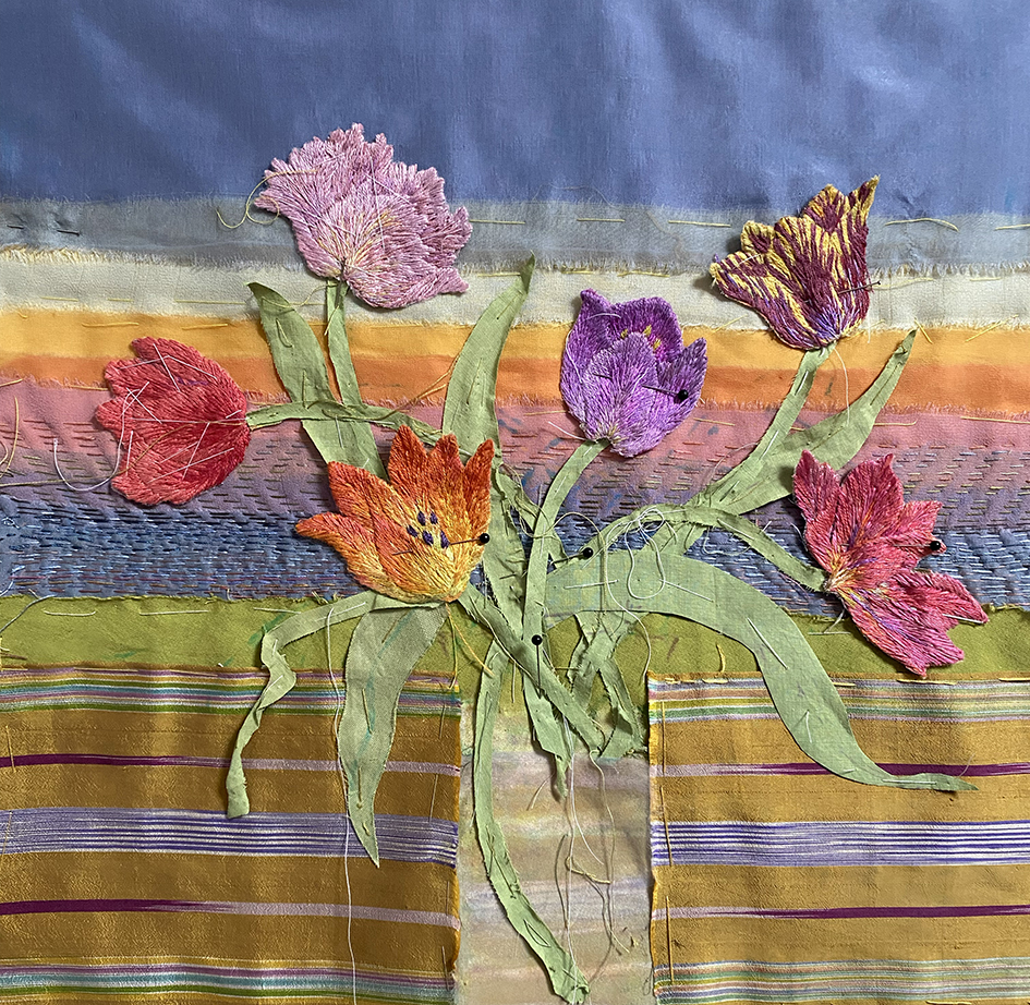
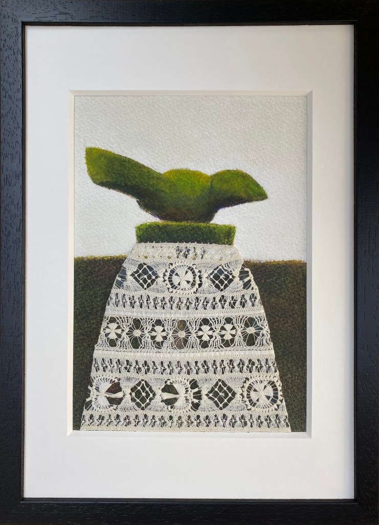
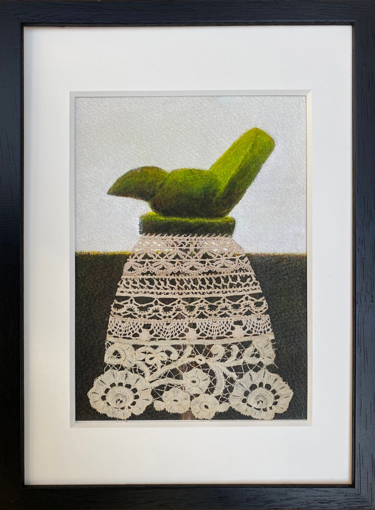
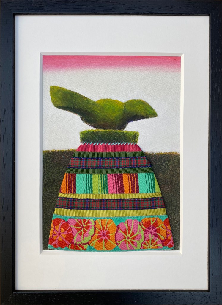
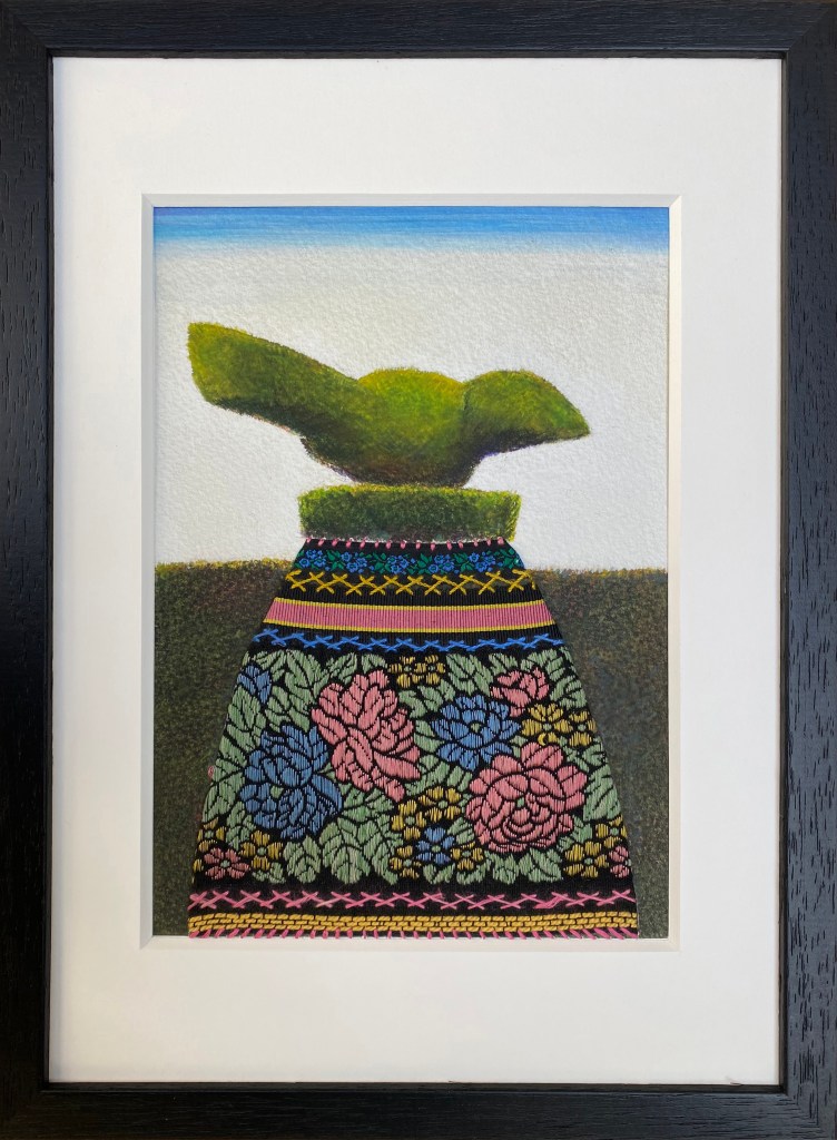
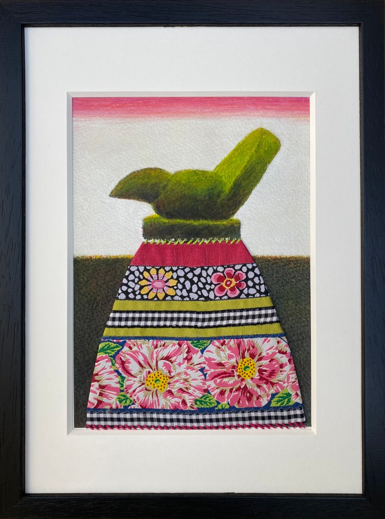
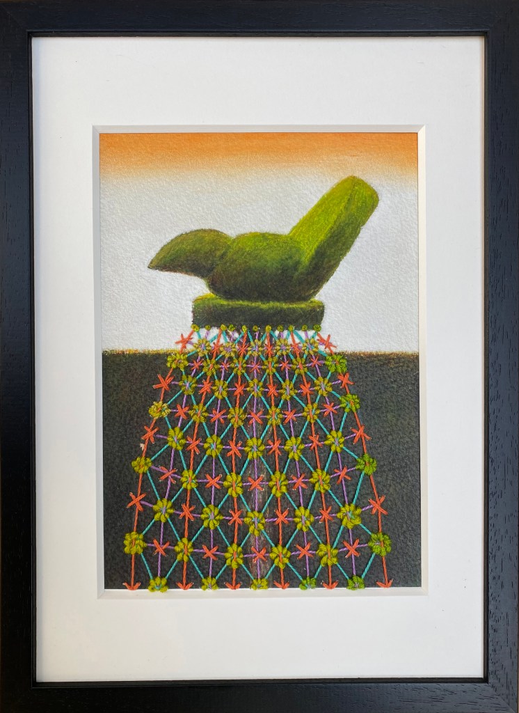
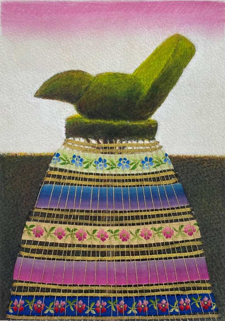
And last the vase – which is another story – believe me!
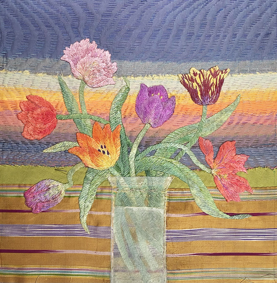
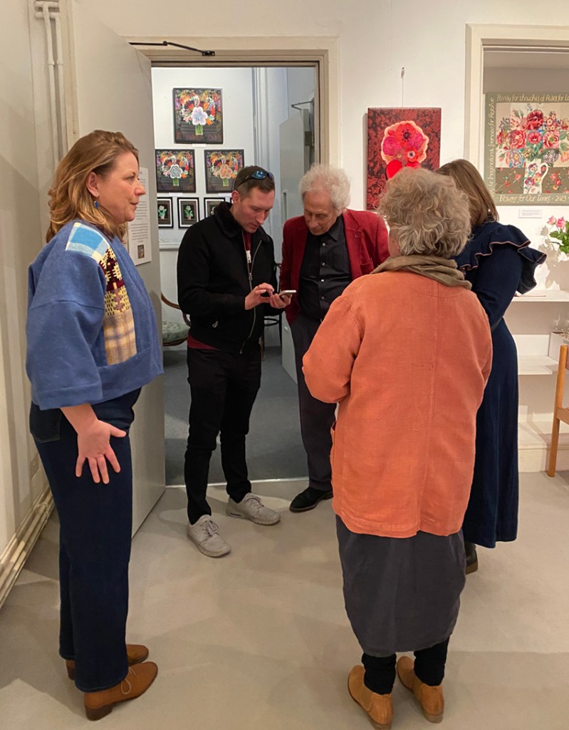
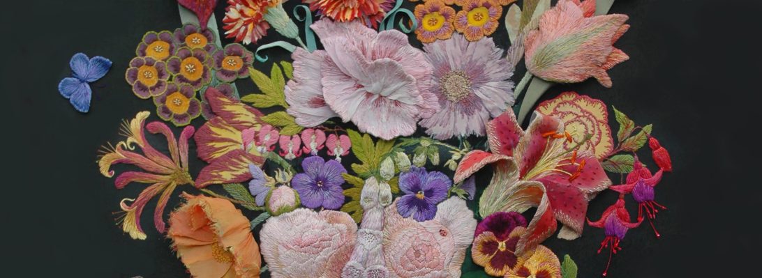
I truly enjoyed this work, creating spring flowers in the depth of winter, but it was a challenge as you can see. It is now safely framed and given straight into the hands of the son of the person who commissioned me; he had seen my work at the exhibition and talked about it…..and he has promised to send me a photo of the framed work in situ in the new house.