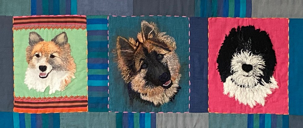
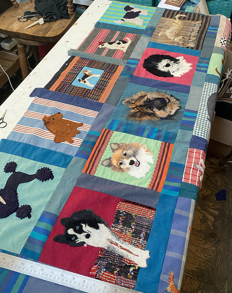
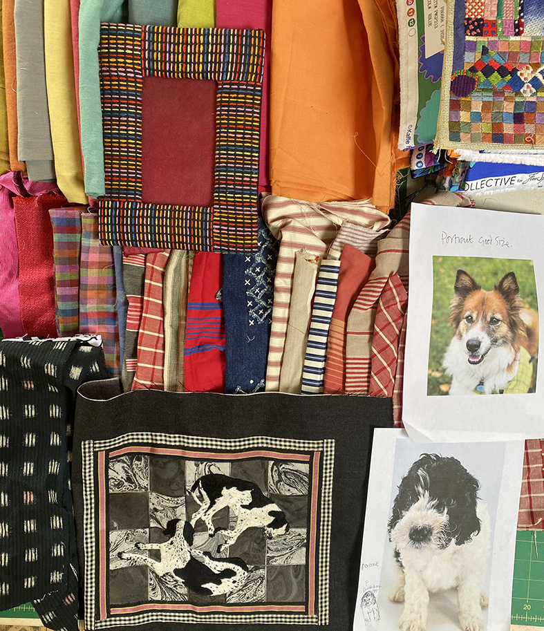
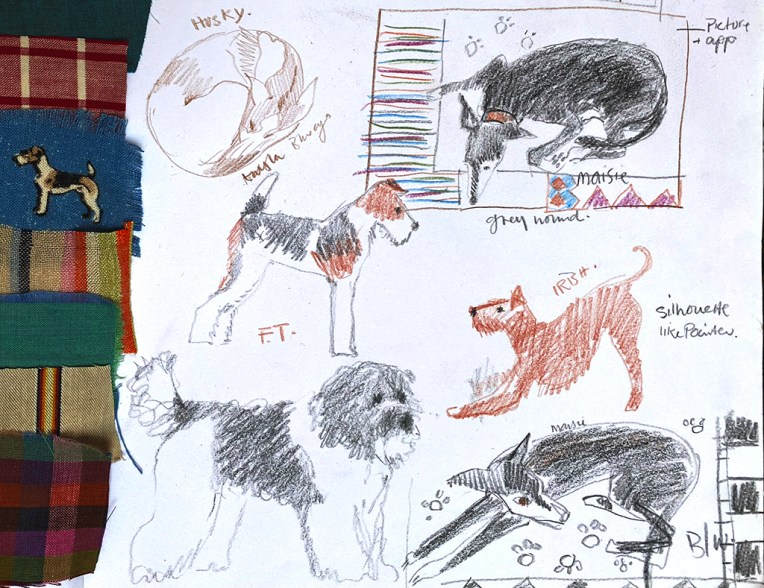
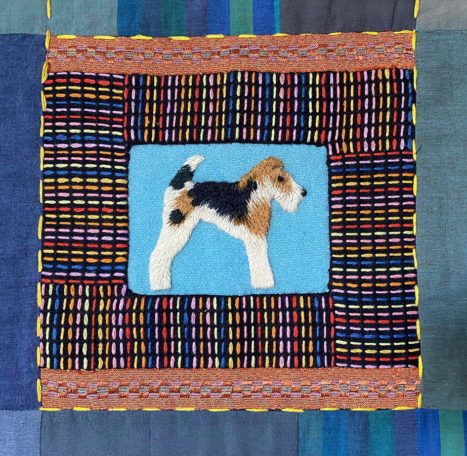
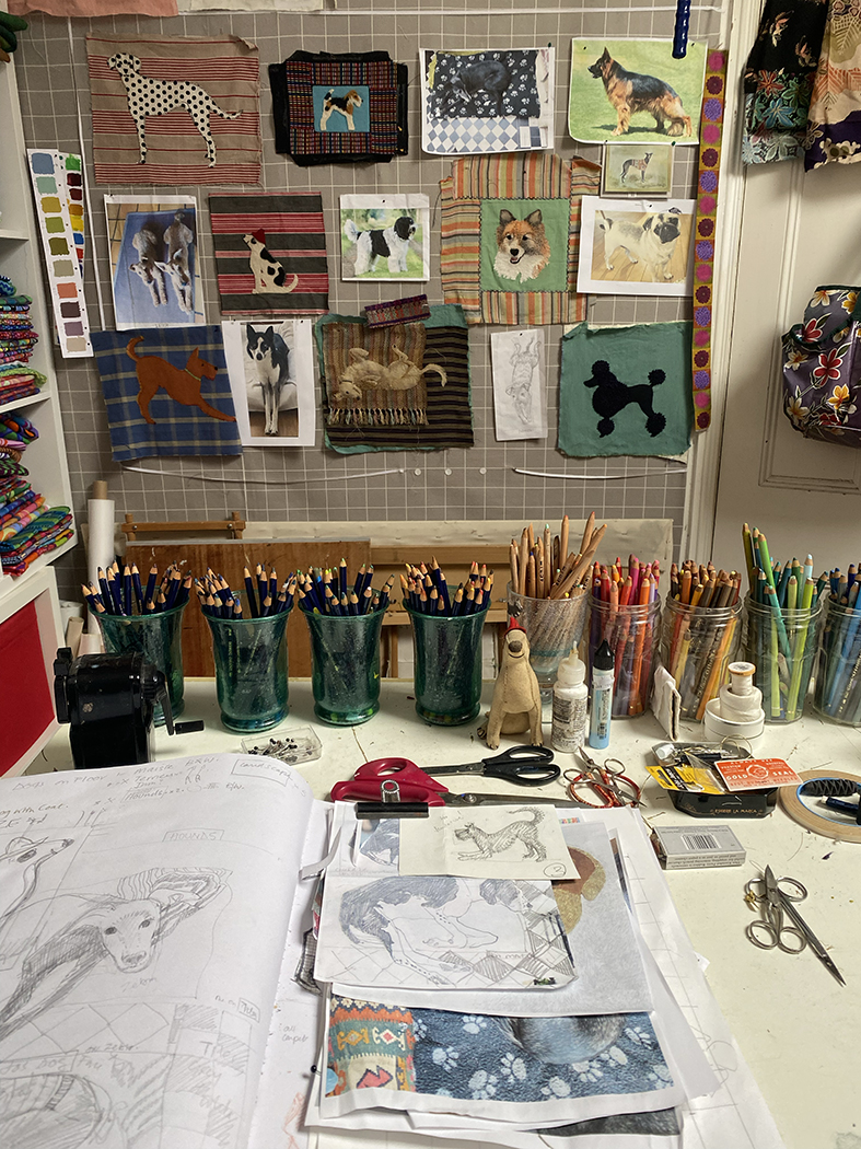
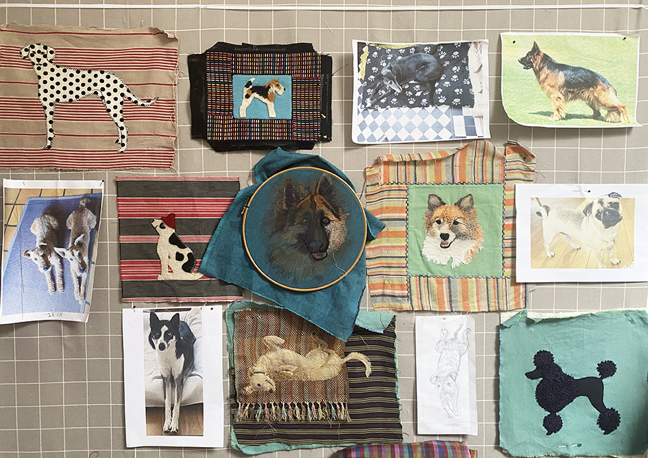
This is the next instalment of the dog quilt. I decided to stitch proper portraits, close up and personal of 3 dogs belonging to the designer who had originally commissioned the quilt. These dog embroideries were obviously really important to the success of the whole project, so I gave them the centre stage in the compositition. Luckily I was provided with several images of each chosen dog.
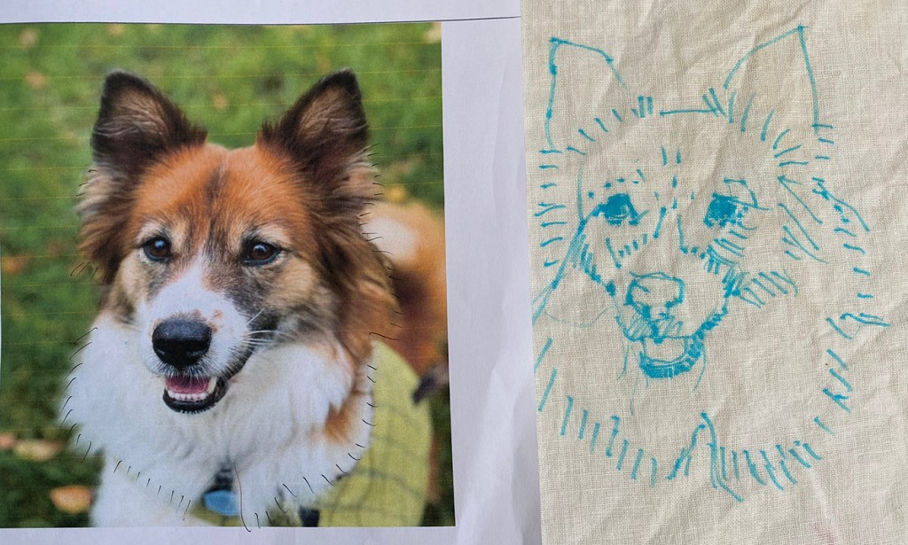
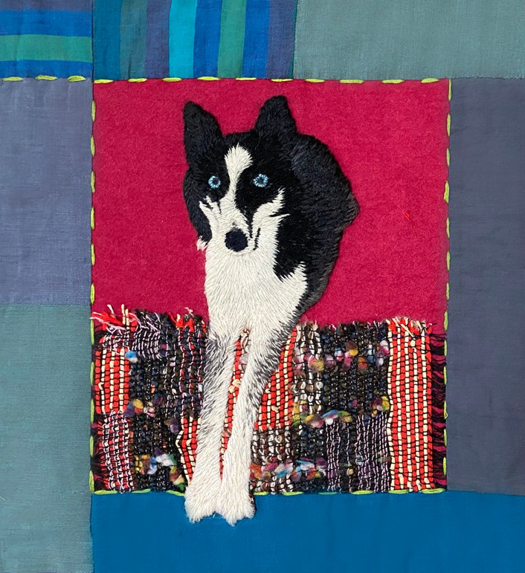
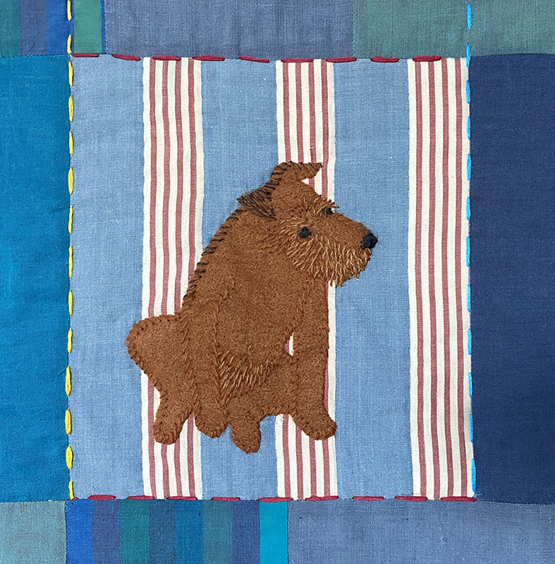
For the first one that I stitched (as the trial sample), the photograph was so clear that I could start to draw directly onto the linen fabric using water soluble pen (one that does not disappear after a few hours – these small fine embroideries can take days, even weeks to complete).

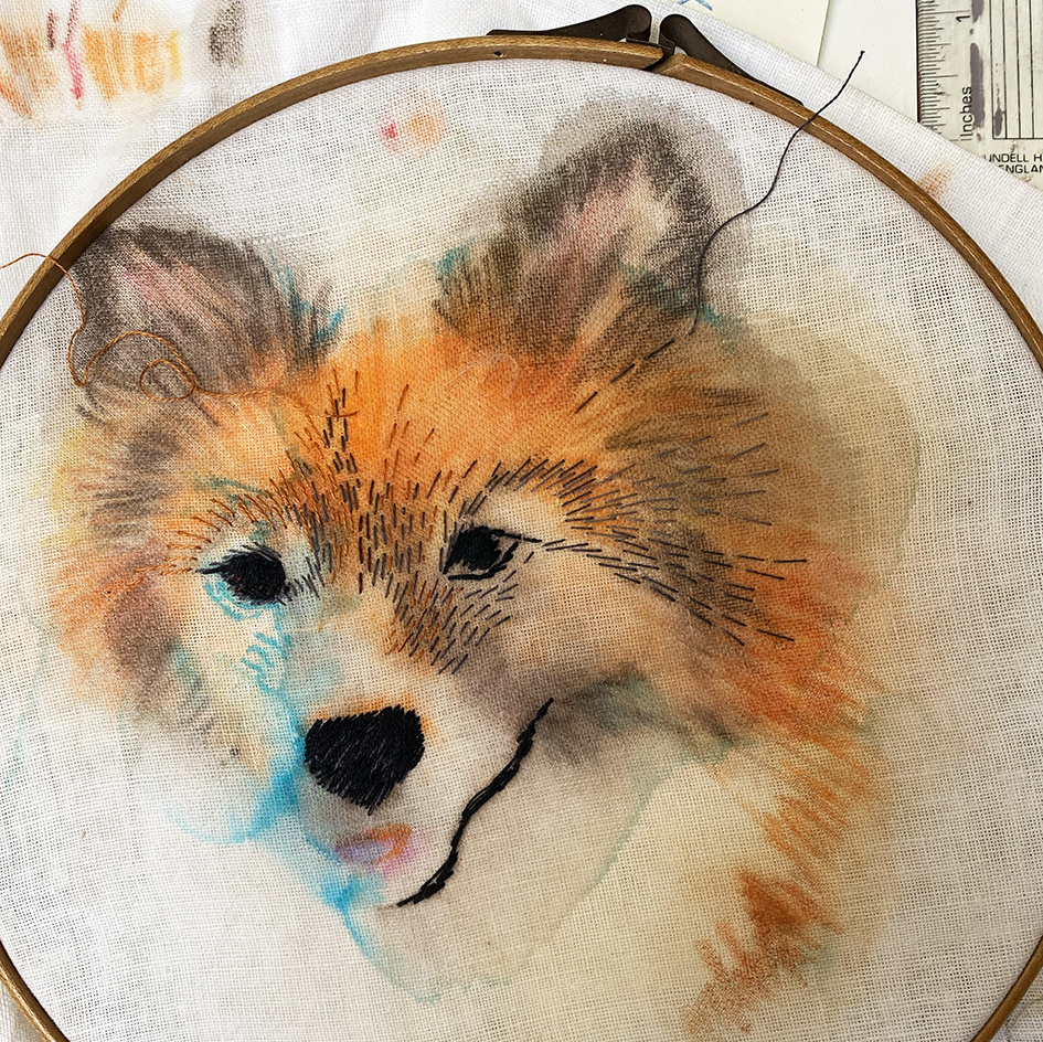
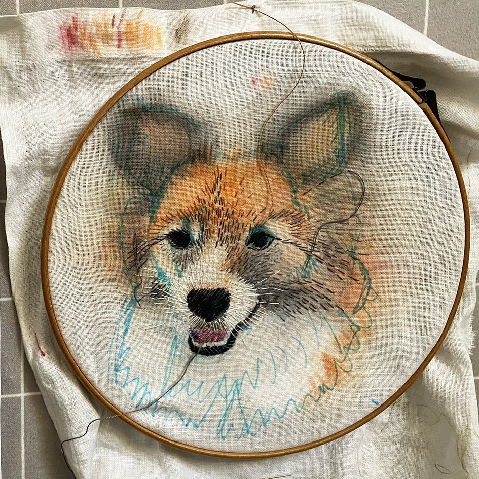
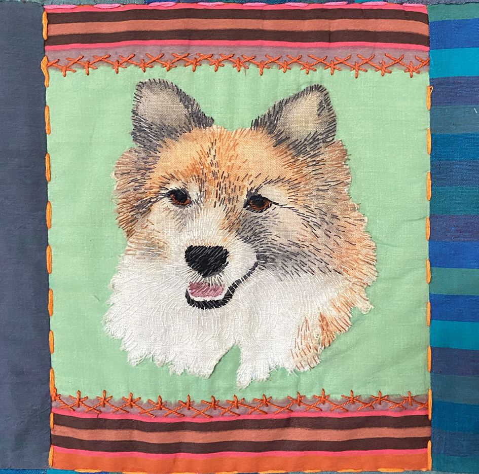
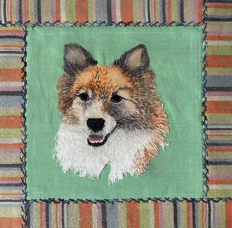
Using Derwent Inktense pencils I applied the basic colours of the coat, wet it to blend and intensify the colours then pressed it to fix the dyes. I continued to draw with the water soluble pen to give me the stitch directions for the coat.
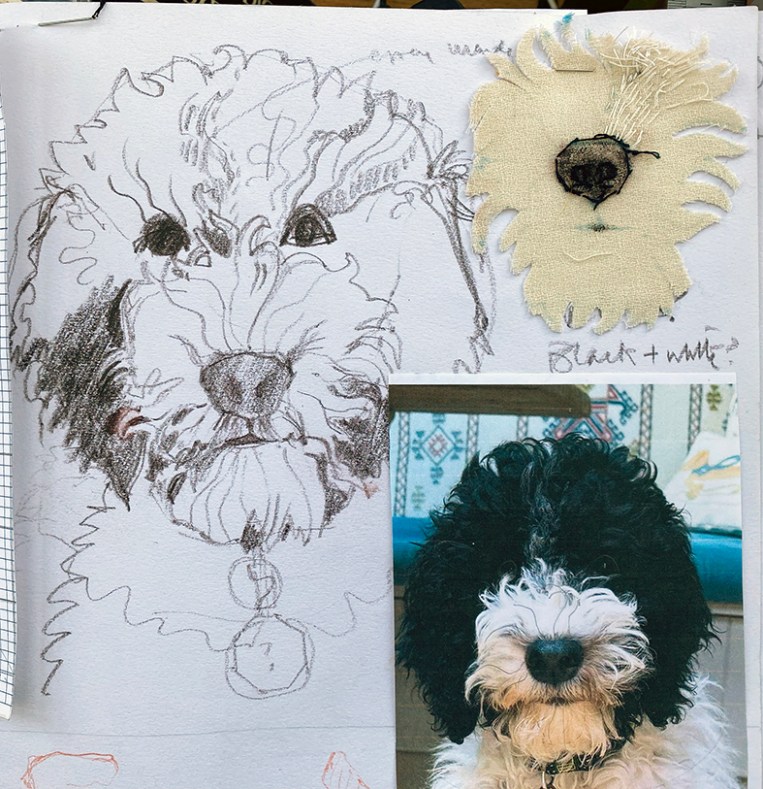
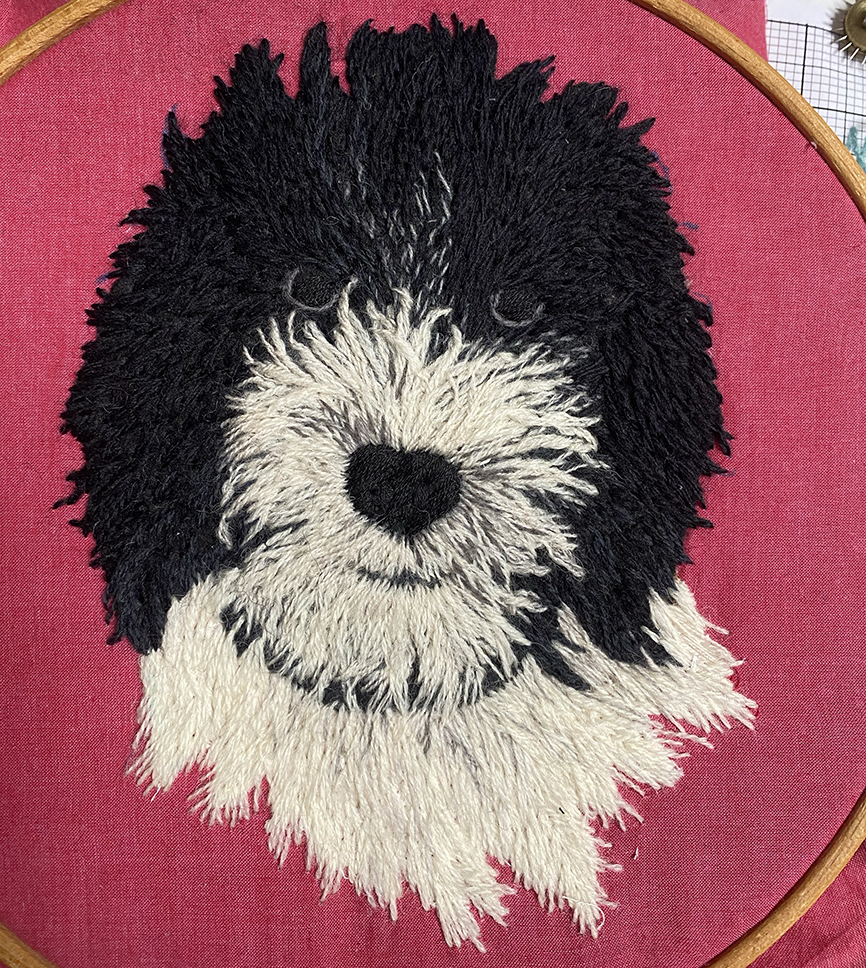
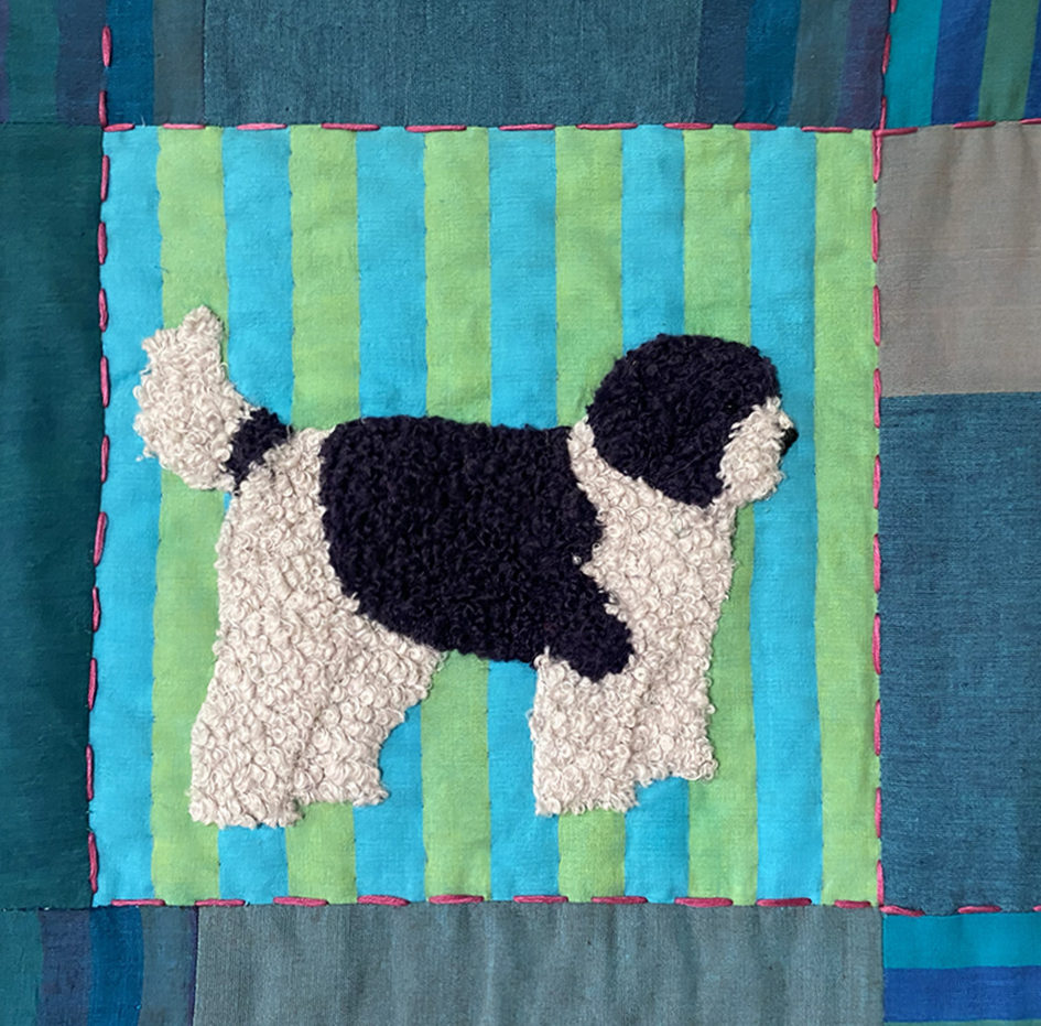
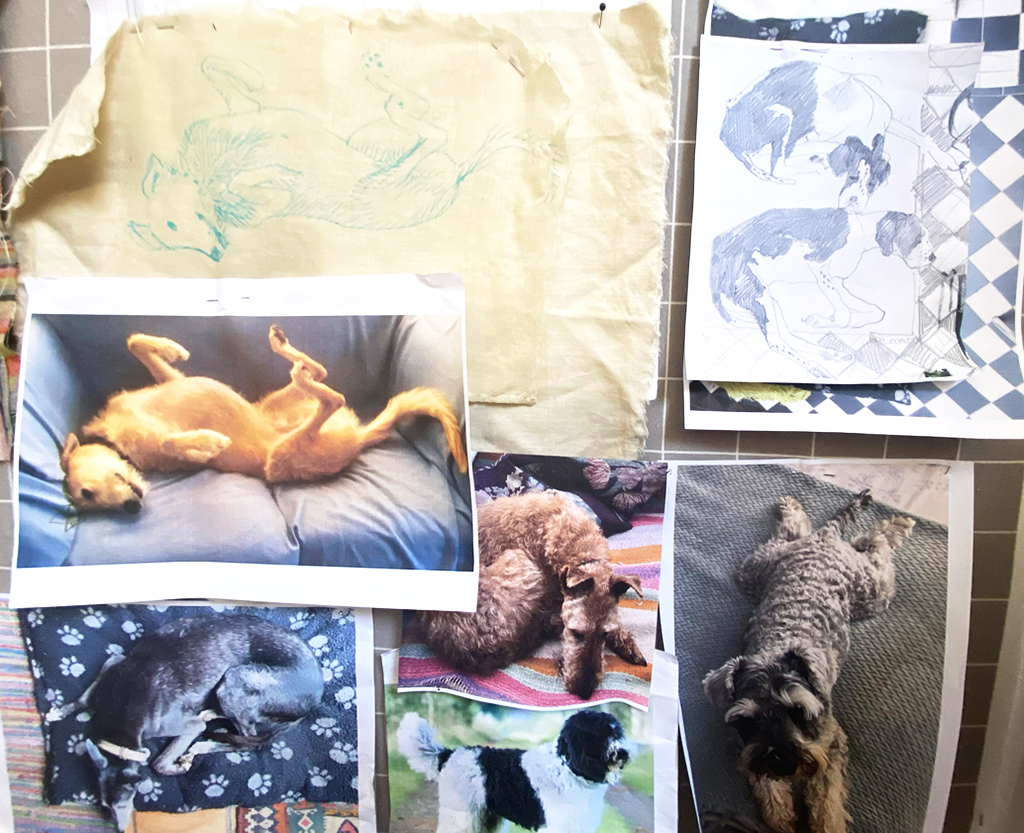
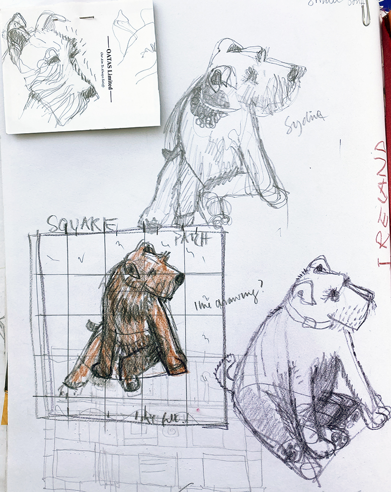
When I started the quilt I was sent images of a very young and nervous looking puppy, so decided to wait a while to see how it looked when it had gained its character. Above is my sketch book page with several drawings based on a number of images of a wiser but amusing dog…I used woollen felt and threads to stitch the rich curly coat.


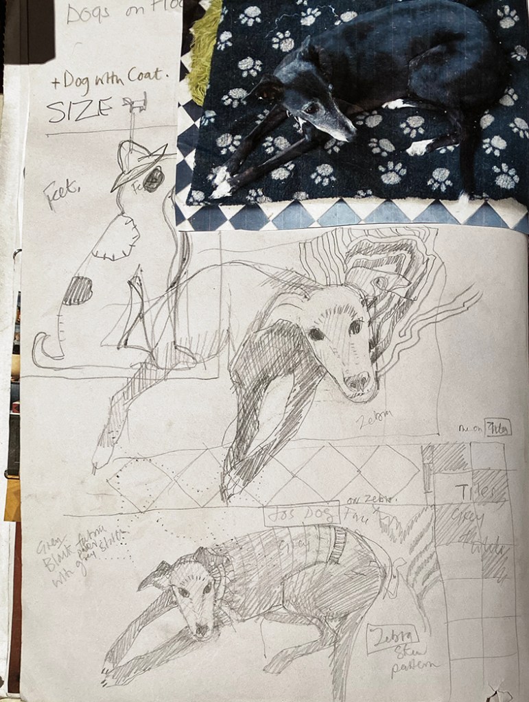
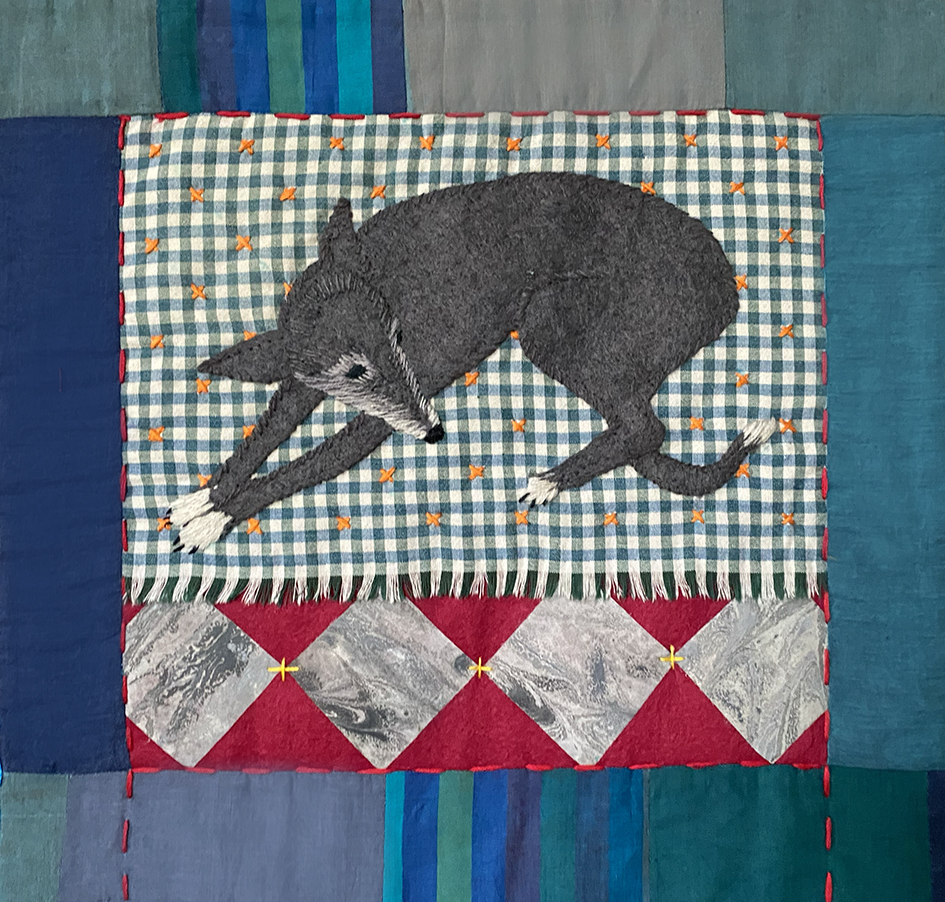
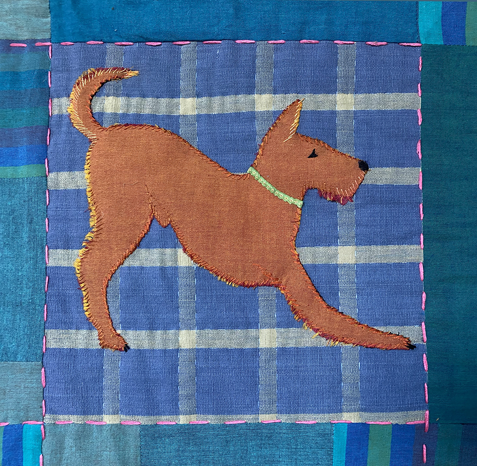
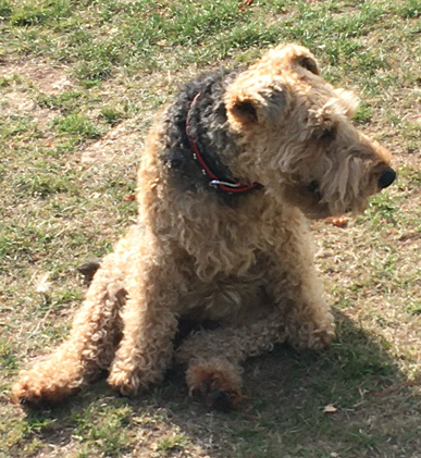
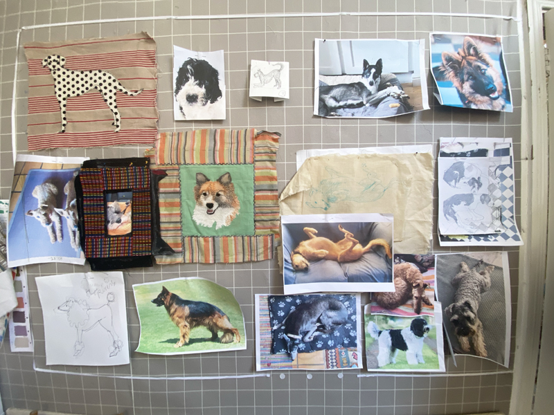
Meanwhile I was working on the remaining dogs that now had to fit into the whole quilt design. One of the first dogs I had chosen to use was Maisie, I had taken many pictures of her over several years as she was one of the elegant greyhounds/lurchers that are regularly rescued by my family. These long legged hounds are the most wonderful dogs to draw, it was hard to choose which position to use.
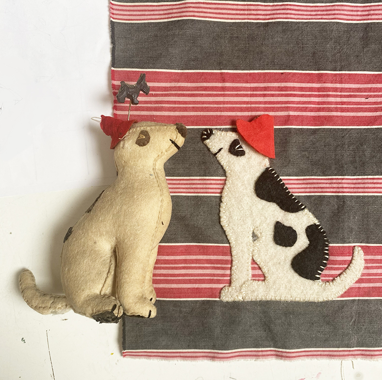
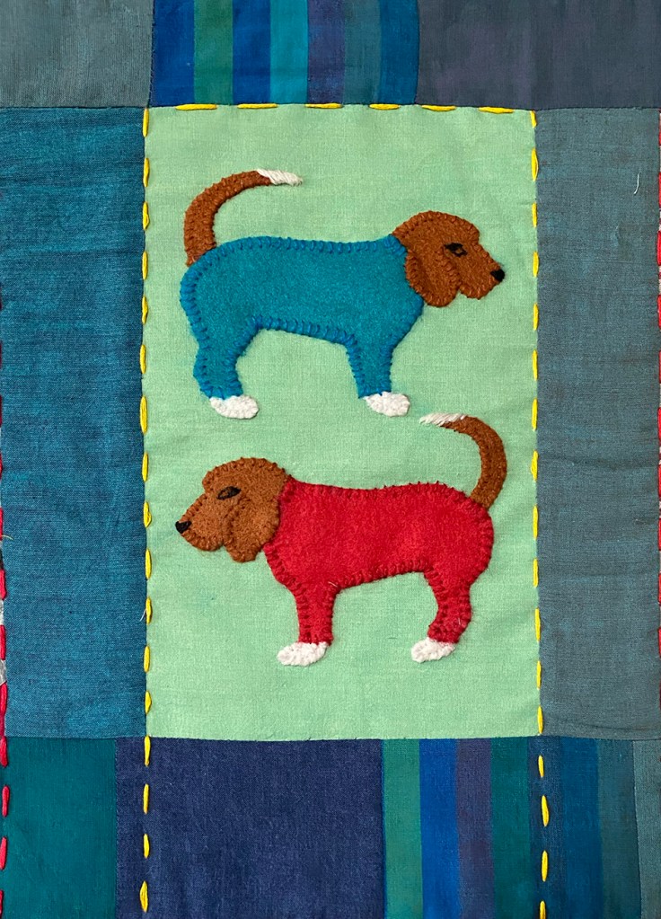
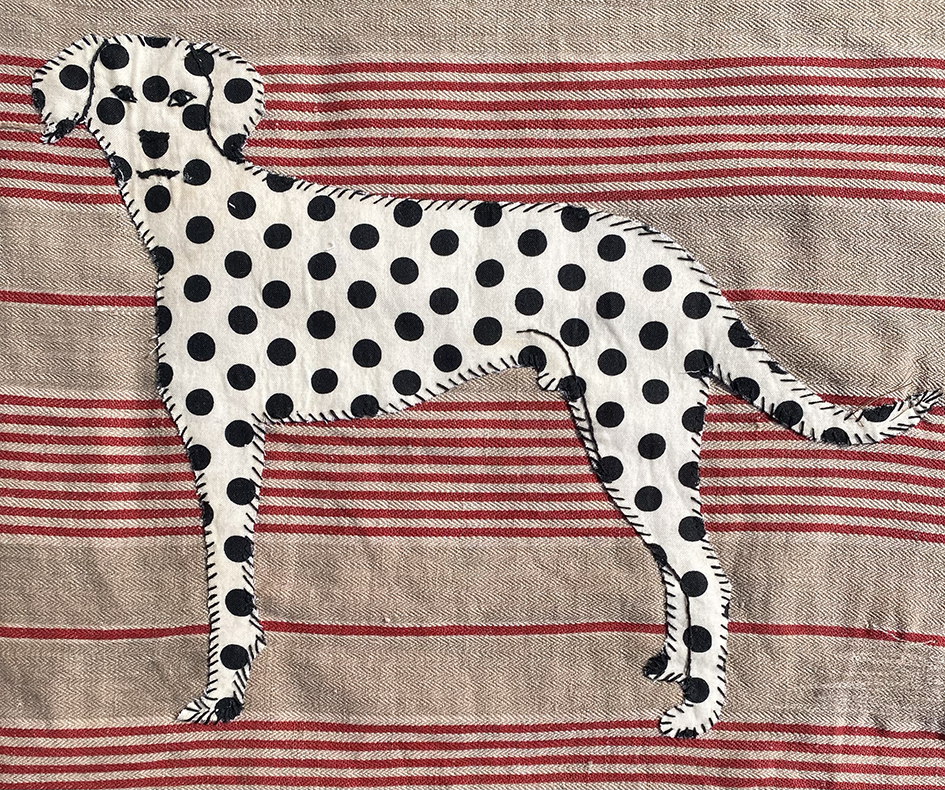
And there were a few others to make a late appearance; deciding I wanted some extra humour I chose to embroider my toy felt dog that had its back leg chewed off by my first dog, the Fox Terrier Archie. I also included one of my pet hates for dogs, those all-in-one coats with 4 leggings…..so shaming. I chose Kevin, a friends’ Beagle – sorry Kevin but you do have a good range of expressions.
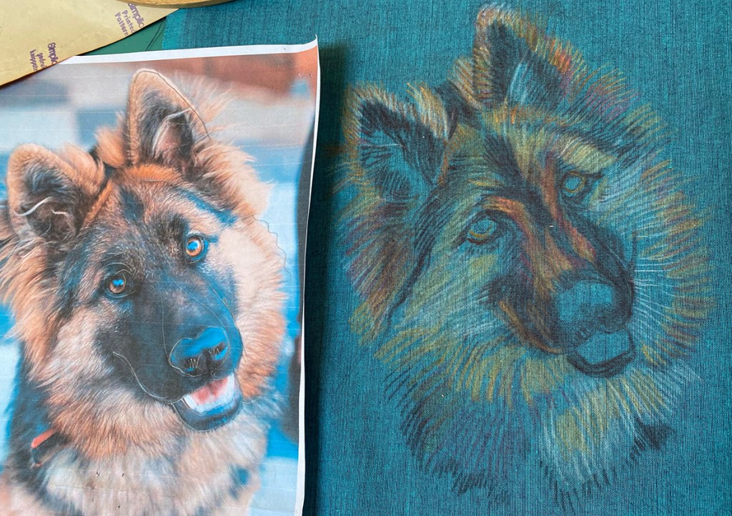
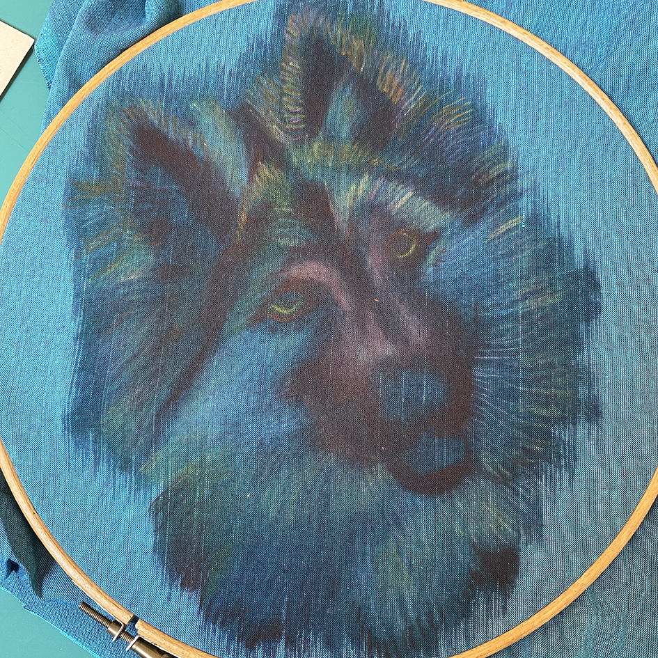
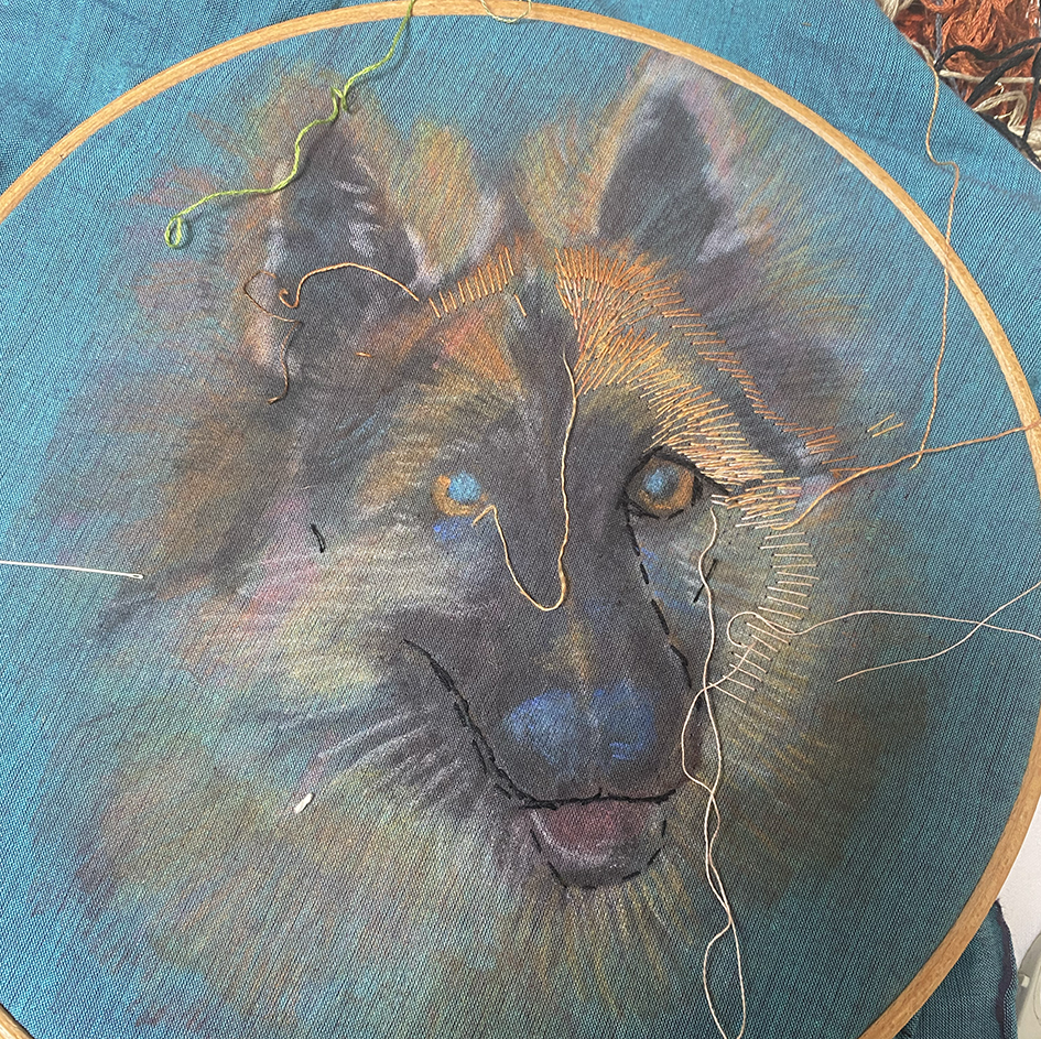
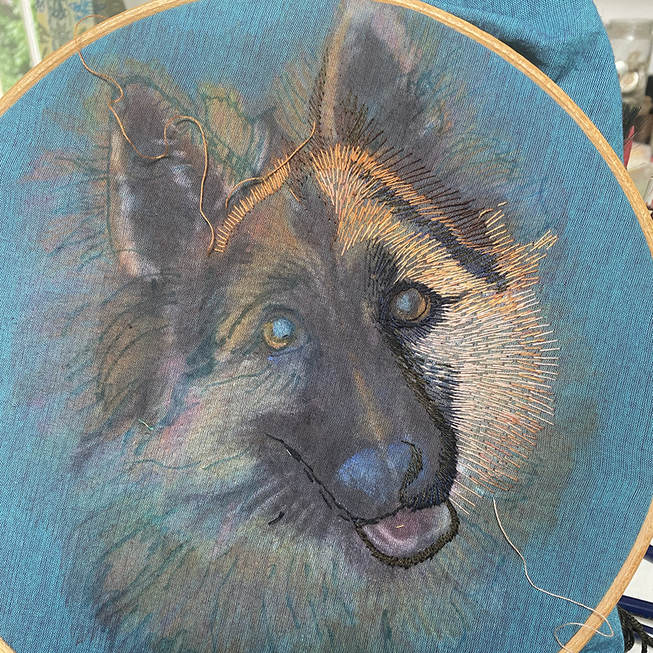
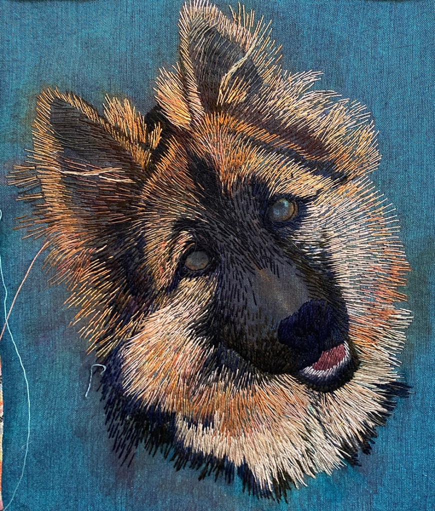
And the last portrait is the German Shepard – I was sent an image of an utterly beautiful dog with a yearning expression – probably wanting a biscuit! I decided to make this the centre piece as it was such a dramatic full-on face. I again worked directly from the photograph( which is rare for me) onto a very rich blue shot-cotton, using my favourite Inktense pigment crayons to draw and dye the cloth prior to stitching.
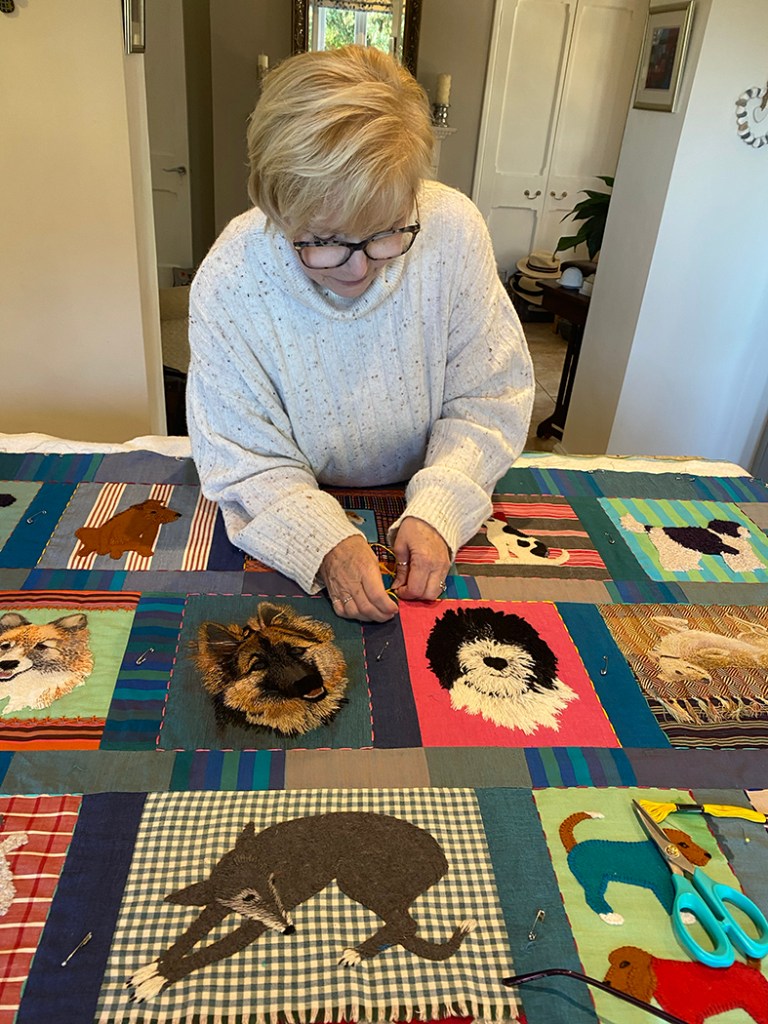
So slowly, and then very quickly with a deadline looming, the quilt finally started to come together and shown below on my studio table is the final arrangement complete with machine stitched sashing. Eventually I took it to expert quilter, Julie Harvey, who measured, layered and trimmed it, and together we both hand quilted it.
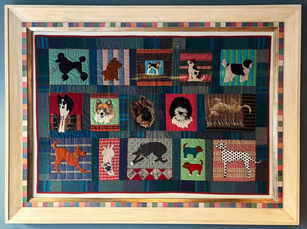
Eventually I posted it to be framed, in some style, by Marcus Wells who had commissioned me to make the work: and here is the finished piece.
And the best outcome of all – I have received commissions for 3 more single dog portraits; what a joyful set of work to start the new year.


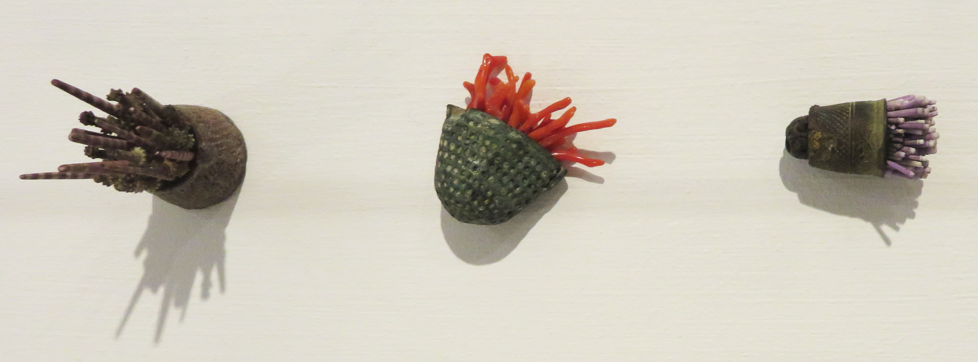


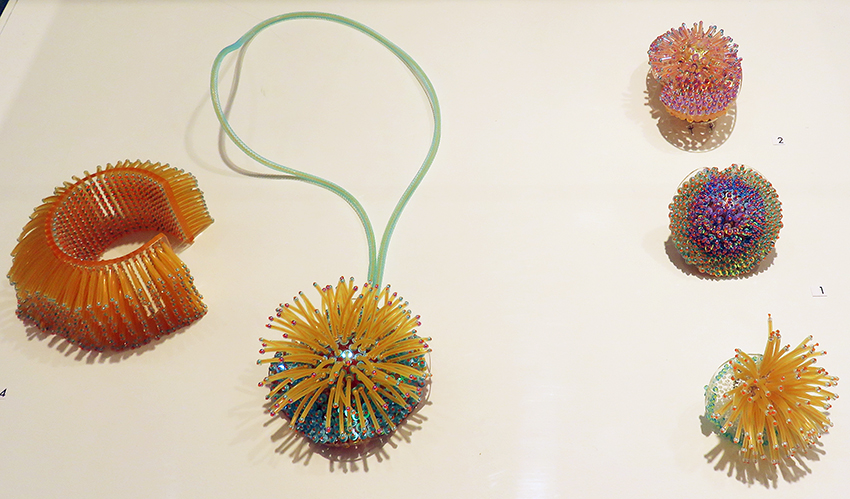 Sea creatures emerged as inspiration in the beaded work of