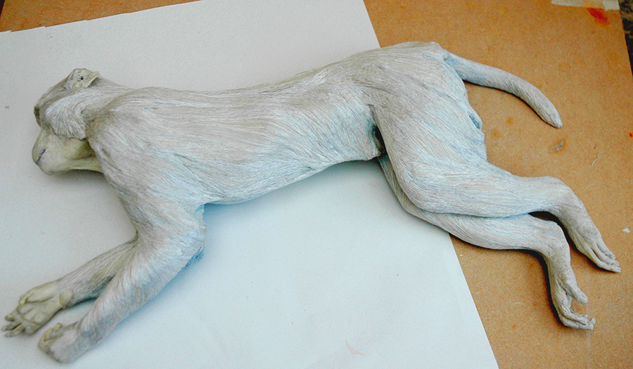
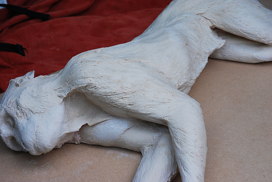
I was invited to the Hugh Lane Gallery in Dublin recently, to discuss the making of the stitched silk covering for the sculpture “Primate”( above) by Daphne Wright. The gallery had recently acquired the sculpture for its permanent collection, and Jessica O’Donnell, the head of the Education and Outreach department, had asked Daphne, who had commissioned me to make this in 2009, if I would be willing to talk to the conservation department to give them any insights into the process. I was so delighted to be asked for this because, I not only could explain the ways of making it, I had kept all the materials and stitching samples, and there is a blog that explains the whole 3 month long process.
We all first viewed Primate in the gallery where he was lying alone in the middle of a large darkened room within a spotlight. Daphne spoke about the difficulties of obtaining the cast and I later talked with her about various ideas and conversations we had about aspects of our collaboration – it had been intense. However, I have seen this work in various circumstances from busy National Trust properties, in commercial art galleries, and our own studios and now here in pure isolation…un-nerving.
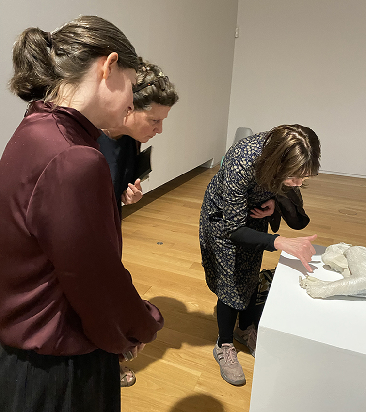
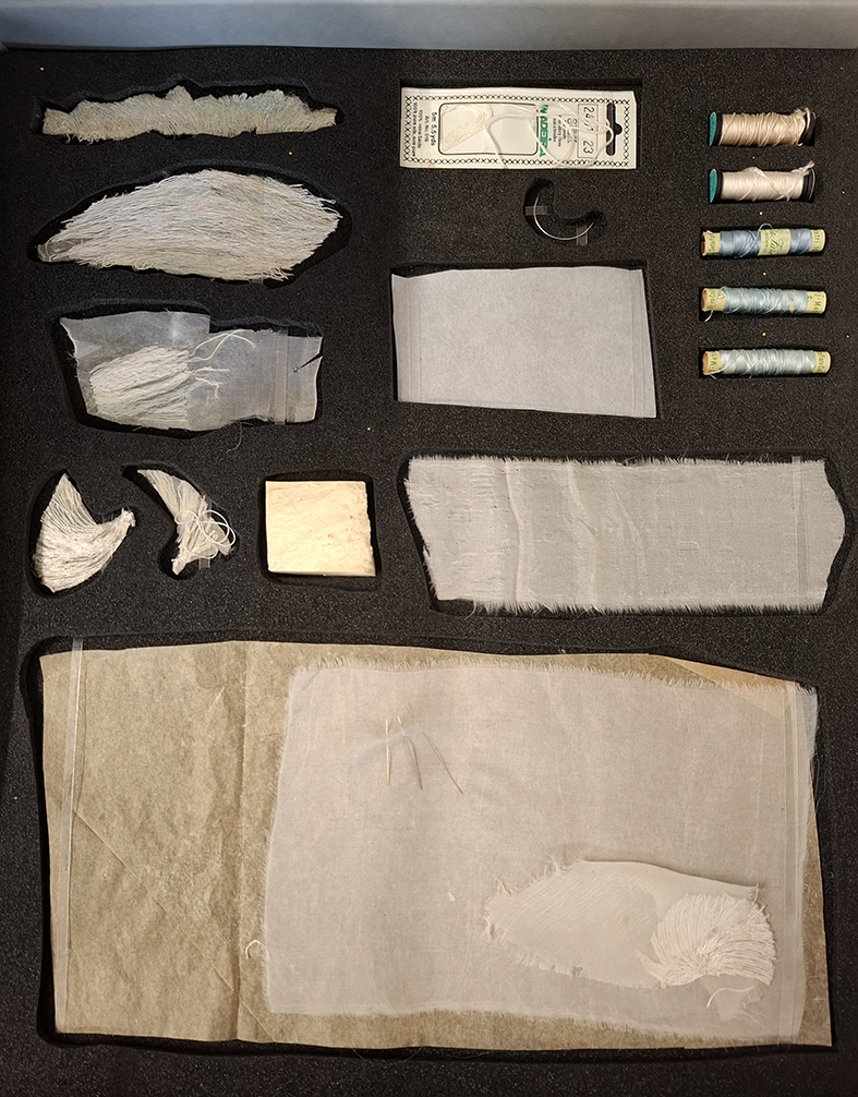
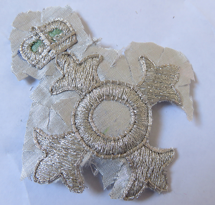
Next we went behind the scenes of the museum and I showed the small set of samples (below left) that I had kept: silk organza and different backing materials, paper backed adhesives, silk threads, needles, and the cut out and discarded stitched pieces, even a sample block of the marble resin; all kept in my research stash to explain my journey. Below right shows the way the gallery has now laid them out for viewing in the education department – so perfectly neat and simple.
Below the basic and flawed resin and marble-dust cast of the Rhesus monkey, and the stitch development at about the 3/4 way stage, on my studio table.
And here is the gallery where the Primate was introduced to the public as a new acquisition to the Museum’s collection. When I saw this space for the first time it felt like entering a tomb, or at least a place of veneration and it still makes me feel bereft every time I look at this image.
This commission has had a considerable effect upon my stitched works, even up the present day. For further insights and my stitching this work please go to my post in COMMISSIONS: Primate.
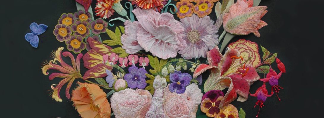
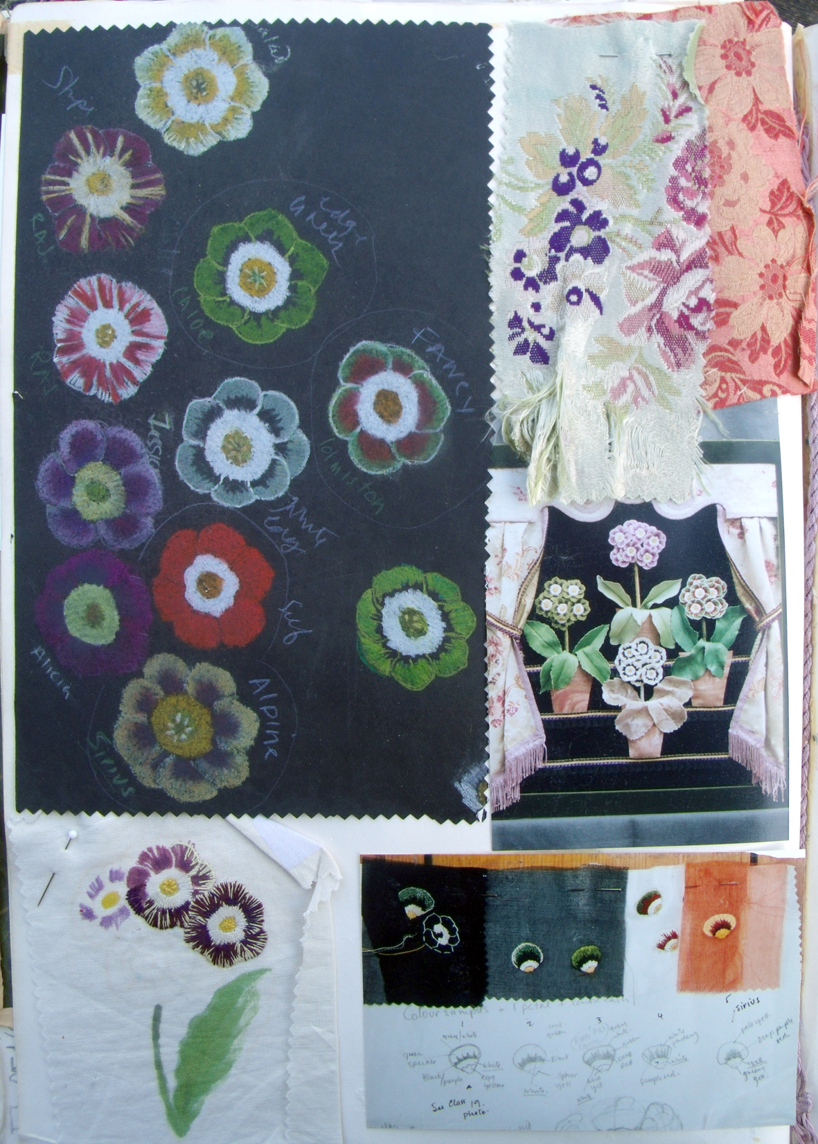
first page of my reborn Flora research/sketchbook – Flowers Again!
Recently, the “After Winifred” embroidery has inspired me to develop work to use as Giclee prints in order to add a fresh way of getting my work ‘out there’. I turned to my old Flora workbook, some 20+years old – but still alive for me as a source of inspiration.
last last pages of drawings circa 2000 in Flora workbook .
drawings and stitching samples for Auricular Theatre 1998
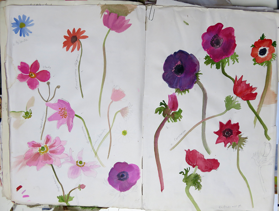
painted studies of garden Iris circa 2000
most used pages -Anemonies painted from life and photos.
I found some empty pages at the end of the old book and started to collate recent samples and drawings of bunches of flowers grown and made up at Court House Farm, where I conduct drawing workshops, using the cutting garden as inspiration.
second page of the book – old samples and magazine cuttings for colour a small bunch of dahliasobvious inspiration from Winifred Nicholson flower paintingmy initial research fixed now into book showing early samples of new-to-me Inktense pencils – as dyed ground for stitching
looking back at my Flora work, which is 3 dimensional and very heavily embroidery, I now want a freer drawn imagery to stitch into. So I bought some Derwent Inktense pencils that basically act as dyes when wetted and left to dry – I did many samples but found my drawings had too much information in them – I needed to loosen up further. Ha ha – the story of my working life!
first inkjet pencil drawing second freer drawing sample hand stitchingdesign page using a very old photograph of my own collection of hellebores against a silk ribbon applique.
To enable me to play easily with the new ink crayons I chose an old set of drawing research and photographs to work with. The colours of the crayons are very brilliant and I needed to find ways of making more subtle colours, so stippling, cross hatching and dotting colours one over another made for rich but softer ground colours – these techniques are still a work in progress. Below are 2 studies of the under drawings using pencil dyes ready to be stitched
Meanwhile I have been looking at all my old flowery finished works and their drawings to use as reference and then reframing/remounting stitched pieces ready for the printers.
original drawing for this older Hellebore embroidery right early Hellebores silk embroidery
the little Hellebore image above is my first Giclee print and the smallest at 30cms/12inches square.
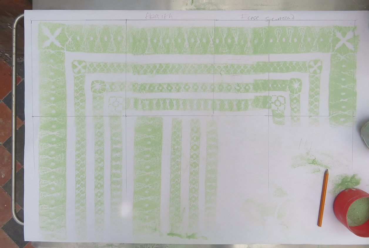
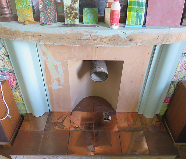
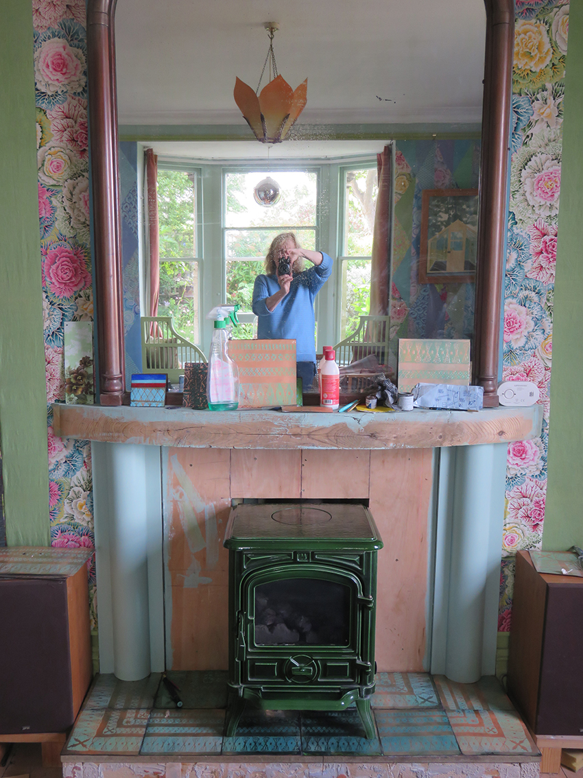
The patchwork walls are almost completed, just some finessing needed so time to think of the fire grate. We measure carefully and then cut 20 copper tiles ready to be decorated – using my favourite Drawn Threadwork stencils. I started to scribble lots of ‘back of the envelope’ ideas as to design layouts – but decided to just make the stencils and then see how they best worked together.
An assortment of design, scribbled ideas for the enamelled copper tiles ideas
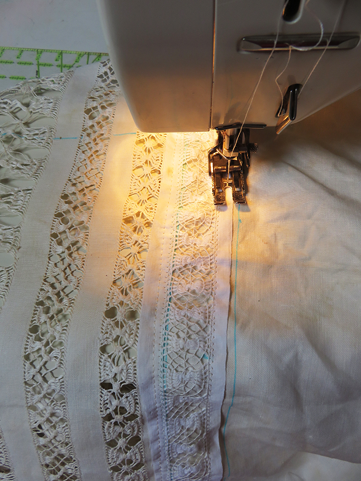
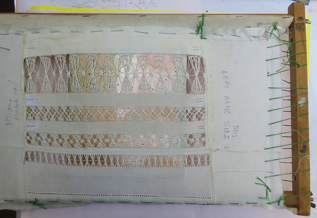
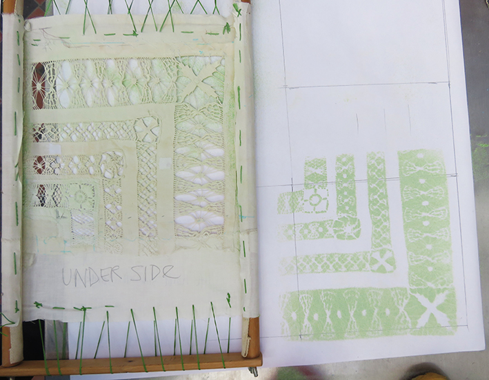
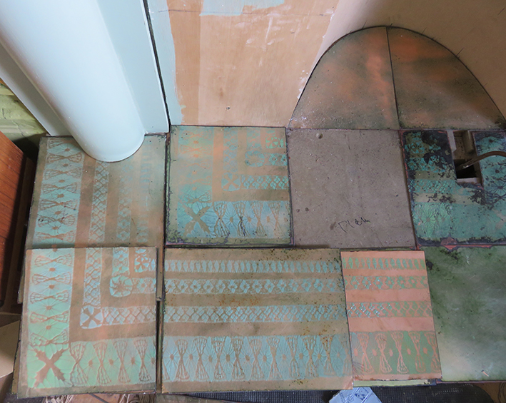
I found a small table cloth ( in my stash) with very large scaled drawn thread-work embroidery that would be suitable for this making many variations from just 2 basic designs. I needed 2 stencils one square for the corners of the grate and a striped version for the longer lengths. Initially I thought it needed to be made larger to fit the cut copper tiles so I had to extend the stencil. I appliqued extra pieces of embroidery, using a machine for strength (for when it is stretched on a frame) then cut away the linen beneath it.
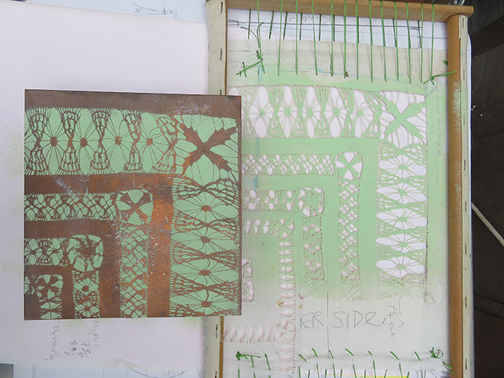
a corner of large scale vintage drawn-thread work table cloth with extra embroidery machine stitched in for a bigger stencilthe stretched stencils are tested using enamel powders sifted first onto paper using the corner design, the next image is the long length stencil between the corner stencils then straight onto a copper tile ready to be fired
meanwhile the rest of the copper tiles have been cut and checked for how they fit together – like everything else in this very old house nothing it straight or even.
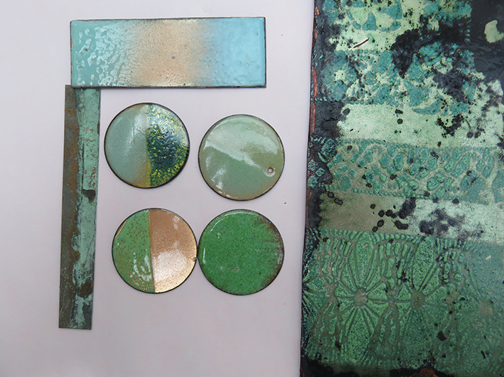
i had wanted to verdigris the tiles but decided to stick with what I knew, so I started sampling the enamelling colours. It is a few years sinceI have enamelled anything but remember the colours that will best look like verdigris – I match the pale greens and blues to a naturally verdigris copper strip I found in the studio
samples of copper enamel colours to make a similar effect to the real verdigris copper strip, the first set of hearth tiles placed in position for deciding the final design
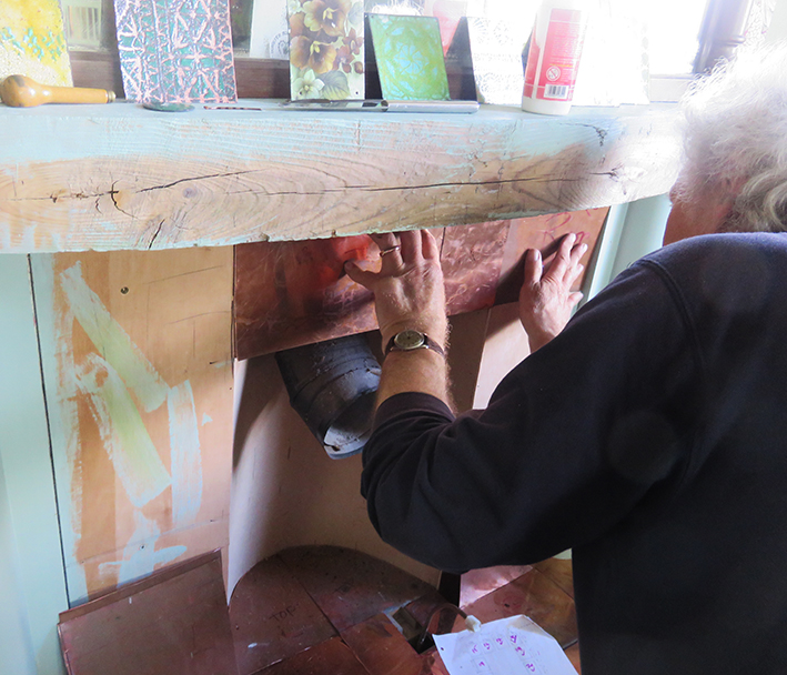
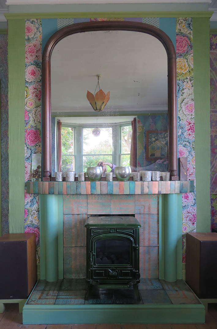
after the gas stove had been replaced in its original position, I continued to adhere the top set of tiles in their allotted places. They make a very uneven but harmonic set of colours…so then I needed to re-paint the surrounding columns and wooden skirting to blend in with the rest of the room.
finally I ran around the house searching for the pieces I could put on the new mantlepiece – my old mirrored glass candle holders fit in very well. The small separate enamelled strips of copper are leftovers from cutting the tiles, plus anything else I could find in the studio that could be fired with the remains of the vitreous enamel colours – real make do and mend patch-working.
My next post will show the whole room complete with art works, cushions and flowers!
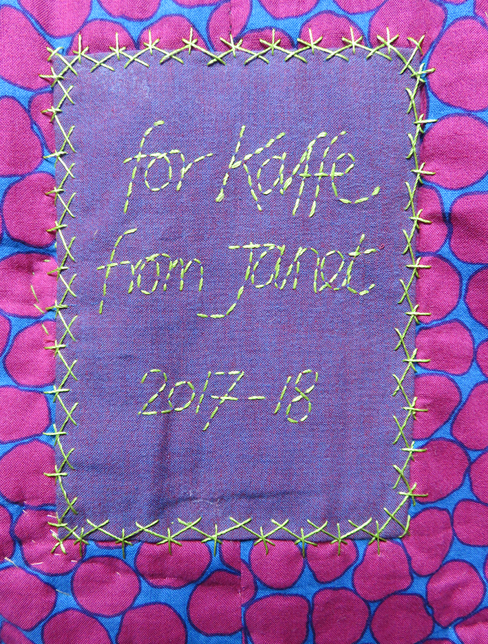
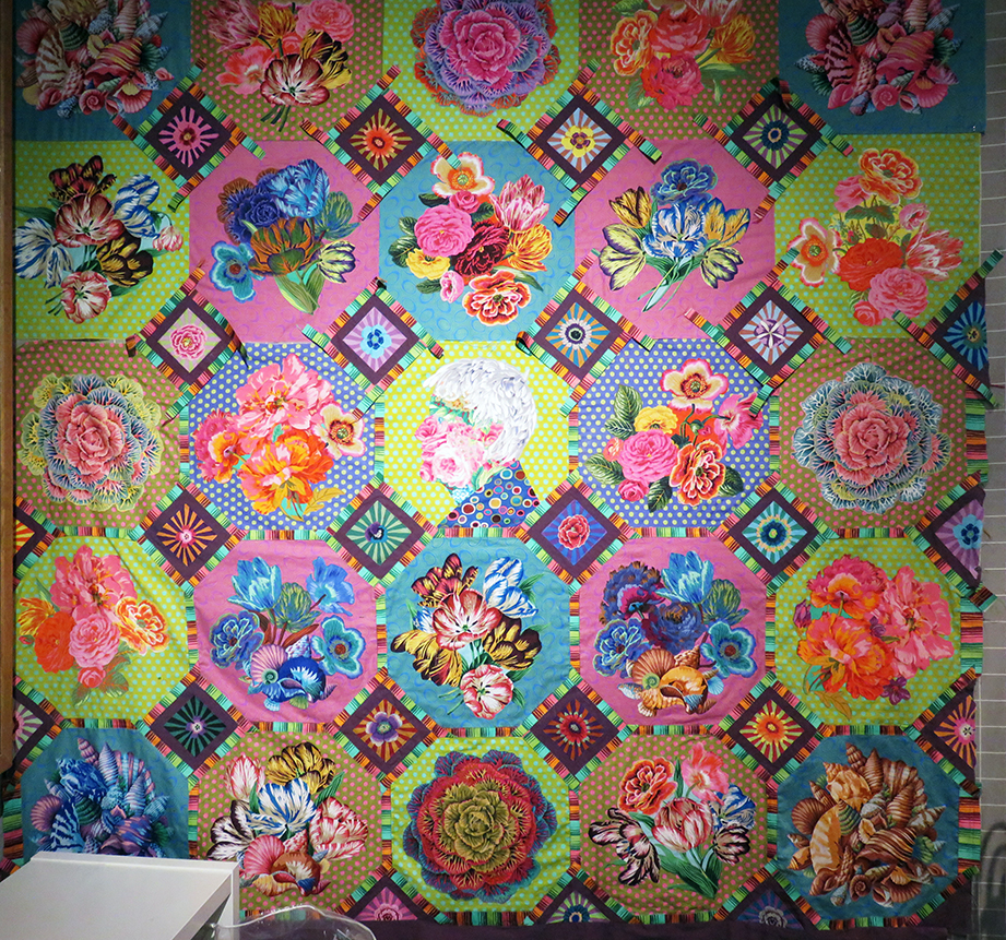
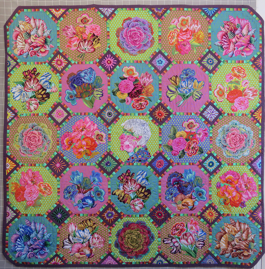
My final stitches on the back of quilt appropriately backed with fabric designed by Brandon Mably
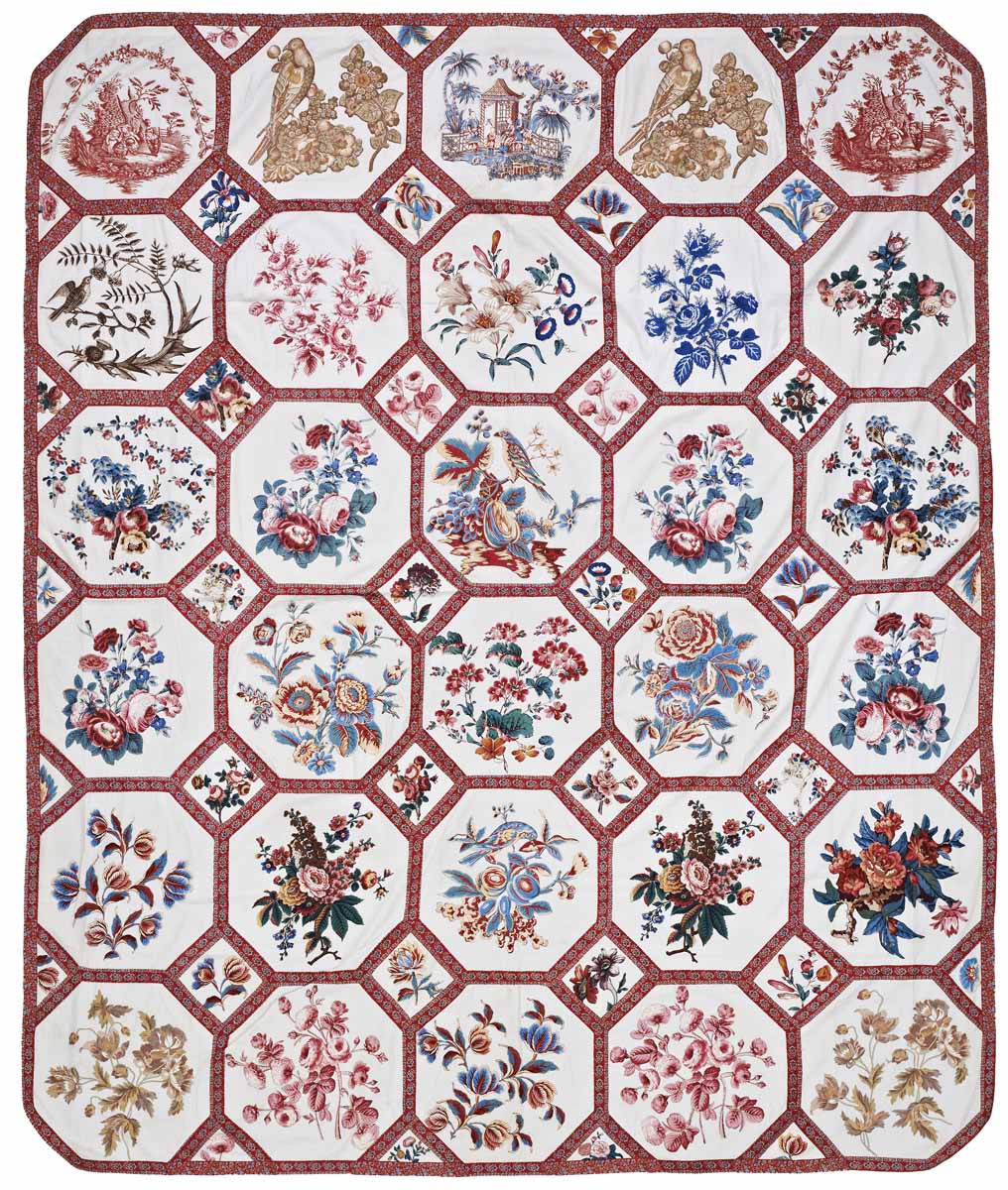
This major project started life in 2017 through sheer frustration. For Kaffe Fassett’s 2018 quilt book, based on traditional quilts housed in the American Museum in Britain he had asked that, as a hand embroiderer, I make his revised version of an ‘Broderie Perse’ in their collection. I was delighted.
I immediately started to sample some simple ways to make such a large hand stitched quilt nowadays, plus information notes for others to follow the instructions. However, due to lack of time due to publishing deadlines this quilt was dropped….Rats!
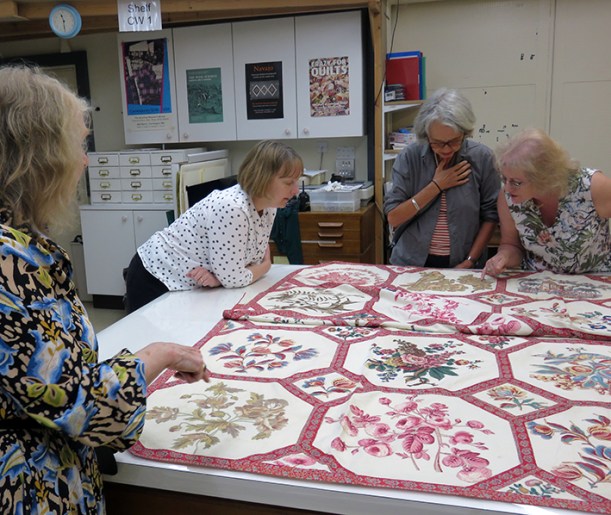
behind the scenes of the American Museum
Later in the year I organised with the museum’s curator, Kate Hebert, to visit the archives with the UK making and publishing team. I asked to see ‘the one that got away’ and on hearing the story, Kate said that if I ever re-considered making the quilt she would show it in the quilt gallery alongside the original. Well of course I jumped at the chance to show work at this museum, and I did want to make the quilt.
I decided that I would make it as a present for Kaffe, it was his 80th birthday in December and I had enjoyed the last 3 years working with him on his books and my contract was at an end. I reasoned I would soon have plenty of time on my hands to complete the project in time for his birthday.
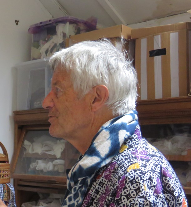
Kaffe Fassett studies new work on the quilt wall in my studio
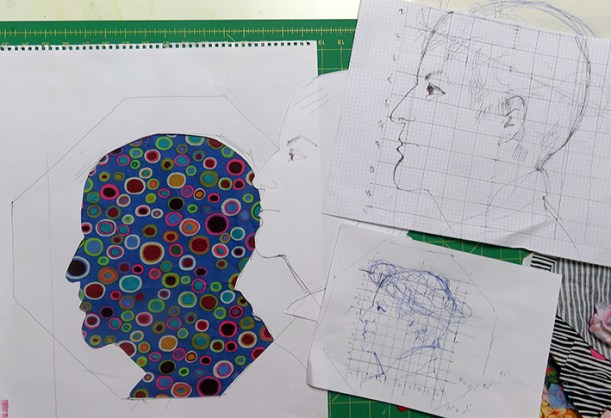
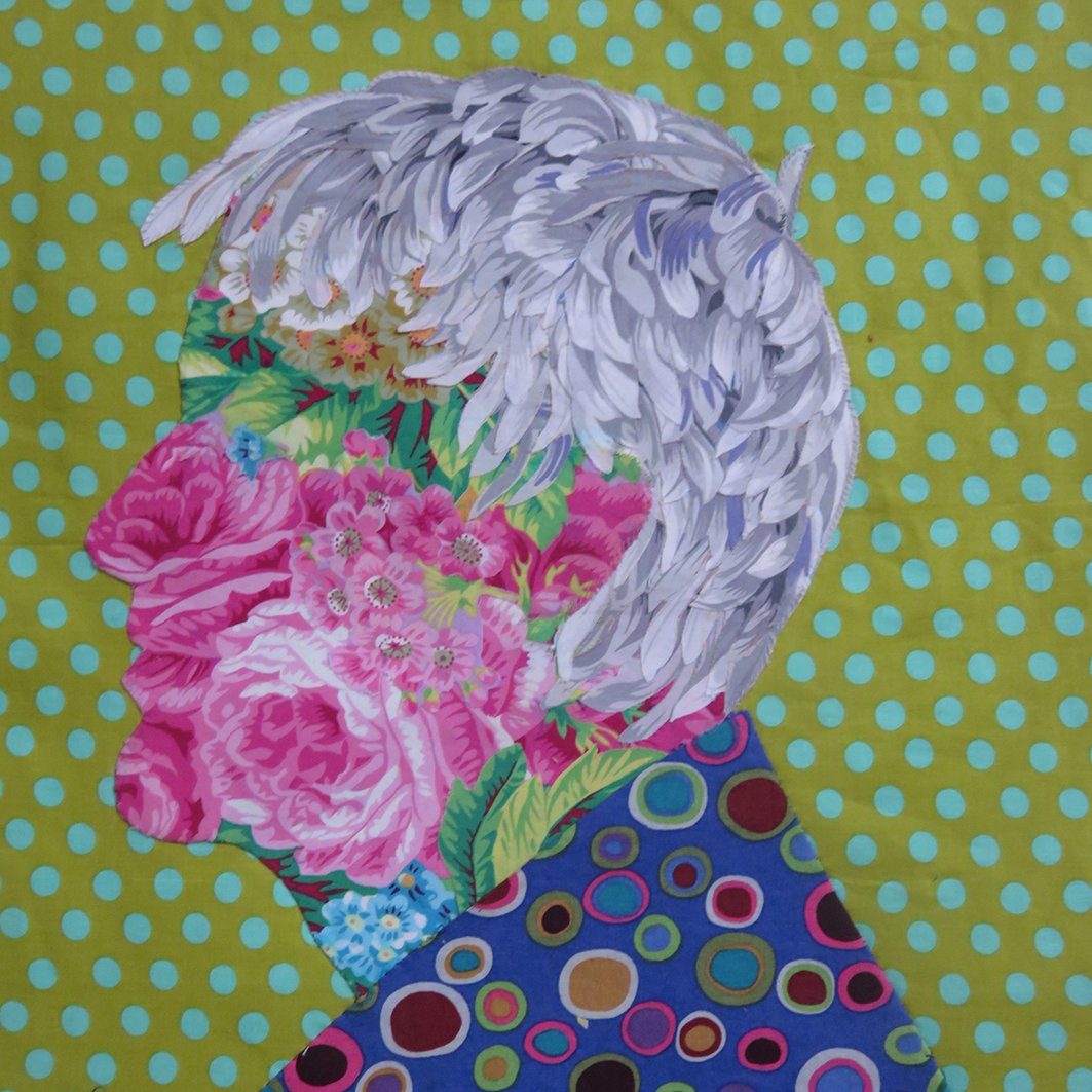
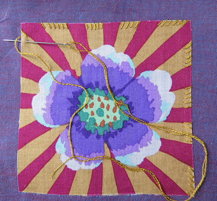
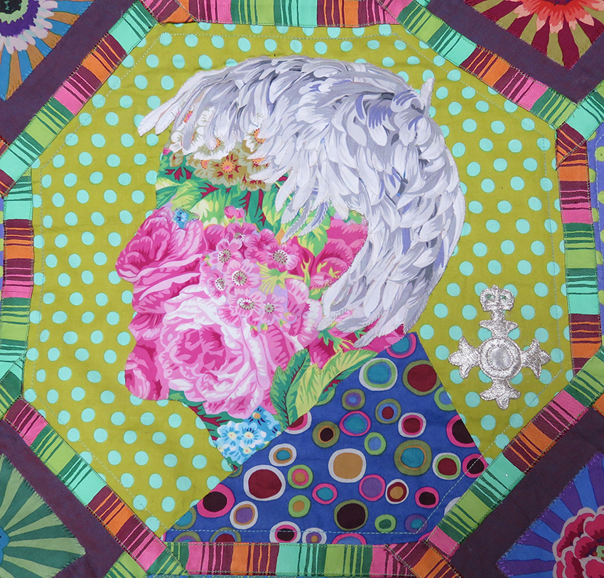
As I now had ‘carte blanche’ to interpret the design as I liked I decided to make his portrait as one of the panels. Using a recent photograph from his last visit to the studios I set about drawing and scaling the head.
the original drawings scaled up from the photograph
I made carefully measured sketches, and then 2 masks – one to the size of the hexagonal block and the other of the head. My initial idea was to garland the head with flowers – well why not?
first attempt to design the head using some of my favourite fabrics
This looked miserable, and the garland didn’t fit into the hexagon very well – and then I would have to embroider the features; I remembered my ‘Flora’ embroideries influenced by Archimboldo – the artist who made faces from flowers. I tried various flowery fabrics from the Kaffe Fassett Collective.
This selection took several days and I was still not convinced I could make it work well enough, then into my studio stepped an old university colleague from my teaching and researching days, Dr Dawn Mason, with the perfect bunch of flowers to match the work – I believe that chance happenings are not always random
serendipitous flowers – I am on the right track
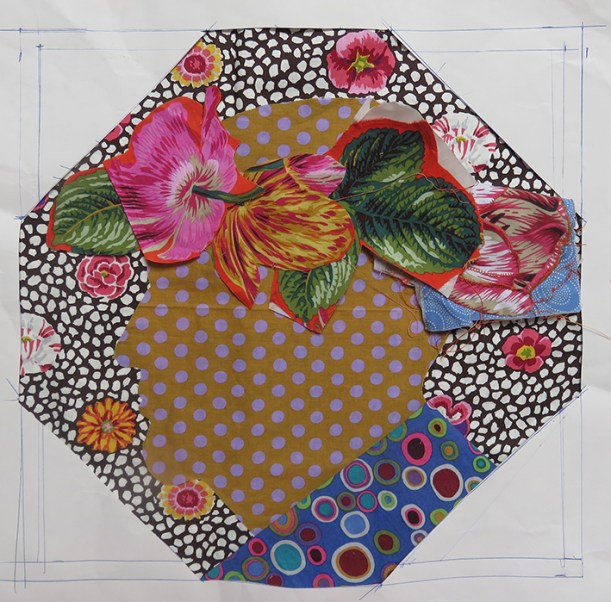
I persevered. Eventually I chose the fabric placement, cut it out with a tiny seam allowance and hand slip stitched it to a spotty fabric, adjusting the chin to become a tad larger proved successful. Very carefully I placed a blue bud for the eye. Suddenly Kaffe appeared in front to me.
chosen fabric on drawing
perfecting the chin
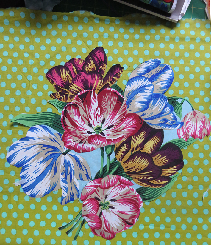
Now for the hair: I found the white petals of Japanese Chrysanthemum by Phillip Jacobs perfect for my purpose, and so it appears does everyone else; the hair is the thing that gets the attention. In fact most of the fabrics that I used Summer Bouquet and Shell Bouquet and Tulip Extravaganza are designed Phillip Jacobs, his fabrics are so elegantly drawn and painted and the perfect replacement of the original chintzes.
The next stage was to decide the rest of the portrait. For the shirt I had a smidgeon of an old version of Kaffe’s Roman Glass in blue, I had bought years ago – and after many trials chose the fresh Spot fabric in the colour ‘Pond’ for the background.
the finished head
Now for the rest of the patchwork, So far this has taken me about 3 weeks of drawing and stitching – but it is still only June.
the original samples for the American Museum book
I dug out the abandoned samples I had made for the book – I needed to make more other panels to add to the portrait.
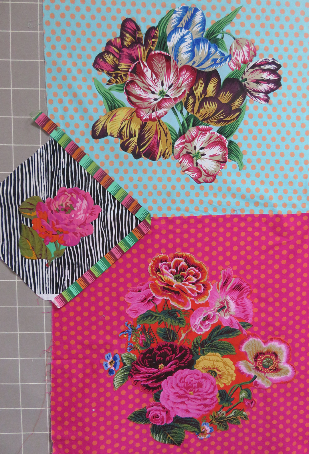
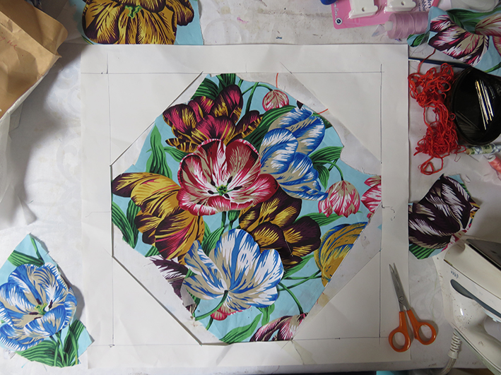
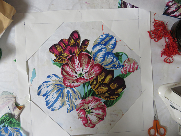
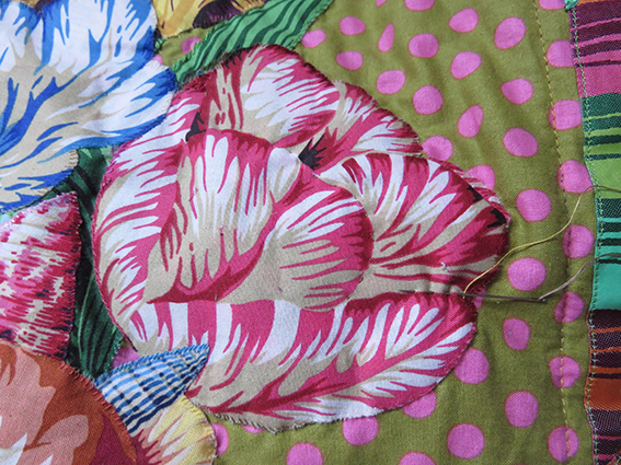
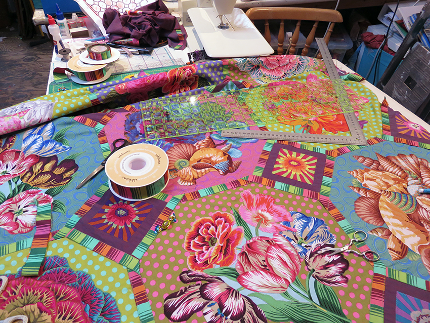
To make the bouquets, the fabric has to be backed with a bonding paper, carefully cut out, placed into position by re-arranging the various elements to fit harmoniously, pressed, then hand stitched around each raw edge, the stitching is quicker than the arranging and my idea of blissful work.
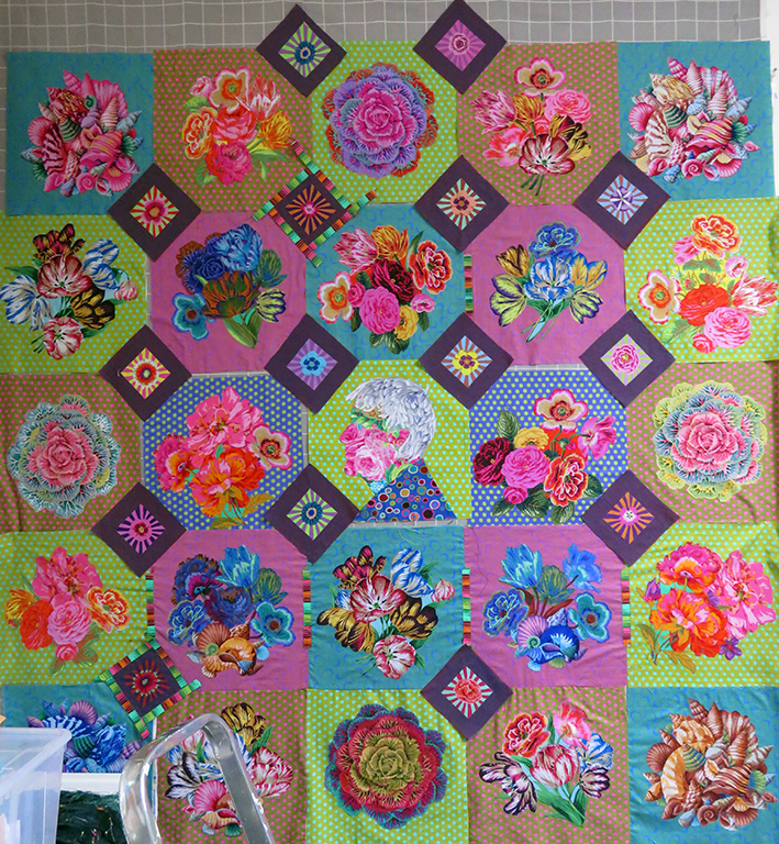
The quilt slowly started to grow; but trying to control the overall colour was the most difficult thing – colours that work on their own or in a sketch suddenly look drab or take on another shade when placed next to one another – obviously. But the colours of the flowers changed the balance every time I added a new panel. It was my major ongoing and fascinating struggle to get these balances to work.
my textile studio September 2017
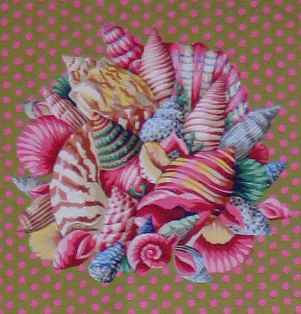
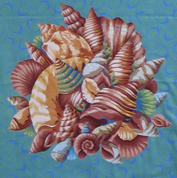
By September I had eventually made my fabric decisions, I had to make multiple versions of some of the panels – all in different colour-ways, but this gave cohesion to the busy design. I also added 4 shell corners, this was possibly the easiest panel to apply as the size was perfect and the shape fitted – just a few additions to balance colour.
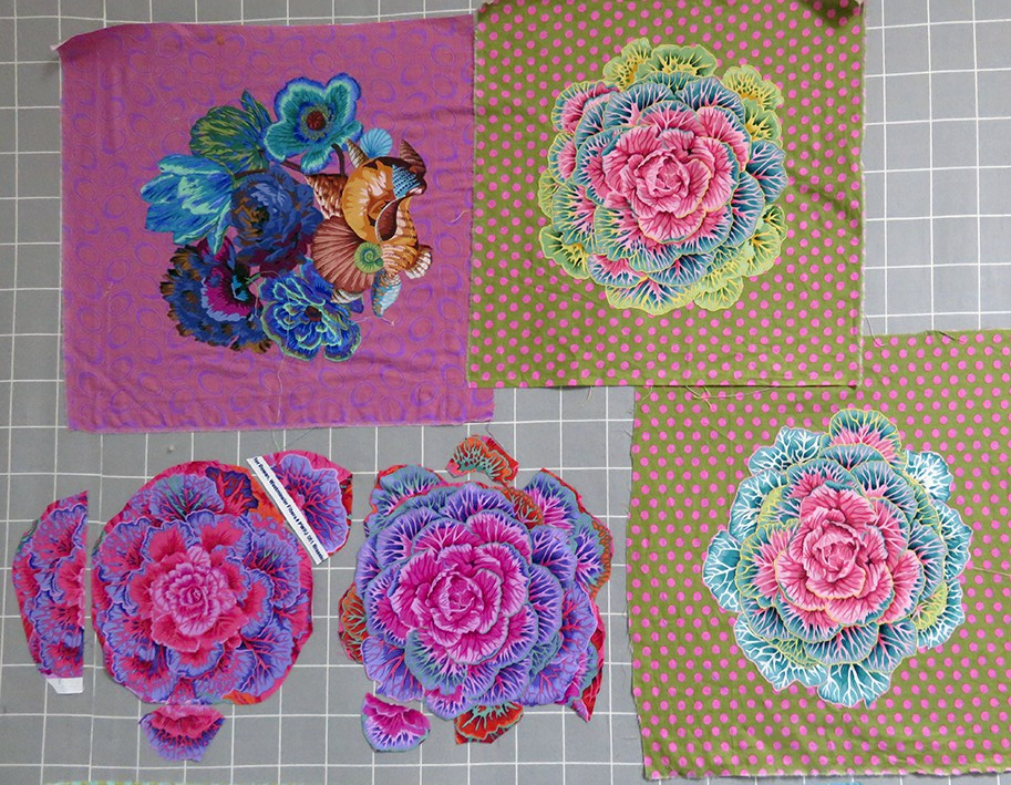
making larger Brassica panels
Above shows the development of the Brassica panels, they needed to be made larger by adding extra rows of leaves before hand sewing them onto the grounds.
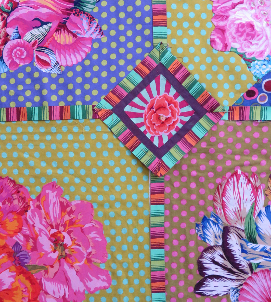
The next stage was to add the diamond shaped patches at the intersections of the squares.
the added diamonds start to assert themselves
And this is when the panic started – suddenly this massive work, that had grown over months took off in another direction, these diamonds dominated the entire design – already busy, this was manic
The only thing was to keep going – too late to stop now – the samples below looked fine
hand stitched applique
sample of pinned Phased Stripe by Renaissance Ribbons
I started to applique the tiny cut squares from Kaffe’s fabrics, Sunburst onto Shot Cotton dozens of them, all hand stitched in 2 colours and I slowly added them to the quilt on the wall ….and the result below doesn’t have all the dividing ribbon strips yet!
without the addition of all the ribbons – hells’teeth!
This was beginning to look overloaded, so I called in my 2 trusted quilt makers, Julie Harvey and Ilaria Padovani – they have very sound taste in all things quilt, and I knew they would tell me the truth. They just laughed and said “well it is for Kaffe and ‘more is more’ with him – why are you worried’?
It was the addition of the ribbons, kindly donated to me by both Edith Minne, owner of Renaissance Ribbons and Brandon Mably (who was in on the secret) that tipped the balance of the work and I suddenly understood that the work had ceased to be mine – it was now Kaffe’s. This happens when you are commissioned to design and make stuff for people – you need to work with their ideas/tastes/preferences – otherwise they don’t pay you! But this wasn’t a commission this was a present, and it was all my own work – I realised now just how much I have been influenced by working alongside him.
the quilt starts to look like it belongs to Kaffe
So I machined in place all the ribbons – a mammoth task for a hand embroider! they were very tricky to manipulate especially as I had to split many yards of a wider ribbon to get the correct proportion, both Edith and Brandon were out of stock of the narrow version. Hey ho! Thankfully Julie machine stitched it all into position first and then I started to hand quilt all around my stitched applique – another mammoth task, but so rewarding, the quilt looks suitable wonky – in a good way – it looks very hand made
March 2018, finally finished – I thought!
It was completed in March 2018 but I had not time to deliver it; then Kaffe was awarded an MBE and I know I have to include this – so back again to the finished quilt
I made a sample first and then the real thing and appliqued it to the ‘finished’ portrait
portrait complete with medal
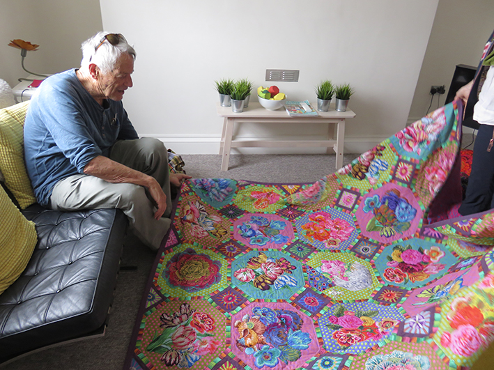
In Bath, where Kaffe and Candace Behouth, have an exhibition together based on Flowers , I delivered another set of 5 quilts for the next book and my “surprise”
And Kaffe’s reaction when he was shown it?
Worth every moment.. I made the sample into a badge for Brandon – this says it all!
Crazy stitching on a Crazy Patchwork by Naomi Clarke from a recent workshop at Heart Space Studios
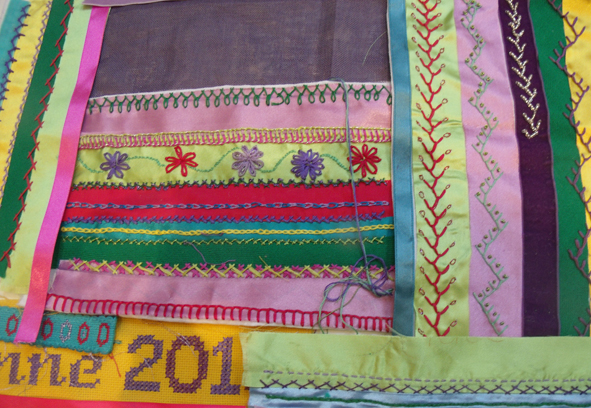
Crazy Patchwork classes have always been popular at Heart Space Studios and several people asked me to teach them more hand embroidery stitches, so I started a course called Crazy Patchwork Sampler. The course is built around the sampler that I made for my book, Crazy Patchwork, published in 1998 by Collins and Brown – it seems what goes around comes around……
my book of Crazy Patchwork ideas and designs.
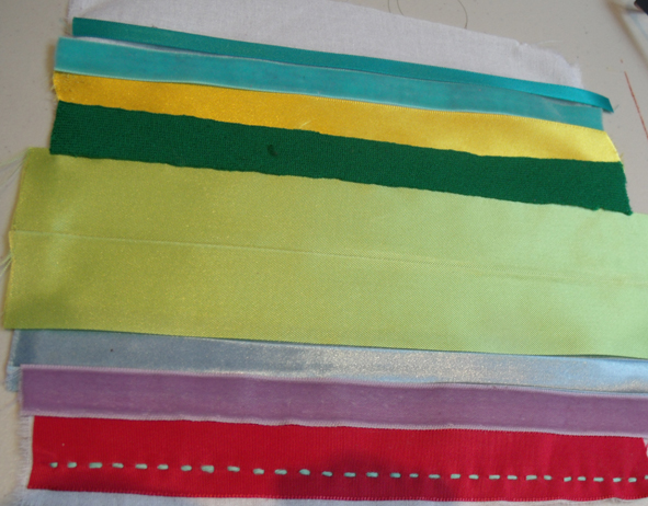
For the FIRST WORKSHOP I started off with the absolute basics, first we chose the colour scheme – I supplied various ribbons and fabrics for people to choose a small group of their favourite colours: this takes longer than anyone imagines it can and causes a lot of negative ideas to flow as people are usually very nervous about using colour, but I have learnt that this choosing is really important as eventually by using the same set of colours in various patterns and proportions the finished piece can be made harmonious.
strips of ribbon ironed on to backing fabric
first chosen coloured ribbons
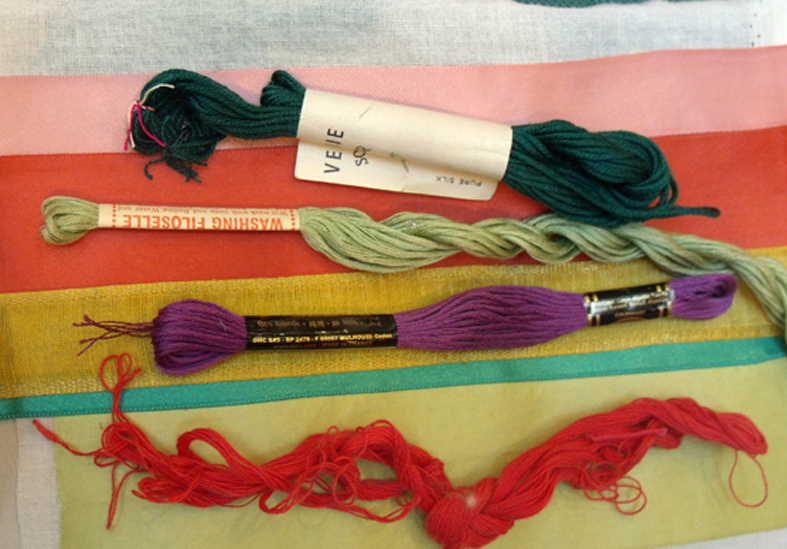
Most people, to their own surprise, choose colours similar to what they are wearing. The next choice to be made is the threads – I ask them to choose similar colours to the fabrics but to stitch in complementary coloured threads – so that the stitching will show up.
choosing complementary coloured threads
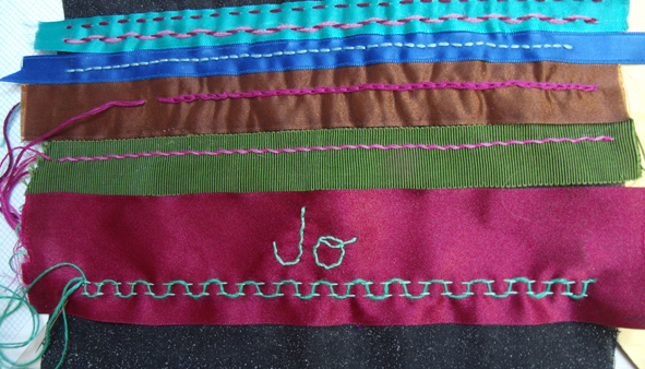
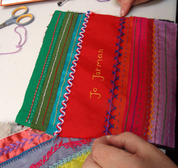
The first sampled stitches are the straight ones – running, back and all the variations, easy does it….but it also includes writing a name…very simple but very effective for the first workshop. There are various methods of writing onto fabric so that it can be embroidered and we start with the simplest by using a water-soluble pen or the old-fashioned transfer paper still used by dressmakers.
the maker’s name worked in back-stitch over water-soluble pen.
The SECOND WORKSHOPsession was cross stitch, counted and herringbone – which is the main stitch I use for joining the patches together. The group was still concerned about colours, but I assured everyone that we had a long way to go and plenty of opportunity to make the whole sampler work in harmony – I was delighted that they had all done ‘homework’ and had finished the first workshop’s ‘patch’ and found more variations to add to the straight stitches.
finished patch from first week being decorated with herringbone stitch
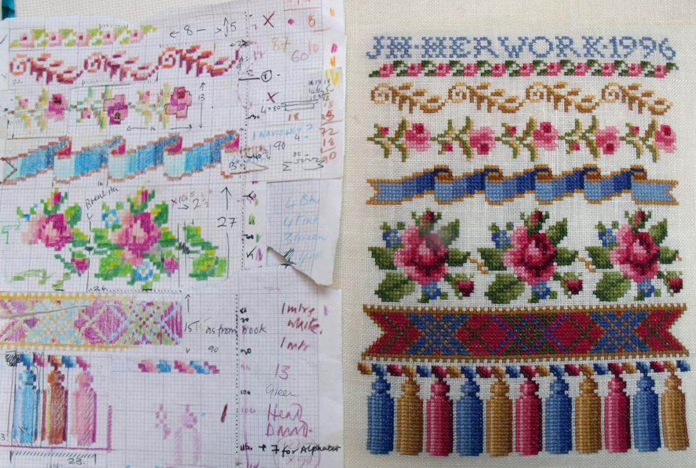
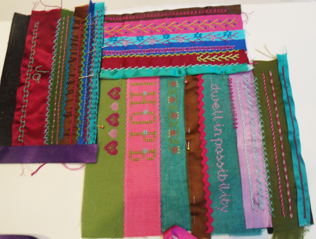
Counted cross stitch is another way of embroidering letters and numerals……
my working chart of cross stitch motifs for the accompanying sampler
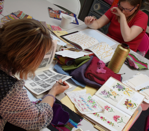
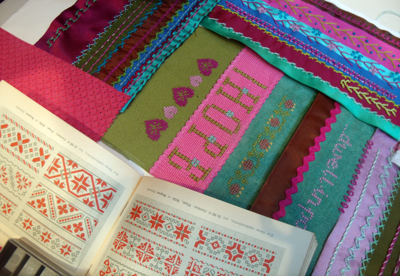
There is a whole world of cross stitch motifs and I like using the traditional ones – to illustrate the technique of charting for cross stitch I showed them some old work of mine that was designed from vintage needlework manuals. I still work as a freelance designer for a canvas embroidery company, Ehrman Tapestry, where I sometimes use similar charting for some of my designs, even though the stitch for tapestry is tent or half crass stitch. So I have lots of reference material and the group spent an hour of the 3 hour session looking at all my books and notes before they began charting their own designs.
Jo and Helen choosing cross stitch motifs and alphabets from my reference book
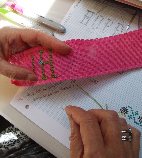
The task for this second session was to chart a name and date as well as a small multi-coloured motif and to stitch it onto the counted thread fabrics.
Jo decides to chart and stitch HOPE – she s going for an aspirational crazy sampler.
choosing the colours from a limited range of counted thread fabrics involves creative use of colour
Helen uses a shaded red thread creatively to harmonise her cross stitch samples with her first straight stitch patch
it is interesting how the maker’s character soon emerges from their choice of colour and letter forms, above Helen’s looks strong and directional while Sophie has chosen elegant letter forms and motifs ; the colour combinations are similar but the proportions are very different
cross stitched bands being cross stitched together
By the THIRD WORKSHOP the patchworks are starting to look very rich and there is less uncertainty about colour choices, everyone seems to be enthralled by this process and are bringing in finished pieces that they have developed at home alone….everyone comments on how good it is to just stop for a time and concentrate on their stitching.
2 finished ribbon patches with 3rd ready to be embroidered
The third week is supposed to be looped stitches – chains and lazy daisies and feather, but we have to spend some time catching up on herringbone as the counted cross stitch took up most of the last class at the studio.
looped stitch patch of chain, lazy – daisies with feather variation being worked in beads
The patches are now starting to harmonise together by careful use of colour; everyone really enjoys the frivolity of stitching with multi-coloured threads to make up the herringbone variations
herringbone stitch variations plus feather stitch rows that are beaded
By the LAST WORKSHOP we have got a small range of patches ready to be worked into a whole square.
Anne’s collection of patches ready to stitch together.
The piecing together of the patches for the last class was easier because of the colour co-ordination of the embroideries, but the strict oblong patches made for geometric patterns for the final piece. Maybe for the next session of this class I will give each person a triangle as well as oblongs and squares of fabrics to apply the embroidered ribbons on.
geometric patterned patchwork for final piecing
I just didn’t have the heart to ask them to cut up their embroideries to look like a more authentic crazy, even so each person had completely different patchworks –
the inspirational crazy patchwork sampler is pinned together
This group of students want to learn more stitches and techniques so I am running an advanced course for them – and other more experienced embroiderers can drop in for single sessions. Considering that this group had only 5 classes for 3 hours each they have really advanced their practice in many ways and not just by learning how to stitch. I think that they have caught my bug – the embroidery bug – and are now developing their own libraries and stashes of materials ready to try out new techniques and new ways of expressing themselves.
vintage DMC book of counted cross stitches bought by Jo after seeing my old battered version with her almost completed Crazy Sampler
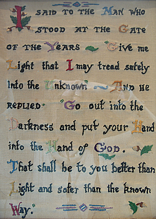
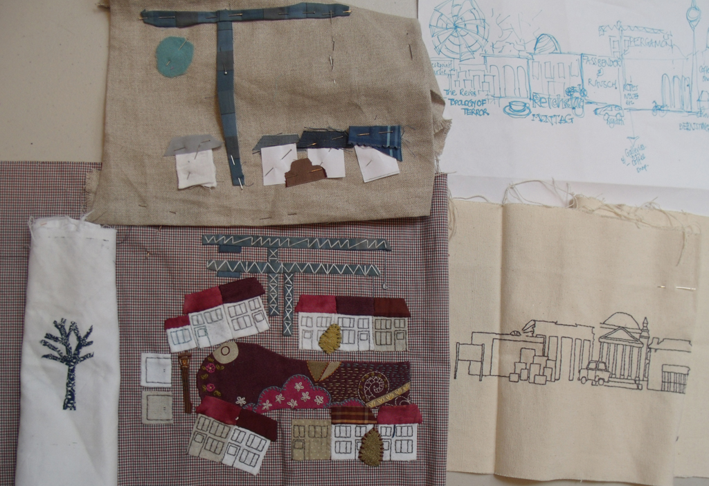
This vintage embroidered panel was brought to me by Caroline Doran who has requested a mentoring session recently at Heart Space Studios. Caroline was a member of our regular Knit and Stitch group who meet each week to talk, work and enjoy textiles together. The last time I had seen her she had brought a small hand embroidery she was working on, it was of her own neighbourhood with some enormous cranes from a local building site – she had asked me for some advice on windows . I remember discussing the work at length, which looked really very promising …then I didn’t see her for several months!
original neighbourhood embroidery – Caroline Doran
However she turned up again asking if I could review her work as she was a bit “stuck” : how well I know what that feels like…” is this piece worth going on with? What am I doing this work for? Why can’t I seem to keep going with the same momentum I started off with? Have I any other better ideas? We all experience this doubt when we make work that is slow going, you just have to keep stitching but it helps if you have some record of the why as well as the way the work came to be made – research – for want of a better word.
a small selection of the inspirational objects
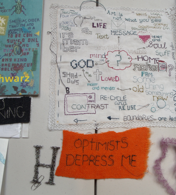
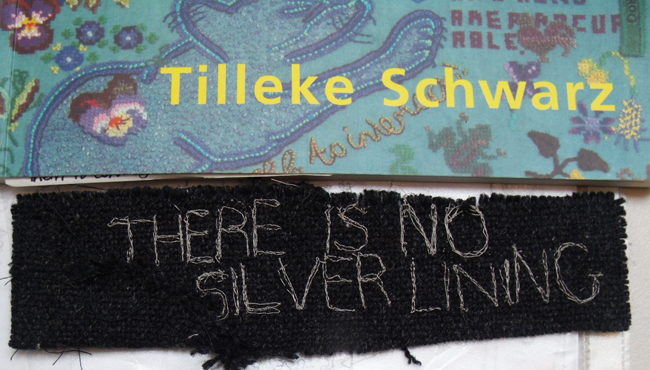
Before Caroline come to the tutorial I asked her to bring some inspirational objects or documents as well as evidence of her personal research – fabrics, photographs, books, drawings, scraps books, old work – whatever made her want to commit to actually making her ideas. She brought several telling things and as she unpacked them I started to make groups that showed how her own work connected to what she had brought along. Tilleke Schwarz ( on of my own great favourite embroiderers) had evidently been a real influence, in fact Caroline has attended on of Tilleke’s workshops in England. She had translated Tilleke’s acerbic but generally neutral stitched commentaries and slogans to make her own negative statements…
Tilleke Shwarz catalogue with an opposing down beat message
a sure reflection of how she was viewing her work ( and in complete contrast to my own rather more upbeat slogans)
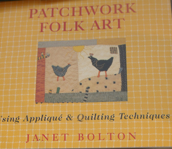
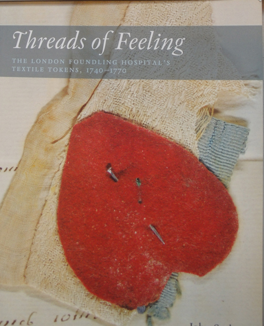
She also brought in several books, by other embroiderers who use applique and patchwork, notably Janet Bolton, but also the catalogue from the London Foundling Hospital about the mementoes left by mothers with the children they had entrusted to the future to the care of the institution. There is a very strong set of images and ideas being laid out before me. I was very intrigued to see what other work she had brought in to show me. A few years ago Caroline had undertaken an arts foundation course and she also brought along some of the work that she thought was still relevant to her now.
I find that the great breadth of foundation courses are brilliant for introducing students to a wide range of ideas and media but after a few years ‘at home alone’ the personal and, let’s face it, the available will re-assert itself. This situation can lead people to feel that they are not being adventurous, or the work doesn’t count as it is made of such mundane materials. But I think that this is the real strength of textile practice, for the most part it can be made using materials that are readily available, and these materials are the stuff of everyone’s lives and so are have many and varied associations with which to connect – for both makers and viewers. One thing that good foundation courses do give students is a sure sense of self-critical analysis, and this Caroline had acquired, if anything she was too critical, getting things ” too perfect” had rendered much of her latest work a bit lifeless, and she knew this – but how to remedy this is part of why she has come to me for help.
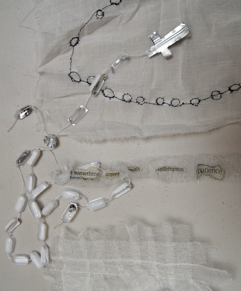
This set of work looked very different from the first work that had been brought out – a mixture of different media about all connected to her very strong family affinity to Ireland and her grandmother’s home. I was struck by several “necklaces” and embroidered images that made me think of rosaries,
recycled ‘rosary’
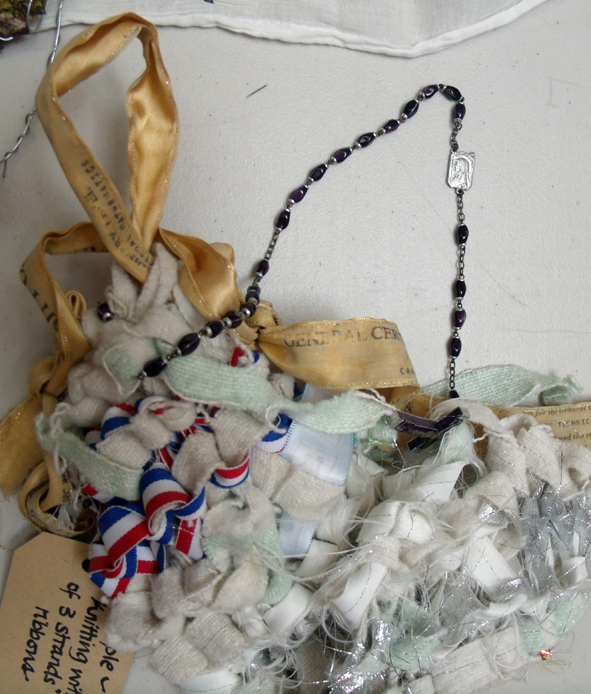
so wasn’t surprised when her grandmother’s real rosary turned up stitched onto a piece of work.
grandmother’s rosary stitched into woven fabrics
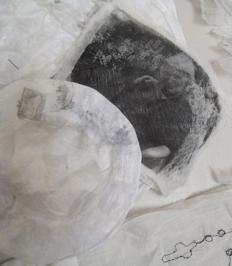
and her grandmother’s image was printed onto another fabric applique
photographic print of onto fine voile
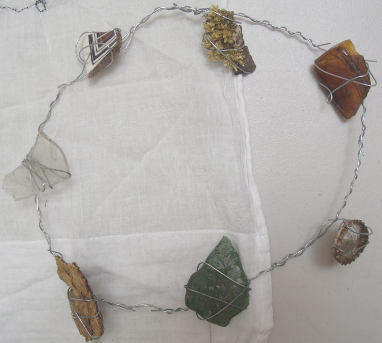
I was beginning to see the connection between the vintage embroidered verse – almost a prayer – that had come as piece of inspiration, with this almost sacred treatment of her Irish heritage. I started to ask about this connection and heard how Caroline still felt deeply connected to her Irish roots, still retained a religious faith and was now concerned with working with evidence of her family background, maybe using photographs, maps and other found objects. The most arresting piece that she showed me from this set of work was literally found – on a land fill site where she had made a necklace from shards of broken glass, pottery and stones – again a sort of secular rosary ….regarding or touching the objects made the viewer consider other lives, other places, tiles, bottle caps, lichen, glass, bark…..
shard necklace from land-fill site
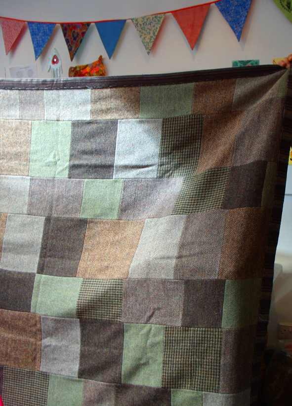
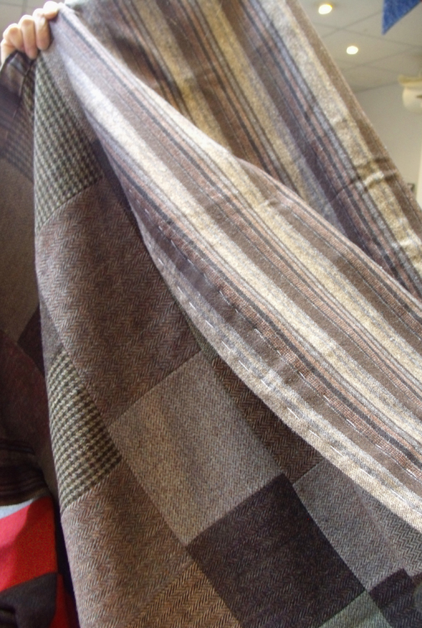
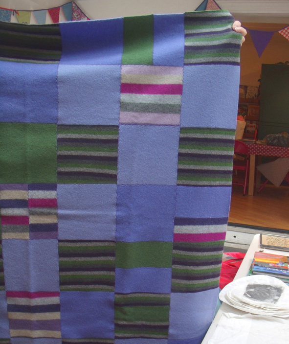
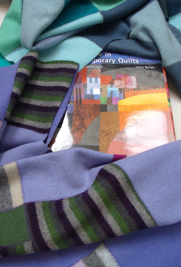
I was now considering how to help develop these disparate sets of materials and concerns into a more cohesive textile context, obviously some form of collage, applique or mixed media patchwork….when, as sometimes happens at the studios, we had 2 visitors from ‘Billie Jean’ which is a lively Bristol vintage clothes and fabric shop, they had been sent to us to show some things that we might be interested in seeing; and these were….. patchworks. Asking Caroline’s permission, I invited them in to see some absolutely lovely recycled tweed and knitted cashmere patch-worked blankets, that Billie Jean herself had made from their stash of old cashmere knitwear and woolen jackets, we were soon all chatting away about recycling, the beauty of old fabrics and how much we enjoyed the experience of just handling and making with textiles.
And as several of Caroline’s inspirational books had been about patchwork and applique, this seemed to be a good omen for the way to go…..as part of the mentoring session we now had to decide the way forward. I advise people how they might develop the next stage of their work, it is entirely up to them if they choose to take that advice. I see my mentoring role to be that of a person immersed in the same materials, techniques and often similar subjects as the people asking advice, and having been through similar making (or not making) experiences many times I have developed several strategies for looking at the work, getting some perspective on it – finding connections and as any tutor will do – suggesting new things to research to take the work forward.
group of half worked embroideries and drawings
We now had to look at what was in front of us, decide what was to be developed immediately, what could be parked for working on later when there had been more time for fresh research, and what could be safely consigned to a folder or file of past experience. I had grouped several half – worked embroideries and drawings together, they seemed to relate to a celebration of the city and street life, I liked their vivacity and thought that they could be somehow ganged up together to make a larger patchwork piece. This means they have to be somehow made to work together, more of the simple line drawings can be assimilated worked as appliques or linear stitching and as made into a textile map of Caroline’s geographical space.
We will wait to see if she brings anything back to me in the month ahead. I am considering developing mentoring as part of Heart Space Studios activities…so I do hope that she has gained some benefit from this initial session.