
Subscribe to continue reading
Subscribe to get access to the rest of this post and other subscriber-only content.
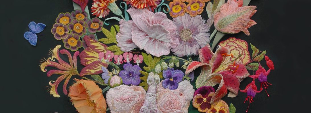
Subscribe to get access to the rest of this post and other subscriber-only content.

Once in a blue moon, one really good thing leads to another and another; so here is Max, the second good thing to flow from The Dog Quilt I was commissioned to stitch him when his owner saw the big quilt and the portrait of Dougal as shown in the previous post.


Starting any new commissions, regardless of subject is always exciting, for me and hopefully my clients. Sometimes it is a leap and sometimes a swim into the unknown for both of us. I always ask for any information that the client thinks is important for me to hear, plus lots of their favourite pictures of the subject even if I am visiting to photograph things for myself. Now I am learning that those favourite pictures often span years…


So looking at these 4 images above, which version of Max am I going to portray? they make me feel that Max is somewhat vulnerable and very wary, then I learnt that he is a rescue-dog from a far flung country in the Indian Ocean.
I started by actually drawing into the photoshopped images in order to edit Max into a middle aged dog after some discussion with the owner. I sent these first images to him for comment and hopefully approval.


Here are some of my drawings with samples of materials and stitching technique, based on one of the dogs in the Dog Quilt.
The Dog Quilt portraits now serve me as a sampler for a myriad stitching and embroidery techniques. Below is the pencil drawing I eventually used as the scaled up working drawing for the hand embroidered portrait. It has very precise broken lines to describe stitch directions but most importantly it depicts his gaze.

I sent these images to my client for feedback and he said to go ahead, with no time deadline and no extra requests. What follows are a just a few of the many stages of building up the portrait. First an outline tracing from the design drawing, then the coloured base drawing using Derwent Ink Tense pigment pencils that act as a guide for the blended colours of the coat and a useful dyed background. From the start of this process Max looked me straight in the eye, it was wonderful to see him emerge.


Using stranded cotton threads I stitched a basic undercoat to give me the directional stitching of the hair


Then the ‘top coat’ stitched in single strands of pure silk following the direction of the coat


Now the contours the face emerge (I have always thought that if I can faithfully describe the surface, what lies beneath will become visible) To get the quality of the blended colours, I ply 2 dark and light strands together – a Japanese technique I learnt years ago on a travel scholarship to study kimono (another story)


Nearing completion and time to tackle the eyes: it is so important to keep the gaze focussed on the observer – who wants a picture of their pet looking away?

Here I compare and contrast the early research samples with the finished and stretched embroidery below

Lately my private commissions have started up again. I always prefer to work like this, in direct contact with the people who have chosen me. This post shows the ways in which I develop my small stitched portraits – not just dogs, but gardens, vases of flowers and even, at the beginning of my career, whole families.

The classic 17th century Dutch paintings of fabulous flowers, but this arrangement probably did not really exist. The modest bunch above, features early spring Daffodils, with mid to late spring Tulips and Irises, and yes they can all grow in the same season, but the give away is the fully formed damask rose seen only in mid summer. It demonstrates how the artists worked: each flower was a sample of horticultural expertise, painted when it came into season, then there was a wait for the next bloom to come to perfection.
So last year when I was commissioned to embroider ” a vase of colourful tulips” during my Hidcote exhibition, and I realised that tulips would not be in season in October when I could start working on it. I decided to find tulips within my own work and remembered a very old sketch book with a vase of drooping purple tulips ( circa 1980). Always keep your sketch books!

Above is the inspiration behind my latest commission. Below shows my studio wall with earlier flowers against stitched Kantha skies…with a sample of different fabrics to act as the background


Now I needed to choose some colourful tulips to put in a vase. I started with my sketch, below, of some striped tulips that I have used many times for different projects. It was at this point that I sent images of ideas and sampled fabrics to the buyer – for any feedback then with her agreement I went ahead and started on the actual panel. But with the stipulation of no other sighting until the piece is finished !!!!!!!!

Here is the drawing used again for the front cover of one of my embroidery books, and on a detail of Tulipomania now used for a print in my shop,


Below, designs for counted thread canvas work woollen embroideries – a good drawing goes a long way!


Now to flower arrangement – I am not good at arranging flowers and I really have to work hard at this aspect of my flower embroideries. I edited the tulips from the original early drawing as I did not have the time or space to stitch 10 flower heads in different colours and shapes. Below are 2 of many early drawings graphed for transference to the stitched ground.


And to colour, the tulips need to work with the sky, and the sky is all organised, tacked ready for quilting between stitching the tulips.


To enable me to gauge the placement of colours against the already glowing sky, I wrapped some silk ribbons to act as flower heads, found the silk threads to match them and took colour notifications – if only things work out so simply in reality – but I was starting this bouquet from scratch.
Drawing, redrawing, sampling and stitching one by one each tulip head is made,


Below show older drawings in my current sketch book; plus my friend Lizzie Butler’s birthday card to me – I just copied it straight onto silk organza – with her permission of course!


When enough heads are made I start to arrange them on the background….and then the leaves. I just love to draw tulip leaves and their colours are so soft and gentle. I start with cut linen shapes from my original drawing in order to stitch over them to give definition; getting there.


And last the vase – which is another story – believe me!

I truly enjoyed this work, creating spring flowers in the depth of winter, but it was a challenge as you can see. It is now safely framed and given straight into the hands of the son of the person who commissioned me; he had seen my work at the exhibition and talked about it…..and he has promised to send me a photo of the framed work in situ in the new house.

Strange how sometimes things come together: I was contacted, out of the blue, by Marcus Wells at Havilland Designs to see if I undertook commissions? He had framed some of my earlier work (embroidered portraits of women designers) for one of his clients, the interior designer Kit Kemp, who, to my amazement, had spotlighted my work on her blog, showing the perfectly placed Clarice Cliff portrait and lots more. Now read on……


Marcus had a client who wanted a quilt depicting dogs. I am not a quilt maker but I was intrigued and asked him to send me details, sizes, preferred imagery etc. and an overview of the space where the quilt would hang. It was to be framed by Marcus and – no pressure – his client was another interior designer….He sent several images of the room that the quilt was to be hung in and I noticed a small dog’s head on one of them, I asked for pictures of any other dogs belonging to the client.


I then made several design sheets for a colour scheme and fabrication, with drawings and 2 embroidered samples using of a range of techniques that I could offer: from the simplest applique design for a spotty Dalmation to a hand-stitched portrait of the small dog in the original photograph. I was given the commission:- a quilted hanging with patchwork blocks of stitched dogs using the different techniques.


So now to find the extra dogs; my first set of drawings showed typical positions taken by each breed above. I do love dogs and am fascinated by their shapes, specially when totally relaxed. I had started with basic stance like the Dalmation, and just had to include a French poodle and terriers, so an Irish terrier, a Fox terrier and a Border terrier. And hounds, a Schnauzer Leo and even a Siberian husky Twyla, all in easy reach as they belong to friends, family and the local dog-walkers.


For most of the embroideries I drew the dogs to scale from photographs sent to me by the various owners, to decide which technique used for each dog but sometimes I just copied the photograph! Below are working drawings for the relaxed hound Rodney, and the oh-so-tired Sydney.


But how to assemble them into a quilt? I had been putting everything onto the quilt wall in my studio as I made it – constantly adjusting the arrangement to fit within the required measurement. Not how quilts are usually made I know, but this was created by the love of dogs, not the discipline of the patchwork quilt. The first scribbled design for the quilt shown below and the reality that surrounds it….


The design chops and changes as each new embroidery is completed and not every dog makes the final cut, but a design finally emerges. There were a few more dogs needed to complete the design, but how to highlight the family dogs (which are actual portraits) and stitch it together as a proper quilt…is the next instalment.

Invited to conduct a week long course of drawing flowers and then to develop the drawings into a small sketch book at Court House Farm in early June, when the cutting garden flowers are blooming. I checked out my collection of sketch books/ visual research journals (whatever they are currently called) I have kept all my research books throughout my working life.
then I unearthed my first Liverpool College of Art sketch book circa 1968 – and this cover still looks like a protrait of my early loves and fashion influences …Modigliani, man and work, Chagall, dresses as worn a la Dusty Springfield; with the faces and poses of models that influenced my design illustrations. And inside???


Above are a range of design drawings in pencil and coloured inks that were used to tint black and white photographs. I found that the colours were very subtle, I wonder what happened to them? These are layouts of my designs ready to be illustrated, I think for a competition for RSA (a brilliant organisation that enabled students to develop their practice with scholarships and grants). Everything looks in proportion until you see the legs, they go on forever. We were taught to make drawings that someone else could work the pattern cutting and making, a very good practice as I found out when I did become a fashion designer and illustrator in London in the 70’s. But what is really fascinating, the pages do not look so different to my own recent research books – just a change of subject matter- oh and embroidery!

These pages of flower are from my current research book started in 2023; I am still having a written conversation with myself. Back to the 60’s…….


These very neat dresses were designed to be made in Double Jersey, a new innovation that made for easier pattern cutting (but little else as far as I was concernd). I always preffered my designs to be made in fine wool crepe. In the sketches below it appears I was also designing lots of accessories as well! the drawings above use my favourite media of the time – pastel with mapping pen and ink details.


Below are designs that use applique and embroidery – I remember embroidering woollen flowers onto a knitted dress for my final collection and I think this is where I really got the passion for embellishment and embroidery. My first freelance job was making and designing appliqued T shirts for the Mr Freedom in Kensington – the height of London boutique street fashion at the time.


Another sign of the times the Saga Mink competition, ( I did not win – well just how much fur would these designs sell)? The anti fur lobbly was just starting up, but that’s another story. The drawings are in crayon and pencil.
However here you can see the direct connection to the cover of my sketch book and the influence of my favourite fashion designer and illustrator – Barbara Hulanicki the design genius behind the most fashionable shop of the times – Biba .


Following on from the successful Drawing Day in June at Court House Farm The RWA ( Royal West of England Academy) Drawing School organised another Autumn Flowers day. But due to the ultra dry summer the flowers were not so abundant as the spring crop…my solution: select just 3 big bunches of different flowers in vintage vases with a toning striped runner and everyone would be able to draw all 3 during the day
In at the deep end. I asked the class to choose a table to sit at and draw the whole display in front of them…in 20 minutes!


Tall and elegant autumnal shades…and in contrast below – hot clashing colours!


and then massive and majestic….


only 2 people attempted this vase and were somewhat overwhelmed by the abundance! So we started again by choosing another section of the bouquets and making some rather more detailed drawings – now things were starting to develop.


BUT so far no-one had even attempted the fabric specially chosen to be drawn with the colours already used in the flowers……so after lunch I changed things over and added another arrangement – now we start drawing with the fabric!!!!


And in the process we even got vases.
For the last session I relented and asked them to choose just 1 flower/branch/leaf from all the masses of materials and to place it next to their drawing boards and make a study – I usually start my drawing sessions like this – and I may return to this method for my next drawing flowers session in November….


Here is the open door into my completed ( well just a few more pictures to put up) patch-work room, using fabrics from the Kaffe Fassett Collective. It has taken 6 months to achieve. I started 2020 during the last Covid 19 lockdown in England and we are still not entirely unlocked mid way through 2021.
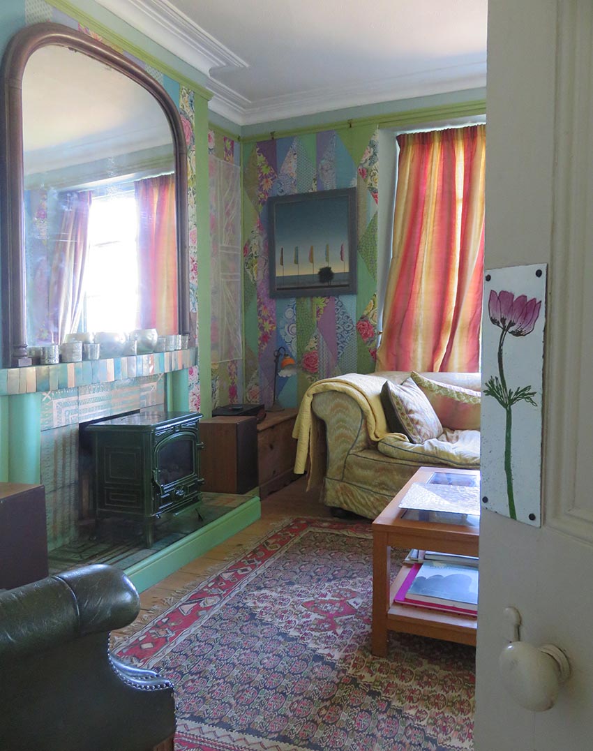
I aim to take you around the room to see how it all has come together, here the door from the porch has a vitreous enamelled finger plate – now I want to make more of these for inside the room…the enamelled fireplace can be seen with our old furniture and carpets safely back into place.
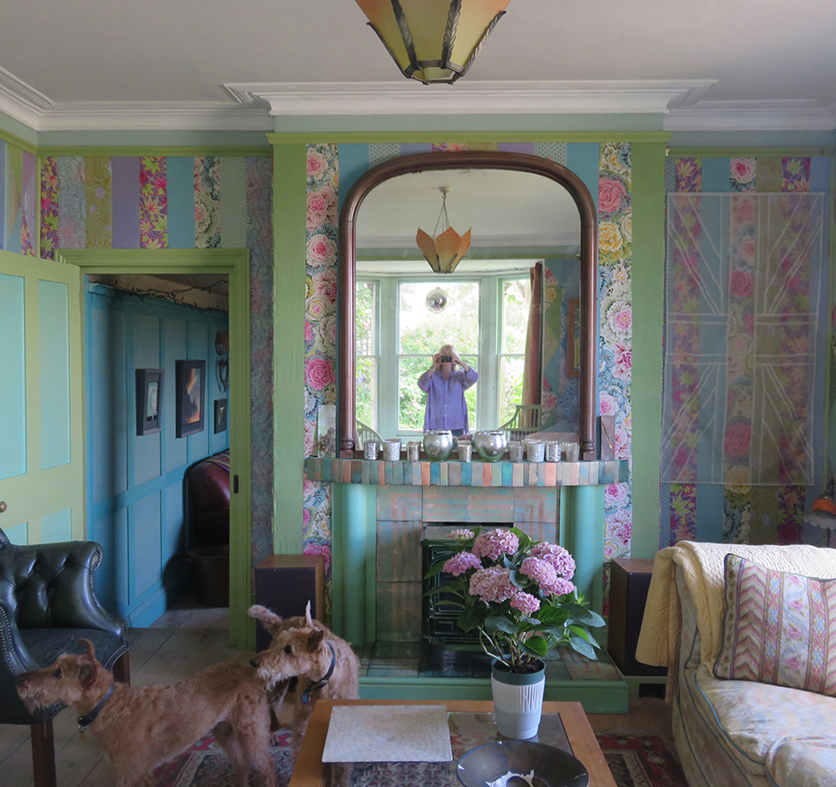
turning left is the view into the small panelled room, our 2 Irish Terriers and the enamelled fire surround – see previous post for making this….luckily my much loved vintage Deco glass shade tones perfectly…now how did that happen?
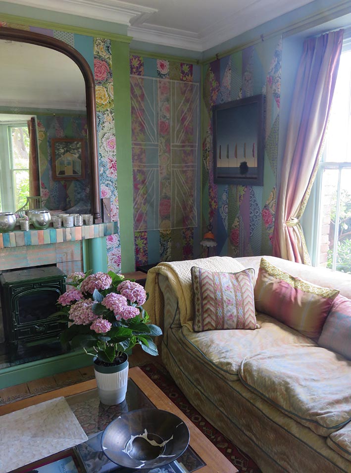
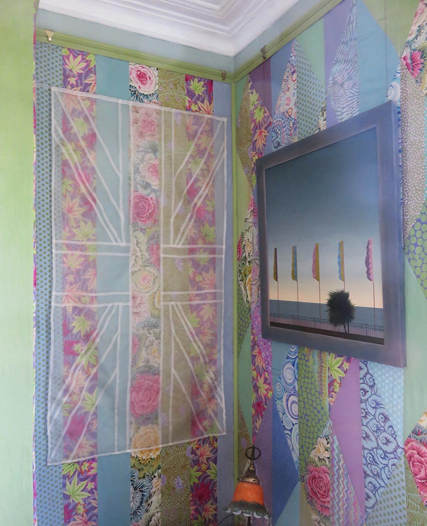
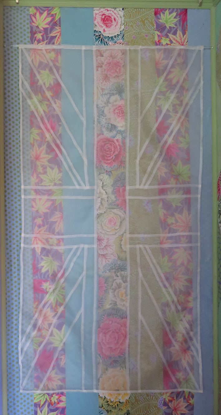
Above are 3 views of the chimney corner with 2 different totally different Flag representations. the row of flags at the sea side is an old painting by Stephen Jacobson next to a ghostly silk organza flag by Nigel Hurlstone. this piece of work proved pivotal for me to see how the room could hang together using cooler colours
Once we had started to put the room back together our 2 Irish terriers, Maeve and Murphy took a particular if very relaxed interest in it.


I found on Ebay a beautiful discounted Zoffany silk striped fabric and bought enough to make 4 very large padded curtains for the big Victorian windows in the room. The fabric cost me about 4 times the amount I had spent on the rest of the room…but they work well once I had trimmed them with some vintage woven ribbon that I over – dyed to suit the colour of the paintwork – as you do! And then I found these mazing brass tie backs on-line at my favourite store for just about everything decorative, Anthropology.
Continuing around the room…
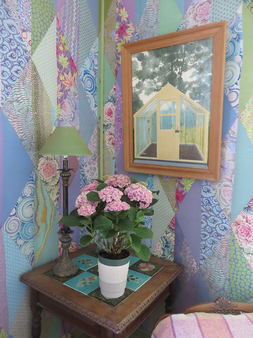
In the the corner between the windows hangs an old (and much loved by me) painting by my husband, Stephen Jacobson, of my father’s greenhouse that he built in my family’s garden on the Wirral in north west of England.
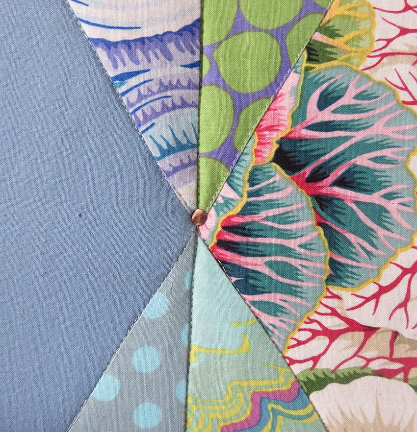
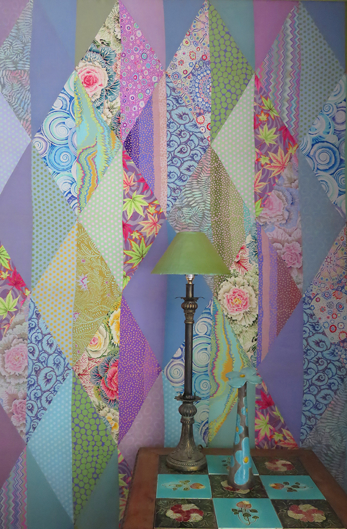
From the photographs I have posted so far it is hard to see that the patchworks are all padded and quilted, but it is evident that my ‘in the ditch’ sewing notbetter placed than my hammering in the copper tacks that fasten the fabric to the battens. On the tiled table is a flowery flower vase by Tean Kirby.
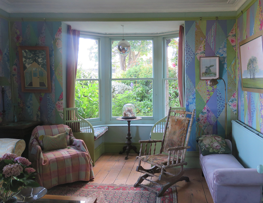
the opposite end of the room to the fireplace with the bay window looking out on the overgrown garden

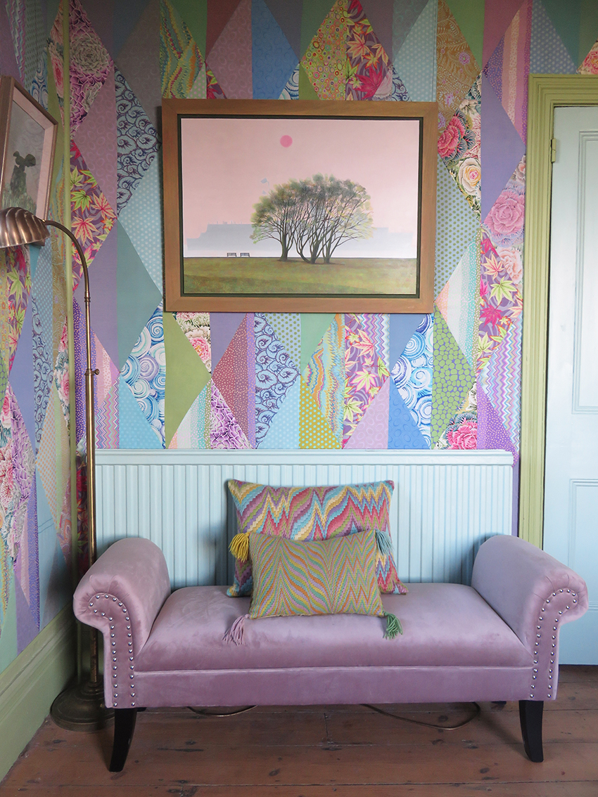
one of a pair of window seats with an old canvas work cushion sample and the luxurious silk curtains and brass tie backs. Then to the other new thing I bought for the room – the glamorous mauve velvet mini chaise – from a TK Maxx sale!!!!!! Well I had to balance the spend on the curtains.

Coming Into Port – Stephen Jacobson
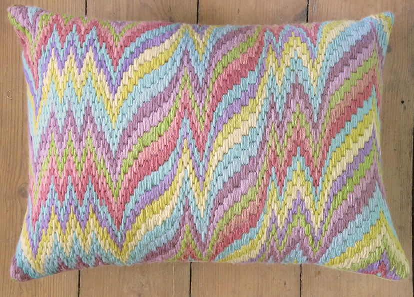
Above is ‘ Coming Into Port’ – I leapt on this for the room when it came back early from a “closed for Covid” exhibition and it fitted perfectly. Basically our house serves as a venue for our joint work. I made the large cushion especially – it uses all the major colours of the room, and in fact the whole house, in my wonky version of Flame Stitch; and I have been commissioned to make a design from this by Ehrman Tapestry so look out for it next year if you stitch canvas cushions.
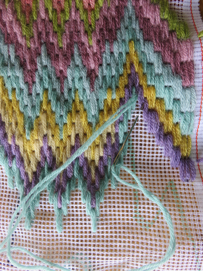
So here we are at the porch door again – and the gingers are waiting for us – well actually for Stephen with the biscuits to get them to pose….
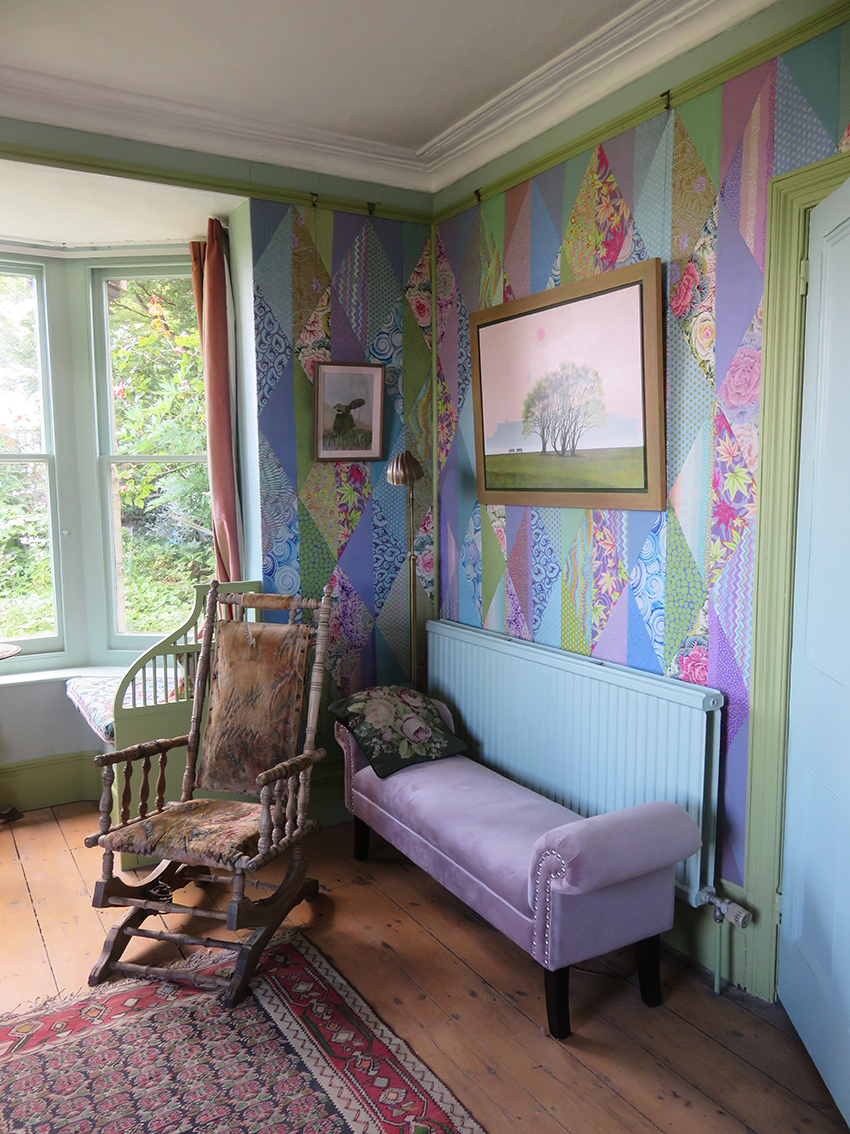
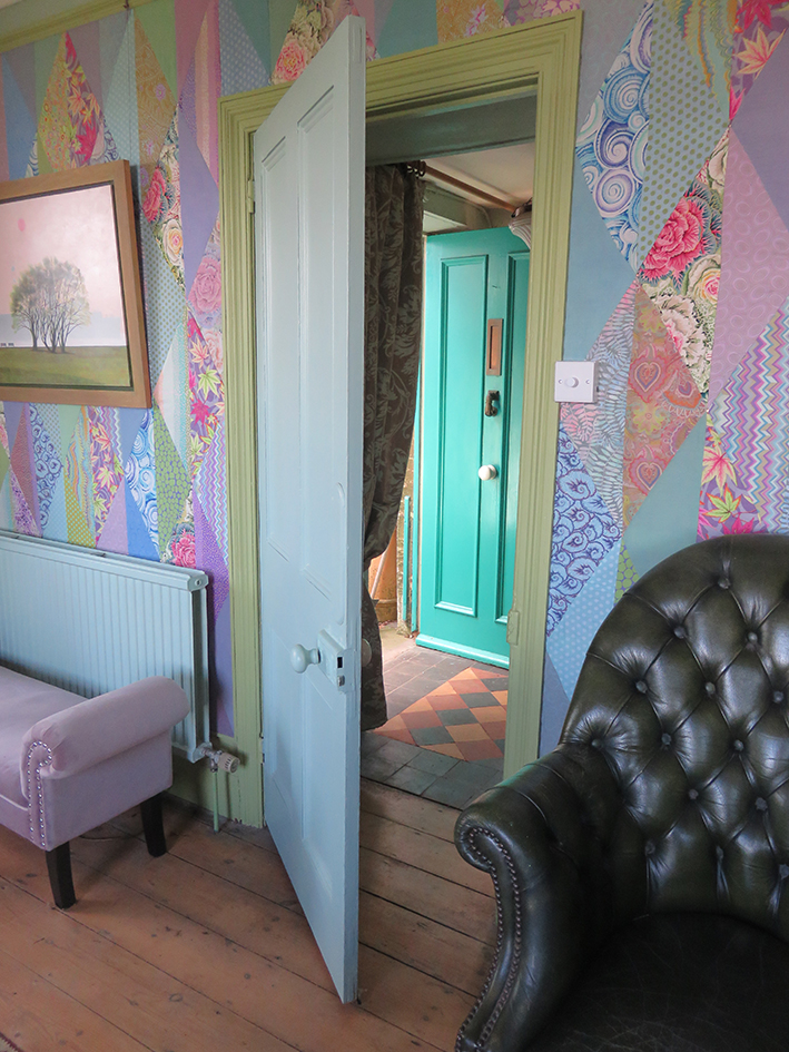
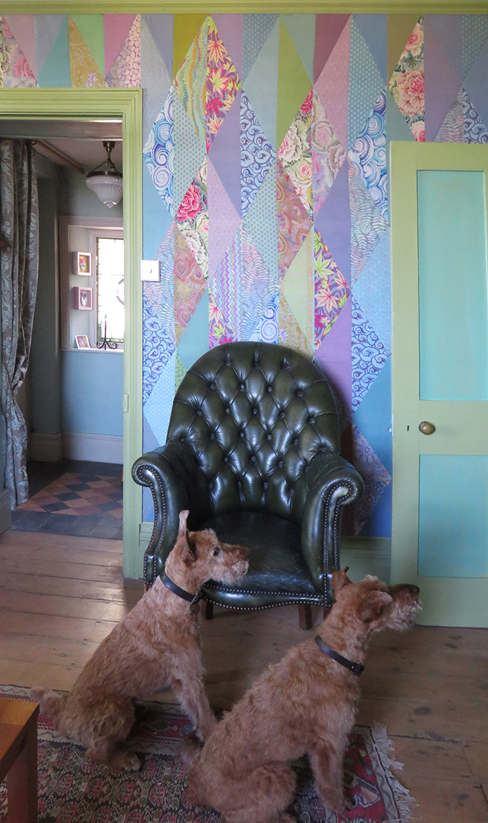
and that is it – at last after so long – finished enough for people to see it – with the doors and windows open and only 4 visitors at a time!
The patchwork walls are almost completed, just some finessing needed so time to think of the fire grate. We measure carefully and then cut 20 copper tiles ready to be decorated – using my favourite Drawn Threadwork stencils. I started to scribble lots of ‘back of the envelope’ ideas as to design layouts – but decided to just make the stencils and then see how they best worked together.
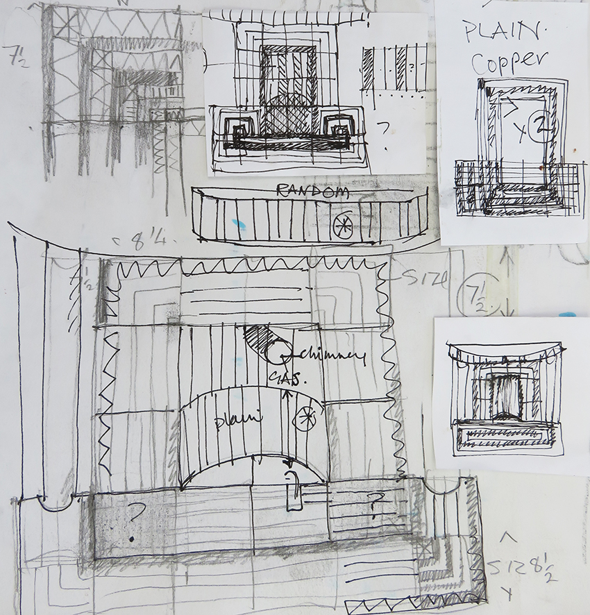
An assortment of design, scribbled ideas for the enamelled copper tiles ideas
I found a small table cloth ( in my stash) with very large scaled drawn thread-work embroidery that would be suitable for this making many variations from just 2 basic designs. I needed 2 stencils one square for the corners of the grate and a striped version for the longer lengths. Initially I thought it needed to be made larger to fit the cut copper tiles so I had to extend the stencil. I appliqued extra pieces of embroidery, using a machine for strength (for when it is stretched on a frame) then cut away the linen beneath it.


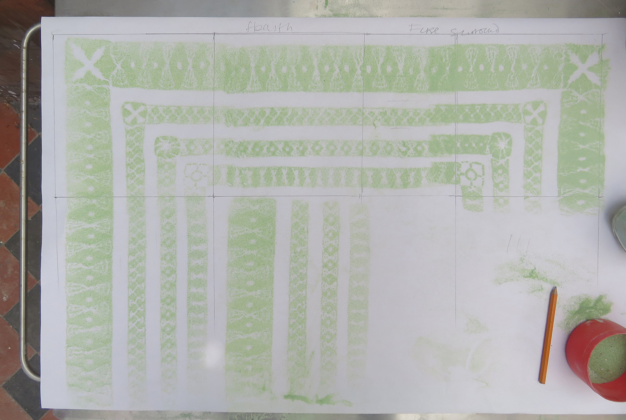


meanwhile the rest of the copper tiles have been cut and checked for how they fit together – like everything else in this very old house nothing it straight or even.
i had wanted to verdigris the tiles but decided to stick with what I knew, so I started sampling the enamelling colours. It is a few years sinceI have enamelled anything but remember the colours that will best look like verdigris – I match the pale greens and blues to a naturally verdigris copper strip I found in the studio


samples of copper enamel colours to make a similar effect to the real verdigris copper strip, the first set of hearth tiles placed in position for deciding the final design


after the gas stove had been replaced in its original position, I continued to adhere the top set of tiles in their allotted places. They make a very uneven but harmonic set of colours…so then I needed to re-paint the surrounding columns and wooden skirting to blend in with the rest of the room.
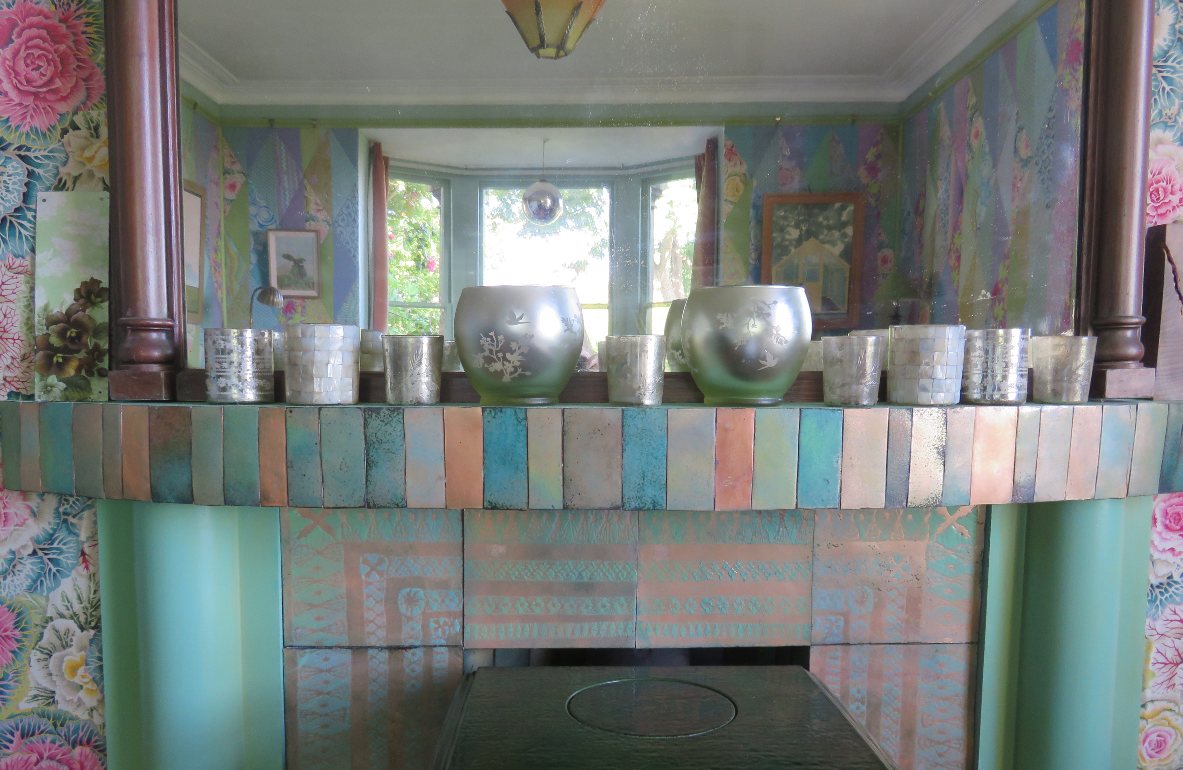
finally I ran around the house searching for the pieces I could put on the new mantlepiece – my old mirrored glass candle holders fit in very well. The small separate enamelled strips of copper are leftovers from cutting the tiles, plus anything else I could find in the studio that could be fired with the remains of the vitreous enamel colours – real make do and mend patch-working.
My next post will show the whole room complete with art works, cushions and flowers!
although I was not aware of it at the time I wrote this blog this is the very last post for Heart Space Studios…we conducted many more parties, clubs and classes , we have now ceased trading as a class based studio – however I continue to make my work and explain many different ways of constructing and thinking about the making of ‘Her Work‘ in my ongoing blog http://www.janethaighherwork.com.

Autumn is here and the new term started for Kantha Club – run by Susi Bancroft for Heart Space Studios. We all wanted to swap summer experiences and stories and show what we had been up to – or not!

Susi had embarked on a very large piece ( I meanwhile had put my first attempt at a large piece aside). She had dyed the fabric in Turmeric and Tea to get this very subtle yellow. She finds it easier to hold the needle at the eye end to keep the cloth steady – so each stitch requires 2 hands on the needle, standing to work on such a large-scale fabric she says ” I am surrounded by beautiful colour with the light behind you, like being cocooned in colour “


Explaining how she made decisions for spacing the stitching bands by using simple hand measurements she said “I used the fact that I couldn’t see the whole cloth working so close up so the hand spans were the measurement I adopted”

to enable her to keep stitching rhythmically while standing up, she threaded several needles at a time in different colours, using each as she felt that she wanted them – relying on her instinct for the colour striations, she enjoyed the feeling of the fabric being “just being out of my reach’ whilst she worked.
Kay Swancutt showed us some dying samples that she had stitched , she had exhibited these recently at Nature in Art and used many natural materials to make the different patterns and colours


Steph Wooster brought several examples of her earlier drawn textile work that she has now worked with a kantha stitched ground…these were also exhibited at Nature in Art and I feel that they could lead to even more intricate background stitched patterns – I am thinking animal skin patterns, leaves, grass..

I particularly like the combination of the stark elegant drawings and the tone on tone rippled grounds.

she also brought a new piece fabric that she wanted some feedback from us – it was a parachute silk sheet, very old and damaged,

she wanted to mend it – we suggested she start with the weakest area.

Meanwhile Naomi Clarke has been having fun just using Kantha technique to stitch the patterned cloth and also appliqueing it to the tie- dyed ground – as a technique this could really be developed to make lively fabrics

I had started another project in the break – a quilt based on a painting by Alfred Stockham, an old friend and ex colleague, it is a small painting that had always called to me to be made as a patchwork…

starting in the top right hand corner I ripped some pieces of shot cottons into squares and strips and stitched them down onto a red cotton ground…the coours of the threads made for the nuance of his dragged brush marks


during the last few hectic weeks of launching my book it has been a relief to get back to simply stitching these square transitions from paint to cloth
I am interested to see how each square is in itself a small complete composition


I am fascinated by this work but it may take some time to get finished
