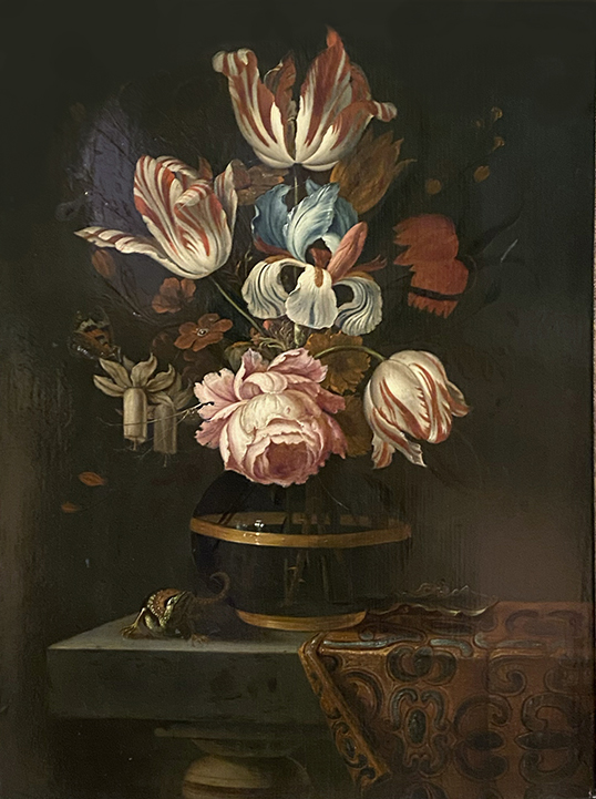
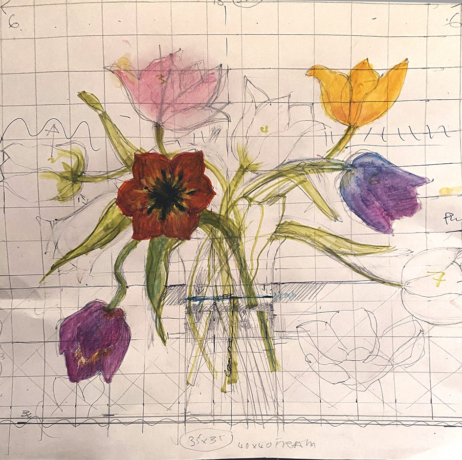
The classic 17th century Dutch paintings of fabulous flowers, but this arrangement probably did not really exist. The modest bunch above, features early spring Daffodils, with mid to late spring Tulips and Irises, and yes they can all grow in the same season, but the give away is the fully formed damask rose seen only in mid summer. It demonstrates how the artists worked: each flower was a sample of horticultural expertise, painted when it came into season, then there was a wait for the next bloom to come to perfection.
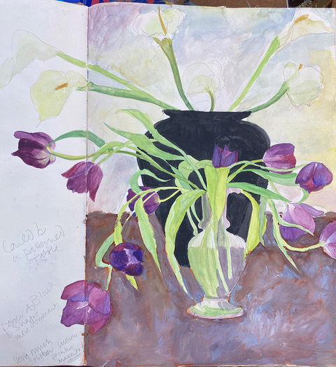
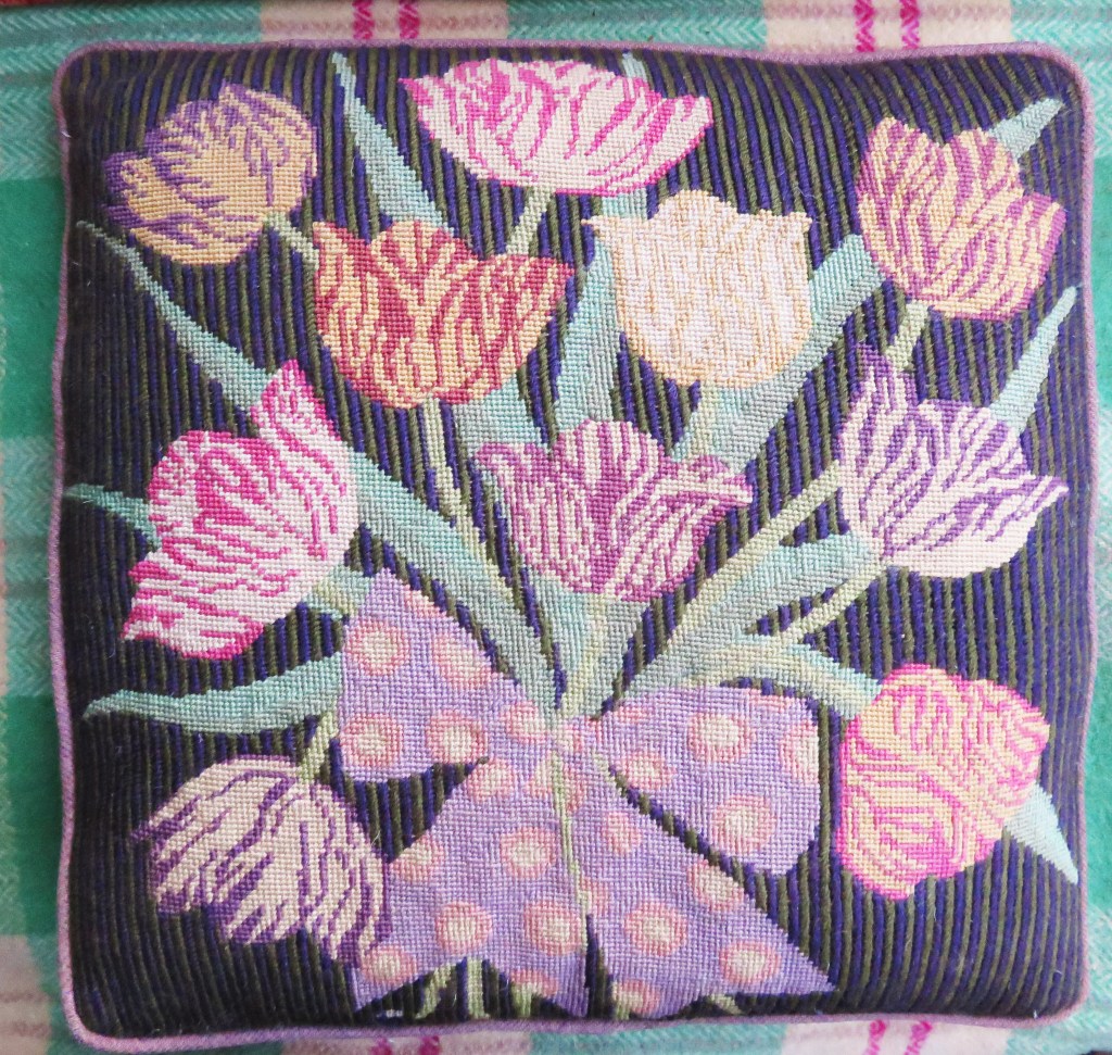
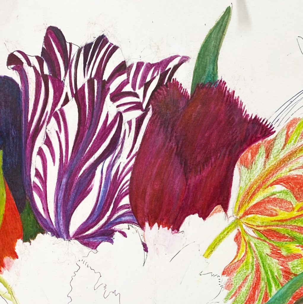
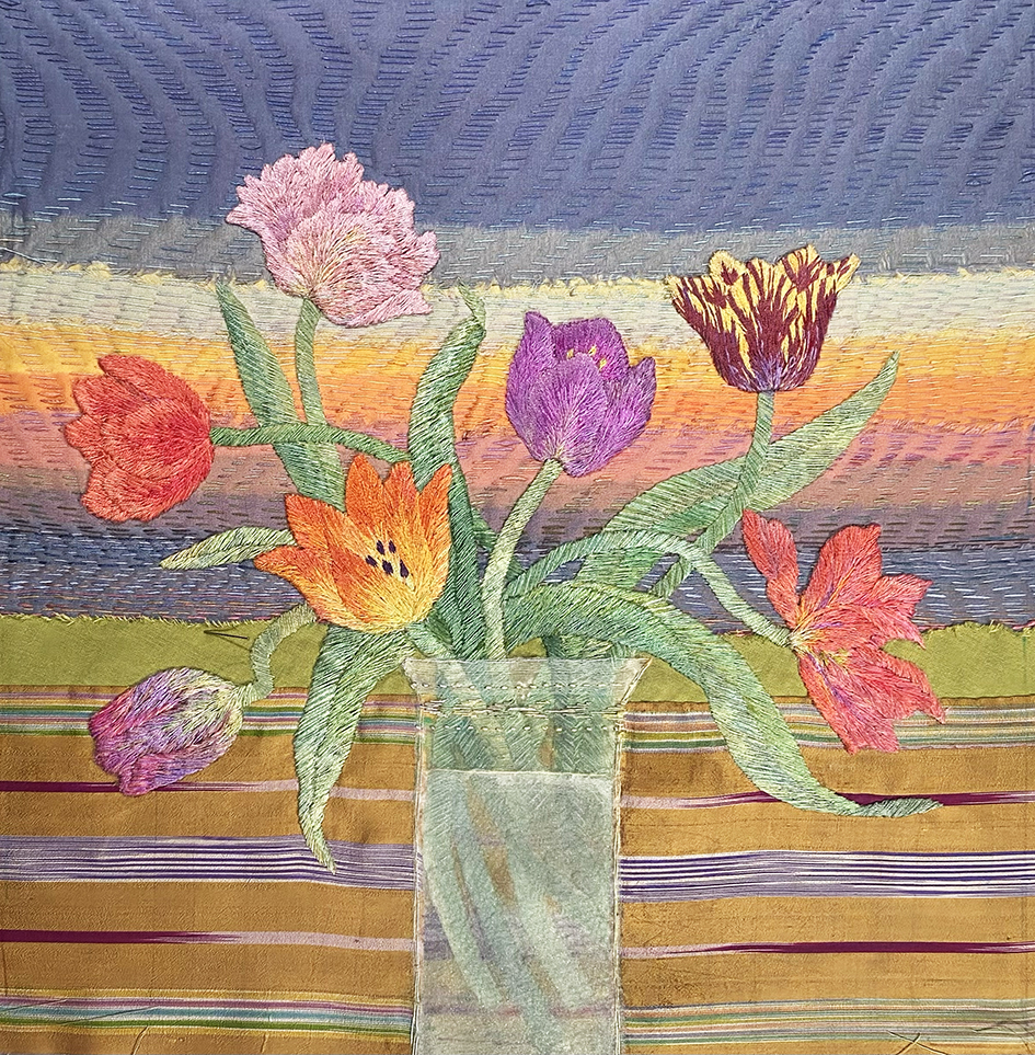
So last year when I was commissioned to embroider ” a vase of colourful tulips” during my Hidcote exhibition, and I realised that tulips would not be in season in October when I could start working on it. I decided to find tulips within my own work and remembered a very old sketch book with a vase of drooping purple tulips ( circa 1980). Always keep your sketch books!
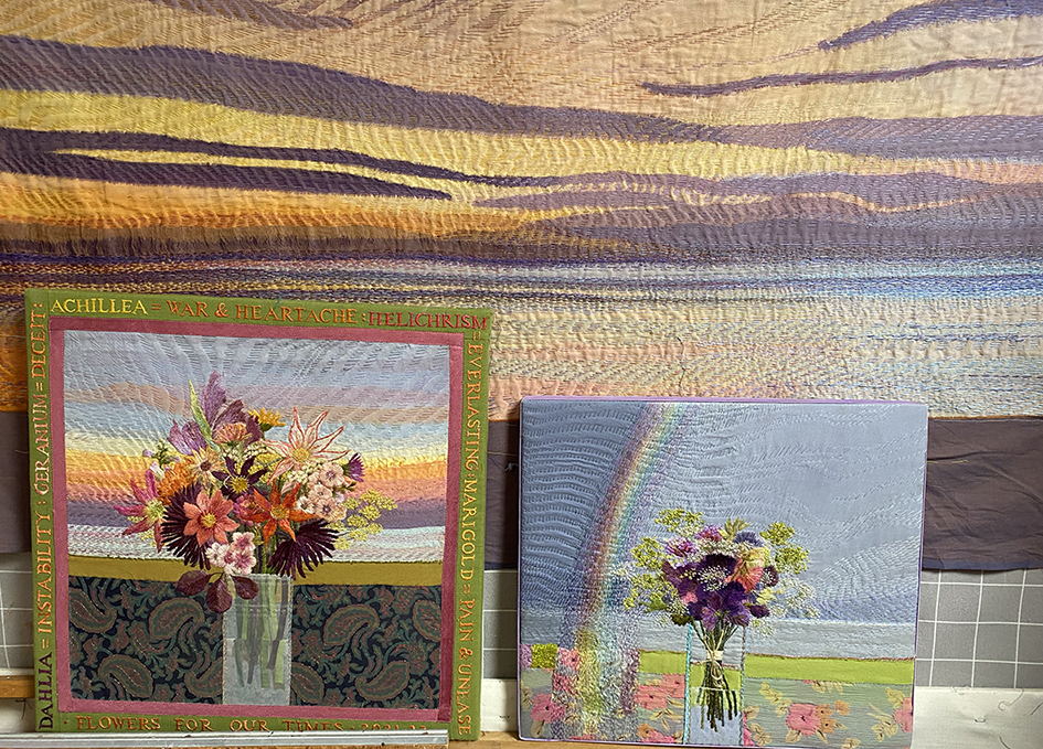
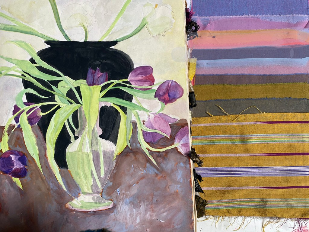
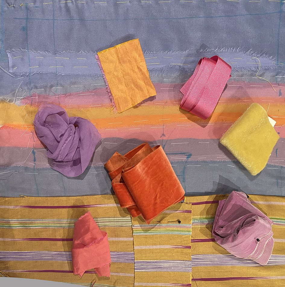
Above is the inspiration behind my latest commission. Below shows my studio wall with earlier flowers against stitched Kantha skies…with a sample of different fabrics to act as the background
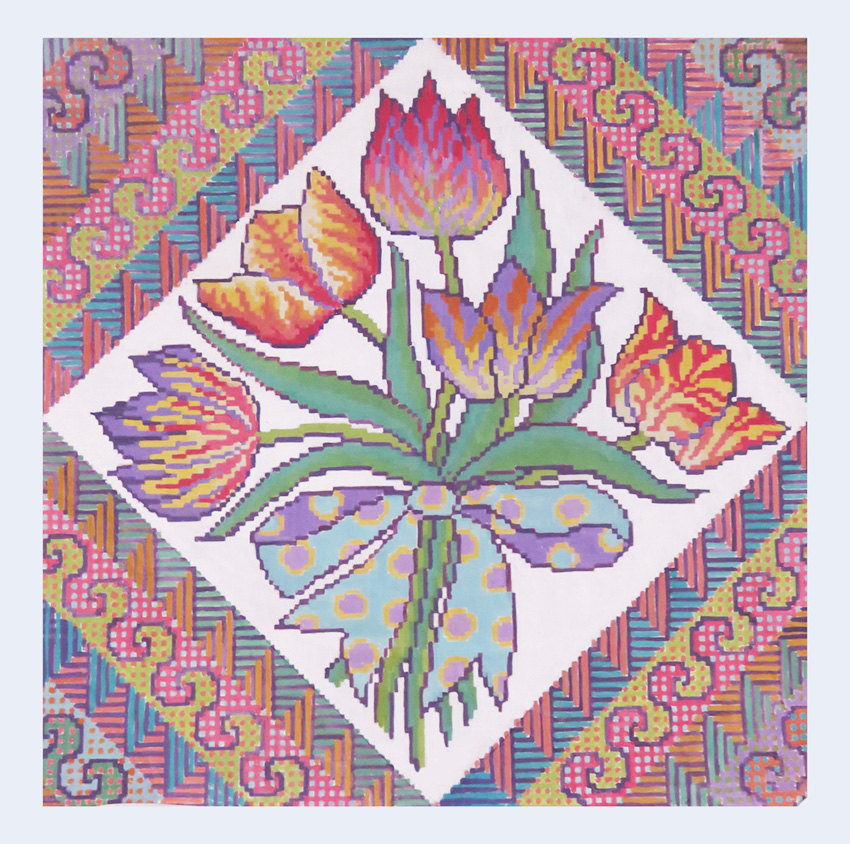
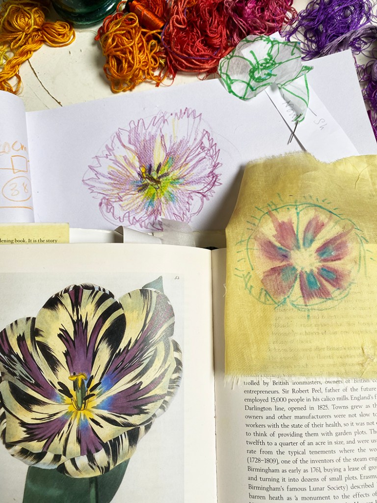
Now I needed to choose some colourful tulips to put in a vase. I started with my sketch, below, of some striped tulips that I have used many times for different projects. It was at this point that I sent images of ideas and sampled fabrics to the buyer – for any feedback then with her agreement I went ahead and started on the actual panel. But with the stipulation of no other sighting until the piece is finished !!!!!!!!
Here is the drawing used again for the front cover of one of my embroidery books, and on a detail of Tulipomania now used for a print in my shop,
Below, designs for counted thread canvas work woollen embroideries – a good drawing goes a long way!
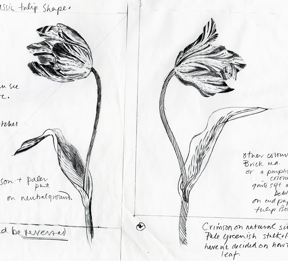
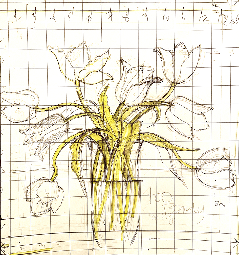
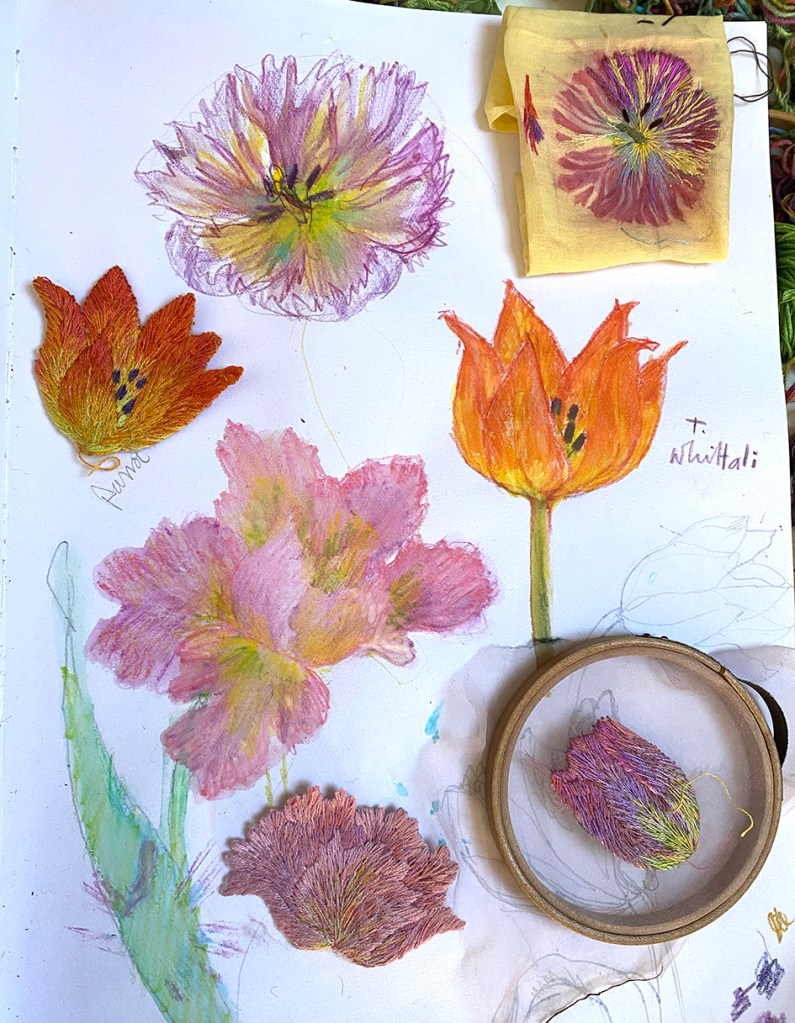
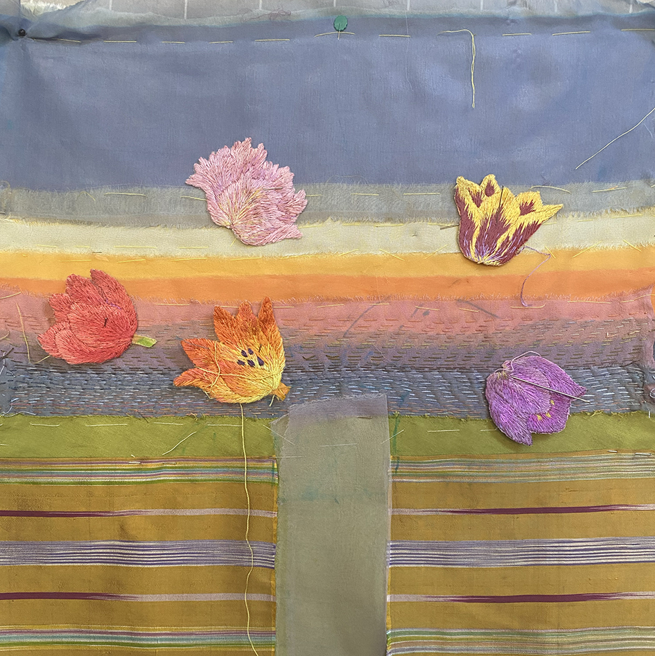
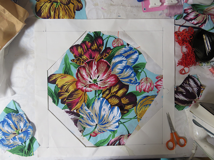
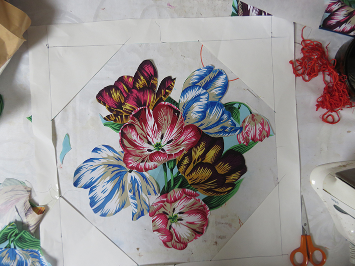
Now to flower arrangement – I am not good at arranging flowers and I really have to work hard at this aspect of my flower embroideries. I edited the tulips from the original early drawing as I did not have the time or space to stitch 10 flower heads in different colours and shapes. Below are 2 of many early drawings graphed for transference to the stitched ground.
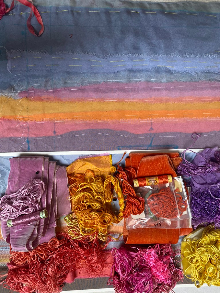
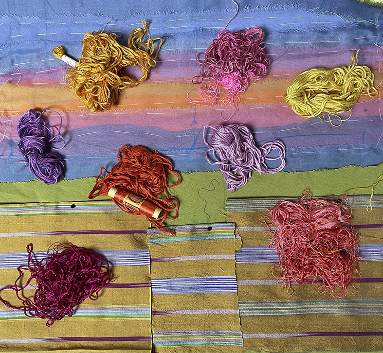
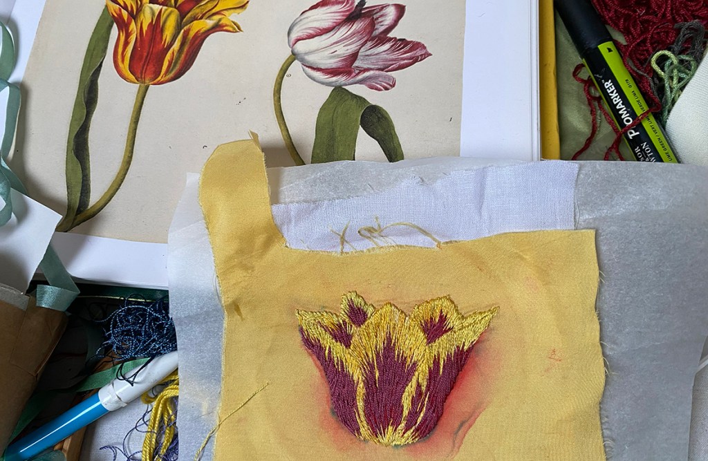
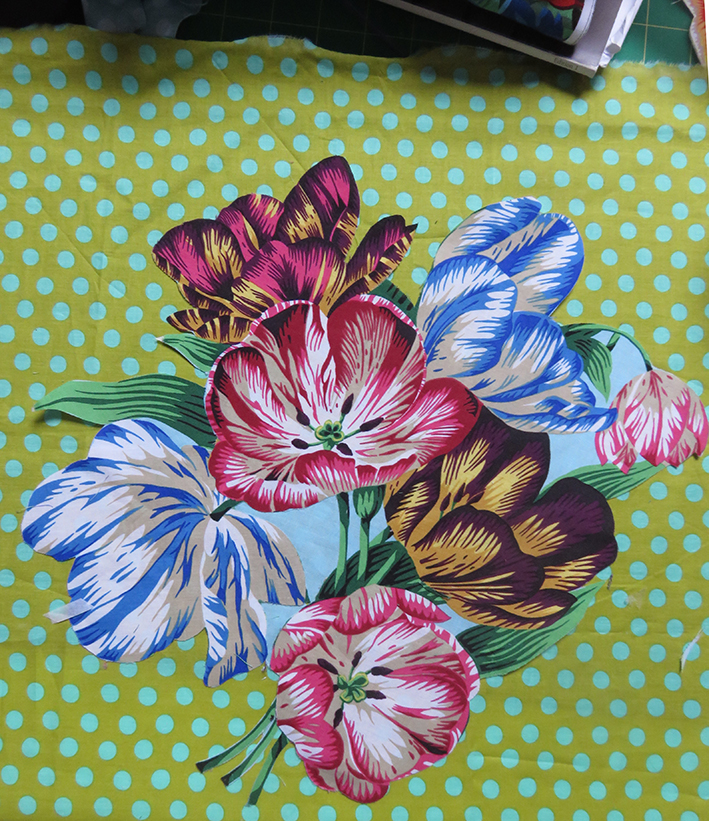
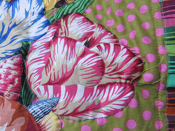
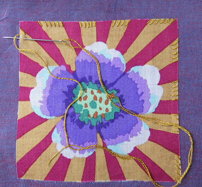
And to colour, the tulips need to work with the sky, and the sky is all organised, tacked ready for quilting between stitching the tulips.
To enable me to gauge the placement of colours against the already glowing sky, I wrapped some silk ribbons to act as flower heads, found the silk threads to match them and took colour notifications – if only things work out so simply in reality – but I was starting this bouquet from scratch.
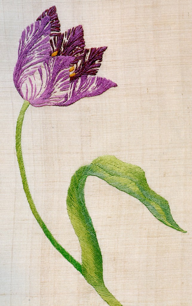
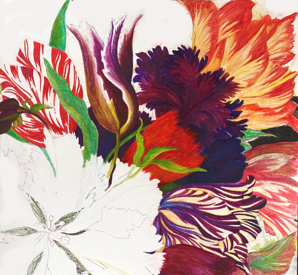
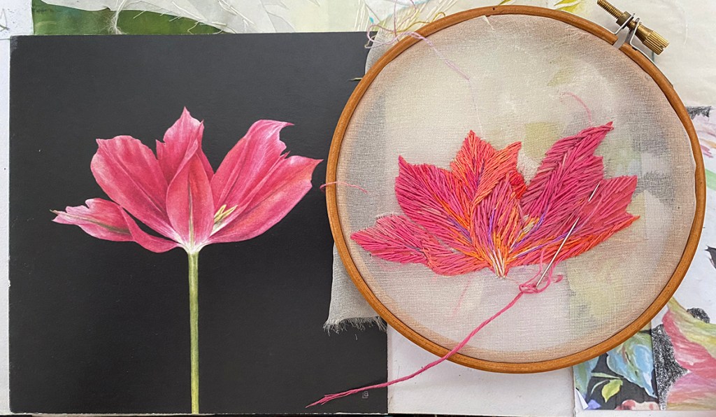
Drawing, redrawing, sampling and stitching one by one each tulip head is made,
Below show older drawings in my current sketch book; plus my friend Lizzie Butler’s birthday card to me – I just copied it straight onto silk organza – with her permission of course!
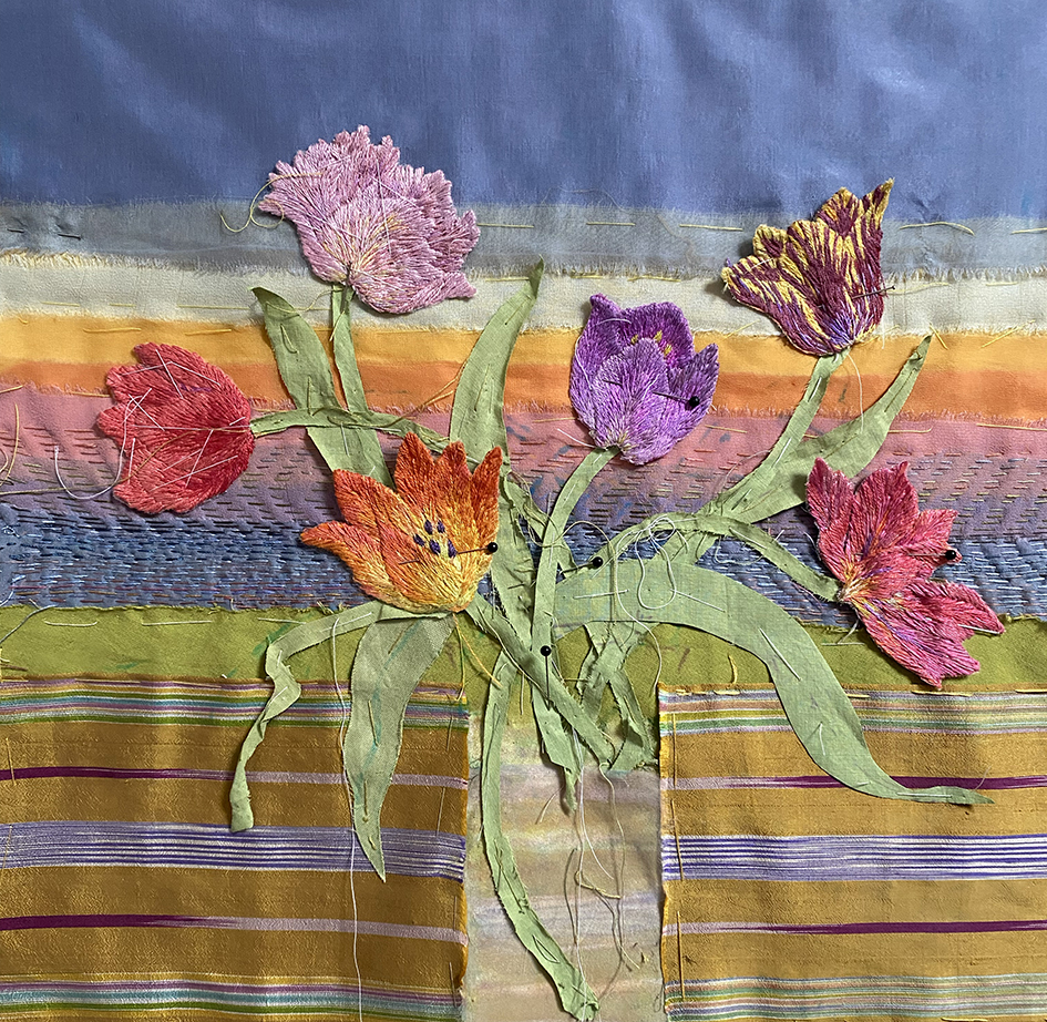
When enough heads are made I start to arrange them on the background….and then the leaves. I just love to draw tulip leaves and their colours are so soft and gentle. I start with cut linen shapes from my original drawing in order to stitch over them to give definition; getting there.
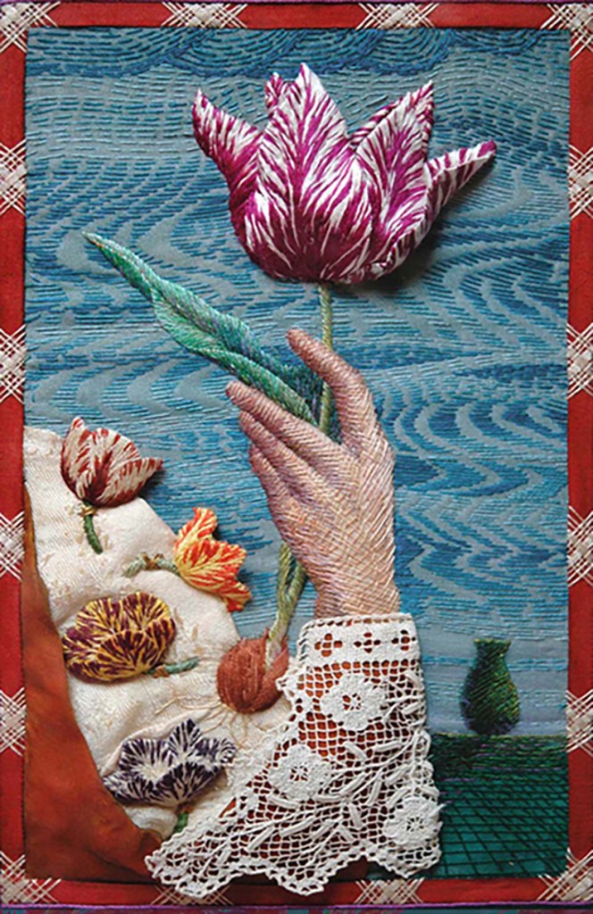
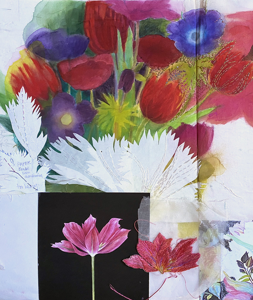
And last the vase – which is another story – believe me!
I truly enjoyed this work, creating spring flowers in the depth of winter, but it was a challenge as you can see. It is now safely framed and given straight into the hands of the son of the person who commissioned me; he had seen my work at the exhibition and talked about it…..and he has promised to send me a photo of the framed work in situ in the new house.
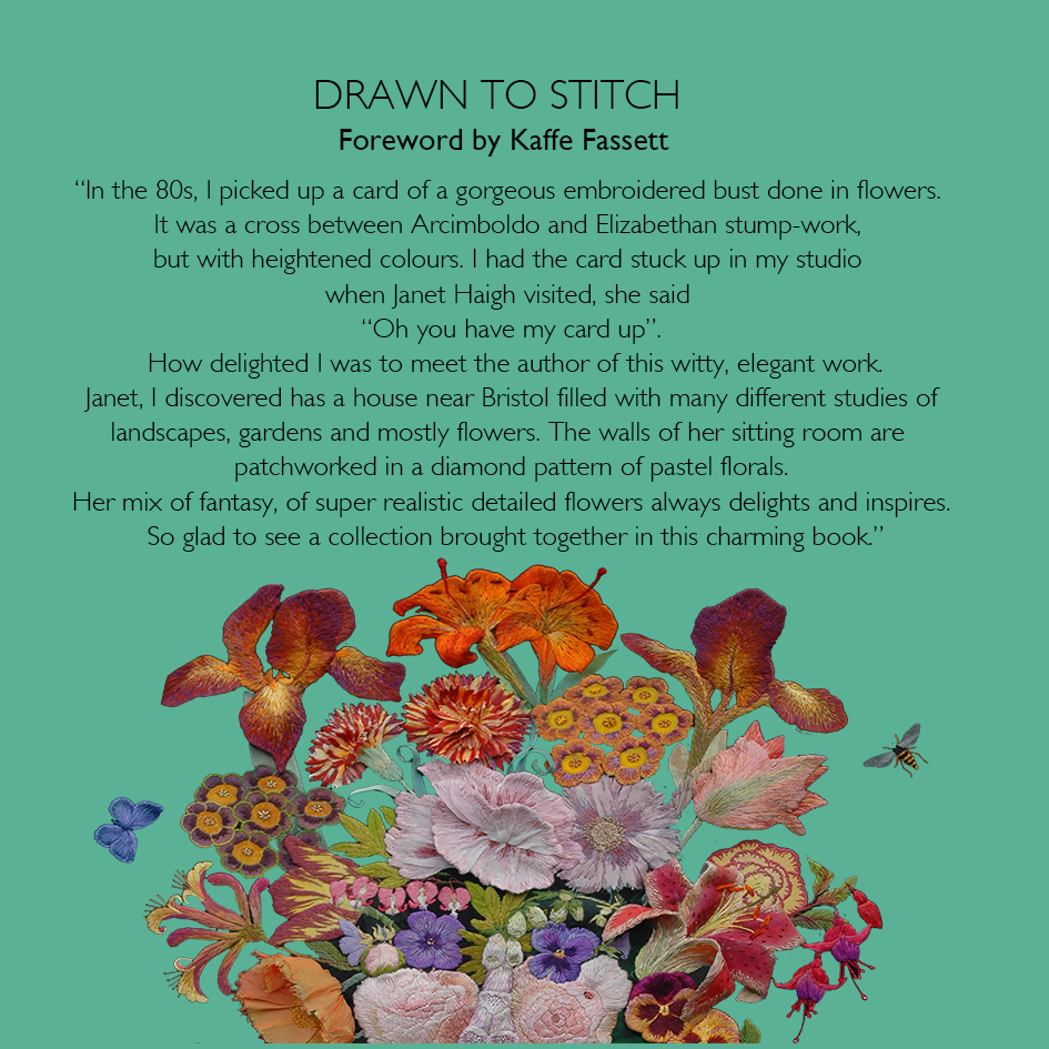
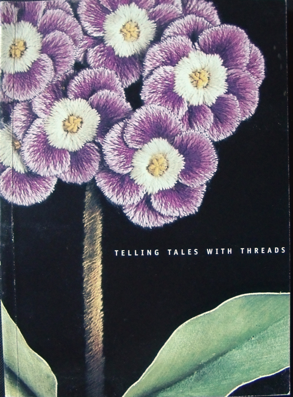
This is the foreword, kindly composed by Kaffe Fassett, for the first page of my latest book I made as a catalogue/ picturebook to accompany my latest exhibition Inspired to Stitch: Hidcote Revisited. at Hidcote gardens in Gloucestershire.
It illustrates part of the story of my career in stitched textiles, from my first ever embroidered picture above, made out of the sheer frustration of working in the fast-track commercial fashion industry in London, after I left Liverpool Art College in 1970. And it is an imagined garden.
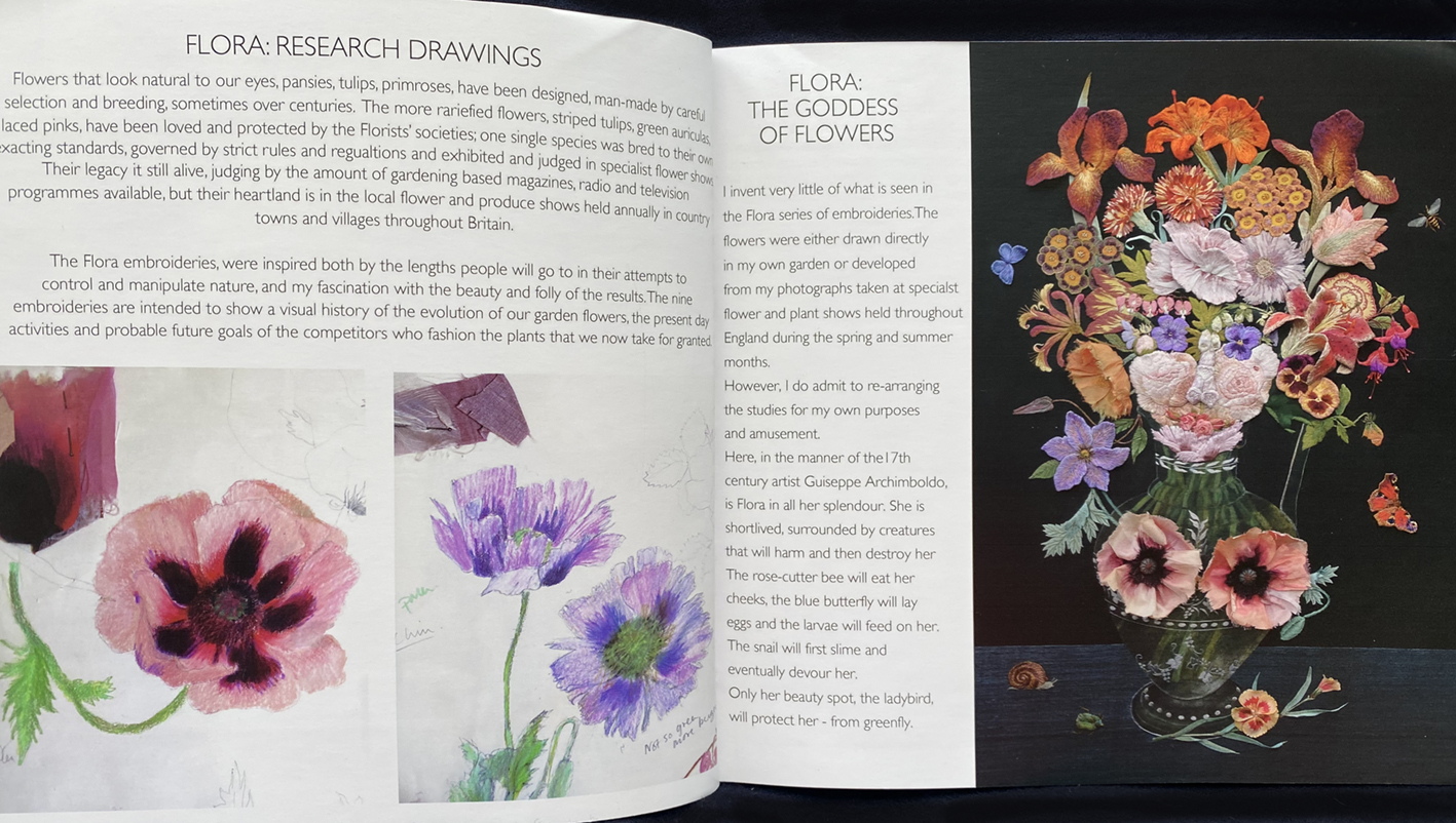
Fast forward several years to 1992 (you will have to buy the book for more information)and I am totally committed to all things flowers, gardens and topiary! Here are several pages from the book to whet your appetite and first here is Flora, the Roman goddess of Flowers.
Flora is the central image of 9 embroideries called ‘The Flora’ that tells a visual history of the development of, what I now think of as, “designer flowers”.
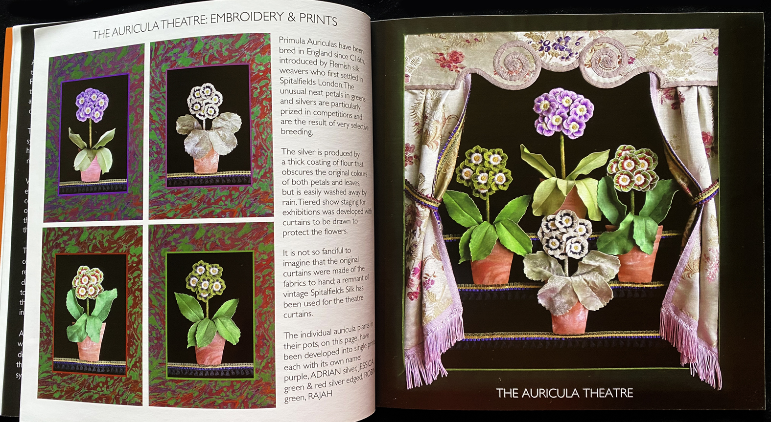
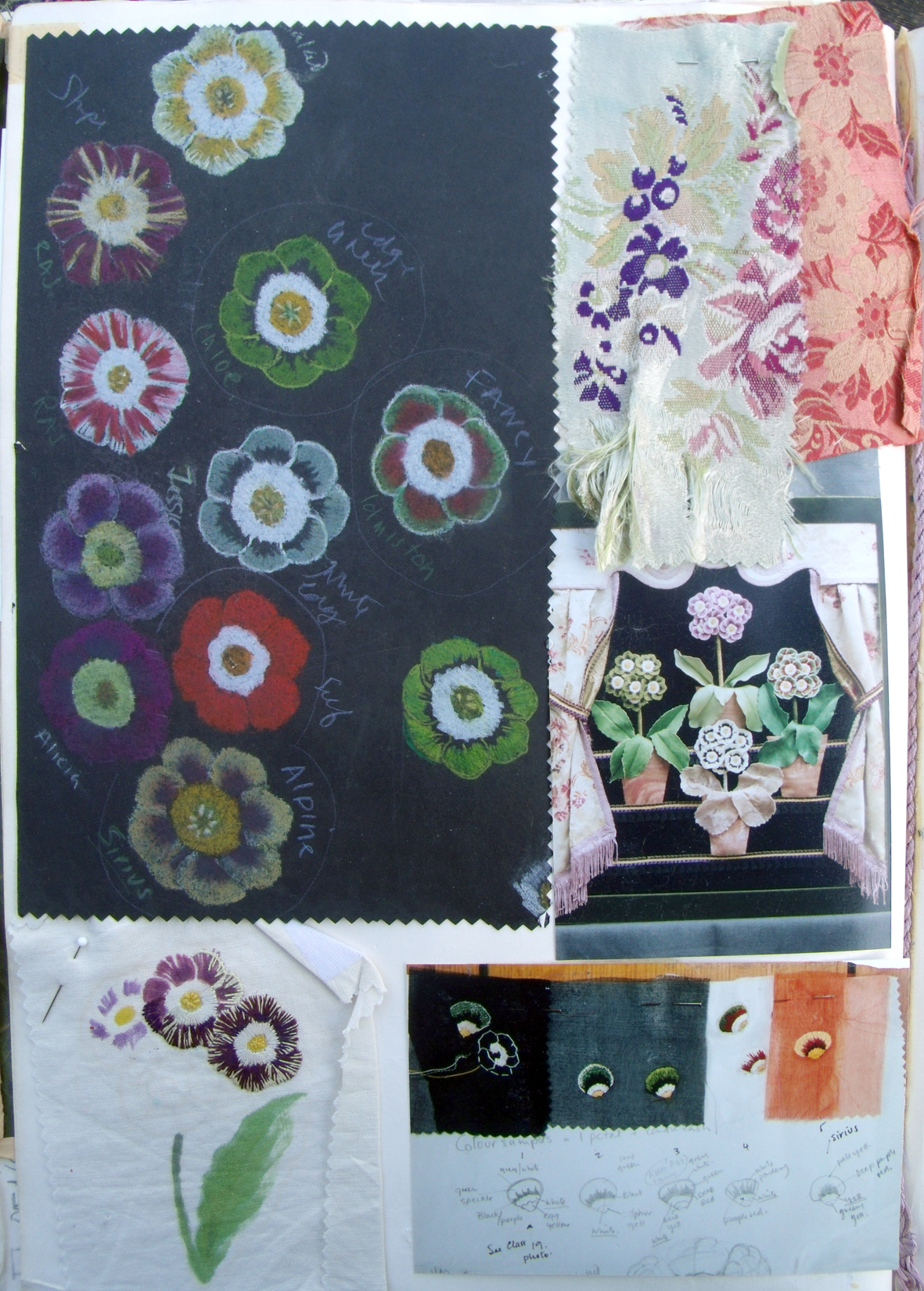
The Auricula Theatre above, with a series of small giclee prints I developed from the original silk embroidery. The protective curtains are made from a piece of vintage Spitalfields silk.
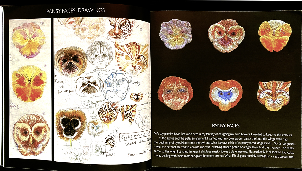
Pansy Faces and my drawings for the inventions I imagined as my exhibit in our town’s annual flower show.
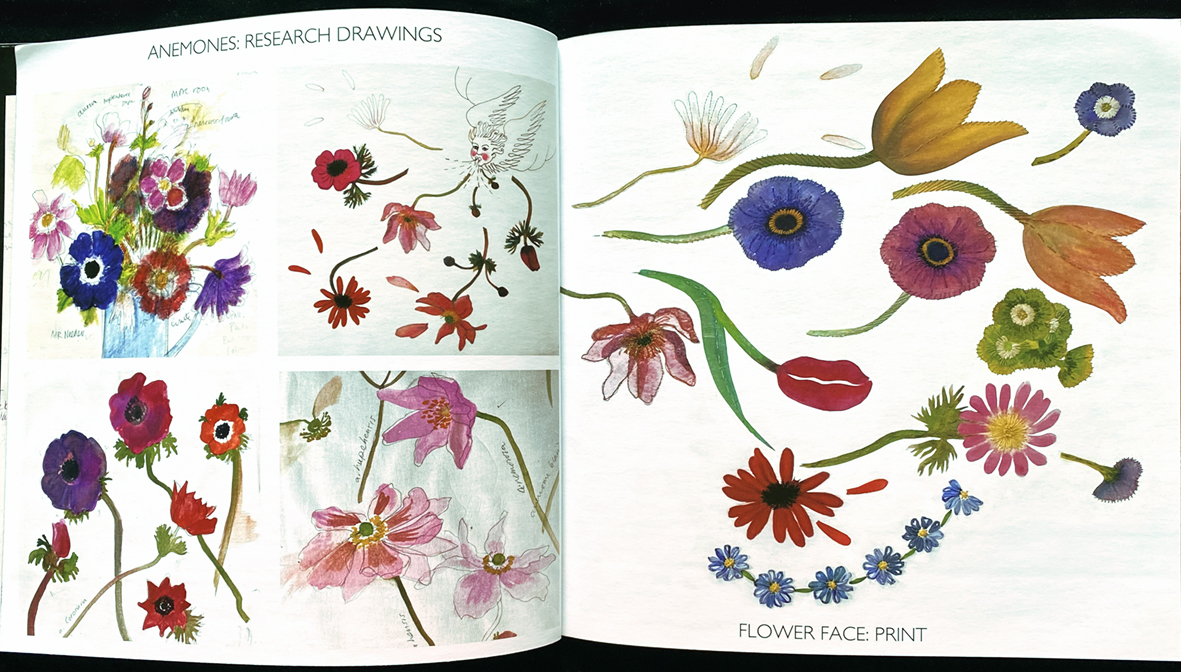
A personification of Blodeuwedd, or “Flower Face” from Welsh folk lore; this is a giclee print of the original stitched silk collage on paper, that I developed from my old drawings made for ‘The Flora’ .
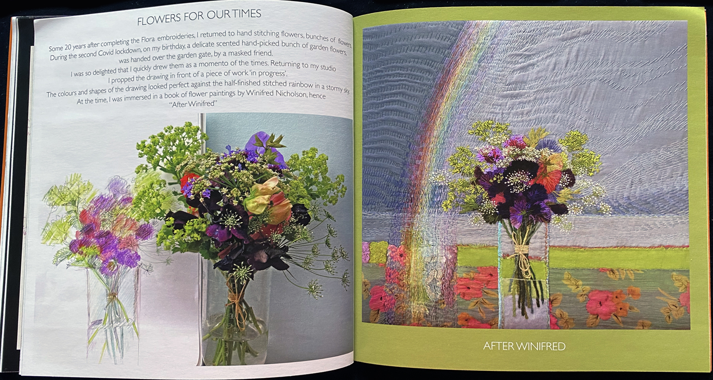
Here is a bouquet of hand embroidered flowers in ‘After Winifred’. I was given this bouquet during Covid, by a masked friend, in my garden, on my birthday. I was looking back though my Flora drawings to make some joyfulembroideries and had bought a book of flower paintings by Winifred Nicholson……
I keep a careful record of all my research drawings, this results in a whole range of different drawings, samples, notes and photographs being kept for further inspiration. Here are typical ways that I use these ideas and studies for new works. Above are some pieces of ‘The Enamel Garden‘ a major academic research project into using textile techniques for other materials, here vitreous enamel on hand cut sheet copper. It is possible to trace how I used my research drawings to create these flowers and hedges.
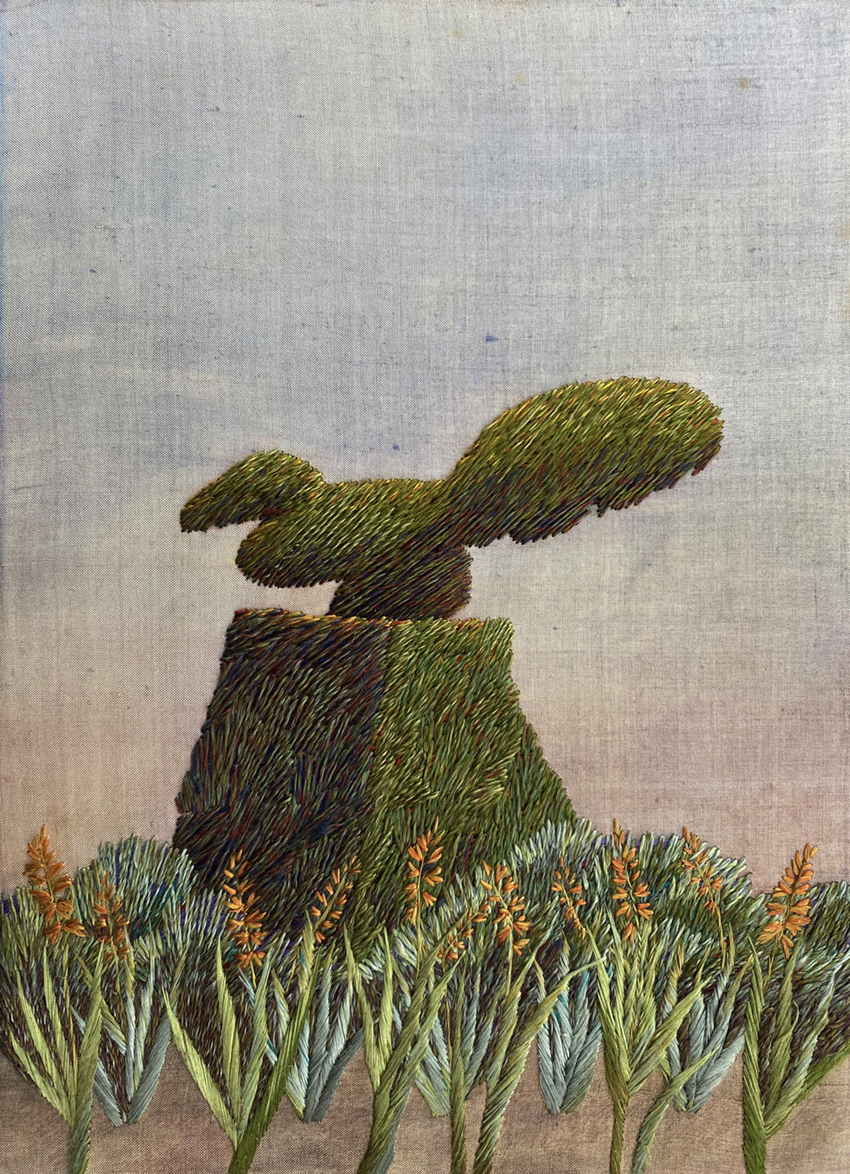
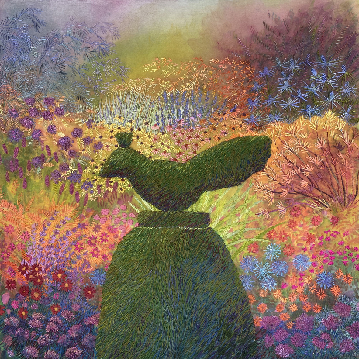
And my latest canvas work design for Ehrman Tapestry, a version of the Vintage Topiary Bird used for the front cover of the book. I designed this especially for the company to make a kit of this design to celebrate the exhibition…. I will keep the post about making it until later.
And at last I am selling the book from my Shopify site ( QR code below). Above is the flyer for the Hidcote exhibition that gives access to more information into to all the works contained in the book. But best of all in the first week of the show, my first package of books and a giclee print ready to be posted.
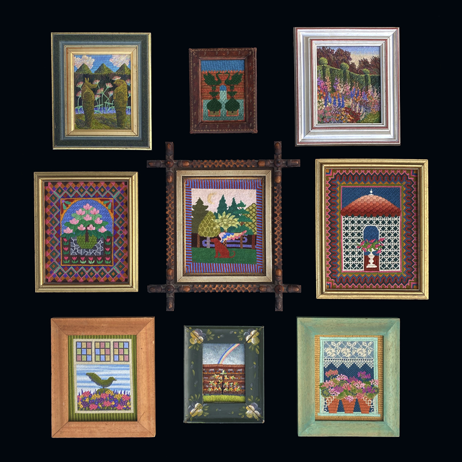
Invited to exhibit my embroideries at Hidcote Manor, a National Trust Garden, in April 2025, I immediately thought of my first visit in the 1970’s; I had just started to embroider, and the effect that it has had on my stitched work ever since. Above is a small selection of my first-ever embroideries that were inspired by my delight and fascination with gardens and flowers.
I stared with basic canvas work and enjoyed the restrictions imposed by the strict stitching and its filling-in-until-you-finish discipline. I was designing pictures in order to learn to embroider my ideas.
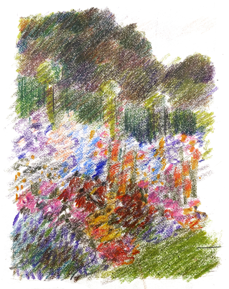
It was after visiting Hidcote that I started to draw gardens, mostly details of planting and of course, topiary. I took photographs and scribbled down notes to remember colour planting and topiary shapes to develop into embroideries. Now I realise that this was the time when I found my own way of stitching by using blended colours and really just stitching my drawings. I always scribbled drawings, took too many photographs and made notes ready to be tranformed into working drawings, and this is how start my work now, almost 50 years later.
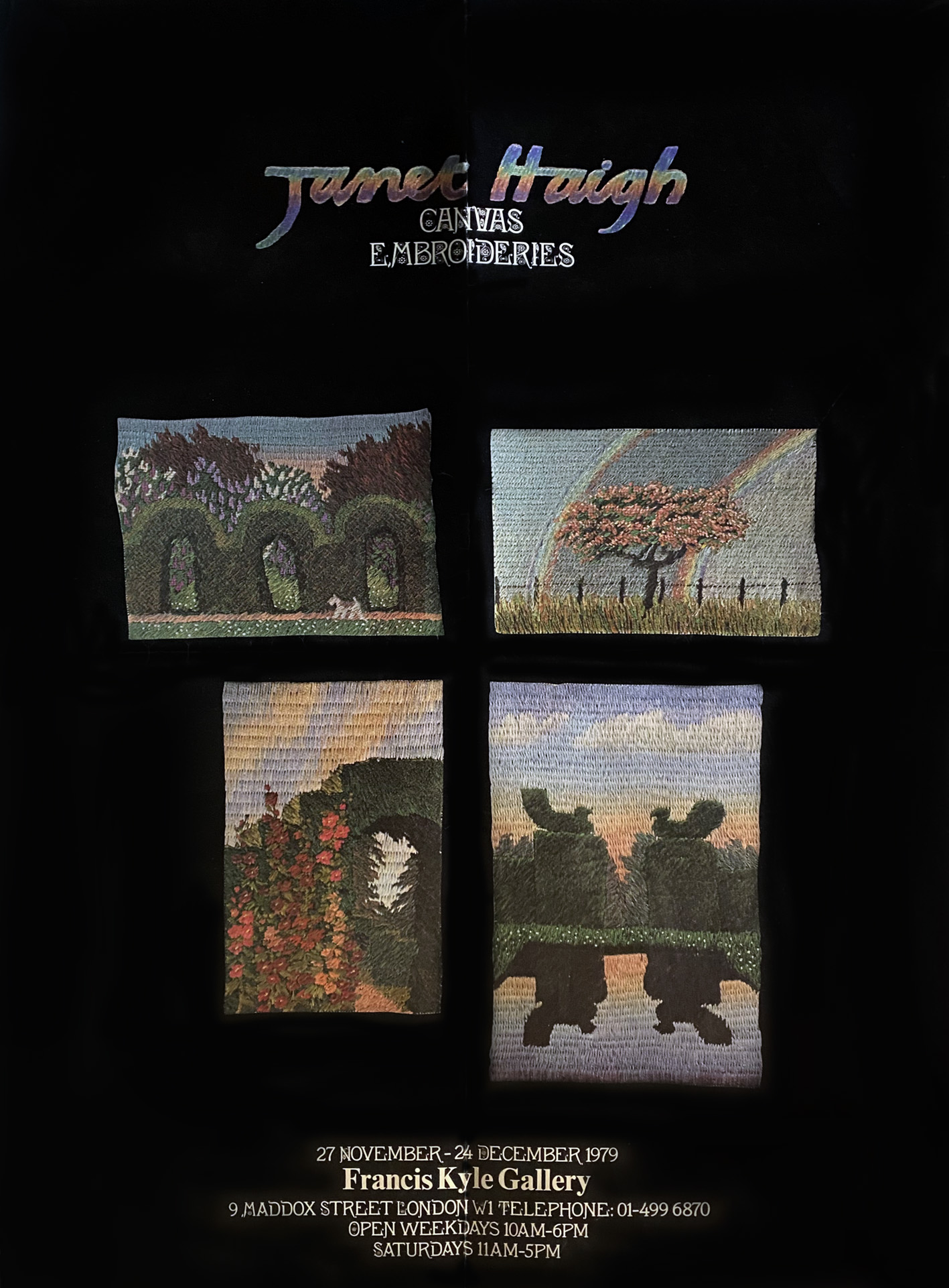
Above a rather creased poster from my first one person show at Francis Kyle Gallery in 1979, showing my small scale canvas embroideries. My early fascination with topiary is evident.
Oddly I do not actually like the idea of strictly clipped hedges, specially when trimmed into animal and bird shapes, but this feeling completely disappears when I actually see it for real. I find this ambivalence really useful and for me it provokes new ideas; why bother to make anything that holds no meaning, mystery or is simply a puzzle for you to try to solve? But mostly I am delighted by the sheer absurdity of it. Why do we tether bird-shaped hedges to heavy domes of yew – to stop them flying off?
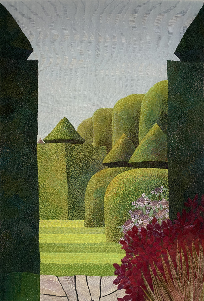
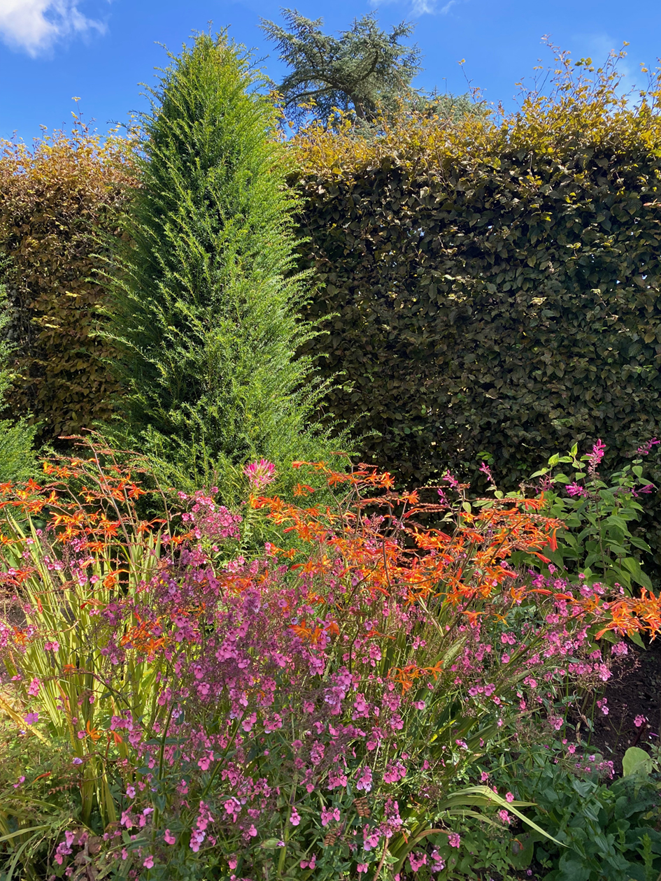
And I have continued to embroider the topiary figures that are often seen in grand gardens. Above is ‘Great Dixter’ a small silk embroidery circa 1980, that was very inspirational in making new pieces for this exhibition. Right is ‘Lytes Carey’, another National Trust garden, this is made mainly with simple large running stitches in woollen yarns onto a wool ground for a big woollen panel, in 2001. I always enjoy seeing the dense green walls of hedges surrounding an abundance of flowers, as seen below on my several visits to Hidcote in 2024.
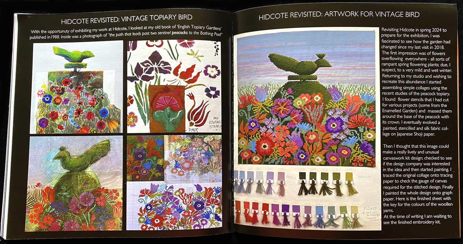
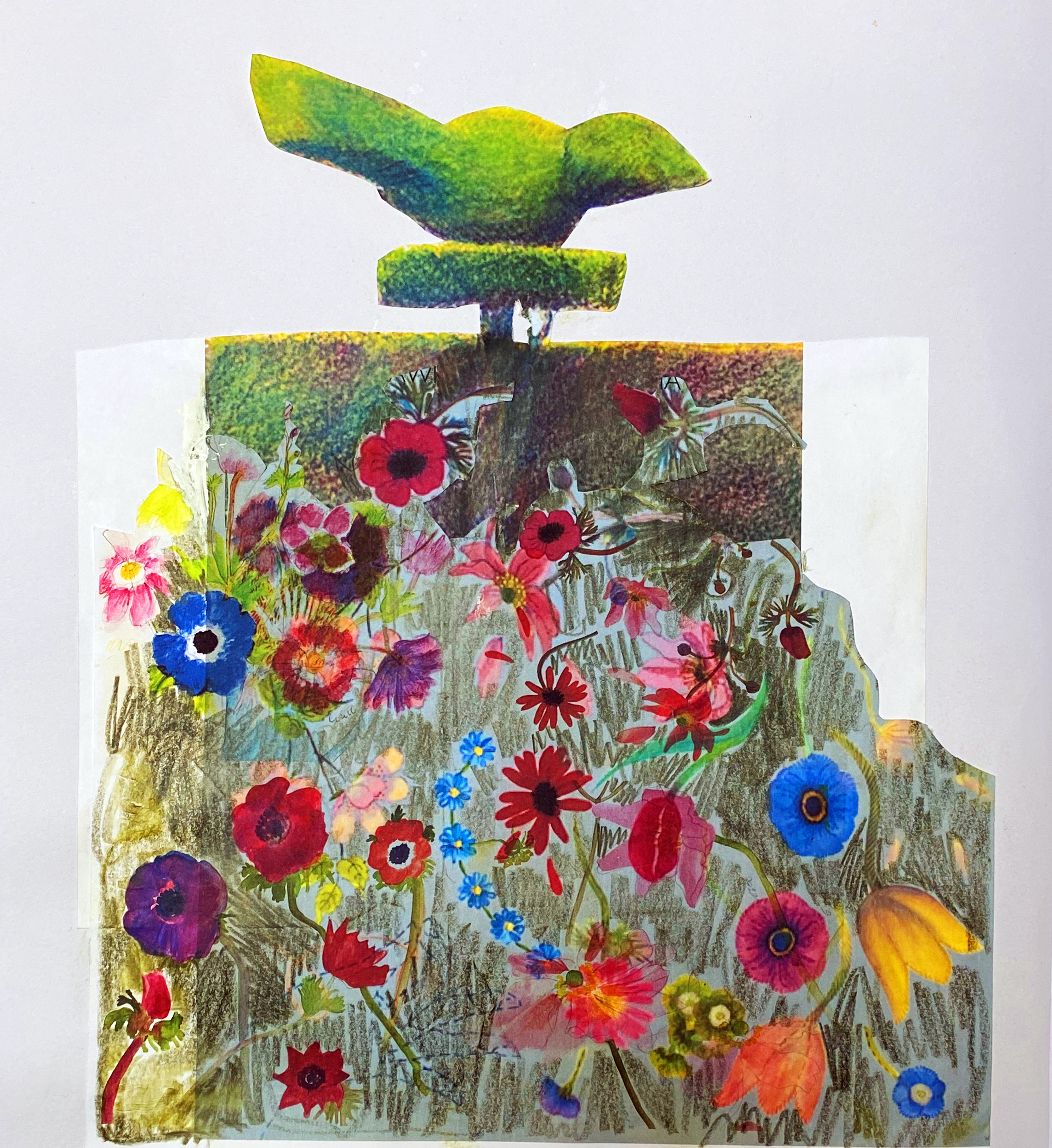
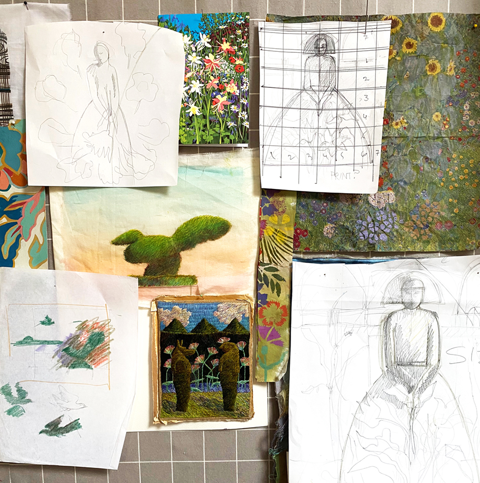
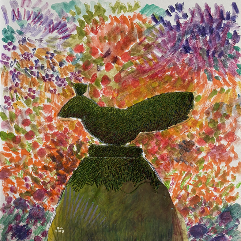
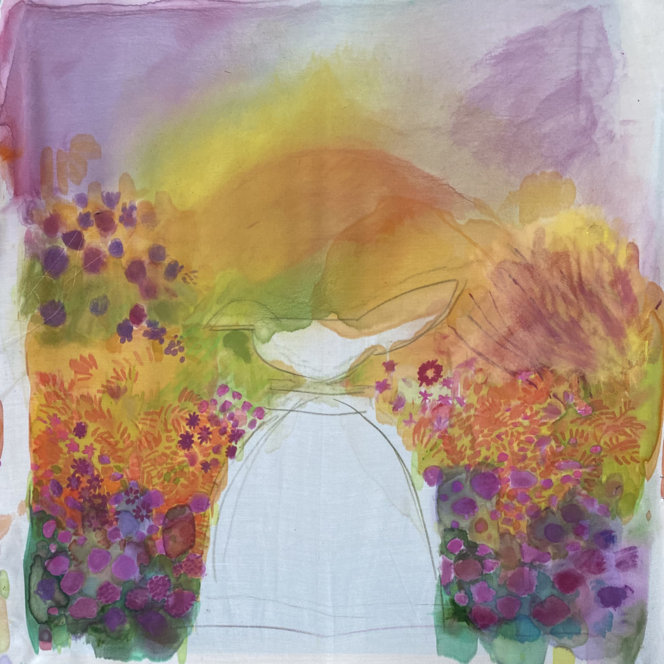
Insired to make new works for the exhibition, back in the studio I combined different drawings, prints and photograps of several aspects of the garden’s abundance and used some old stencils and wonky photocopies that had been over-printed with my embroidered flower images. From this I developed a collage from shoji paper and stitched silk. Then found an old photograph of the birds as I can remember them with their crowns as peacocks.
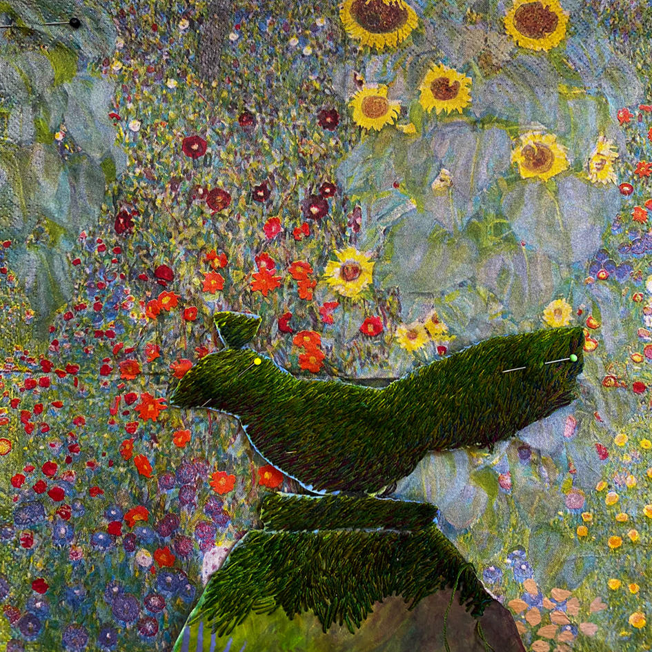
The abundance of planting in the garden beds reminded me of Gustav Klimt’s flowery lanscapes, I began to imagine the plants at Hidcote developed into a wall of flowers. I had bought a packet of paper napkins patterned with a Klimt garden for presents to friends, from a museum in Vienna, but had kept them myself. I took one and pinned it to my studio wall, with the other half formed ideas.
Stages in the inspiration: designing, drawing, dyeing and stitching my homage to Gustav Klimt. I stitched a bird in twisted silk thread on a fine silk ground, then painted dye onto another silk ground adding many of the flowers and leaves, found in my photographs, to make the flower wall. Eventually I stitched the finished bird into postion.
The finished ‘Vintage Topiary Bird’ has become the front cover of the picture book/catalogue that I have produced specially for this exhibition. It has just been delivered to the publishers in time to be printed and for sale at the start of the exhibition Inspired to Stitch: Hidcote Revisited.
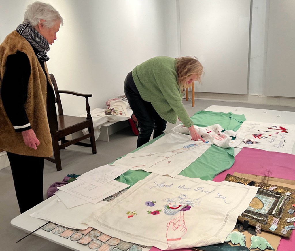
The new season’s exhibitions at Jen Jones’ The Welsh Quilt Centre, Lampeter opened a week ago today where I am exhibiting a small show of personal work – work that I make and keep for myself.
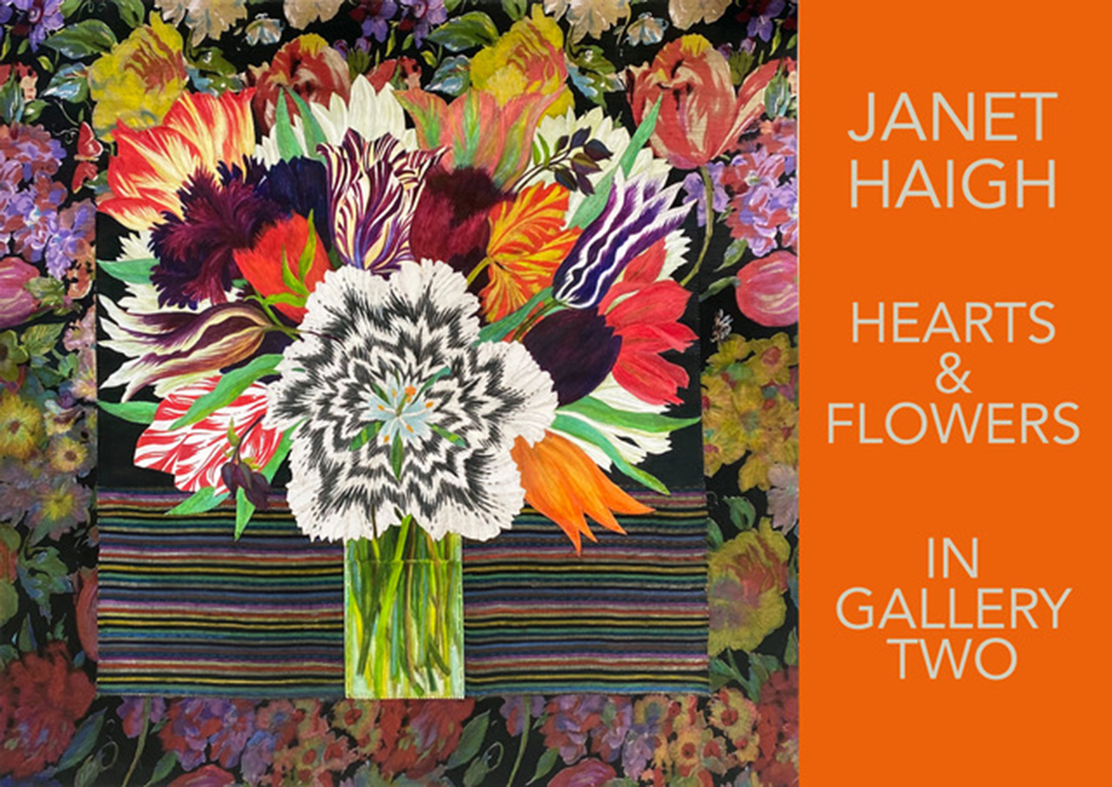
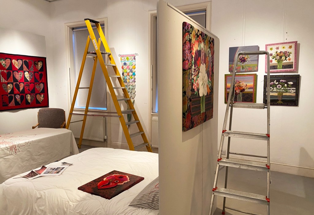
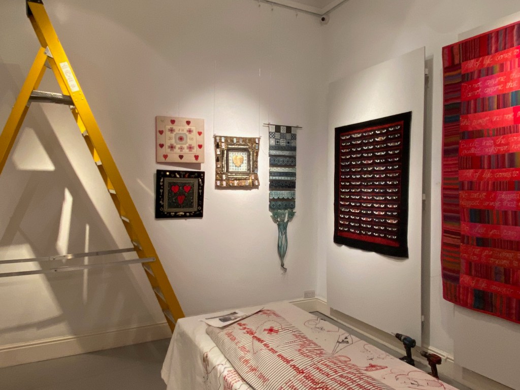
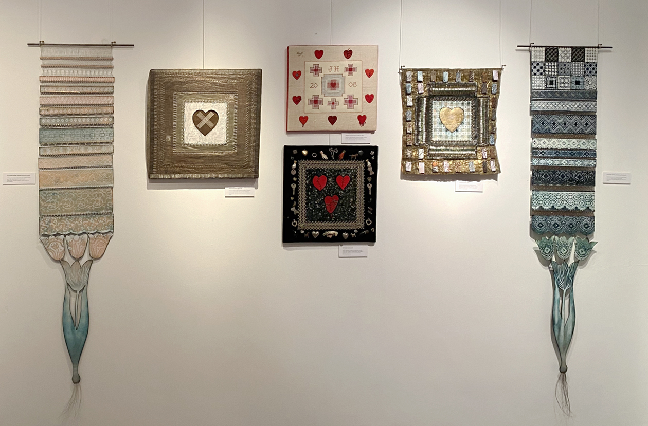
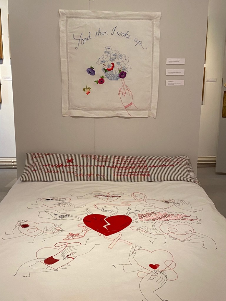
On my first visit early in 2023, when I took actual work to show Jen Jones, she offered me a small gallery for an exhibition and I decided on ‘The Flora’ embroideries. However on my second visit to the, now empty, room I immediately realised it would need far more works than I had imagined. I decided to add a more unusual collection of my textiles combining vitreous enamel and based on Mending. It features broken hearts and how to mend them, so Hearts and Flowers: starting at the begining and going round the room: this is the story of putting up the exhibition
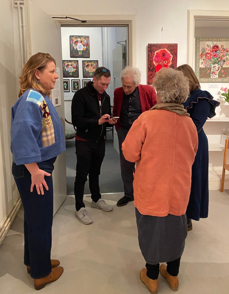
In the first week of March I took all my works and with the help of the whole team at the centre the exhibition was in place in a day(apart from a few extra tweaks before the opening)The first wall of work was The Flora. The exhibition curator/editor, Sarah James, remained focussed when I had lost mine.
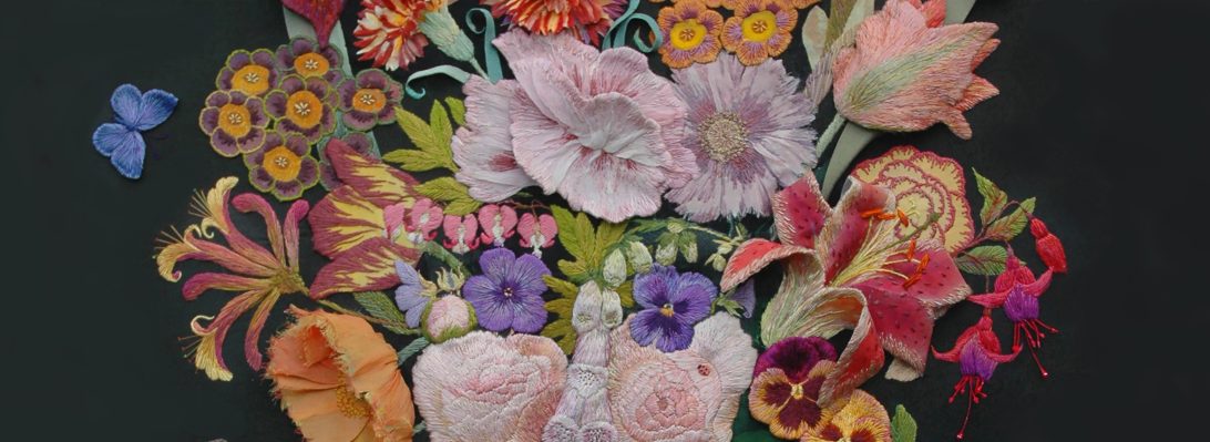
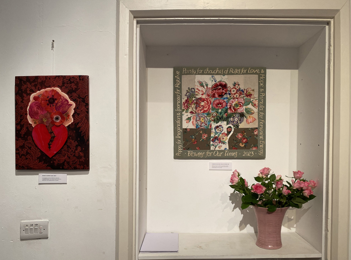
The Flora flowers give way to a group of ‘Flowers For Our Times’ my most recent hand embroideries..but they continue the themes found in Flora. On the left is a stitched appliqued drawing.
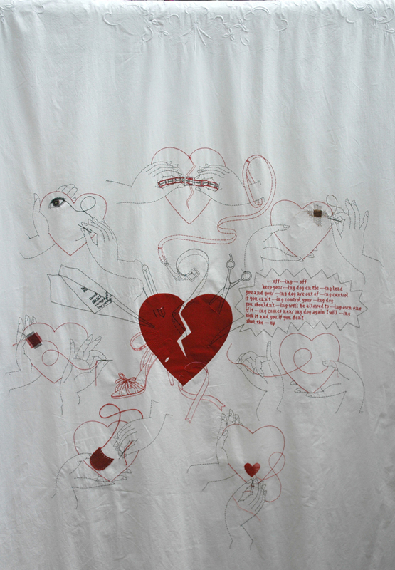
The flower walls give way to hearts (and eyes) so here are my minimally quilted fabric patchworks. This took quite a lot of preparation, pressing on my behalf and for Charles (and Russell) the gallery’s invaluable exhibition men, constantly measuring and sometimes just waiting, but colour co-ordinated!
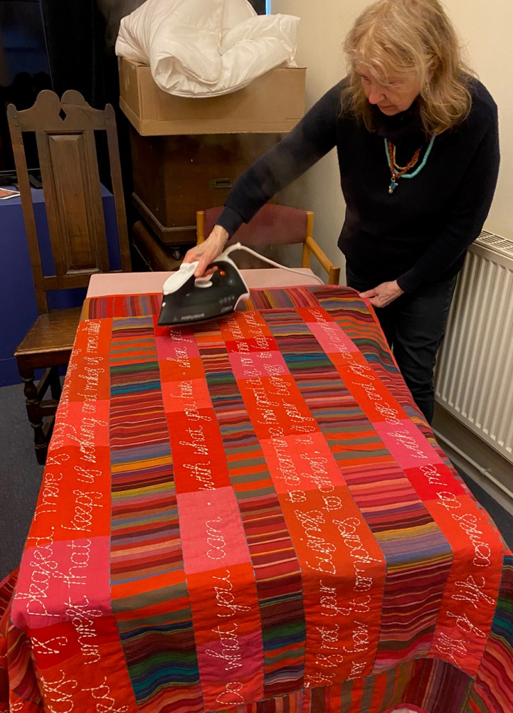
The large Comfort (Hearts)and Security (Quotes) Blankets and Safety Curtain ( Eyes) had been draped over my bannisters for weeks (above right) but a 3 hour car journey had creased them; I am always relieved to be able press my work before it goes on display.
Moving round next are the metal and vitreous enamel hearts – all broken, discarded, damaged but saved in some way.
The works above are made of metal and glass enamel, they are stitched and embroidered with drawn thread work in copper wires on metal fabrics and copper plate. Patterned by sifting white enamels through Lace and Broderie Anglaise stencils, except for the red sampler that is darned in silk on vellum
The bed in the centre of the gallery is Sarah James’ idea, she thought it would perfectly show off the bedding of Make it Through the Night and she was right! People are really curious and stop to ‘read’ the symbols and it makes sense when teamed with the Bolster.
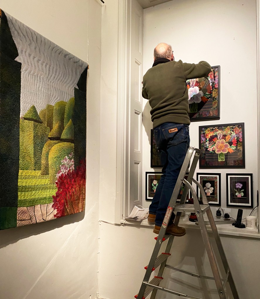
Eventually we get back to entrance with patchworked and embroidered and flowers but outside in a vestibule there is still something else to see, Russell putting up my framed giclee prints, unframed for sale in the shop with many more flower pieces. And the large ‘Lytes Cary Manor’ woollen wall hanging taken from my studio wall where it has lived since 2001.
The very last picture I took was at the end of the Private View. A group of staff and on the left Jenni of Jenni Smith Sews talking to Hazel (who appears to organise just about everything around the Centre) waiting to hear how to get through the wild Welsh countryside to the restaurant for us to celebrate all the exhibitions and videos on display throughout this amazing place.
PS. my work is not for sale but my new giclee prints of embroidered flowers are available to buy in the fascinating vintage textile and bricabrac shop attached to the centre.
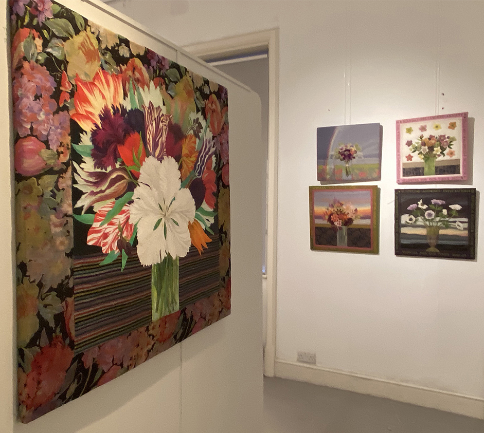
Over the past few years I have been intending to start selling giclee printed versions of my personal stitched work. The latest pigment prints available are unbelievably faithful in reproducing my finely stitched work…but where to start? Flowers – where else? I determined to develop some new flower embroideries for this venture.
Following on from revisiting my old research books and past work, I decided incorporate the flower embroideries with the Kantha stitched skies as in After Winifred. I took a beautiful bunch of dahlias and held them against a large scale Kantha Stitched sky in progress on my studio wall. I had been brought the flowers by Helen Reed, who owns Court House Farm and runs a seasonal cutting garden amongst other ventures. And where I hold drawing sessions in the summer months.
I also eventually started to work on an idea taken from a rare photograph of my garden Hellebores in a vase and in front of my scarf design of Hellebore flower heads. What is odd is that while Hellebores are one of my most favourite flowers, am not keen on Dahlias and did find myself reluctantly stitching them onto a small version of the Kantha sky. Below are the first 2 prints in the series Flowers For Our Times, on the left is Dahlias, on right, Hellebores
Reflecting on the Dahlias and Hellebore pieces (made between winter 2021 to early 2022) I felt as if I had made a definite link between my old and new work in order to make the really vivid giclee prints, available soon at Heart Space Editions. But although technically demanding, using the new Inktense dyes from Derwent, I decided that this was not the way forward that I had imagined it would be.
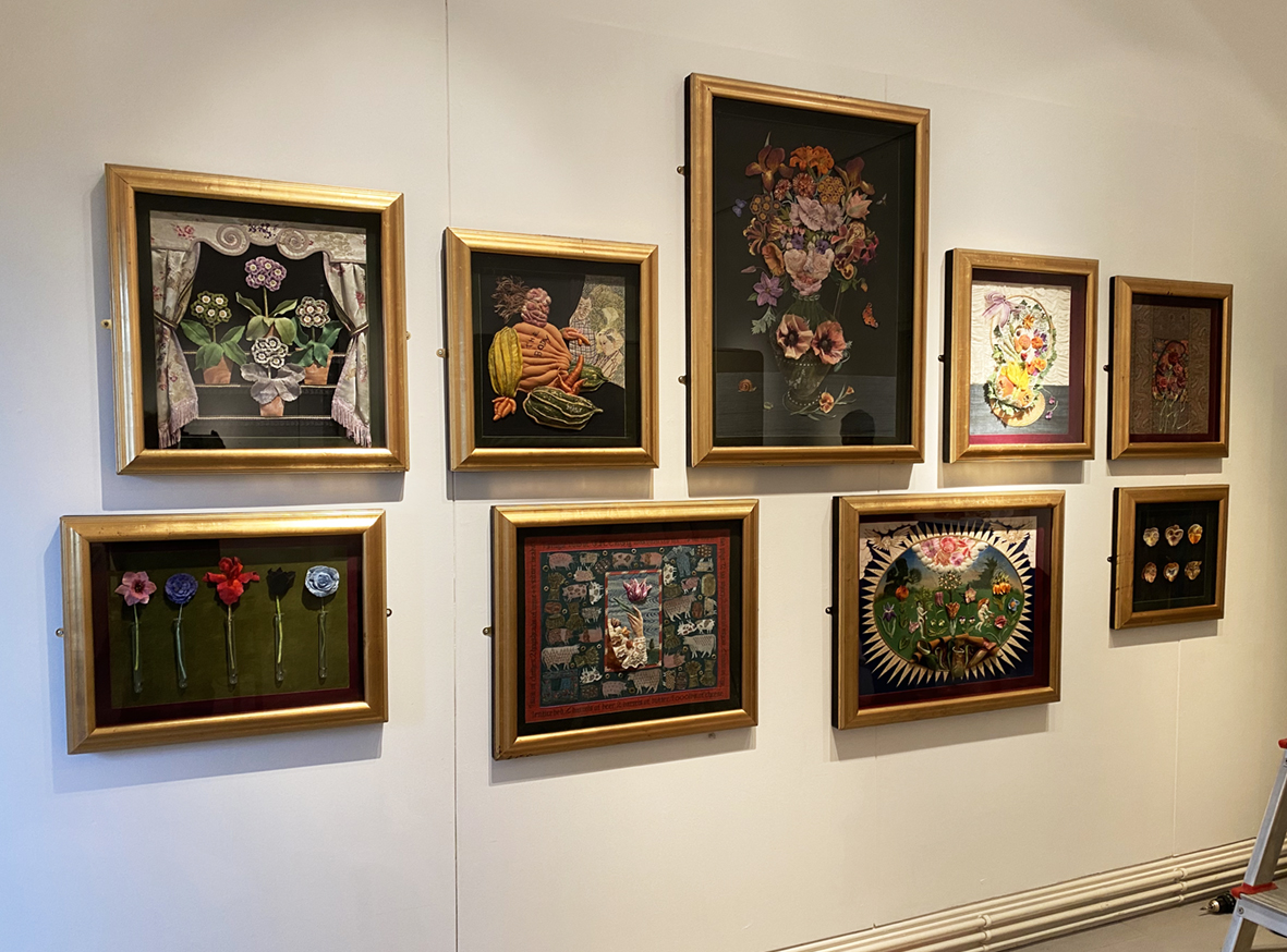
I returned again to my early flower work and re-read the catalogue of my exhibition of Flora’s Legacy, held in Bath in 2000 ( yes – so many years ago!!!!!) and realised exactly what was missing – symbolism – or the half hidden messages often contained within these earlier works.The centre-piece from the exhibition, Flora – the Roman goddess of flowers, had what was missing from my new works…the hidden meanings and humour – here some blackish, bawdy humour.
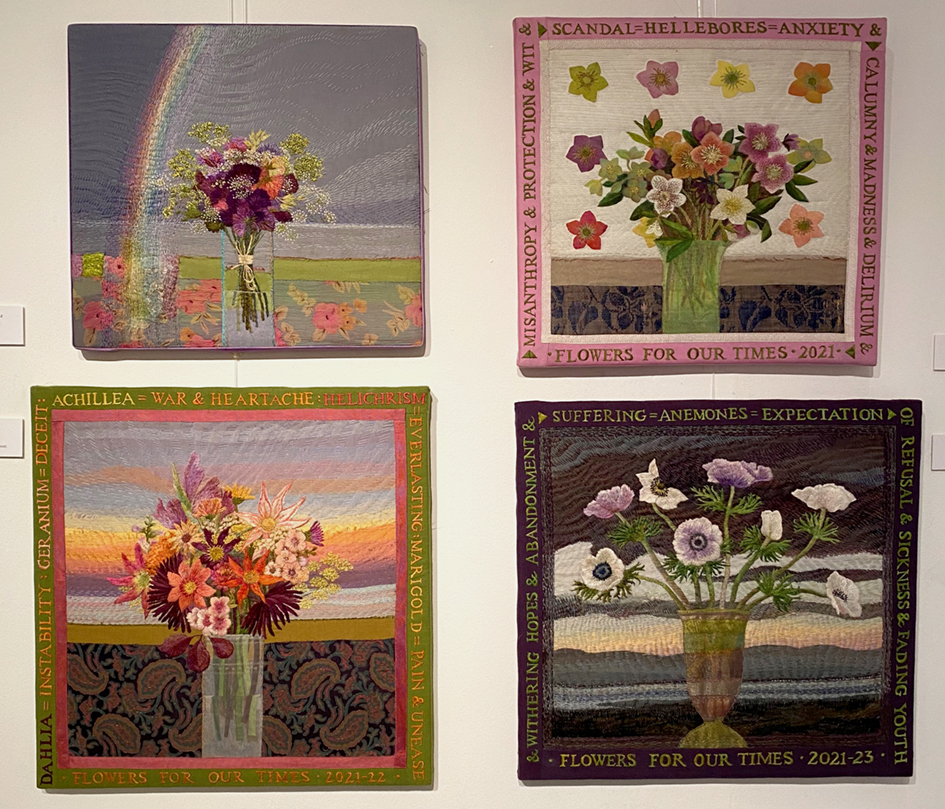
Turning to the many and various dictionaries of symbols I keep in the studio library I thought I would invent a bunch of flowers instead. The meanings of plants and flowers are universal and every culture has its own beliefs, sometimes conflicting – sometimes they are entirely in agreement: a poisonous plant is a poisonous plant. Out of curiosity I checked what the 2 bunches meant adding, the meanings to my original studies…..
I must admit that I was shocked, relieved, delighted and then excited to find that I had embroidered War, Scandal, Uncertainty, Instability and Sickness within 2 pretty bunches of flowers. But everyone else around me was spooked. So – they asked – where did I get this information from? Well in my books of symbolism, the most curious and confusing is The Language of Flowers – but oh the possibilities that it offers for mixed messages and hidden warnings amuse me enough to keep going with this theme.
Using just my old folders and Victorian books of flower meanings lead me to a brand new fully comprehensive dictionary by S. Theresa Dietz – published by Wellfleet Press, and the here I discovered far more arcane information than I had gleaned from my all my original sources.
So now what to do next – can you guess?
check the gallery sectionto see more outcomes of this ongoing project
first page of my reborn Flora research/sketchbook – Flowers Again!
Recently, the “After Winifred” embroidery has inspired me to develop work to use as Giclee prints in order to add a fresh way of getting my work ‘out there’. I turned to my old Flora workbook, some 20+years old – but still alive for me as a source of inspiration.
last last pages of drawings circa 2000 in Flora workbook .
drawings and stitching samples for Auricular Theatre 1998
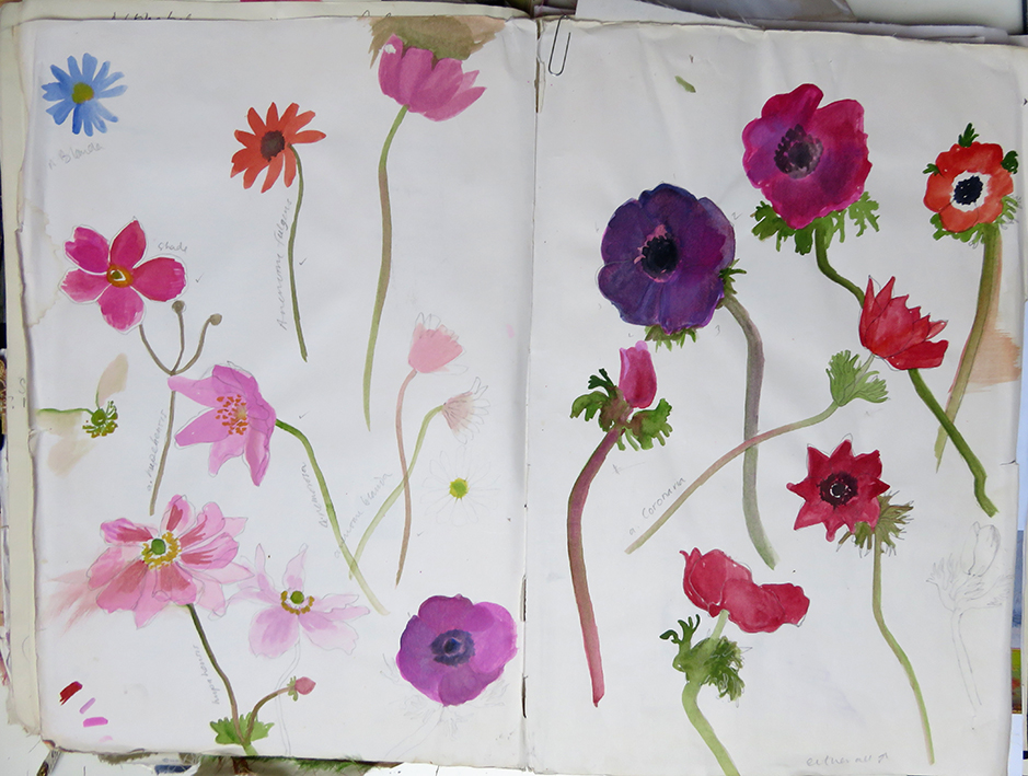
painted studies of garden Iris circa 2000
most used pages -Anemonies painted from life and photos.
I found some empty pages at the end of the old book and started to collate recent samples and drawings of bunches of flowers grown and made up at Court House Farm, where I conduct drawing workshops, using the cutting garden as inspiration.
second page of the book – old samples and magazine cuttings for colour a small bunch of dahliasobvious inspiration from Winifred Nicholson flower paintingmy initial research fixed now into book showing early samples of new-to-me Inktense pencils – as dyed ground for stitching
looking back at my Flora work, which is 3 dimensional and very heavily embroidery, I now want a freer drawn imagery to stitch into. So I bought some Derwent Inktense pencils that basically act as dyes when wetted and left to dry – I did many samples but found my drawings had too much information in them – I needed to loosen up further. Ha ha – the story of my working life!
first inkjet pencil drawing second freer drawing sample hand stitchingdesign page using a very old photograph of my own collection of hellebores against a silk ribbon applique.
To enable me to play easily with the new ink crayons I chose an old set of drawing research and photographs to work with. The colours of the crayons are very brilliant and I needed to find ways of making more subtle colours, so stippling, cross hatching and dotting colours one over another made for rich but softer ground colours – these techniques are still a work in progress. Below are 2 studies of the under drawings using pencil dyes ready to be stitched
Meanwhile I have been looking at all my old flowery finished works and their drawings to use as reference and then reframing/remounting stitched pieces ready for the printers.
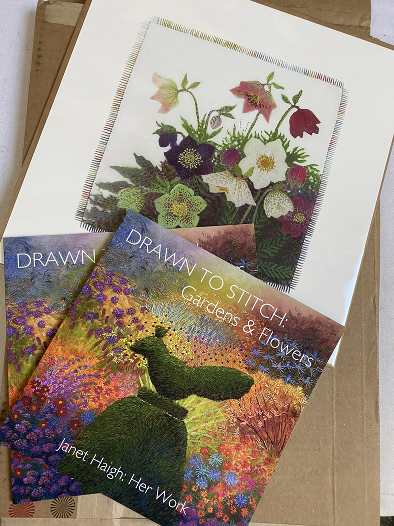
original drawing for this older Hellebore embroidery right early Hellebores silk embroidery
the little Hellebore image above is my first Giclee print and the smallest at 30cms/12inches square.
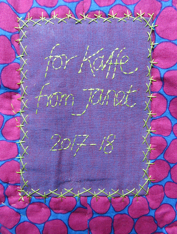
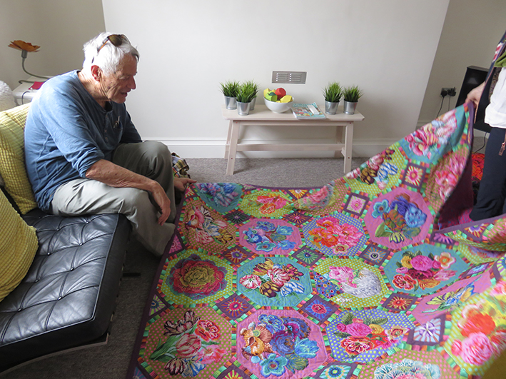
My final stitches on the back of quilt appropriately backed with fabric designed by Brandon Mably
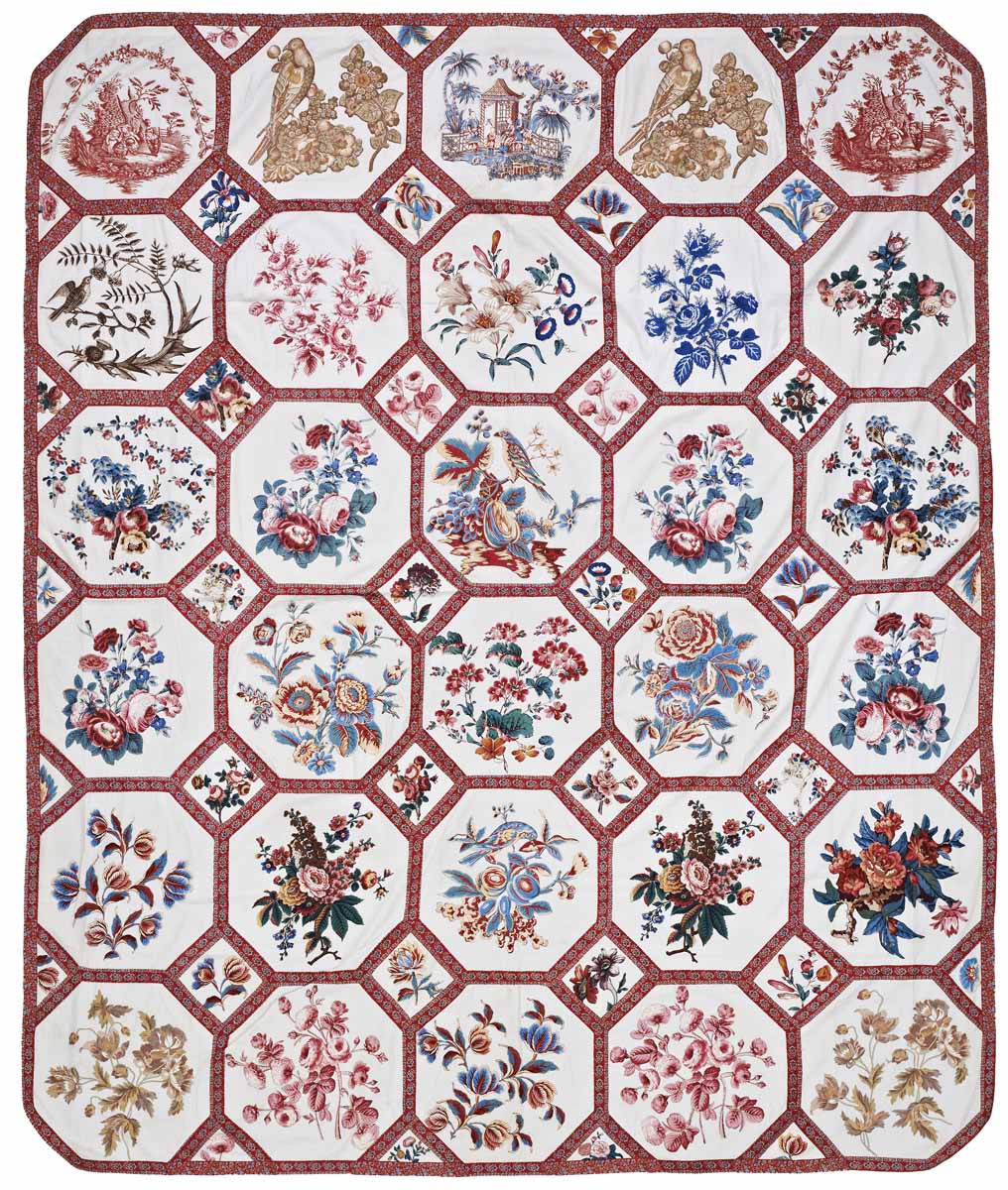
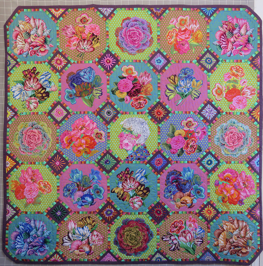
This major project started life in 2017 through sheer frustration. For Kaffe Fassett’s 2018 quilt book, based on traditional quilts housed in the American Museum in Britain he had asked that, as a hand embroiderer, I make his revised version of an ‘Broderie Perse’ in their collection. I was delighted.
I immediately started to sample some simple ways to make such a large hand stitched quilt nowadays, plus information notes for others to follow the instructions. However, due to lack of time due to publishing deadlines this quilt was dropped….Rats!
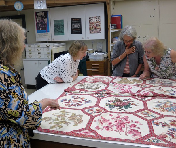
behind the scenes of the American Museum
Later in the year I organised with the museum’s curator, Kate Hebert, to visit the archives with the UK making and publishing team. I asked to see ‘the one that got away’ and on hearing the story, Kate said that if I ever re-considered making the quilt she would show it in the quilt gallery alongside the original. Well of course I jumped at the chance to show work at this museum, and I did want to make the quilt.
I decided that I would make it as a present for Kaffe, it was his 80th birthday in December and I had enjoyed the last 3 years working with him on his books and my contract was at an end. I reasoned I would soon have plenty of time on my hands to complete the project in time for his birthday.
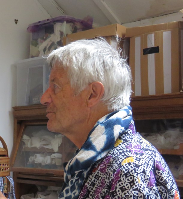
Kaffe Fassett studies new work on the quilt wall in my studio
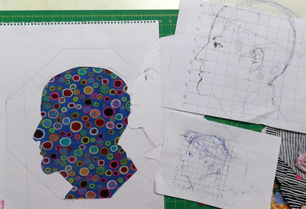
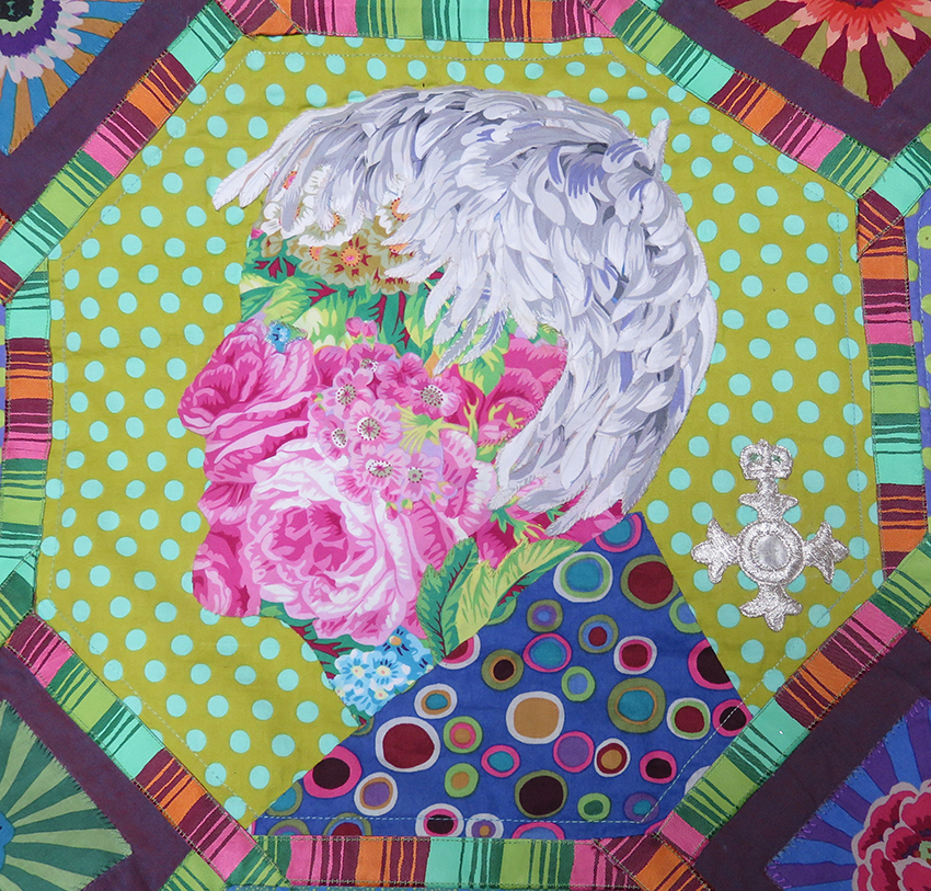
As I now had ‘carte blanche’ to interpret the design as I liked I decided to make his portrait as one of the panels. Using a recent photograph from his last visit to the studios I set about drawing and scaling the head.
the original drawings scaled up from the photograph
I made carefully measured sketches, and then 2 masks – one to the size of the hexagonal block and the other of the head. My initial idea was to garland the head with flowers – well why not?
first attempt to design the head using some of my favourite fabrics
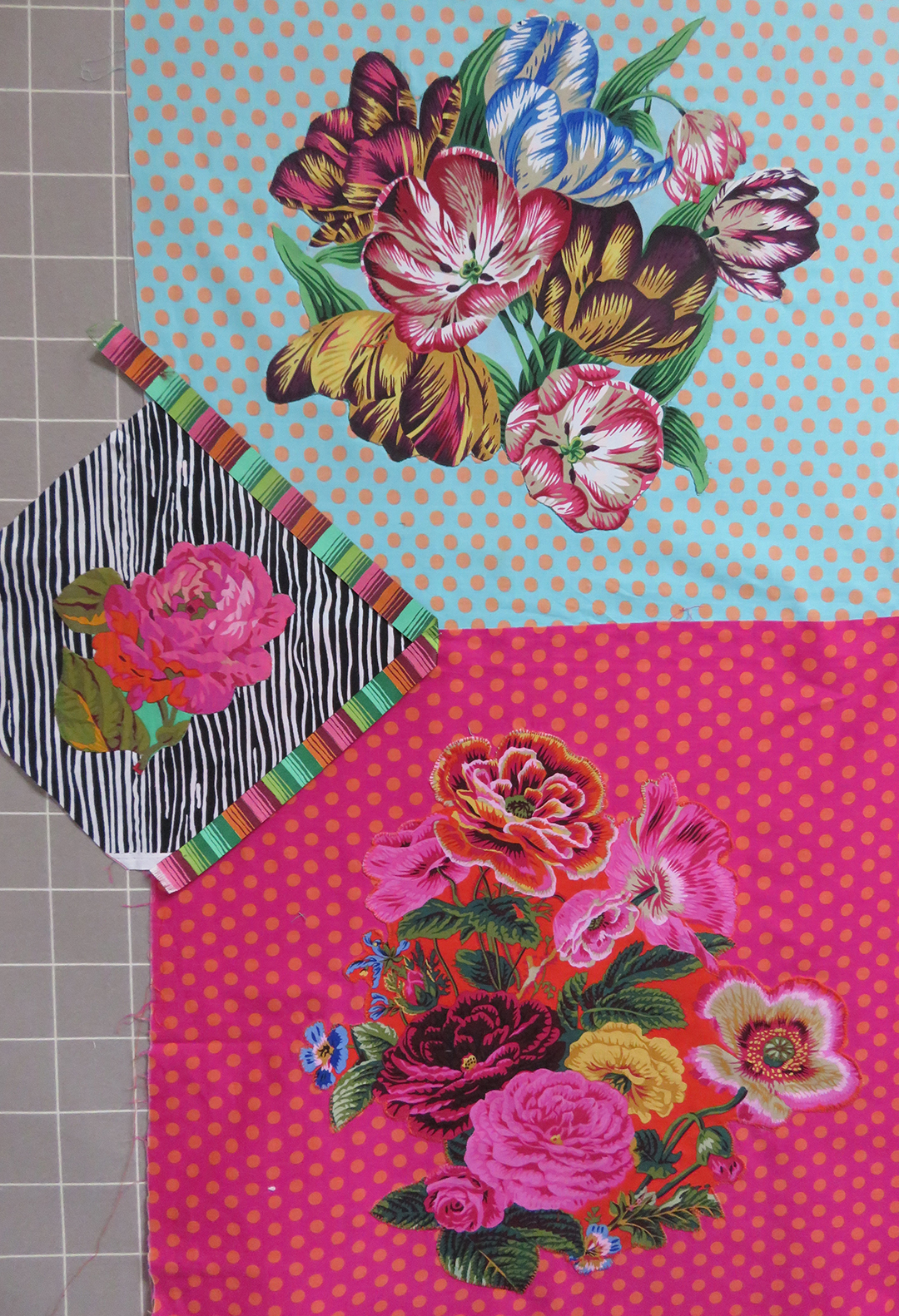
This looked miserable, and the garland didn’t fit into the hexagon very well – and then I would have to embroider the features; I remembered my ‘Flora’ embroideries influenced by Archimboldo – the artist who made faces from flowers. I tried various flowery fabrics from the Kaffe Fassett Collective.
This selection took several days and I was still not convinced I could make it work well enough, then into my studio stepped an old university colleague from my teaching and researching days, Dr Dawn Mason, with the perfect bunch of flowers to match the work – I believe that chance happenings are not always random
serendipitous flowers – I am on the right track
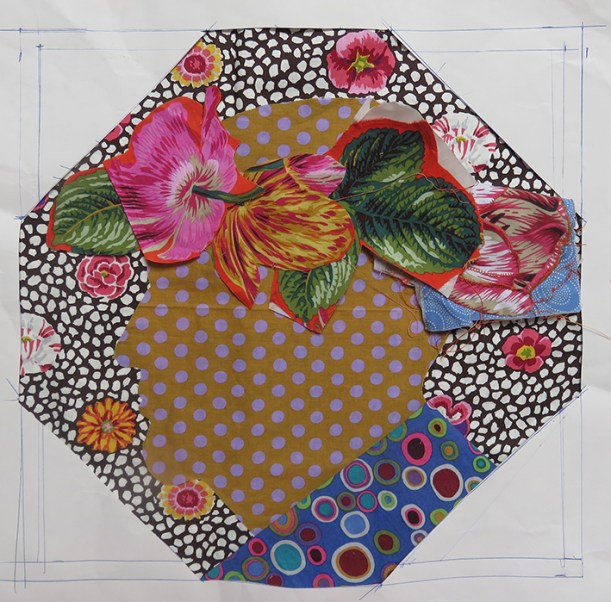
I persevered. Eventually I chose the fabric placement, cut it out with a tiny seam allowance and hand slip stitched it to a spotty fabric, adjusting the chin to become a tad larger proved successful. Very carefully I placed a blue bud for the eye. Suddenly Kaffe appeared in front to me.
chosen fabric on drawing
perfecting the chin
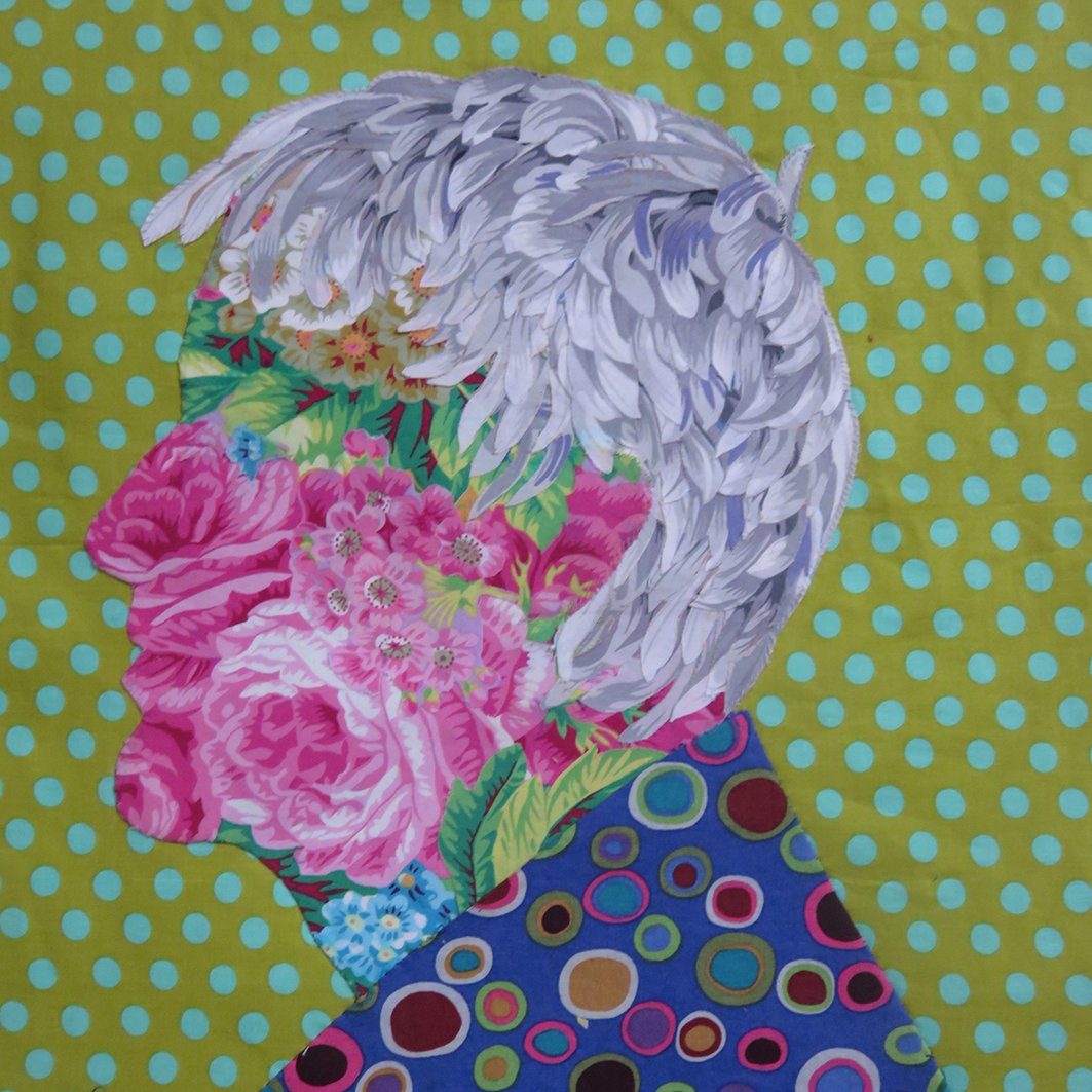
Now for the hair: I found the white petals of Japanese Chrysanthemum by Phillip Jacobs perfect for my purpose, and so it appears does everyone else; the hair is the thing that gets the attention. In fact most of the fabrics that I used Summer Bouquet and Shell Bouquet and Tulip Extravaganza are designed Phillip Jacobs, his fabrics are so elegantly drawn and painted and the perfect replacement of the original chintzes.
The next stage was to decide the rest of the portrait. For the shirt I had a smidgeon of an old version of Kaffe’s Roman Glass in blue, I had bought years ago – and after many trials chose the fresh Spot fabric in the colour ‘Pond’ for the background.
the finished head
Now for the rest of the patchwork, So far this has taken me about 3 weeks of drawing and stitching – but it is still only June.
the original samples for the American Museum book
I dug out the abandoned samples I had made for the book – I needed to make more other panels to add to the portrait.
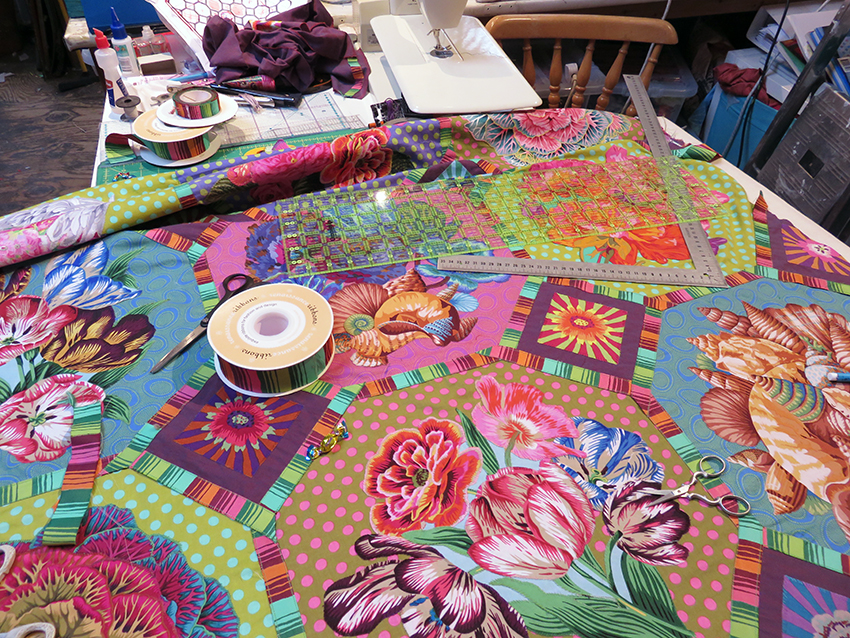
To make the bouquets, the fabric has to be backed with a bonding paper, carefully cut out, placed into position by re-arranging the various elements to fit harmoniously, pressed, then hand stitched around each raw edge, the stitching is quicker than the arranging and my idea of blissful work.
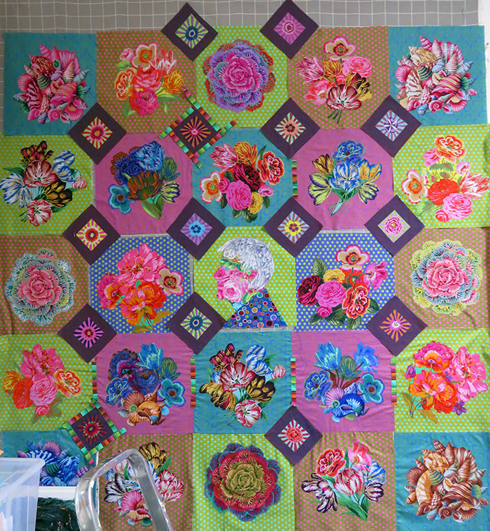
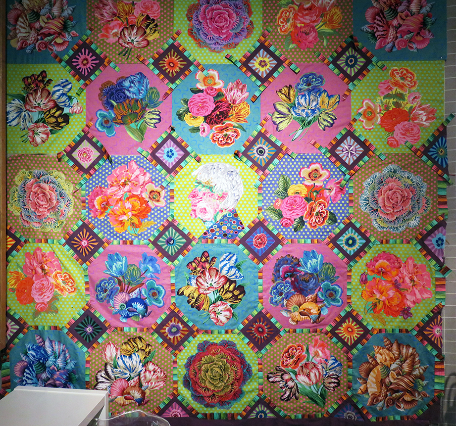
The quilt slowly started to grow; but trying to control the overall colour was the most difficult thing – colours that work on their own or in a sketch suddenly look drab or take on another shade when placed next to one another – obviously. But the colours of the flowers changed the balance every time I added a new panel. It was my major ongoing and fascinating struggle to get these balances to work.
my textile studio September 2017
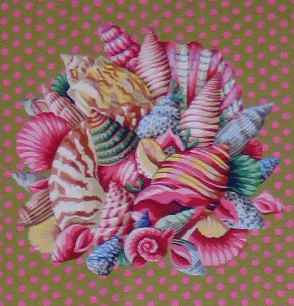
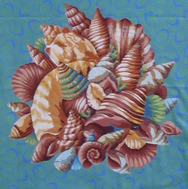
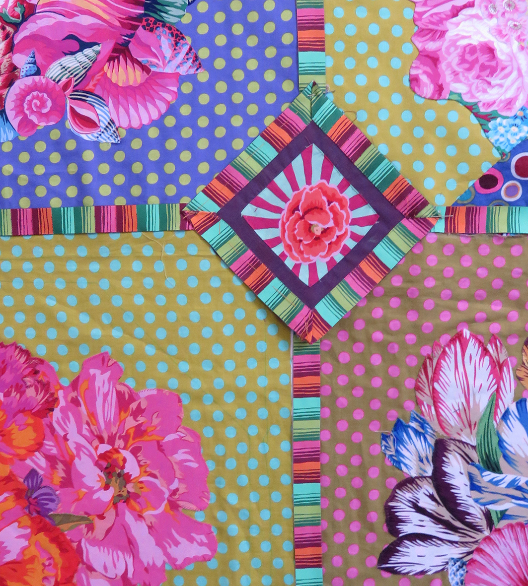
By September I had eventually made my fabric decisions, I had to make multiple versions of some of the panels – all in different colour-ways, but this gave cohesion to the busy design. I also added 4 shell corners, this was possibly the easiest panel to apply as the size was perfect and the shape fitted – just a few additions to balance colour.
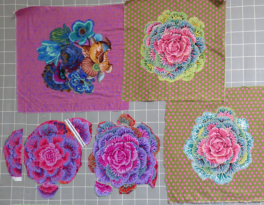
making larger Brassica panels
Above shows the development of the Brassica panels, they needed to be made larger by adding extra rows of leaves before hand sewing them onto the grounds.
The next stage was to add the diamond shaped patches at the intersections of the squares.
the added diamonds start to assert themselves
And this is when the panic started – suddenly this massive work, that had grown over months took off in another direction, these diamonds dominated the entire design – already busy, this was manic
The only thing was to keep going – too late to stop now – the samples below looked fine
hand stitched applique
sample of pinned Phased Stripe by Renaissance Ribbons
I started to applique the tiny cut squares from Kaffe’s fabrics, Sunburst onto Shot Cotton dozens of them, all hand stitched in 2 colours and I slowly added them to the quilt on the wall ….and the result below doesn’t have all the dividing ribbon strips yet!
without the addition of all the ribbons – hells’teeth!
This was beginning to look overloaded, so I called in my 2 trusted quilt makers, Julie Harvey and Ilaria Padovani – they have very sound taste in all things quilt, and I knew they would tell me the truth. They just laughed and said “well it is for Kaffe and ‘more is more’ with him – why are you worried’?
It was the addition of the ribbons, kindly donated to me by both Edith Minne, owner of Renaissance Ribbons and Brandon Mably (who was in on the secret) that tipped the balance of the work and I suddenly understood that the work had ceased to be mine – it was now Kaffe’s. This happens when you are commissioned to design and make stuff for people – you need to work with their ideas/tastes/preferences – otherwise they don’t pay you! But this wasn’t a commission this was a present, and it was all my own work – I realised now just how much I have been influenced by working alongside him.
the quilt starts to look like it belongs to Kaffe
So I machined in place all the ribbons – a mammoth task for a hand embroider! they were very tricky to manipulate especially as I had to split many yards of a wider ribbon to get the correct proportion, both Edith and Brandon were out of stock of the narrow version. Hey ho! Thankfully Julie machine stitched it all into position first and then I started to hand quilt all around my stitched applique – another mammoth task, but so rewarding, the quilt looks suitable wonky – in a good way – it looks very hand made
March 2018, finally finished – I thought!
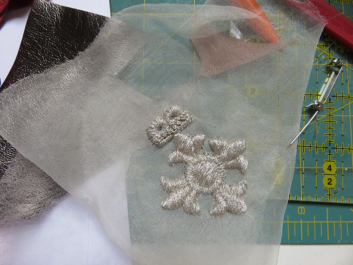
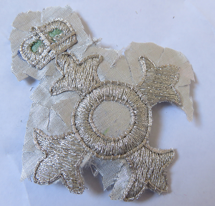
It was completed in March 2018 but I had not time to deliver it; then Kaffe was awarded an MBE and I know I have to include this – so back again to the finished quilt
I made a sample first and then the real thing and appliqued it to the ‘finished’ portrait
portrait complete with medal
In Bath, where Kaffe and Candace Behouth, have an exhibition together based on Flowers , I delivered another set of 5 quilts for the next book and my “surprise”
And Kaffe’s reaction when he was shown it?
Worth every moment.. I made the sample into a badge for Brandon – this says it all!
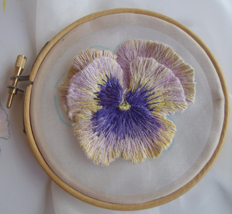
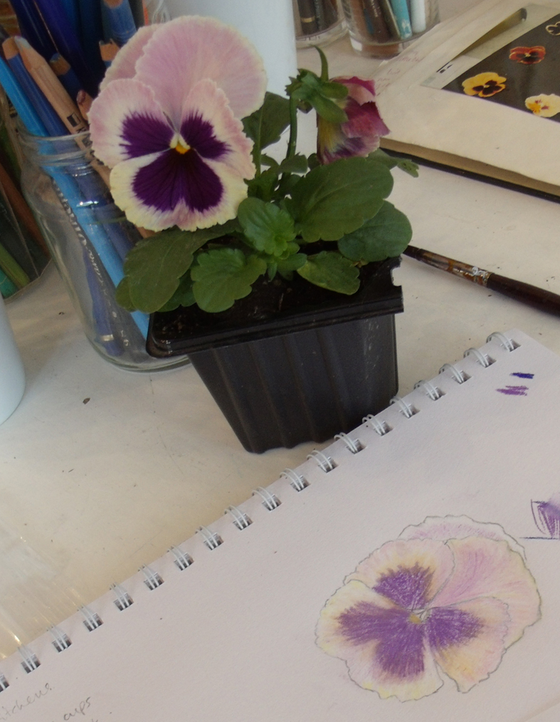
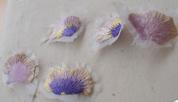
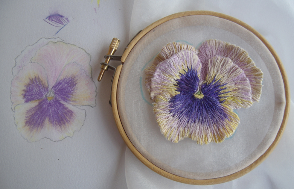
Stitching 3 dimensional flowers is a strange mix of observational drawing, refined stitching and alchemy; the transition of the flat stitched petals freed from their background and applied to form a flower is slightly surreal. I developed this particular skill while making the Flora Embroideries, using the pansy to metamorphose into different forms to develop faces.
winter flowering pansies
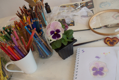
I had been asked by a regular Heart Space Studio student and volunteer, Libby Butler, to teach her to stitch a 3 dimensional pansy – her favourite flower, and knowing that she was a skilled embroiderer I agreed. What I did not know was if she could draw the flowers from life; this is the first essential stage as learning to select the colours and study the growth lines of the petals is most important to develop natural petal patterns – and looking really carefully to draw each petal really concentrates the mind for the stitching that follows.
selected pansy and the drawing equipment
Libby looked a little nervous when I handed her the jars of crayons after selecting her pansy – however after a nervous start she achieved a simple working drawing from which we could establish petal shapes and colourings, now to move to the fabrics….
simple drawing of the Pansy face
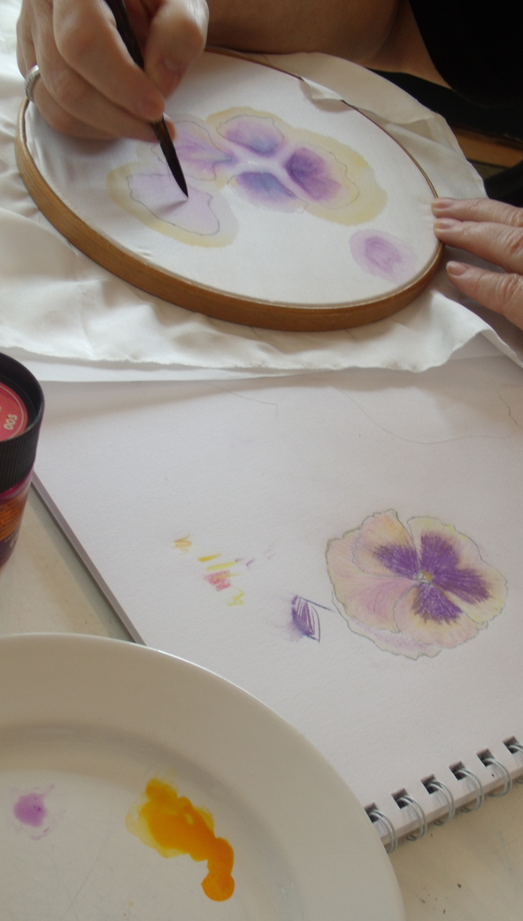
Now to the fabrics – first a thin silk fabric was selected and the individual petals from the drawing were traced onto it in pencil, a light dye was then applied with a paintbrush to give a background colour.
dyeing the background fabric for the petals
When the dye was dry, a heat transfer fabric adhesive was ironed onto the back of the fabric and each petal was cut out and ironed onto a very fine silk gauze and placed in a small embroidery hoops ready for embroidery – the edge of the silk petal means that the stitches have very strong definition which will be needed later for cuttung out. The silks were matched to the drawing colours and using one strand only, the embroidery was started…
embroidering the individual painted silk petals
Libby worked one whole petal (see above) by the end of the first day of the 2 day workshop, she then had 1 week to complete the rest of the petals…..she took the drawing home to work from – the drawing is what she is following not the real flower – this is why the drawing needs to be really carefully observed
stitched work brought in to the second session
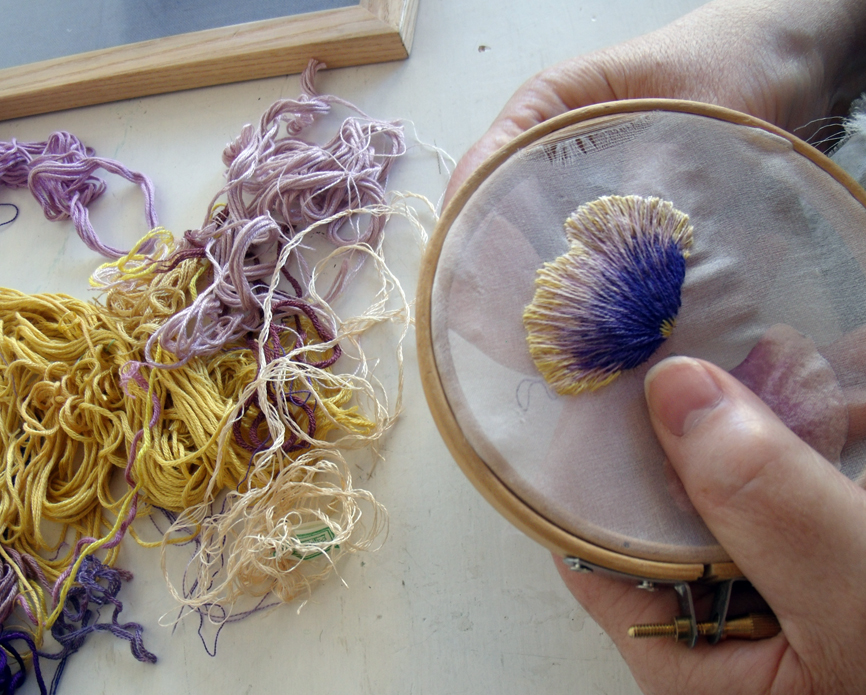
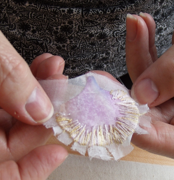
On her return I found that she needed to work a fine blending thread over the transition between the dark purple and light yellow of the pansy to make it look natural but this was quickly achieved – attention needs to be given for the direction of all the stitches so that they follow the lines of growth of the petal – but it is easy to see in bi-coloured pansies.
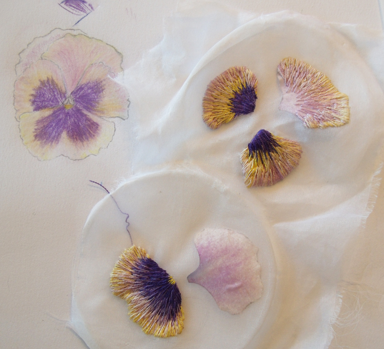
the embroidered petals are cut out
Once the embroidery was complete, the back of the fabrics was once again bonded with heat transfer adhesive and each petal cut out leaving a small area of surrounding silk. Each petal was then pressed from the back while being stretched around the its edge, this sets the stitches and gives a very life – like undulation to the petal edge – but the stitching needs to be very dense to allow this to happen…..then taking courage in both hands the extra fabric is VERY carefully cut away – the bonding keeps the threads in place.
holding the back petal snipped and waiting to be pressed.
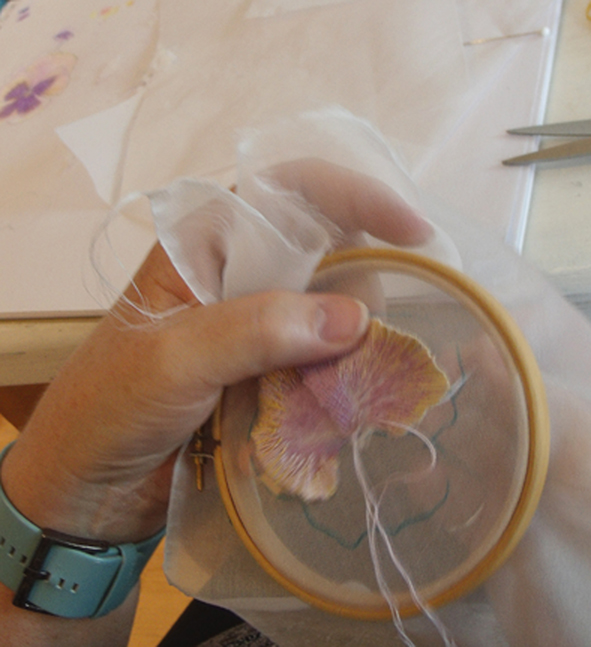
Now the flower formation can begin. On a fresh and final background fabric the original drawing was traced using a water-soluble pen, then each petal is embroidered into position starting from the back, only the middle area needs to be attached – the petals must be left free from the ground
attaching the petals to form the flower
The actual assembly does not take very long but it must be carefully structured so that each petal overlaps the one below it, the original drawing is again of vital importance to this process.
work in progress with an old embroidered sample we used as a stitching guide
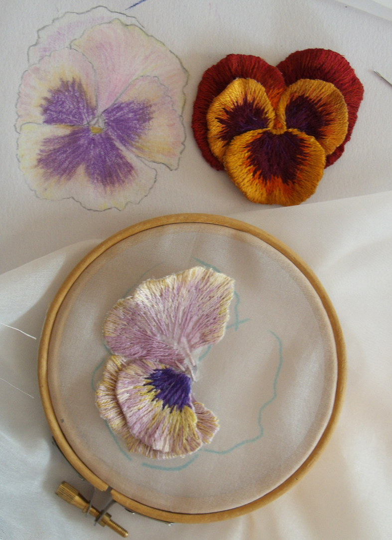
Eventually each petal is placed and the inside edges of the of the petals are is built up and over-sewn and a single central stitch finishes it – Da Da!
the final flower seen against the original drawing
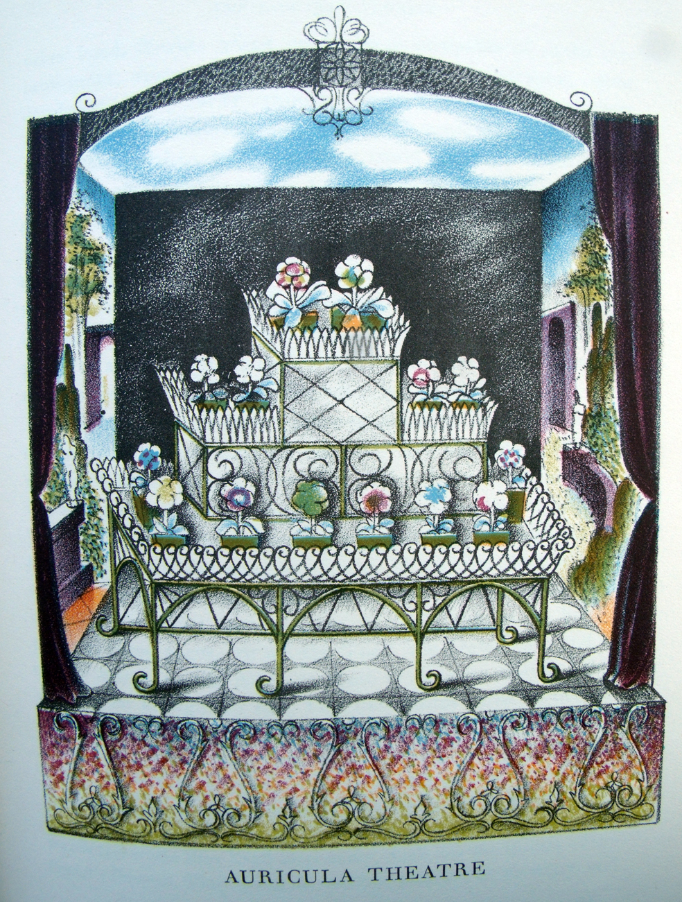
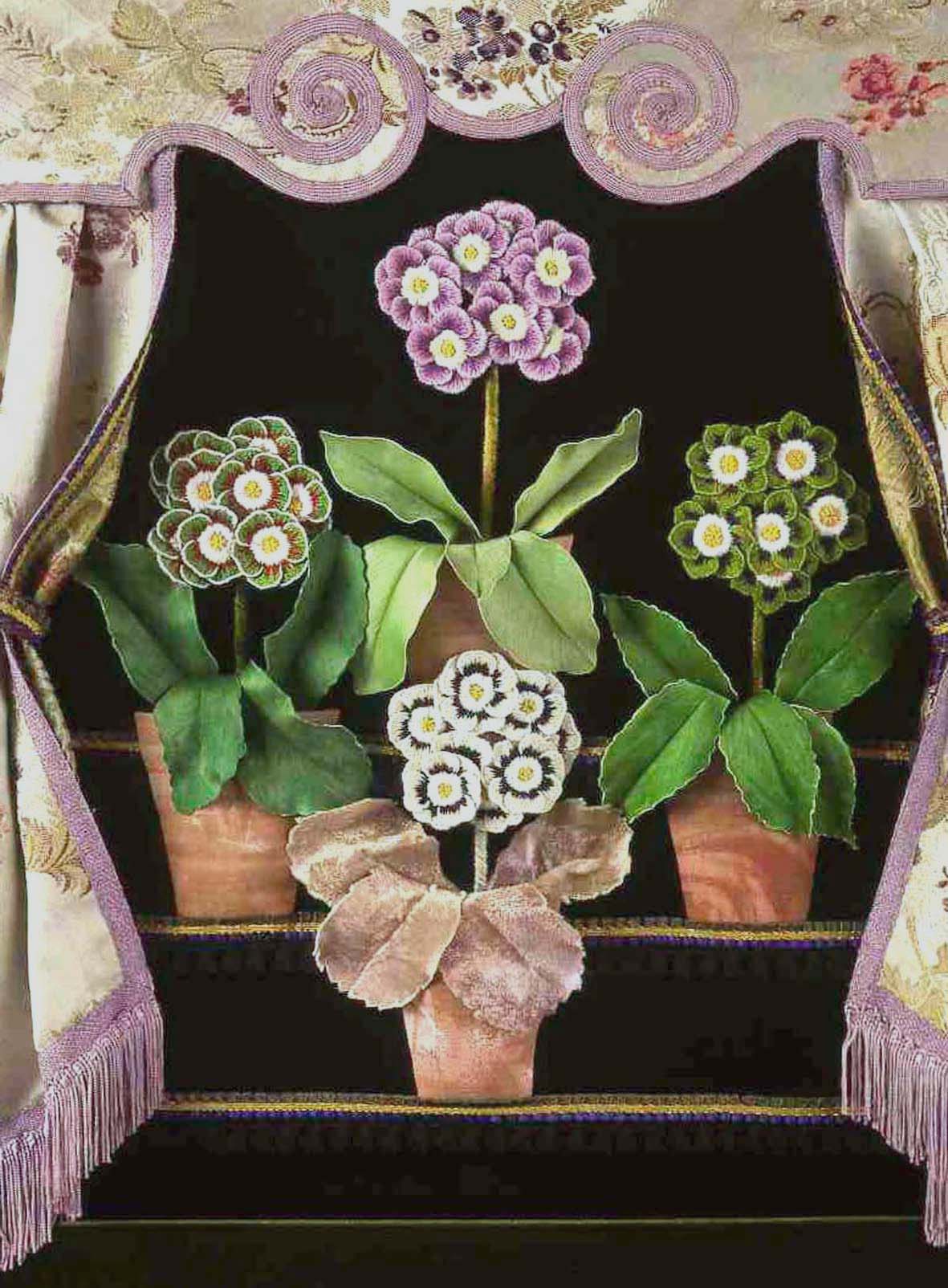
In an effort to be topical with the spring here at last, I am posting another of my Flora Embroideries, the Auricula Theatre. A strange idea to display flowers in such an artificial setting, I just had to embroider it – but needed quite a bit of help. In fact after the initial sampling I left the embroidery of all the dozens of tiny petals to my then assistant, Debbie Cripps, and a beautiful job she made of them. All I had to do was design and assemble the whole edifice.
Auricula Theatre illustration by John Farleigh
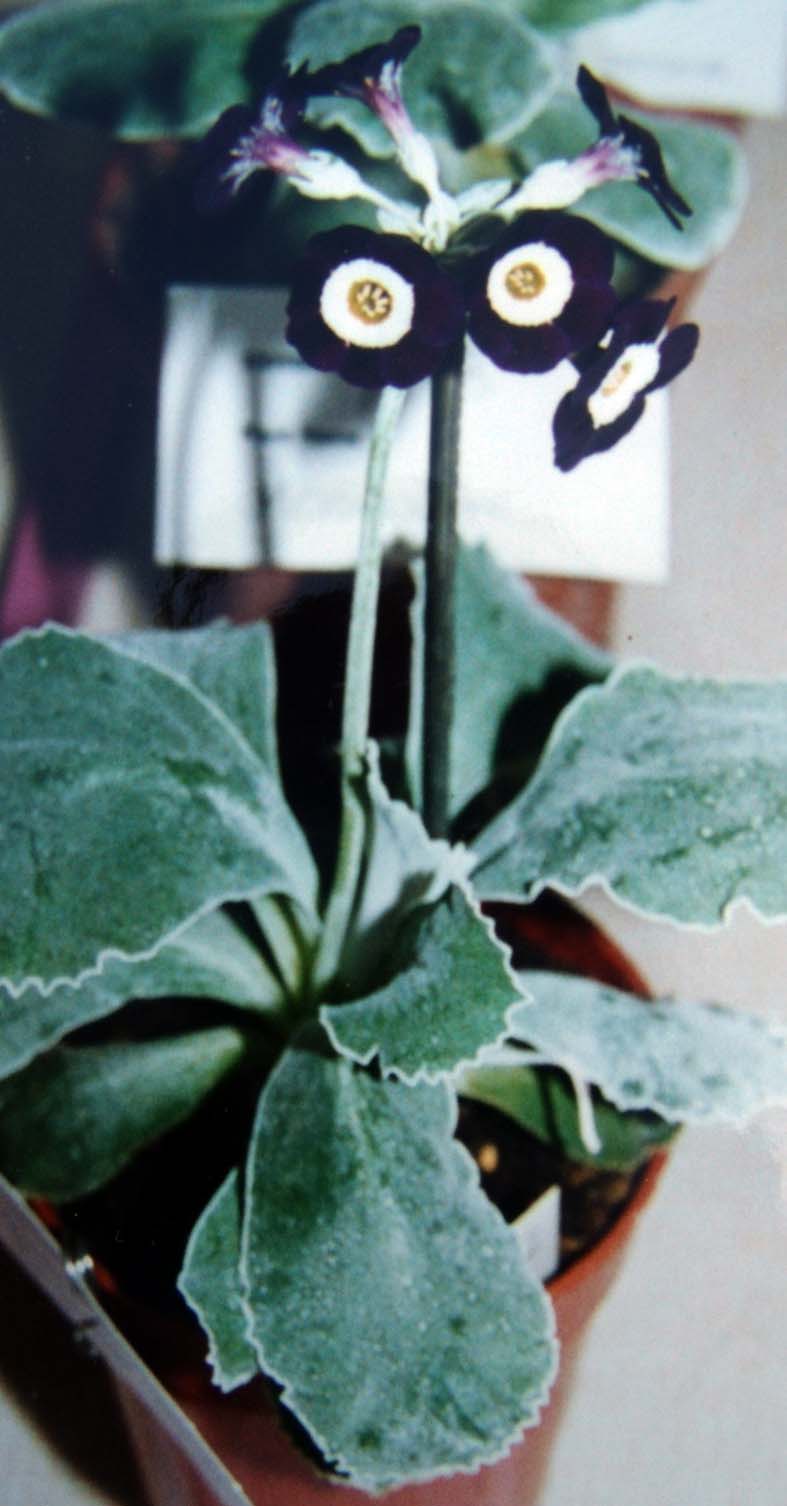
The theatres actually did exist and originally for a purpose other than display, the curious colours of some of the flowers is due to a farina or flour like substance that coats the leaves and petals giving them a white or silvery appearance and it can be washed away by rain – so the earliest flowers were often placed under protective coverings. I became intrigued by the auriculas having seen them at spring flower shows – not in theatres but in simple plant pots; even in local church halls they really attract attention – they just don’t look real, they look like someone has painted them in strange colours with stripes and edgings of greens and white and yellows, they look like a child’s drawing of a flower.
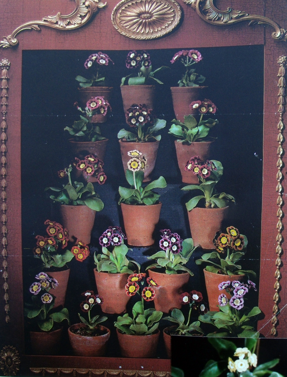
black and white auricula at a local flower show
And when they are displayed in modern theatres their various markings can be truly appreciated
modern Auricula theatre
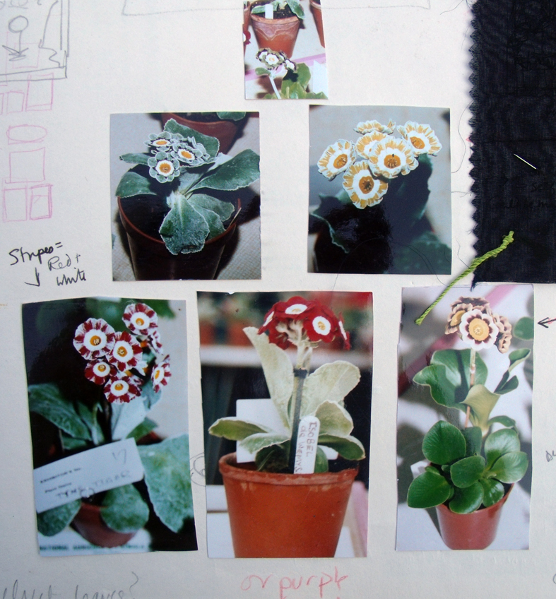
So I set about making one for myself, to become a permanent display. I arranged several of my photographs form the various shows I attended into a staged setting, then set about trying to embroider them.
.
show photographs arranged as theatre display
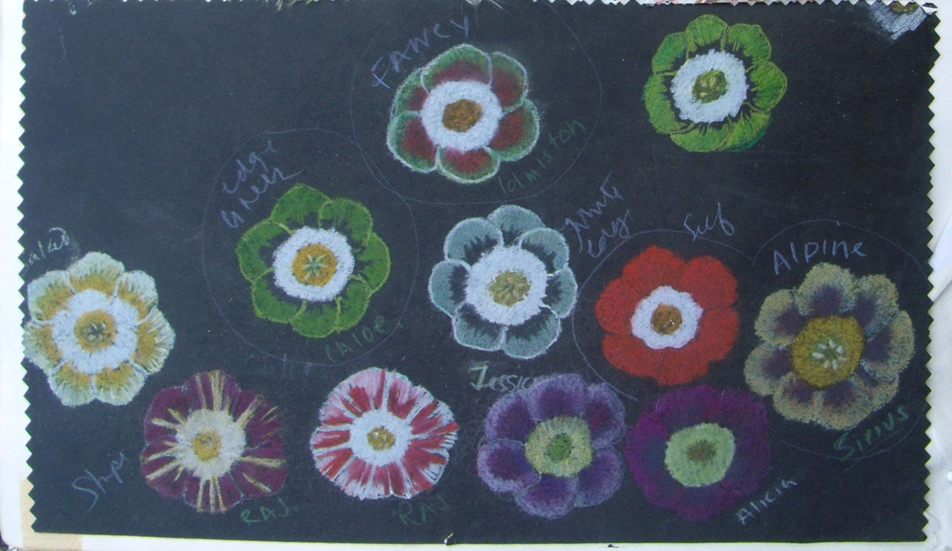
first I needed to draw them before I could start to stitch them.
first pastel drawings of flower heads
at first I tried to paint in the backgrounds, really to make things easier and quicker….
painted dye on linen ground with embroidered edgings
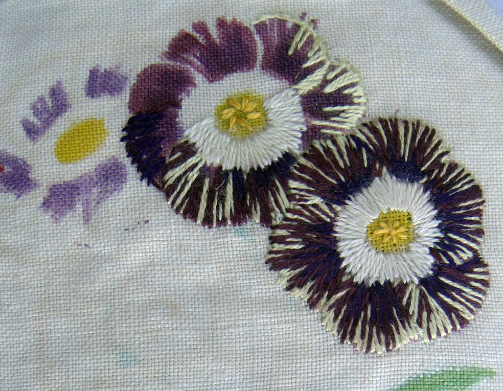
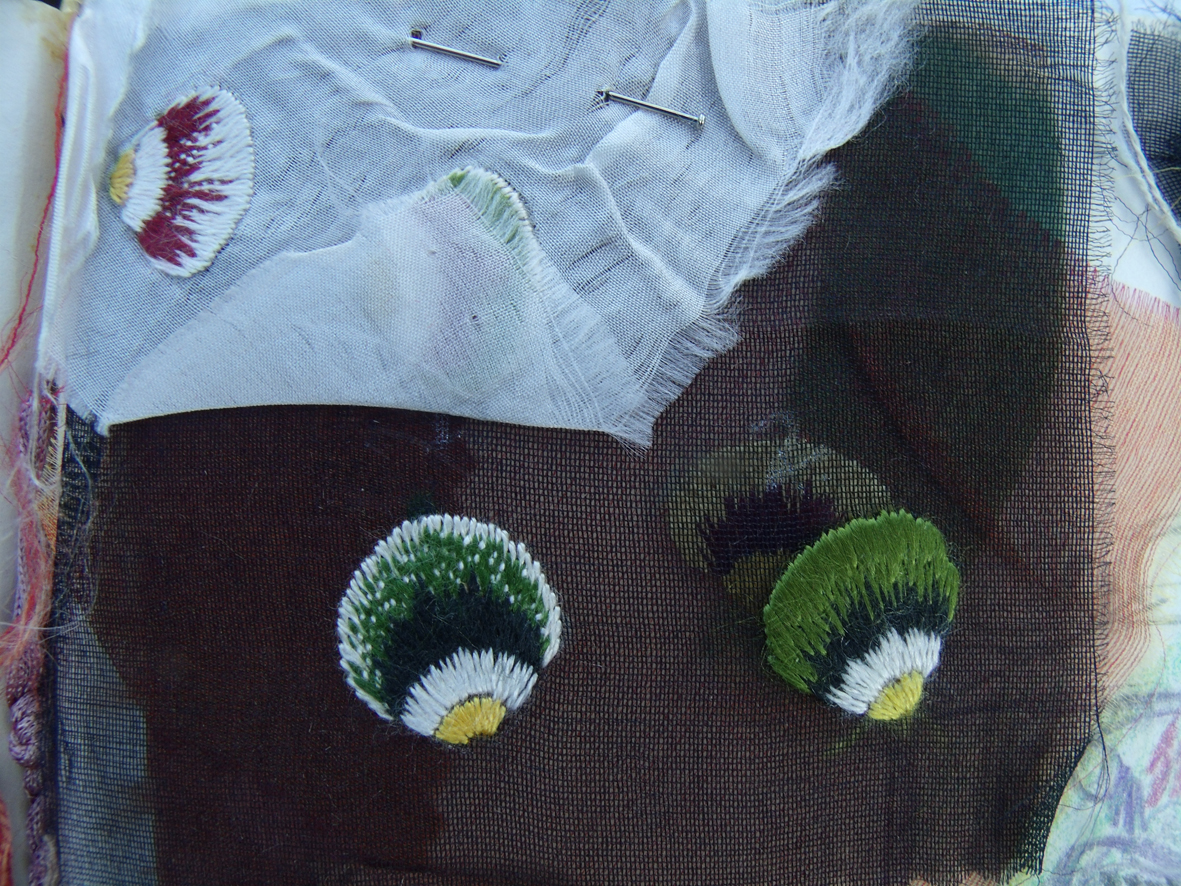
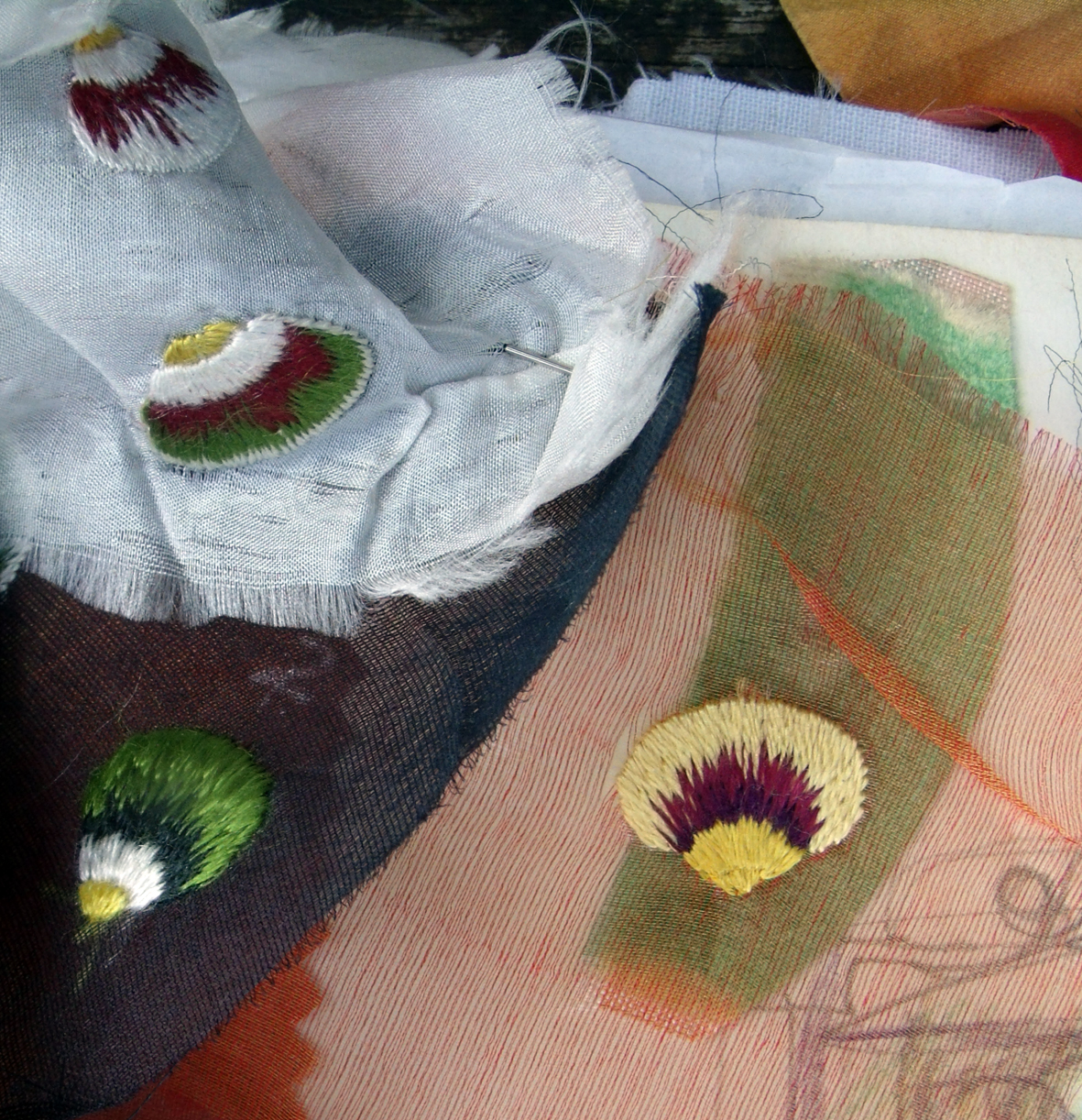
They looked OK but didn’t really have the intensity that the real things had, show auriculas look like imploded flowers so intense is their colouring and perfectly symmetrical their form. I realised that I had to make similar intense embroideries. I started by embroidering individual petals..
my hand stitched samples of individual petals
I decided to try coloured grounds to make life a little easier.
different ground fabric samples
I used gauzes and fine silk grounds so that the made up flowers would not be too heavy but it was a bit of an awesome task even with help with the stitching.
after giving the fabrics and my working samples to my assistant I set to work to develop the theatre.
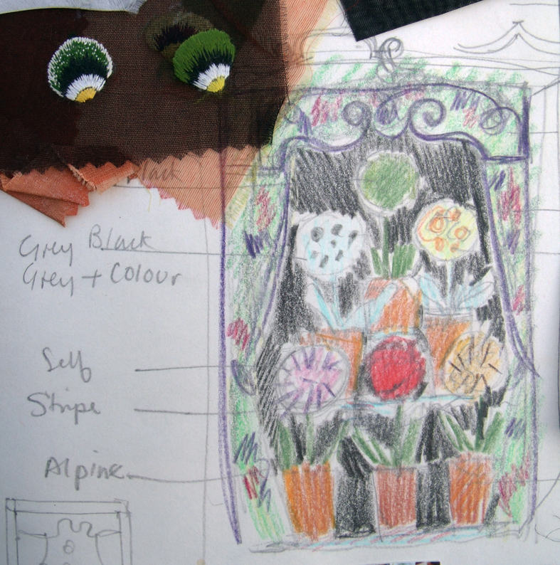
initial drawing for the embroidered theatre
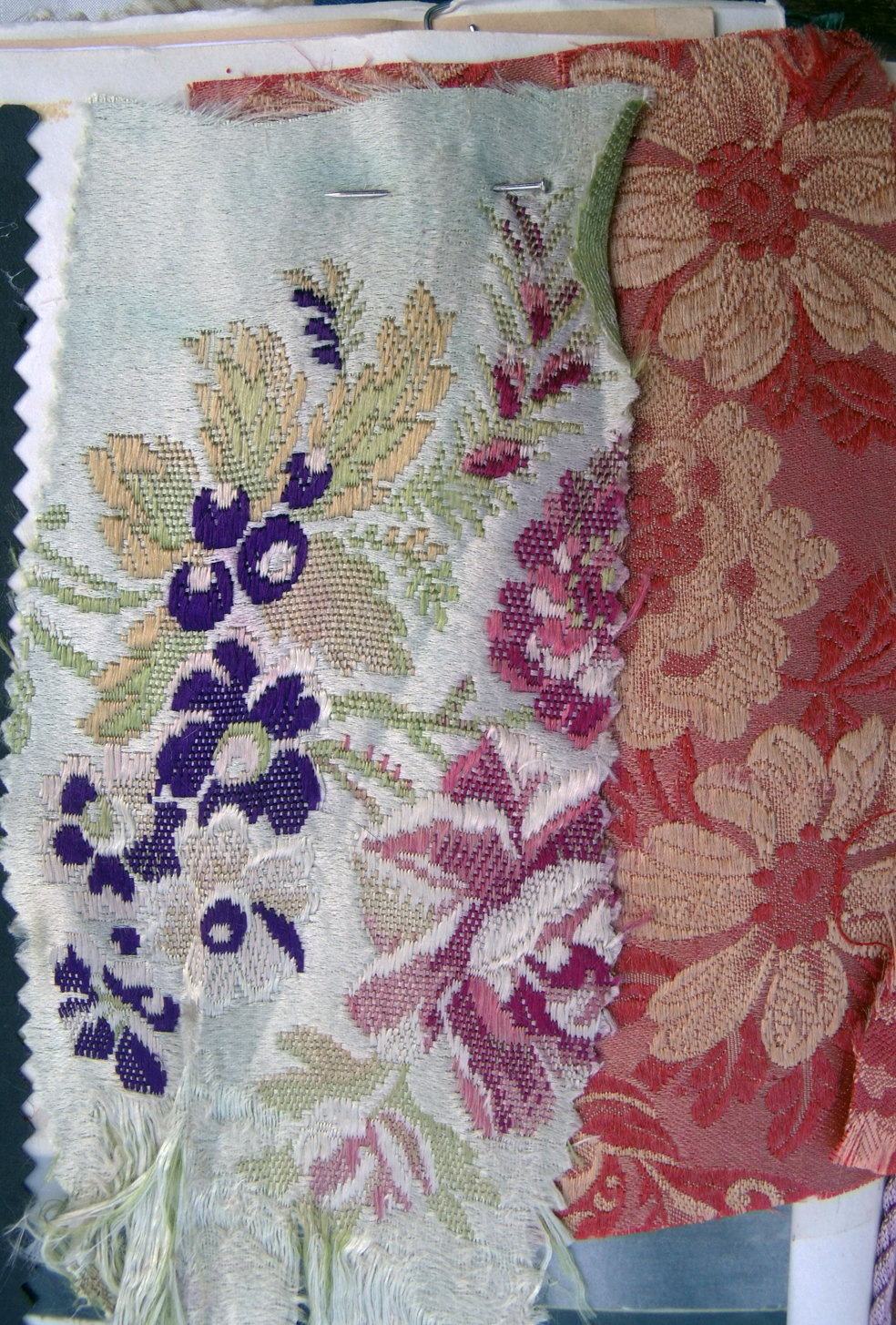
I know that this drawing is really simple and childlike but it was enough to get me started – I soon realised I had to make a 3D embroidery, so the curtains were lined and draped and the canopy was held above and projected out beyond the flowers, it was ribbon worked exactly as 17th century embroidered bed hangings. The earliest auricuals were grown by Flemish silk weavers and eventually shown in special competitions were prizes were awarded, usually a silver cup or spoon. The Flemish silk weavers introduced them into England as early as the 17th century – so I decided to have curtains made from woven silk brocade that features auriculas ( you can’t say I am not thorough in my research)!
pure silk brocade featuring auricula flowers
The finished embroidery is very 3 dimensional and is densely stitched and draped, it is the one piece of work that everyone wants to buy, probably because it featured on the poster for the exhibition at the Holburne museum in Bath where the whole set of Flora embroideries were first shown in this country. This was in 2000 so this is really old work now – but making this piece made me decide that I needed to start to develop new types of work using different media or techniques or both, this heavy stitched surface is too time-consuming and therefore too costly to sell except to a committed collector or dare I say it – museum? and I have decided not to separate the pieces because they tell a story of how, through trying to perfect nature we can go horribly wrong. I had stitched myself into a corner but I still had quite a few more pieces to complete The Flora set of work.