Putting up Christmas

bunting wall at Heart Space

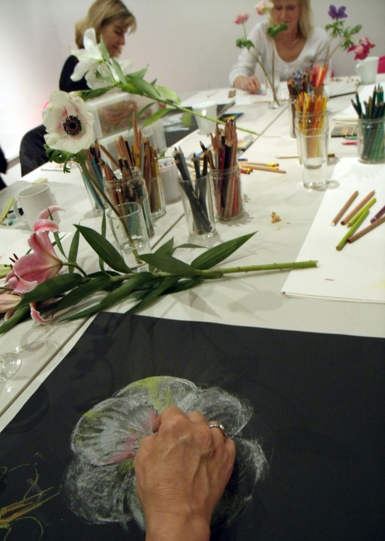
I am not a big fan of Christmas, I prefer New Year with its promise of a fresh start and better times ahead…but here at Heart Space Studios everyone expects us to do a Christmas window at least. But with a refurbished shop to launch, the powers behind my shaky throne decided to put out all the flags – well bunting to be precise – and go for it….hot mulled wine, mince pies and a late night opening party. Added to this was an idea for an exhibition of bunting.

animal mask by Jenni Joule

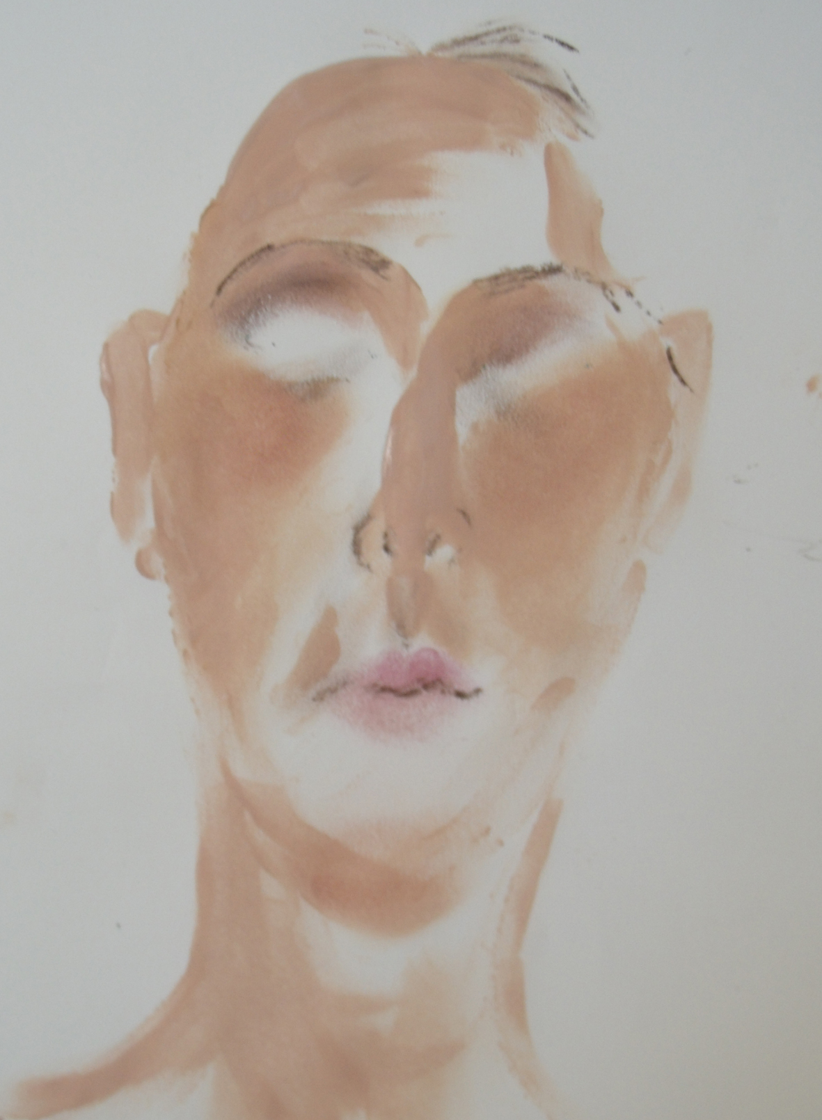
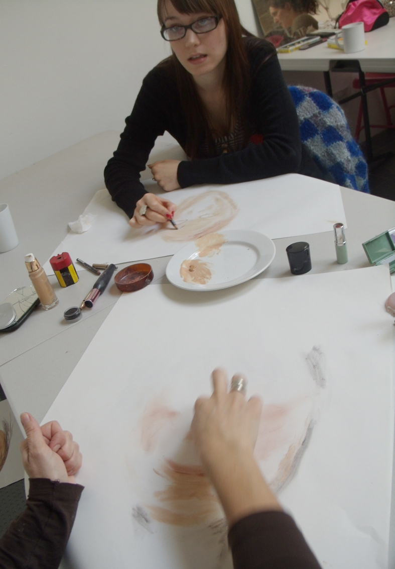
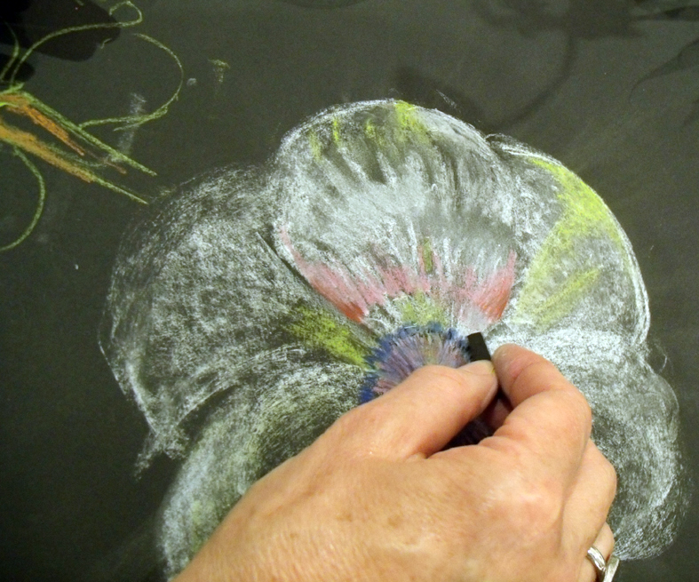
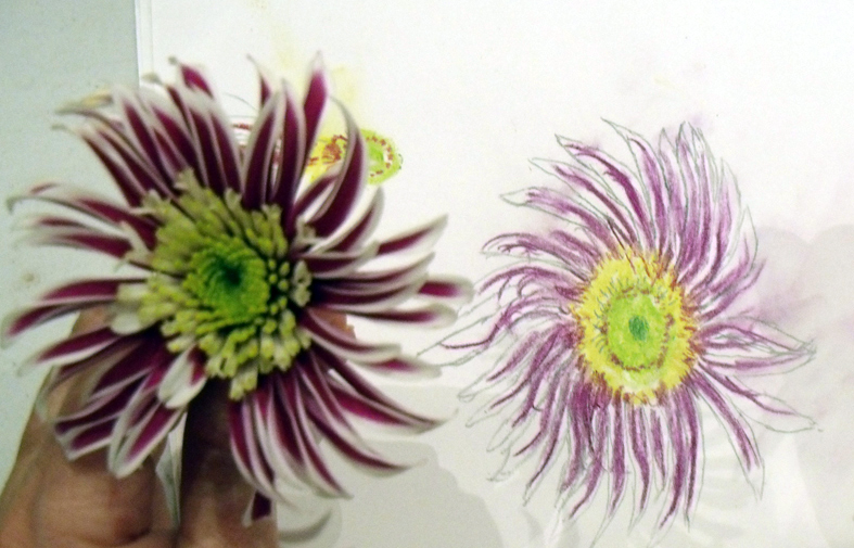
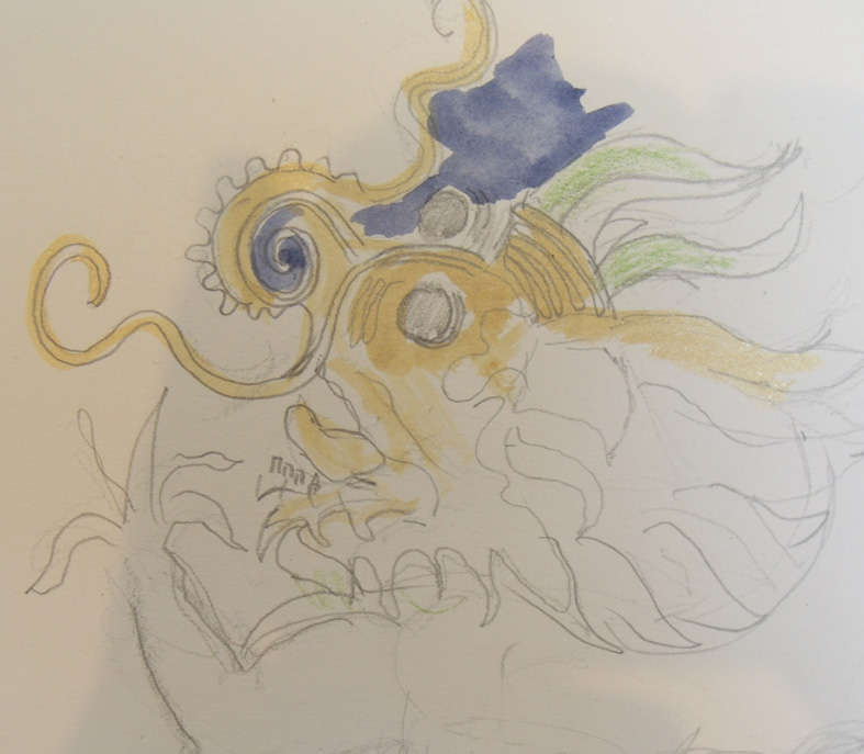
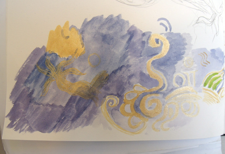
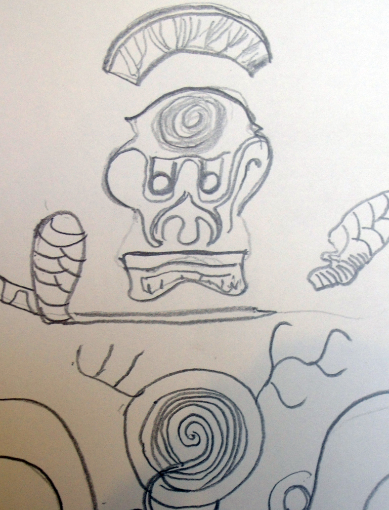
But, first things first – find the inspirational object – I always do this when starting something new, search for an image or a piece of fabric – anything that gives me lots of ideas or gives a very strong atmosphere…Sophie found it on Facebook in the guise of a head – an animal’s head, 3 animals in fact, by artist Jenni Joule, who brought wonderful things in to a meeting about a month ago – we were away, a spooky-wooky frozen forest

Debbie Bird being very precise and technical
rejected heart bunting

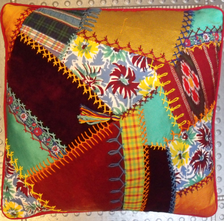
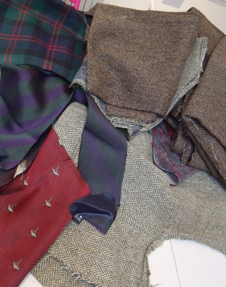
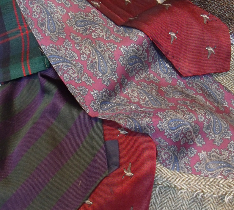
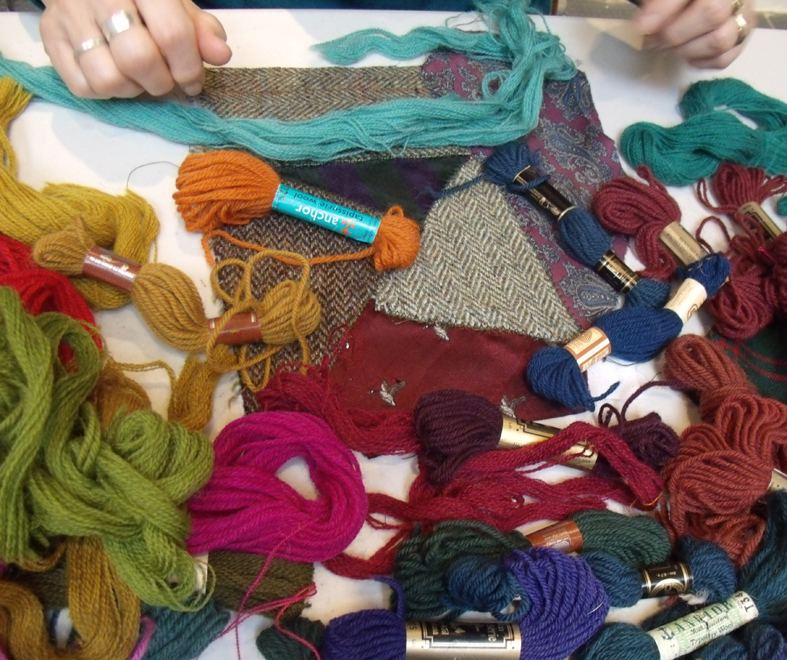
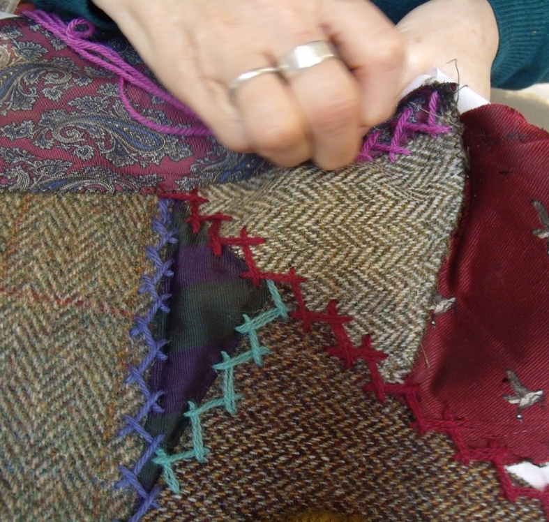
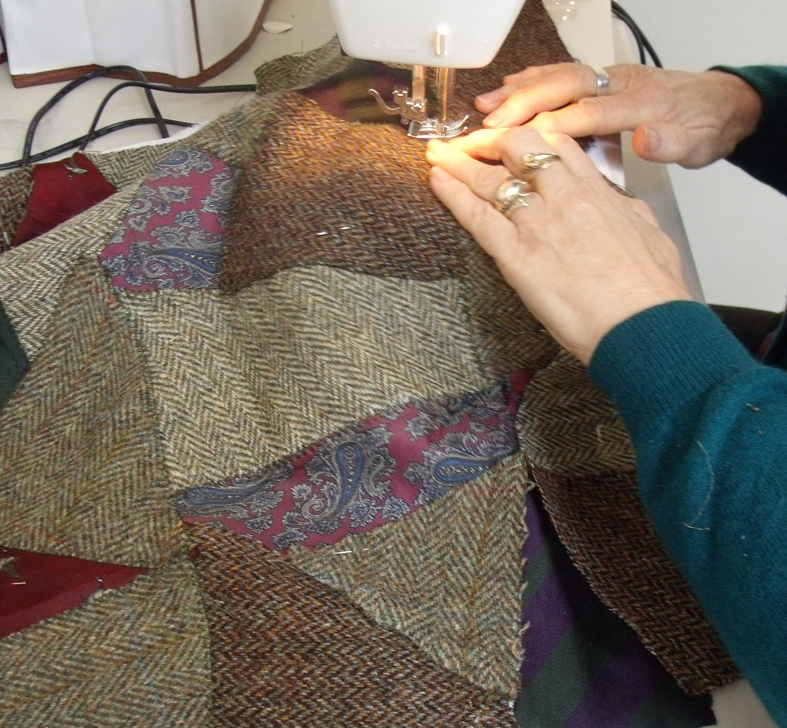
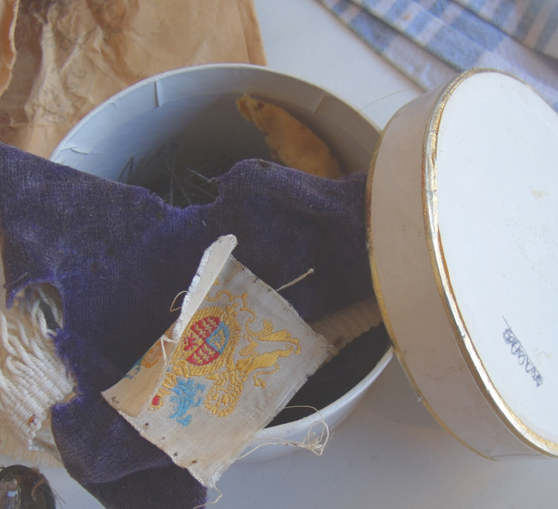
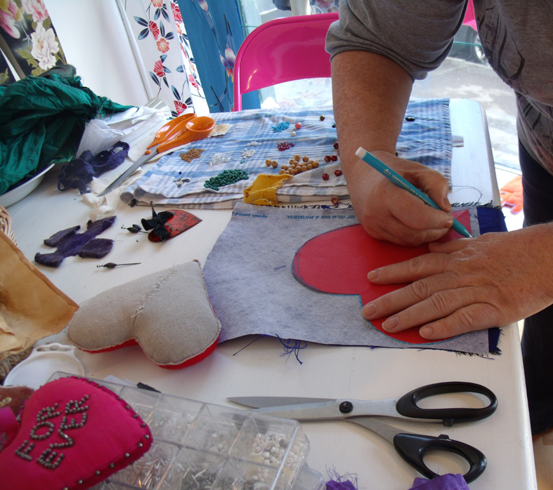
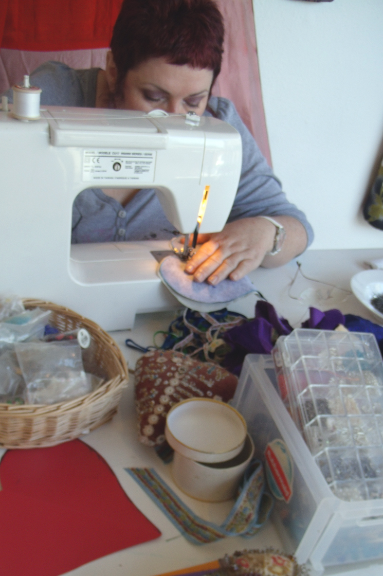
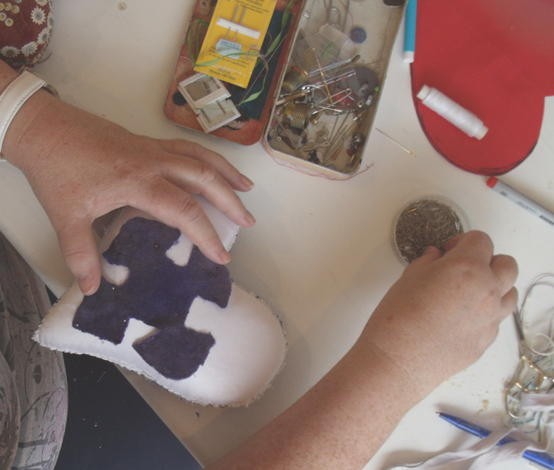
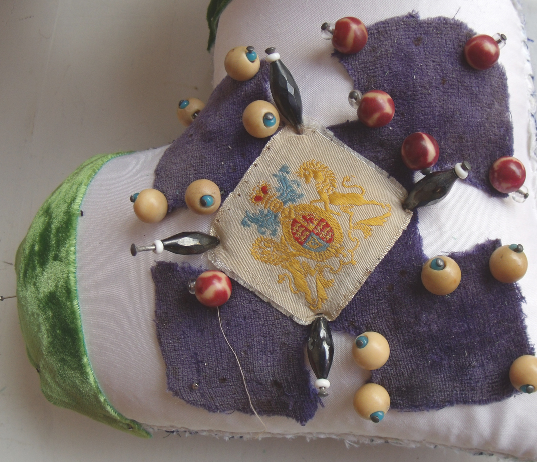
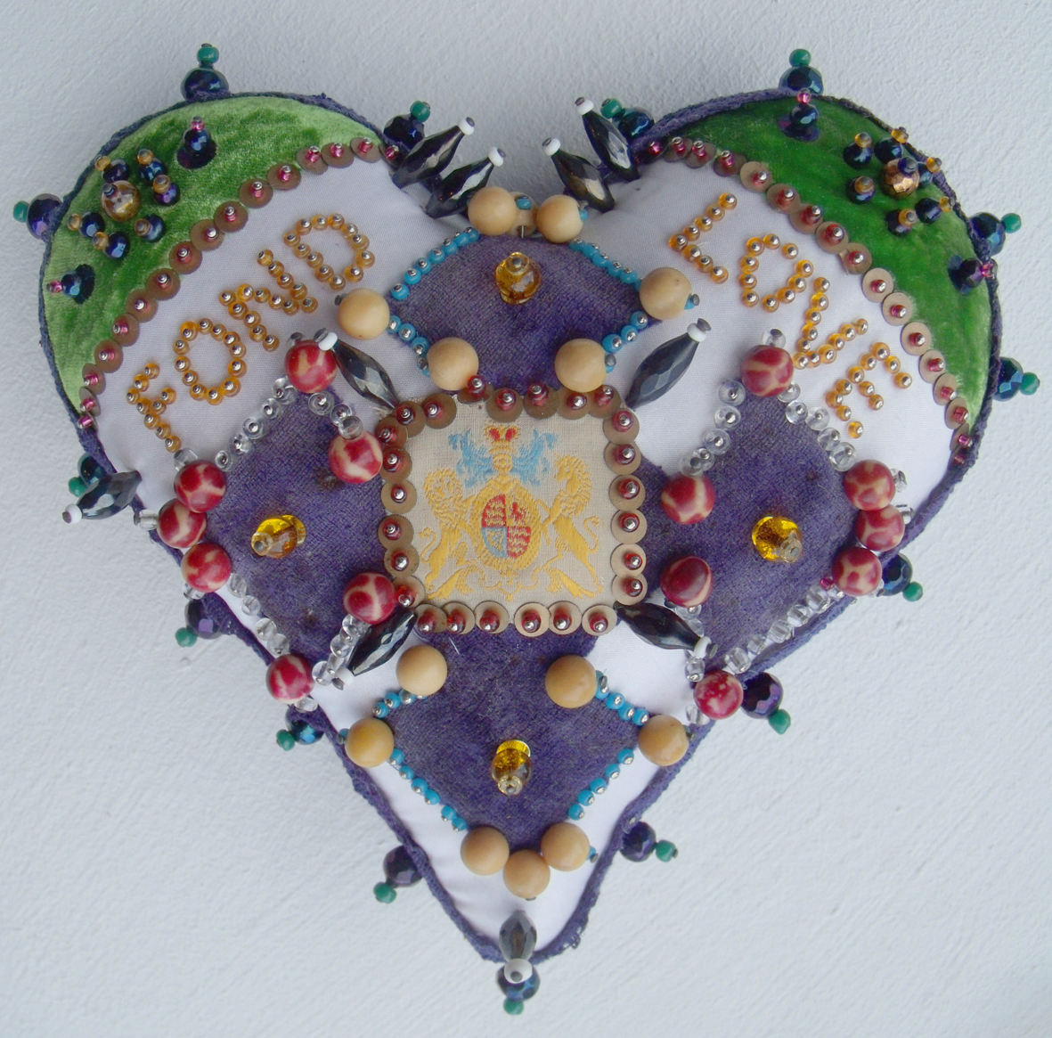
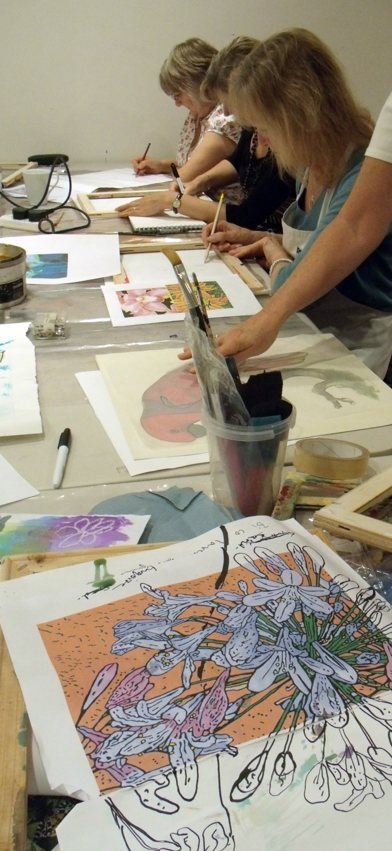
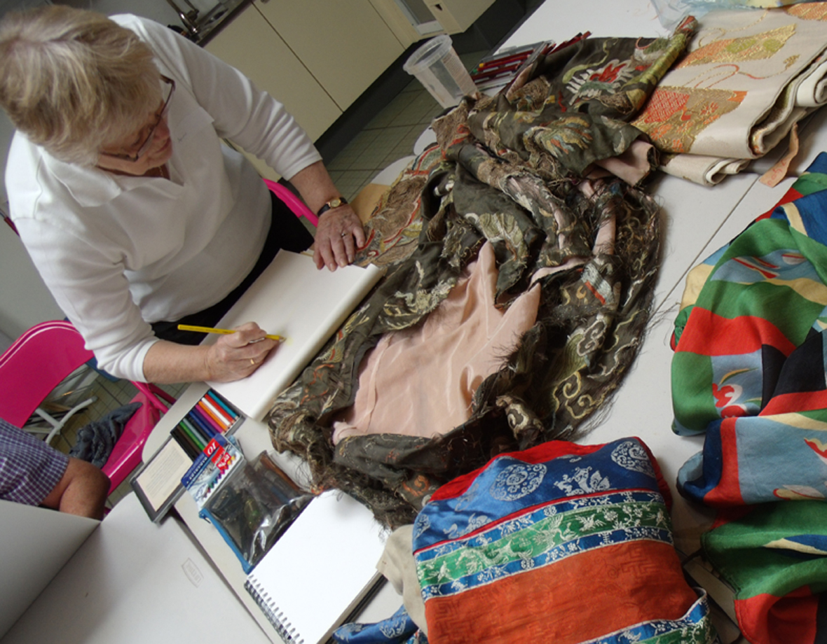
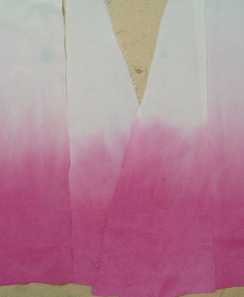
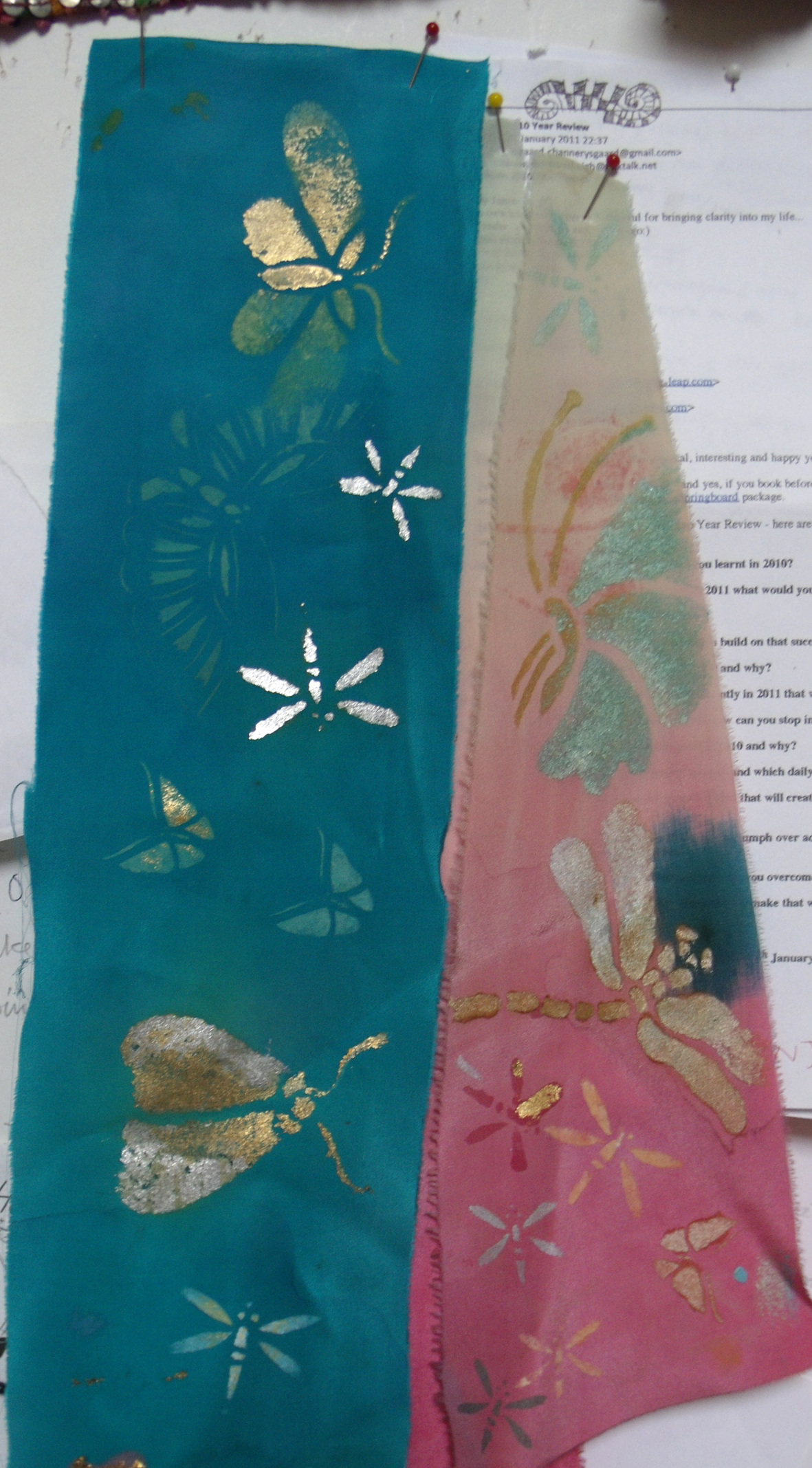
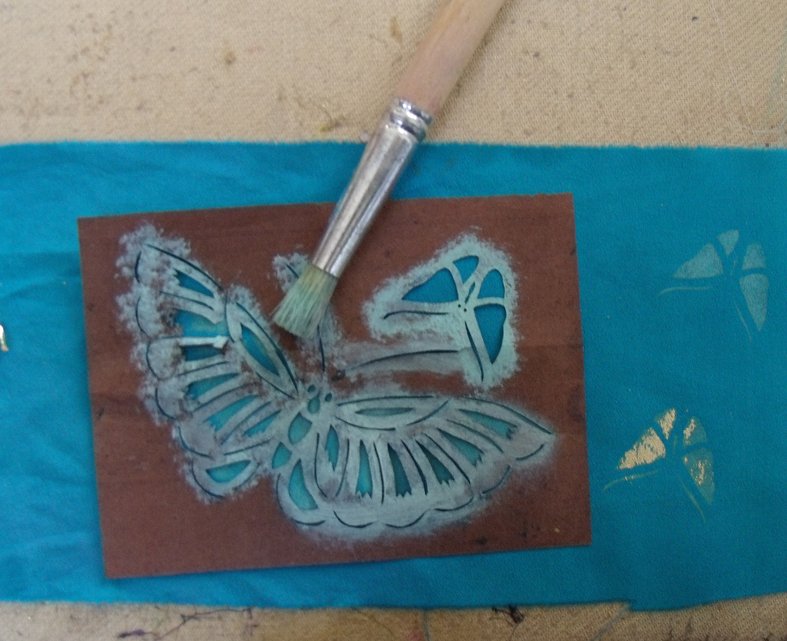
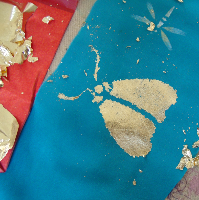
Meanwhile all the tutors set about producing bunting…Debbie Bird held a class on making it and so Heart Space admin, ( Sophie Bristol and I) turned up to find out how to do it.I made several attempts at heart shaped bunting in very tasteful fabrics…they were soon abandoned.  What I needed was a contrast to the white spooky windows..I realised I was trying to reconcile 2 different atmospheres in one space – so the only way to go is complete contrast, the more extreme the better. We would have one red window and one white. So I found an old and very crude Russian shawl in my stash, I hand painted the mustard coloured roses with some pink and purple dyes and then cut it up; next I went for glitz – why stop now? then I added tartan, I do love tartan and paisley – I couldn’t bring myself to cut up any of my old woven paisley samples – far too precious, but I had at last found a use for this old neglected shawl.

tartan and Russian Shawl bunting

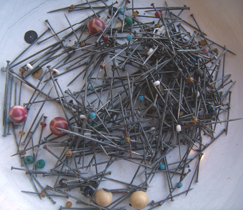
I didn’t bag-out the pieces  but just cut them and left them, as they are cut diagonally to the straight grain they shouldn’t fray too much, and hey it’s only bunting…..I set about making 5 lines to sell.

But then we had to start stocking the shop. The first thing was to get one area working properly to set the tone for the whole place. An old and true saying is ” you can’t sell from an empty shop”;  so we piled it all in, colour co-ordinated of course.

Teresa Searle’s felted and embroidered bags, mittens and cases look wonderfully colourful, setting the standard for the rest of the shop, my hand embroidered felt letters look strong and clash nicely with the work beneath.

the first stand of textiles sets the tone

And the pile of scarves hand knitted by Sarah Thorpe go happily with Janet Clarke’s beautiful soft coloured felts. For real winter warmth, the  knitted and felted Hot Water Bottle Covers and neck warmers made by Steph Wooster all mingle together.

felted hot water bottle covers and knitted scarves

The shop starts to look like it is in business.

shop taking shape
the shop takes shape

But what about those windows? The winter white one came together very quickly, it is now stocked with cream and white  woollen goods for sale, with the 3 headed animal standing sentinel.

spooky white window

But the other window was more of a problem, the costumes that had been brought didn’t fit our stands and there weren’t enough animal masks to make an impression, beautiful though the horned mask is, by Jenni Joule.

jacket and mask by Jenni Houle hung with my silver heart

I needed more red stuff to link with the bunting on the wall behind…so I asked Lisa Keating who was running a corset making workshop for us, if she had anything suitable to contrast with the white and silver and she lent us this wonderful glitzy black and gold number – now that’s what I call a contrast.

Lisa Keating's black and gold lacedcorset

Then I took every red or silvered glass heart from home and hung them in the window – my house now looks bare – but the Christmas windows are paramount.

red and silver window with my glass hearts from home - note the corset bunting by Lisa

Eventually everything was finished and looked totally intentional; always the way when a design works out well, you can’t imagine that you ever had any other ideas than the finished piece.

Drawing Faces

The Sunday Drawing Club that I conduct at Heart Space Studios, continues to surprise and fascinate me..this week 2 old and trusted classes in totally different ways of drawing portraits  – with  difference. In the morning we began by using make -up to draw with, so no long sampling sessions to get the skin colours, but a real battle to manipulate the media.

We started with self portraits….the difficulty for most women who are attuned to wearing make up is that they draw what they want to see, as if they are applying make up to the page for the same reasons they apply it to their own faces – to enhance themselves instead of using it as another drawing media.

Mike did not have this problem but found the blending particularly difficult as modulating make-up on paper is surprisingly hard, some of the foundation lotions are really greasy and do not blend happily with one another .

The slow build up of the subtle colours, above, was interesting to watch because eventually the tacit knowledge of applying make- up for years results in carefully modulated tonal drawings. But eventually  gestural drawings developed as people started to realise the potential of media. the drawing below has been made without using the techniques to apply  of make- up.

Everyone started drawing only using their fingers….

The next stage is to sketch in the eye brows and mouth using appropriate coloured make up…eyes brow pencils and lipsticks

So now to draw other people….

the group split into couples or threesomes…and took turns at drawing one another – this is so much harder and much patience and ingenuity is needed to be a good sitter and drawer both at the same time.

The gradual build up and refinement of the drawings was developed slowly when the students were “allowed” the use of more conventional media…I am a strict mistress when I teach drawing.

The necessary degree of concentration for this way of working  shows in both drawing and model above, but  also look at the mouth. I had talked about how Hans Holbein completely captured the character of his sitters by drawing very precisely the line of the shut mouth…this example is well observed.

But for some unfathomable reason all the people who drew bespectacled partners omitted the glasses from their drawings!

The in the afternoon session, something completely different,  I started everyone stitching the eyeball but no drawing allowed only stitch – I am even stricter when I teach stitching.

The complete change of media and type of drawing really achieved some remarkable results, slow but immensely concentrated studies resulted from the short session. Often stitching is a release for people who imagine they cannot draw, no-one ever has high expectations for the outcome of this exercise.

Not all the people who come to the group are stitchers, so it was fascinating to see how they tackled another unusual drawing media.

At the end of the day we had made a good start on the stitched work and several people vowed to finish them, I will post them later if they do. But I am interested in the variety of stitches applied to this exercise and I feel that some of the group could develop their own work using stitch – but I would think that wouldn’t I? In fact I would like to have another class that involved both of the day’s exercises on one portrait…maybe later in the year.

Commemorative Crazy

Jane’s finished cushion from the original workshop

It is the 11th of the 11th 2011 and I am in commemorative spirit; yesterday at Heart Space Studios we made the beginnings of a series of commemorative crazy patchwork pieces. After the last Crazy Patchwork workshop one of the participants Jane, asked me if I could help her make some more patchworks using the beautiful tweed jackets that had belonged to her husband, she could not bring herself to throw them away after his death, but now saw a way that she might be able to use them to make gifts for their children.

silk ties and heathery tweed unpicked jackets

I was very pleased to be asked to conduct a one-to one session with her to help cut into the jackets and organise the patchworks. I knew it would be really difficult so I volunteered to cut into them for her , suggesting that she make a start by unpicking and when she arrived she had carefully unpicked and pressed them all; 3 beautiful tweeds in soft shades of beige, grey and brown and she also brought some club and military ties that she had been unable to part with, and a piece of her husband’s Scottish clan tartan.

silk ties woven with memories

This is what I find so compelling about many old and used fabrics, the story behind each piece; “Make, Do and Mend” is not such a simple statement when applied to projects like this. The first thing to do was to cut the cloths to make a sample piece of patchwork. I wasn’t taking any chances with such valuable fabrics.

starting to cut up the tweeds

 The little sample would tell us what size patches would work best, which fabrics worked well together and what the ratio of ties to tweeds was best. The clan tartan turned out to be the right size to make backings for 3 cushions….so only the ties and tweeds to be organised

sample patches bonded on a backing cloth

But the most important thing of all for the success of the project was selecting the colours of the embroidery yarns, they had to be chosen and tested. I had brought several types of woolen yarns for Jane to sample, the usual tapestry 4 ply and some crewel wools that can be used singly or in multiples, very useful for developing colour combinations. Looking at the colours embedded in the tweeds it was a real pleasure to try to match them ..and at first the pale turquoise crewel yarn seemed the best choice

selecting colours to complement the tweeds – check out that pink

But the colour that really delighted and just kept calling to her, was a zingy hot pink – not what you would imagine for this soft and hazy set of fabrics, but it demanded to be used, Jane kept laughing every time she picked it up.

the pink thread that just had to be used.

We also discussed putting a message or an initial onto the piece, and I explained how in the Crazy tradition there are lots of written messages..so she is writing her husband’s initials on a corner piece of each cushion, but has just emailed me to say that her daughter wants her to just write ‘Dad’ on hers.

platyng with the colour combinations

The use of the crewel yarns in the different tied herringbone stitches makes it easy to combine colours to soften and blend the brightest yarns.

Now Jane had to get brave and cut up enough to make a whole cushion square to take home with her – we distributed the tie fabrics between the tweeds…quite a bit of work ahead …

laying out the first cushion square

the last task before she left the studios was to machine stitch everything into place ready for the decorative stitches that are the true embroiderer’s delight in making Crazies.

matching the patches ready for decorative stitching.

During the workshop Jane explained that she had taken tailoring lessons to make her husband a coat from some tweed he had bought from Scotland, she now wondered what she should do with it – my suggestion is to combine the left over tweeds from the jackets and use them to make a huge throw or blanket using a strippy quilt design….so she is now happy that she does not have to throw it out but most importantly, when I wrote to ask her permission to use her ‘story’ she replied that she now felt that the jackets had “still got a life”. That is why I really appreciate using old and loved textiles to remake and recycle.

Kirsty’s Crafted Card

sample of 1st embroidered card

Recently I was advised  to watch Kirsty Allsop’s TV programme, Hand Made Britain, in order to immediately offer a special class in whatever she had made that week in textiles; a new idea for attracting new students toHeart Space Studios. So this week I did just that – watched the programme that is all about making things for competition at County Shows, which I was delighted by having spent many happy days in marquees up and down the country gazing in amazement at the things that people produce for competition.

Portishead produce show

The local Portishead flower and produce show, even inspired an entire body of hand embroidered work, The Flora Embroideries.

my embroidery of Flora, the goddess of flowers

I watched with growing fascination as Kirsty, aided by textile designer Claire Coles, made a pretty paper collage that was then machine stitched to produce a greetings card with a bird and flower design. She was obviously enjoying every minute of it .

OK, I thought – I can do that – and then I will make another version of the idea adding textiles to the papers to run as a short workshop, easy – peasy……

presentation board for an earlier work

That’s what I thought until I started to make my sample. Looking in my plan chest I found some old presentation boards from my book, Crazy Patchwork, lots of lovely images and scraps of fabrics all ready to be re-cycled into new and glamorous greetings cards.

selecting and arranging the papers

It was when I was trying to make a loose and airy design from my tiny scraps of fabrics and old flower pictures that it all seemed to go a bit wonky – but not wonky in the right way or enough to be quirky – which was the look I was aiming at.  I eventually found that working on a coloured background was easier than all that white space glaring out between the collage ( I had been so busy writing my ideas down when watching the TV that I really hadn’t paid that much attention to the actual nitty-gritty of the proceedings) now I was paying the price of over confidence.

stitching the collage with copper coloured thread

I am not a great machine stitcher so even with the embroidery foot in place, the card was quite difficult to stitch in a fluid line; using metallic thread didn’t help either but I often use metallic thread as a neutral tone for busy designs, plus the scale was very small for my level of skill.

stitching on the back of the card

For once I actually think that I preferred the back of the card as even though the stitching is really bad – it is a quirky drawing – I may work with this idea a bit more in future. I was beginning to admire Kirsty’s effort more by the minute. It took me about 2 hours to get to this stage, but it did look a bit sad – beads will cover a multitude of sins – like the holes in the middle of the flowers….

finished sample card

Eventually I got something I thought I could develop – I really liked the addition of lace to the paper and had to resist use all fabric instead and I like the odd combination of different materials so the next day quickly made another card to photograph for the Heart Space website to advertise the class. From these 2 samples I now need to develop a system to enable people  to make their own versions simply and easily. So now I am off to source and organise papers, pictures, fabrics, glues, beads, threads and cards so that the students who come here can have a relaxed and enjoyable time creating something new from something old.

second sample

Back to Kirsty and the programme; she entered the card into an embroidery/hand craft competition at a show in Wales but won no prize with it – fair enough, it was her first attempt. What did win was a traditional embroidery made into a card, it was very precisely stitched – in fact the prizewinner carried off the ‘best in show’ award for what looked like a large – scale cross stitched alphabet; I suspect it was made from a commercial kit or someone else’s design.

For this reason, I generally find the craft displayed at most county shows dispiriting (unlike the produce which I love) all that seems to be rewarded is careful craftsmanship, but I suppose that is what the shows were originatedto promote. But I prefer to see things that people have had tried to fashion for themselves – some personal quirky things made up out of what is available which is why I always prefer seeing the  children’s competitions that are often much freer in spirit, and originality is always rewarded, now what does that tell us?

Mending a Soldier’s Heart at Heart Space

recreated soldier’s pinned heart

This wonderful pinned heart, so bright and fresh but curiously authentic was made yesterday during a workshop at Heart Space Studios. The maker, Libby, had received the original some 25 years ago from her grandmother, to whom it had been given as a token of love by her husband, a soldier during the first world war.

box of rusted and stained remnants with scribbled design for reconstructing the heart.

When she first received the heart, Libby tried to restore it…..with disastrous consequences; the whole thing disintegrated because the silk that the heart had been made in had rotted. She thoughtfully put  all the pieces  in a small box, with a scribbled note of the design – and yesterday it arrived to be mended. The first thing to do was to see what we had got and to clean it as best we could….

all the beads were separated and washed as was the fine cotton velvet centre cross and the remaining  shoulder applique.

The pins were steel with several rusted, but we decided we wanted to use as much as possible of the original materials and also bright stainless steel pins would have detracted from the overall quality of the reconstruction.

rusted pins with some beads still attached

I then had to draft a pattern to fit the purple velvet cross, luckily one of my old pinned hearts was the perfect size so I used this.

original heart used for pattern.

Libby decided that she wanted to use strong colours that complemented the original velvets, but disliking yellow she chose some of my own hand dyed green silk velvet to replace the shoulder appliques.

drawing round the new paper pattern for the back of the heart

Next came the heart reconstruction, this time stitching by machine, it is stronger and quicker…..

machine stitching the heart shape for filling with sawdust

leaving lots more time for time for the really fascinating business of pinning the beaded design back into its original position.

the first central cross is held in position

The washed velvet was still a bit dull and faded but little is seen when all the rest of the beads and the ribbon are in place.

pinning the regimental ribbon in place

I was pleased to see that the original  woven silk regimental ribbon was still very bright after I had carefully washed it in several rinses of warm water. These ribbons with badges and coats of arms feature in many of the hearts I have collected, but none are as bright as this.

the simple beaded lettering being formed

Libby re-wrote the message “FOND LOVE” onto paper and the pricked through it with a pin straight onto the silk. We had found some evidence of sequins in the remnants and they are useful to hide the raw edges of the applied fabrics; in my stash of beads I found some dull gold metal ones salvaged from a 1920’s dress, the same period as the original heart.

the almost finished heart

By the end of the day the heart was almost complete, except that there were a lot of the original beads left over…Libby said that she would keep pinning them  into patterns as more is more in this type of thing. So that evening she brought back the finished heart which you can see at the head of this post.

The best thing of all though was how the remaking of this family heirloom originally made by Libby’s hardly remembered grandfather, resulted in her reflecting on her family and its history, the ties to the present formed by using the remnants of a family wedding dress;  she was moved by  the idea of actually touching the same beads and placing them in the same patterns as her grandfather had  – I have seldom worked with such an enthralled and ultimately contented and student.

The W.I. Taster Sessions: Drawing + Batik

The Clifton, Bristol branch of Women’s Institute recently asked Heart Space Studios if we would organise a special series of textile classes for their members – so we have put together 3 classes to demonstrate how to develop drawings into designs for textiles.

We chose to draw from flowers – very W.I. and to develop studies to take onto the Batik class – it didn’t quite work out that way – but the results are extremely promising.

The idea was to give the members tasters with a view to developing a whole series of evening classes built specifically for them. I taught the first drawing class and the results were really inspiring, large and luscious drawing emerged for the close studies…

I had chosen 2 types  flowers, those with full faces of interesting detail, Anemones – above, Daisies

and Cabbages – as September roses were not really blousey enough for my purposes….

the drawing below really captures the strange colours and growth patterns of the cabbage…

other flowers were chosen for their silhouettes, Lilies

and long stemmed Anemones

And because of the studio’s spot lights we were getting some wonderful shadows thrown onto the papers, perfect line drawings for the next class in Batik.

the same lights also caused the rapid wilting of the more elderly anemones but they, like tulips die very gracefully.

this drawing below really captured the quality of the flower, both the full faced and the silhouette.

So I was really looking forward to seeing how the group translated these studies into Batiks…..and they completely ignored them, choosing instead some (very attractive) flower photographs that the tutor, Debbie Bird, has brought with her “just in case”……….

however once Debbie had explained how to set about developing  a linear version of the images to enable drawing with a melted wax line, they soon got going to develop more interesting textile studies….

And the colours soon started to flow once the wax line was dry enough to contain the liquid, it is always fascinating to see the cclolour belled to the edge of the line, you wait with baited breath to see if it will escape your initial drawing with the djanting.

Debbie showed various techniques to apply the dye to wet or dry silk.

but the dry results are always fascinating to see –

and some of the Batiks did at least resemble the original flower studies of the previous drawing session or so I like to think!

The last class will be a “show and tell” by  3 Heart Space Tutors’  of their drawing/research books and folders that demonstrate how the process of drawing and sampling in many different media, results in finished textile based work that is both personal and original.

Post Script:and did they sign up for the more paying drawing and craft classes – of course not!

Crazy Patchwork Class

crazy stitch sampler

Yesterday I  taught a Crazy Patchwork class at Heart Space Studios. It was such an enjoyable experience I had forgotten how wonderful it is to just play with colours, textures and threads to produce a whole new seemingly haphazard fabric…and such a pleasurable way to re-cycle old fabrics.

Sue Bradley’s Crazy patched coat

As it is not much made at the present time, I was really surprised and delighted when I saw Sue Bradley’s exhibit “My Father’s Coat “. At the weekend I had visited the TFSW touring exhibition, Material Actions in Bristol,   Sue’s coat had several areas of Crazy patches applied to the ground fabric but unusually she had used tweeds and  dark woolen cloths. The effect of the exhibit was very dramatic, it tells the story of her father and this is the response to her inheriting his  clothes and recently discovering them

This reworking for sentimental purposes is within the Crazy tradition of recycling precious cloths, but usually the preciousness comes from the quality of the fabrics, not the associations.

beaded and embroidered sampler

Crazy Patchwork (it is actually an applique process) was usually made from the most glamorous fabrics – ones that would not be able to withstand the wear and tear of domestic patch-worked  quilts and bed-covers. To add to it’s unsuitability for domestic use the overlapped seams are embroidered over  – which is its major attraction for me   – a case of more is more – not a popular concept for today’s makers!  However one of my first published books was about Crazy,  Collins&Brown ISBN 1 85585 641 7

Paperback book on Crazy Patchwork

 I used several of the samples from the book as illustrations for the class..

samples from  my Crazy book

Getting started is a real treat as you just have to surround yourself with as much fabric as possible to choose a colour scheme  – even if only making up a small square to learn all the steps invloved.

some of the fabrics available for use at Heart Space

Some of the students brought their own stashes of fabrics and the swapping began,

Sophie’s stash of Indian silks

One fabric was exceptionally popular, an Indian ikat dyed and woven silk – you can tell autumn is in the air.

The popular Indian Ikat silk

 I used a method of choosing one patterned fabric then finding other toning or matching fabrics to complement it, this ensures that the small sample will be colour co-ordinated.

to begin with even cutting the fabrics takes a bit of nerve

Ribbons, braids  and all sorts of scraps can be used up. Some choices are made and remade several times before committing to the next stage.

Jane’s selection based around the sprinted silk handkerchief.

There are really no seams to worry about as everything then gets bonded onto a backing fabrics using an iron.

pressing the patches into position

And then the embroidery begins – but before this can happen the coloured threads are chosen. Embroidery is not just a decorative device as it can be used to balance colours within the patch-work and also decorate large areas of plain fabric.

choosing colours for embroidery

Sometimes the colours for the embroidery can come from a totally different source, here Liz decides to choose to stitch the neutral patchwork with the colour of the heads of her pins.

using the pin heads to decide colour scheme for embroidery

I was really interested in seeing this choice made as this maker often uses a range of brilliant pinks, turquoises and purples for her work, here she was wanting to try a new colour gamut and so used the class to this sample something different.

Now down to stitching  – a water-erasable blue pen is used to make a guide for neat but always very short rows of stitching

herring bone stitches to cover the seams

I had to teach some of the students the new stitches and some were having to remember them from childhood, but all were delighted to be learning something new.

using the yellow herringbone stitch to balance the design

embroidering braids to silk and lace.

corners are always a problem – maybe a shisha mirror will cover the collision.

Eventually the students went home with enough information and threads to finish the panels for themselves  – and this morning I had this message from Jane Blair –

“Thanks so much for the crazy patchwork class, just what I wanted and lots of scrummy fabrics and threads….I will bring it in when finished and drop off any threads left.”

So hopefully I can post the finished results later………..

Drawing Club

I have started a drawing club at Heart Space Studios, the first workshop was at the weekend and as I have put up a small exhibition of the kimonos that I brought back from Japan, to advertise my kimono making courses, I decided that the first class would be drawing my collection of oriental costumes.

As you can see my collection is very old, very damaged but very beautifully coloured and embroidered. I have used the collection many times for drawing classes and students always find new ways to respond to these lovely old silk clothes.

The first drawings are often tentative as people are often really nervous when starting to draw, particularly as this group of students had only just met, but the responses were fluent and quick to emerge.

After the first critical overview I suggested that everyone concentrates on getting the colour is the priority for the next drawing of the same fabric, not so easy but still a searching is apparent in the drawing that gives it a life of its own.

This often results in a change of focus and makes the subsequent line drawings much cleaner and concise, and not necessarily in pencil. The dragons were very popular. The drawings below have such a curious mixture of terror and comedy, the gold line drawing looks like a piece of graffiti – such energy and character.

Meanwhile in the front of the studios, where we have a wall as a gallery for hanging exhibitions to advertise our courses, other students were working from the displayed kimonos, the glamorous wedding robe got a lot of attention for the initial drawing session.

The resulting drawings are really, really tiny in comparison to the actual robes, but attention has been paid to interpreting the colours and giving direction to the stitching.
These intense drawings are really difficult to achieve in the small amounts of time I allow for each study – I make sure that to begin with no-one gets enough time to complete anything, I want people to react to what they are seeing, really look to draw in-depth.
The drawing above looks more like the real feathers of a crane than the gold embroidery it emulates. I particularly admire the directional drawing of the stitching, you can tell she is a textile artsist; and the subtlety of the erased pencil lines to describe figured silk is a really imaginative drawing technique.
A change of media often results in a change of scale – see below the difference between pencil crayons and pastels. I often get students to experiment with scale to find out if they naturally draw big or small –  oh and the change of coloured ground makes a big difference as well – colours glow off black.
and a change of scale can also be realised by standing to draw rather than sitting when you have only the arc of your wrist to make marks, the arc of an arm is much wider when standing.
 However, sometimes drawing large releases more than just your reach – below Drawing as Therapy.
this ‘jaunty, exhuberant flower’ is in response to this minute and exquisite embroidered flower on the tassel tag of a Chinese skirt. The artist assured me that she felt a lot better by the end of the day ….she was drawing for some other purpose than the one I had proposed – no problem, I’ll rein her in at the  next workshop.
And this is why I want to run a drawing club, not just individual classes – so that I can work with a group of people and get to know what they like and dislike, how they react to different stimuli, pull them out of their comfort zone to extend their experiences, let them play with lovely materials, fabrics and media  – and over the months  develop their range of drawing skills and experiences; to have the luxury to let them alone when they need space to think and really mess around, but then to push them to try something else when they feel they have finished.
Sometimes a piece of fabrics gets to everyone in completely different ways, above is a pastel drawing of a Chinese skirt, the artist is really trying hard to describe the colour of a soft and faded old pink silk lying next to its green lining….
The colours are completely wrong but the effect is ravishing…now what is this about? He had decided he had finished the drawing – I could tell this before he told me – as he was scraping in some black ground colour – where non existed. But I suggested he look again at the blue silk banding on the skirt to ground the drawing rather than invent a colour to surround it – the effect was immediate and I feel he has started on a journey of really working with colour, playing with the effects of broken/nuanced colour over solid ground colours…
However some fabrics are so simple, strong and vibrant that even in a bundle they cannot be denied their own character.
this vintage Art Deco dressing gown is truly inspired by kimono
But to return to drawing, observational fine line drawing. One of the last drawings of the day, inspired by a padded silk Chinese embroidered jacket, really shows true sensitivity to the garment.
and to finish where I started, here is a pastel study from a modern Chinese embroidered jacket, the student really had been having a bad drawing morning – trying to change the habits of a lifetime in one day – eventually she settled down to a whole afternoon of careful and precise study and here is the very satisfying result.

Kimono Progress

Kimono in progress hanging in my studio

After several weeks doing other stuff, I have finally managed to get back to sampling the decorative techniques for the Kimono course I am running soon at Heart Space Studios. It has been quite a challenge – it dawned on me that although I have helped many students design and make kimono, used the techniques for patchworks, screens, hangings and panels and written books about all of this –  I have never actually made one myself.

dip and tie -dyed silk  front section of silk kimono

I have offered several traditional Japanese techniques on the course, the students will sample them all and then choose which ones to use on the final garment. First thing though is to cut out – rather rip up – the fabric prior to dyeing and this dip dye technique shading red through to blue is a so immediately “Japanese” I always intended to use it – it  reminds me of  the work I did earlier in the year on  the skies embroideries and enamels.

separate pieces of cut silk dyed together to be stitched later

What you need to consider when making a kimono is that you cut the fabric patterns out before you start to decorate them- above can be seen how the front pieces have been cut out and then dyed together. As there is no shoulder seam on a kimono the whole lengths from front to back is dyed at the same time and also the sleeves and neck bands plus some silk for sampling

sky coloured samples with various flying insects in metallic dyes

Deciding that I had chosen a sky theme I dug out all my old stencils of dragonflies and moths that I have been used many times; these particular stencils were last used for the enamel garden – so they are old and well used. as well as stippling

original Japanese stencil stippled with dye

I wanted to try out gilding with metallic foils, but the stencils are a bit too small for it to be very successful.

gilded moth using stencil design

Time to get designing..you can see my quick scribbled drawing below, not very proud of this but it worked well enough.

design ideas and placement of stencils on fabric

I also used my book Japanese Inspirations, the stencils were originally designed for this book – published by Collins and Brown for Chrysallis books in 2000 – so you can’t say I don’t get full value out of my old ideas.

working from my patchwork book – Japanese Inspirations

I soon got the major stencils printed using a thickened dye that can be ironed to fix it – I chose to use pearlised dyes, very subtle if used sparingly.

the back panels laid together for printing.

I then decided to embroider an outline in gold thread of one of the stencils, and because I am so used to embroidering I didn’t sample first – BIG MISTAKE, it looked terrible off the stretcher and I had to unpick it…..it may  go in again at the end, it may not, depends on how the sample looks……

gold line embroidery

I now had to make the whole kimono – mostly by machine stitching for speed – this is a sample after all – with some hand stitched details that I researched by checking my collection of real kimonos.I do like to keep things as authentic as possible including the proportions. I got the garment together well enough, using my old kimonos as reference – usually silk kimonos are lined so the problem of seam neatening is not an issue  – I need to reconsider this later.

stencils seen against an old kimono
hand stitching the front panel

Having got the main body and sleeves together I put it an a stand to see how it looked form several angles. I feel that it needs a bit more consideration as to finish – l do like the hand made look to it – but I am finding the colour a bit too brilliant now it is an actual garment – it looks what I call “straight out of the bottle” colour  – a bit too brash,  but maybe this is because I am looking at it on a dull September day?

So the kimono is almost ready – do I embroider it or not? I will leave it for a few days and take another look – maybe I will not use gold thread but am ombre-dyed silk thread for a bit of subtlety.  Anyway  here it is laid out on the studio floor  – so far so good, first the front …..

Now the back – I feel a few clouds stitched in silver might be on the horizon…………..