Pansy Faces

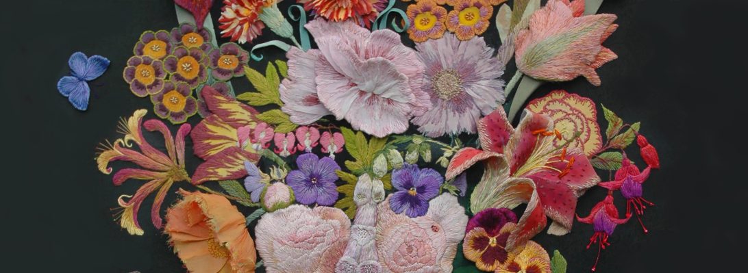
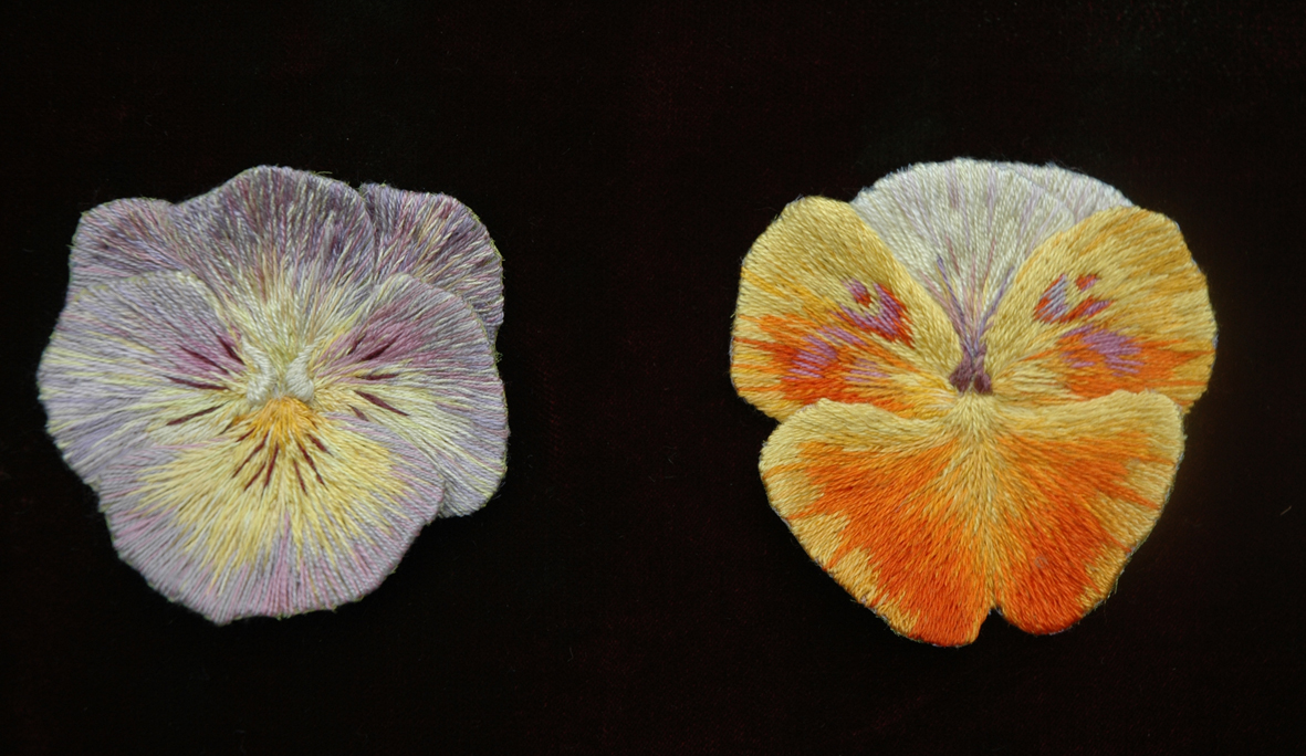
Winter flowering pansies are in the shops now, but I have a set of embroidered pansies in flower all year round…the Pansy Faces from the Flora Embroideries.

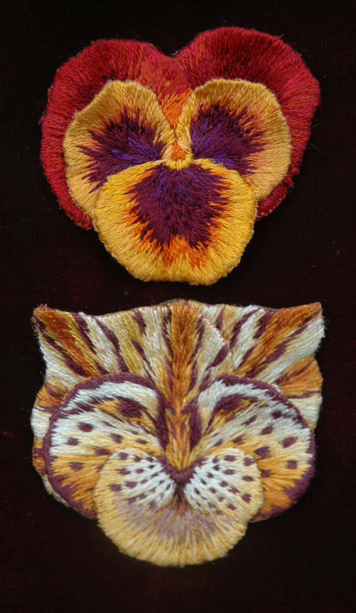
So just how did the rust and gold pansy on the left turn into the tiger below? I will try and show you.

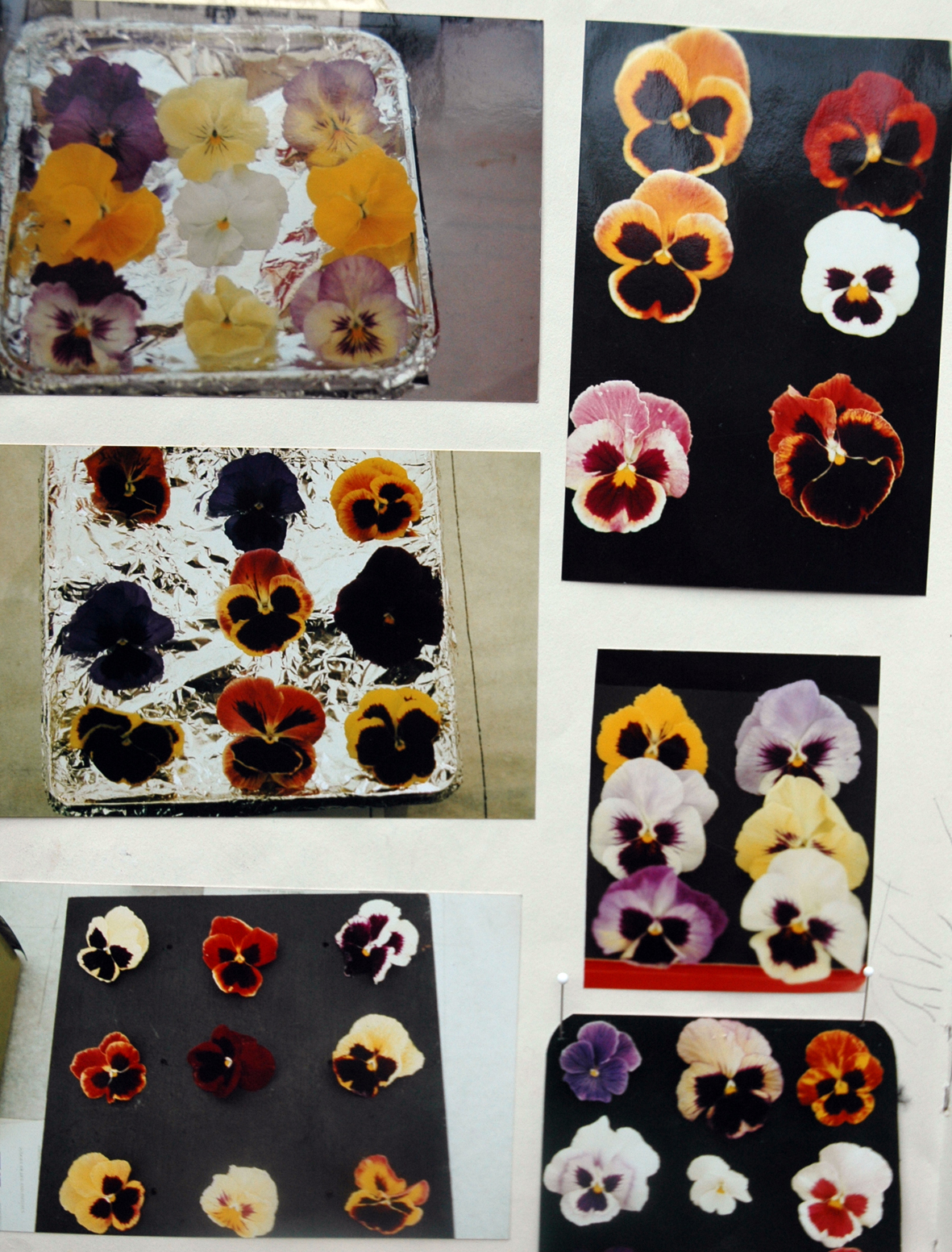
Visiting the many different flower shows whilst researching The Flora, I was struck by the way the pansies were displayed – they are arranged separately in trays, not as the usual bunch of flowers in a vase, but just the heads placed poking out of a board on a tray – why? I like to think that it really makes you look carefully at the difference in each wonderful flower head; but I suspect it may be because one of the criteria for a show pansy is to try to grow the petals to form a perfect circle. Then “heads” and “pansy faces” came together in my mind, so I started to photograph the trays at all the shows I visited, as you can see below the standard of presentation is often patchy and there seems to be no attempt at colour co-ordination!

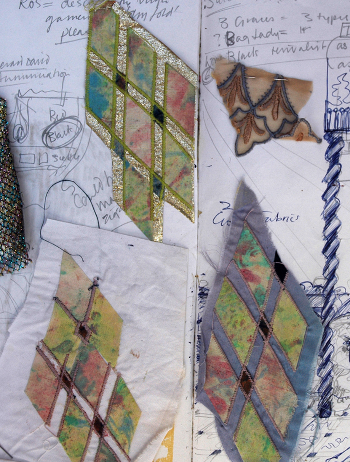
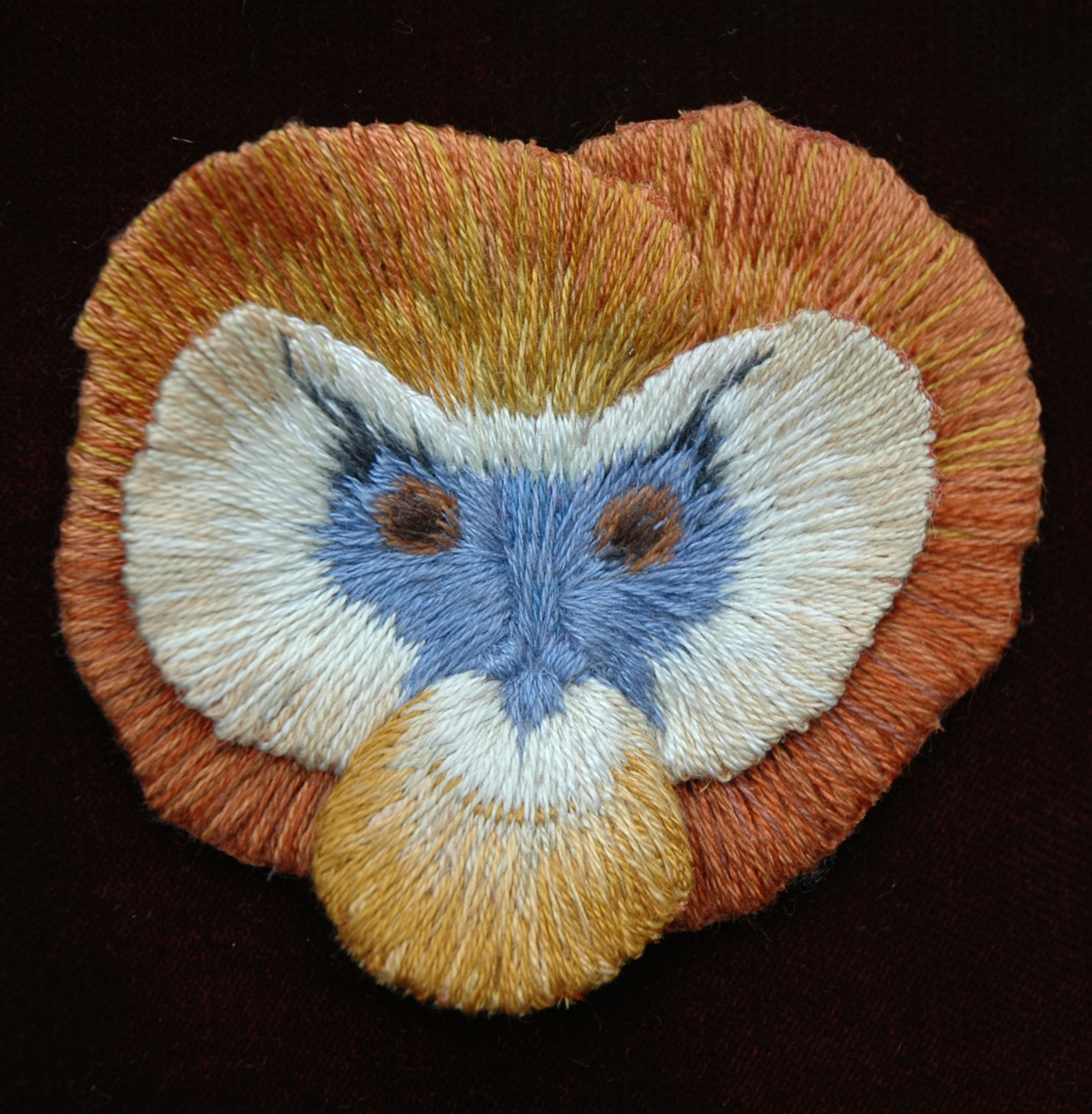
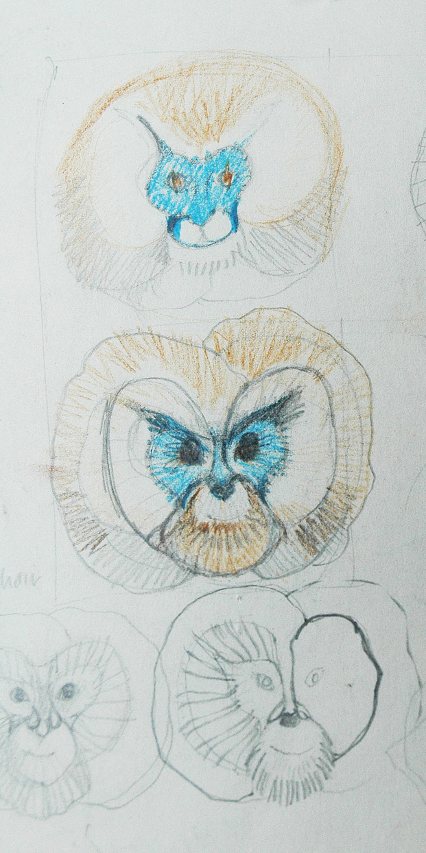
I fantasised that if I could breed flowers I would develop the pansies further by changing the shapes of the petals and regulating their colours. I tried also to keep the changes to a minimum to show the stages  of metamorphoses from flower to face. You can see that in the drawing below I started with a butterfly. which was fairly easy, and then moved onto the owl..he was a bit trickier and the problem of making this metamorphosis became apparent – whilst drawing and inventing from the research everything was clear,  but whilst stitching the flowers/birds/ animals my mind became confused between whether I was stitching an ear or a petal…..and this got more confusing as I developed the series.

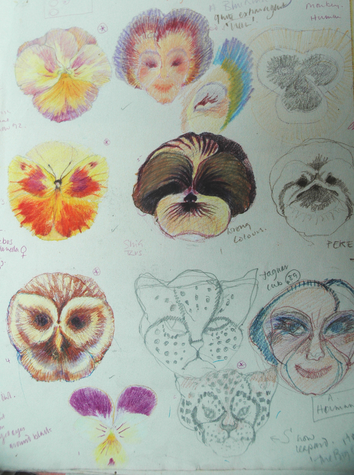
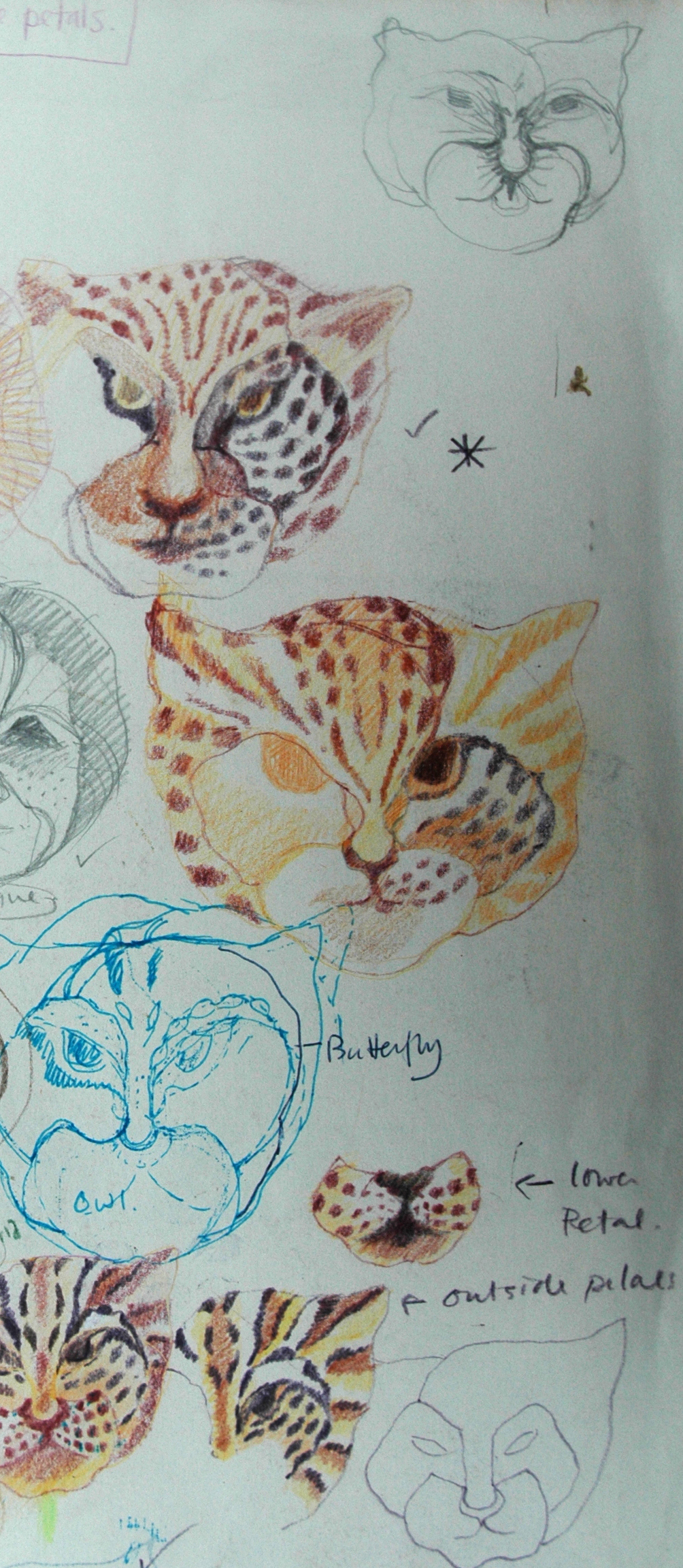
I then developed the cat or tiger;  the stripes were fascinating to depict as they could follow through the growth patterns of the petals  and it was a delight to invent and stitch, as was the monkey – the dog was not made – if I could have drawn a wire fox terrier as  pansy I would have included him that but I could only manage a shitzu – I have  always thought of them as pansy faced dogs.

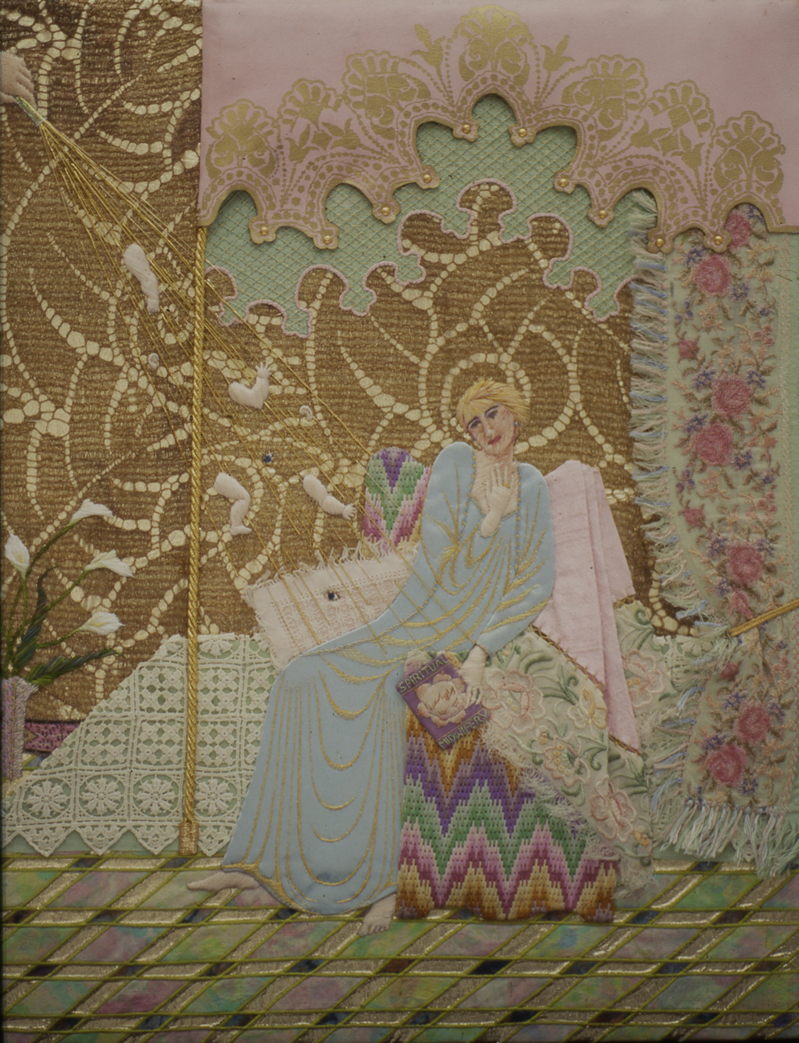
I then decided that this was all too innocent, while I was happily playing and exercising total control over  inert materials – the plant breeders and agricultural scientists were not. What would happen if it all went horribly horribly wrong? The ultimate goal for mankind seems to be to become like god and make make everything for our own benefits and in our own likeness. This was  hard decision to make  and I knew from the start that I would have to eventually develop a human face; I at first thought it could be a nice face – another beauty like Flora and the Edible Woman.

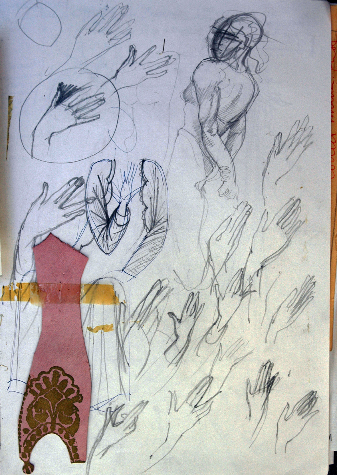
But really all along I had known it had to be a self portrait to make sense of my idea. I first appear drawn in grey pencil amongst my lovely colourful animals and fairy faces – and yes I do recognise that it is a sign of vanity – but I have never ever liked to see pictures of  myself. Friends have learned not to show me any photographs they have taken of me – I rip the heads off them – I want only to be known by the images in my work – so a control freak as well…I know I know.

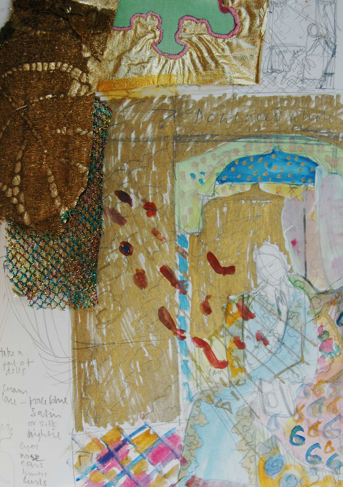
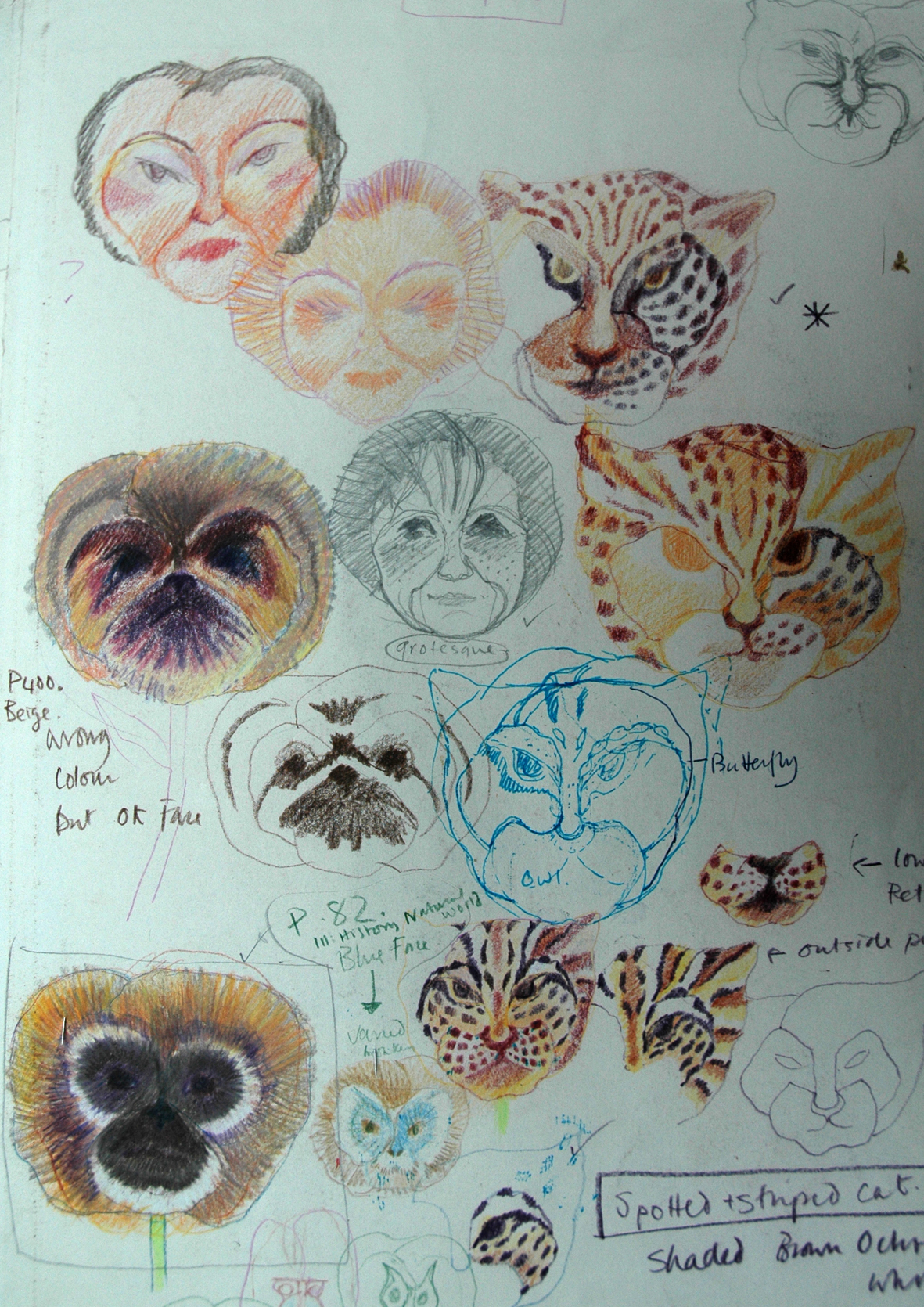
But back to the plot – below is a page of  drawings for the final pansy face, a horrid version of me …

The Edible Woman

This is Harvest Festival time and in celebration of the season I am featuring the Edible Woman, alternatively The Prize.  She is a member of  the Flora Embroideries and was first imagined as a mate to The Giant Vegetable Man in the Flower Show blog. He had to have a mate made for him, even though he is pug-ugly, it would be sad to let all that male vitality and virility go to waste.

The first idea I had for her was as an earth goddess, all burgeoning breasts and stomach, lascivious and wanton…a good match for him. I made several drawings but couldn’t bring myself to actually embroider them; she was not to be a figure of ribald humour like him and I did not want her to be sniggered at in the giant vegetable show .

The  breeders and exhibitors of flowers and fruit for prizes, prefer perfection of form to any other consideration. So she had to have some sort of beauty and so I thought she  could possibly become an old man’s darling, kept for her beauty and breeding potential – a trophy wife. But as such she is vulnerable as is an edible woman.

I thought of the lovely dishes of fruit displayed at the local flower shows often arranged on paper lace doilies and also the bowls of water containing heads of flowers arranged in patterns so delicately displayed.

I then remembered that my mother used to win baskets of fruit at the local whist drives when I was a child. She would invariably come home with either a bottle of sweet sherry or more often a wonderful exotic basket of fruit. Well the basket was exotic, a large straw affair – what I now call a “lady basket” – which had to be given back the next week; it was always tied with a ribbon on the handle and the various fruits culled from village gardens were made valuable by the beautiful presentation –  a proper prize.

My lady was beginning to take shape in my mind, but how to make her face from edible things?I bought some exotic fruit and tried to arrange them into a face – this was not easy, the first attempt was really dreadful, like a fat unhappy drunk pumpkin woman, the only things that worked were the 5 okra as ladies fingers and the pomegranate and persimmon looked hopeful as breasts…….

But I decided to sort it out by drawing..I would work with what I could and let the rest take shape around this, while stitching samples I had plenty of time to think.

I don’t remember when I decided to make the fingers from asparagus, I know why though, they look more like painted pink fingernails. The painted silk is shown below above another edible personification, but who would want to marry her?

So here she is – my Prize – the Edible Woman in all her glory; displayed for your delectation in a ruched fabric marquee, usually reserved for weddings but often used for the classier northern England flower shows. You could eat all of her, from her apple cheeks to her cherry lips, dip her asparagus fingers into melted butter and nibble you way through the sweet salad flowers of her hair; scrunch your teeth through her pear nose while contemplating her dark nipples before you peel your way into her luscious ripe breasts……

Now here’s a challenge – would any of the cooks out there like to concoct a recipe from her, or for her,  maybe a menu would be easier….the asaparagus doesn’t lend itself to inclusion in fruit salads – but then what do I know? I don’t cook puddings I only ever embroider them.

mending more hearts

GEDSC DIGITAL CAMERA

You know when you get an idea and a light goes on in your head and you think – why did it take me so long to see this? Well this has just happened to me – last weekend I was looking at the stitched ceramic dishes I had made for the Museum Mending project and thought – why don’t I just stitch these images onto cloth? The mottoes, the hearts, the hands….all these relate to my personal project Make It Through the Night so why don’t I include these into this? DUH!

I have done all the research, found the mending mottoes and sorted out the drawings of the hands, but what will I stitch them onto? Well when you are broken- hearted what do need to mop up the tears – a handkerchief – which is a ready- made square of cotton or linen – perfect.  And when I looked through my white fabric stash I found a packet of 4  table napkins left over from another project – hem stitched in linen – perfect. I always take these pieces of luck as a sign that I am on the right track.

Counterpane/Counterpain

I thought I should  try to match the mends with the mottoes and to use the broken and mended heart as a link to the Counterpane/Counterpain embroidery which features in the Make It Through the Night project in Work in Progress section of the blog. I decided to keep the same stitching techniques and colour.

I started with a cut and darned heart, which would need considerable strengthening at the edge of the handkerchief, so the motto had to be ” that which does not kill you makes you stronger” a proverb that I think has a stoical attitude. Having drawn out my design and checked the correct darning system in an old sewing manual, and taking courage into both hands, I cut from the edge of the handkerchief straight into the heart, tacked a run and fell seam and set to work sewing it.

sewing manual and darning sampler which provide both the information and inspiration

I chose to sew it in red thread as in the little household sewing sampler that I had bought years ago from an Oxfam shop.  It is probably from middle of the 20th century and made as part of an infant school sewing class. The choice of red for stitching is a swine as every single stitch glows out whether rightly or wrongly placed, I started to dislike the original needlework teacher – why impose this on to  your pupils?  – well discipline of course….and suddenly my little basic sewing sampler looked like the work of a consumate needlewoman – poor girl –  unlike me she didn’t choose to do it.

finished handkerchief pinned to studio wall

You can see by the finished piece above just how personal this embroidery got for me I have hand written “me”  instead of ” you”.   This was quite a difficult piece of darning even though I have worked this technique several times before;  the plain hem stitching on the run and fell seam above the heart was really tricky to get even on both sides. I would choose something easier for the next one………

I found the motto, ” Red is the ultimate cure for sadness”  and decided to use a patching system using a scrap of scarlet linen, I withdrew the threads and darned them onto the heart. Easy Peasy it wasn’t!


withdrawing the threads from the red patch.

The finished red darning piece can be seen pinned to my studio wall, to the side of it can be seen a sample of Darning as Jewellry by Dail Behennah.

red darned patch handkerchief

Dail Behennah’s tiny samples in copper and gold wire for Darning as Jewellry, was also made for the museum mending project

The next piece was also patched, much simpler this time a basic inset patch of fine linen.

mending manual and school sampler

cross stitch embroidered patch ready for insertion

On the left can be seen the set of instructions for basic darning with the sample of the same system next to it. There are many old sewing manuals with all this information in them, up until about the 1960’s when they begin to just talk about machine stitching for  darning

For this handkerchief I decided to cross stitch the motto onto the patch beforehand, and on the left can be seen the embroidered patch prior to cutting and inserting it onto the heart on the handkerchief, below.

The image of the small pink and red  broken and mended heart pinned above the handkerchief below is a photograph of a set of 50 enamel badges I made for an ETC project several years ago. Maybe I should make some more?

patched cross stitch motto

By the time I got around to stitching the 4th mending motto I thought Mend It or End It was a suitable finish to this series, the  finished piece is the seen at the head of this blog, simple and effective the simple cross – way darn also makes a good warning symbol to make your mind up – the type of real advice my friends actually do give me when I am dithering about anything…I think these mending mottoes will lead to other handkerchiefs, I particularly like the one about the colour Red, I wonder what other mottoes there are about colours?

first 3 mending mottoes handkerchiefs on my studio wall.

Mending Mottoes

sketchbook of first mending mottoes idea

I have eventually found the time to get back to the Stitched Ceramics story.  Hanne Rysgaard and I found a few odd days to work together during the past months to develop samples of the plates I want to make. The first thing we did was make some new molds, well actually Hanne made new molds while I took the pictures…….

edited idea from the poetry plate

Meanwhile I got on with drawing out designs for different plates, I had really liked the poem by W.H.Auden and the broken heart image (see the Category Archive, Stitched Ceramics May 18th)  I wanted to repeat this design but with a motto instead of the poem or find a poem I could use without having to deal with the copyright restrictions…but Hanne had recommended not writing a great deal as the porcelain would probably dry out too much for me to be able to manipulate the clay into the tears and holes for later mending.

I made several drawings at this stage and some of these initial ideas did survive intact to the finished sample stage – others have been rather rearranged and one has been mended  – for real.

several more sketches for the mending motto plates

Hanne rolling out the porcelain on her new bit of kit.

When I returned to the ceramics studio, Hanne rolled out the porcelain for me, gave me the molds she had prepared earlier and went upstairs to look after Blaze gallery.

I had drawn and cut some stitching hands from card for impressing onto the clay and I also used the copper blanks I had previously plasma cut for enamelling, these proved to be the best at making the right amount of depth for the impressions. Using the working drawings, which were pretty basic, see above, I started to work. Nerve wracking stuff – as the slightest mark is not easily erased, so I was forced to be more controlled learning to rely on my instincts – if you make a wrong move you will have to redress it either now or later when it is fired – or discard it – I was NOT about to discard anything I had been given to work with and which had been so lovingly prepared for me; time to get a grip.

card hand placed on freshly rolled porcelain

I started out quite well, the first hand impress although  a bit weak, was simple and effective, the finished dish  looks more or less as I imagined it would – see below   no blocked stitching holes, no cracks, no loss of shape  – I should be thankful for beginners’ luck!

finished plate, no problems!

And the rest of the day went well, I made 2 more dishes, well one and a half…I had not enough clay for a whole third plate so started to get inventive….I thought that a half a plate with the holes pierced for stitching another material to it would be interesting…I used a crazy patchwork technique for this.

half a porcelain plate with half made linen crazy patches in my studio

This half dish had lost its shape in the kiln, so I had nothing to lose by experimenting with it and although I feel this version is not working due to the pull of the linen fabrics over the curve of the dish, which may be eradicated by cutting them on a different grain,  I feel that there is a lot potential here;  Liz Hewitt, another embroiderer, told me about a kind of felt that can be molded when wet and will dry to shape – and it  can be stitched ….so I will try this  idea again – maybe – if I get the time.

first and unsuccessful sample of crazy patched plate...

But the dish that was to test me most was just simple and pure white with a motto and stitching hand, it needed no further colour, just taking home and darning.

darned dish before firing.....

There was one small problem, several of the holes I had pierced had fused together; I set about filing them out…. I was oh so careful, when one push too far through the actual needle eye and KERACK..the whole plate split in two, right through the hand but, thankyou universe, the darning patch as well.

You know when you just feel sick, sorry and stupid! I wanted to weep, but just had to carry on – Araldite, fast drying Araldite came to my aid. And YES I do appreciate the irony of this…..but I still had to hold the 2 pieces together in my hands for more than 30 minutes and imagine trying to do this when your are telling yourself to just chuck the whole lot away and forget you ever had any ambitions and isn’t this what you always do – mess up because you want too much control…and you desperately need to pee.

Anyway when it finally felt safe to loosen my grip after walking round my studio a dozen times, I tightly bound it in some strips of fabric and left it overnight – unusually I took no photographs of this episode – too sick about it all.

finished double mended plate

After a turbulent night’s sleep, and when I finally stoned off all the last vestiges of glue from the wound and the back of the dish and my hands…and filled the tiny gap with red making it “bleed” under the darned area. I realised that I have discovered another way of working with the ideas of breaking and mending and which I am now really interested in pursuing for the Museum Mending project

But I am leaving you with another motto which just makes me laugh ruefully each time I turn it up in my research book, this needs a very special dish making for it….

Making Eyes and Ears

Here is an old embroidery  ‘ Making Eyes and Ears’  or ‘Our Lady of Interiors’, which I made some 24 years ago in response to a visit to my friend, Lizzie – happily married and newly pregnant. Yesterday I was at her home again for her husband’s Big Birthday party and I met her son, the hidden inspiration for the embroidery and whom I had not seen for about 20 years. I recounted the following story to him.

I had gone to up to London to have lunch and celebrate my friend’s pregnancy, stupidly taking a bottle of wine and some chocolates; but she was not feeling well, and instead of the usual delicious lunch she informed me we were having rusks in milk, which was all that she could stomach…… But this was a first baby and we had gone through worse together. I have never wanted children, and when any of my friends had children I made a mental note not to see too much of them for a few years…about 20 usually covers it – by then the children have started to get a life of their own and ideas I can relate to. Lizzie knew this but wanted to make me realize what was happening to her and why she felt the way she did.

One my favourite paintings, Simone Martini’s Annunciation, it is in the Uffizi gallery in Florence and I first saw it when I was a student in the late 1960’s, it had a profound effect on me for its emotional quality and the sheer scale and beauty of its presence.  I used this wonderful blue, gold and red painting as the basis of the embroidery I eventually made. Actually the virgin looks not unlike Lizzie on the day of the lunch, sort of queasy.

Anyway, back to the story – no sooner had I got used to the idea of rusks and milk when I had a book thrust into my hands and was instructed to read a particular page. The book was called “Spiritual  Midwifery” by Mary Ina Gaskin (see just how useful rigorous research note taking can be) and it was a type of new- age  manual for pregnancy. I most remember the mandalas of breasts with babies’ heads at the centres. I was beginning to feel a little queasy myself.

But the memorable sentence, which has stayed with me all these years, was stated by Lizzie when she informed me that if I looked up her particular week of pregnancy in the book I would see that she was “making eyes and ears”.  At once I saw the embroidery, an annunciation but not with the usual rays of golden light emanating from a dove or a cloud to symbolise the insemination of the virgin with god’s spirit made flesh, but eyes and ears flowing from a test tube. I couldn’t wait to get home and start work.

The following drawings and samples are of  gold lurex,  hand marbled silks, vintage embroideries,  gold pigment silk screened leather all pieced together to make a sumptuous interior for a late 20th century version of the glamorous gold stamped and gilded original. Also the drawings and redrawing necessary to get the exact hand position to reveal the feelings of the mother – to be,  the hands in the pre- renaissance religious paintings are always particularly expressive.

When she heard this story last night Lizzie had completely forgotten the lunch, the book and the embroidery and so had I until I saw “the baby”.

But now I look back on this very old work, what do I see? Hands and Eyes and Hearts and even a Dream Drawing about a Pakistani or Indian woman in a launderette……which brings me right up to date with all my current work.

Flower Show

class 172 "edible face on a plate". 5-7 years inclusive

This is the season for flower shows in England and here in Somerset there are lots to visit,  so last Saturday I went to a neighbouring village, Tickenham, just to see how it compares to the Portishead show – which is the best in the district and had inspired a set of embroideries which I made some time ago…. more of which later.

When I arrived the first view was of the small marquee set in a field with lots of other tents and awnings with stalls selling things, a brass band played, there were queues for ice creams, cream teas and home-made cakes – so far so good.

perfect photographic opportunity at the flower and produce show

I really like the shows in marquees the best – the air smells of flowers and crushed grass and the light inside is perfect for enhancing the exhibits. Sometimes at the posh flower – arranging shows such as Harrogate in Yorkshire, they hire wedding marquees which have draped walls of ruched fabrics…but plain canvas gives the best light.

marrows glow in the marquee

Although the main point of these shows are the vegetable and flower competitions, I prefer the other stuff; children’s gardens on a plate or  seed tray;

miniature flower garden in a seed tray

surreal faces and animals made from vegetables. But  My Grandad at the head of the blog only received a third prize – what do the judges think they are doing? The display that won – and it was excellent – was praised for being “simple and effective” – but who wants ‘simple and effective’ on a wet Saturday afternoon at a flower show – we want exuberance, competition, prizes for fun, colour, imagination and originality. In all the many shows I visited I have never before seen a child’s vegetable portrait.

simple and effective monster!

So when I went to the shows for inspiration I wasn’t looking for “refined” I was looking for ideas and arguments about how we manipulate the natural world for our own benefits  and as I saw the baskets of vegetables and those marrows on Saturday,  I remembered my own versions of these exhibits.

basket of prize vegetables at Tickenham show

I went to the giant vegetable show in Lincolnshire where I had expected to just see larger versions of the above…but there was something else going on.

photographic collage of the giant vegetable show

The marquees where hot and humid but the smell was of rotting vegetation, huge marrows and mis-shapen pumpkins often carved with names, it made us think we had wandered into a vegetable porn show. My original idea of a sort of giant Green Man was replaced by a lecherous freak of nature –  and it was so obvious that everyone else saw what we saw and were comparing these vegetables to body “parts”.

drawing from collage with the scarified bodies of the pumpkins

the heaviest carrots

I think you can see where I was heading………

drawing for Giant Vegetable Man

The drawing for the vegetable man above was constructed from various vegetables exhibited at the show, all chosen for their grossness and sexual connotations. In the embroidery, below, I have put the man in a booth with a curtain that can be drawn aside, a convention of the popular freak shows in 18th and 19th century Britain. He holds a packet of birth control pills; apparently one grower had stolen his wife’s pills  because they had made her retain water and put on weight  – so he mashed them up as a liquid feed for his Heaviest Marrow exhibit – honestly this is true, I invented nothing for any of the embroideries in this collection, I merely re – arranged the visual facts.  Below, the onlookers are being enveloped by a marauding cabbage.

the freak show vegetable man in his booth.

But to get back to the Tickenham show and the wrongful distribution of prizes. Can you believe that this hand puppet only made third prize in Class 184 – for 8-11 years inclusive – “Anything you like – you made it, let’s see it”?  I think he has such presence and holds the true spirit of Mr Punch that he is in a class of his own.

puppet in class 183 for 8-11 years inclusive

In future blogs there will be more stories from the flower shows which gave rise to The Flora Embroideries.

Samplers

my studio wall of current samplers

I am in a difficult position at the moment because I have a whole set of different projects and commissions all at the sampling stage; this is not good news for anyone who is trying for a smoothly running working life. Usually I aim to have one or 2 ongoing sets of work at the ‘mind in neutral’ stage for when I embark on a new piece of work; by which I mean that the work is at the point where it is being manufactured, whether by stitching, enamelling or constructing…this is when you can think about the work as it is slowly progressing or mull over the next piece you will be making. Time to let ideas settle and allow solutions of sampling problems – see last 2 blogs – to rise to the surface.

detail of studio wall with samples for stitching book and original enamel skies joining sample.

But I have 4 main projects starting up at the same time, one is the enamel skies – my own work – so it is now having to take a back seat, but it was necessary to start it, as a website featuring the work is about to go live – it is for North Somerset Arts Week in May next year; 2 is a possible commission for a book on stitching; 3 is the Sheet of Dreams from Make it Through the Night project, again my own work and started in an attempt to get it going so I could just sit and stitch something between the drawing and development of the stitching book – keep up – 4  is another ongoing commission which will need to be kick started again when the artist comes back from her holiday next week after several weeks’ break. Oh and there are the stitched ceramics I am doing with Hanne Rysgaard, so that’s 5.

first illustration samples to size for the pages of a proposed stitching book

And all are at the sampler stage and all need attention – the same sort of attention. So my workrooms are full of bits and pieces of sampled new ideas, good ideas, failed ideas, hopeful ideas, anything to try to get me focussed on the jobs in hand.

The most important project this week is the book presentation as it has to have 3 spreads, or double pages, with all the stitched designs, illustrations, technical diagrams and information organised in time to get it to the art editor who will sort out the overall look of the finished book for printingto show it to hopeful publishers at the Frankfurt book fair in October –  as you can see I have been influenced by the work I did with Hanne on the tablecloth – or rather my commissioning editor was…….

The idea of samplers being the traditional regimented rows of perfect stitching is of no practical use to me. The samplers we see in museums had more to do with  illustrating young girls’ good behaviour and patience than their creative ability to problem solve  – which is how I see the sampling process,  an absolutely key component of any making project. I usually collect my samples together and pin or stick them into my work books when I have finished the project. They are often all the evidence that is left of my commissioned work, apart from the pictures of the finished image. But until that happens they are pinned to a wall as constant reference.

printed and stitched sampler for the next Sheet of Dreams embroidery, pinned to a full scale collaged drawing

In my enamel workroom though things are even livelier, enamel is impervious to light and weather so I keep all my old samples on view, they are constantly referred to and I think it amusing that even my metal and glass samples look like mad gingham fabrics.

window sill in enamel studio full of samples for colour references, with stitched wire sampler above

I use these colours so often that I do not need the notes that I made for the first colour samples, I know the properties of each colour well enough.

original set of coloured enamel samples in work book - with their recipes, before they became part of the reference in the studio

All around the enamel studio samples are set out, here the enamel skies are hanging next to my first large stitched steel sampler,

more samplers ready for reference in enamel studio

and on another windowsill are placed the drawn and painted samplers I made for the Chintz Collection in the Enamel Garden (see the Gallery Pages) sadly these are the only flowers displayed in my old conservatory.

Enamelling Skies

enamel studio with colour chart and everything neat and clean ready to start firing in the small kiln

I took advantage of the first dull day in recent weeks to start enamelling the cut copper samples for the Sky project. My enamel studio is based in an old conservatory- simply because this was the only space suitable to house the larger kiln and the required water and electricity supplies on the ground floor – but it faces south and gets very hot and even hotter when the kilns are firing, so I tend to enamel in cooler weather

sample copper blanks laid out ready for firing

I had drawn up several colour studies for this work as I am not sure whether I want to have the stripes of the sky sized in relation to the drawings or seen simply as a colour chart – hence the 2 sets of samples opposite. Each sample had been cut, drilled and cleaned in preparation for firing, now I had to make up the colour recipes from one of my sky studies shown in the previous blog, Severn Seas Skies. What I find fascinating about enamel and what drew me to want to make this work is that using several transparent colours over different ground colours it is possible to achieve subtle and glowing tones, perfect for describing the coloured air of the sky. The sky I chose to work from is the first sky on the left of the picture below, plenty of scope to run through a gamut of contrasting colours.

sketches of dawn skies from 2009

The actual colour chart that I worked from can be seen below, it is as close as I can make using my pastel crayons which can be blended into many subtle shades. I will have to buy some more enamels later when I start the big pieces but meanwhile I work with what I have, this way I can discover some interesting outcomes and learn a lot. Making colour with enamel is not the same as using any paint I work with, I suspect it is like using glazes in tempera or certain types of oil paints, but I find it most like silk screen-printing which can be used for the over printing of transparent colours.

color chart hanging in studio window

One of the things to get used to with enamel is imagining the colours before you have fired them, some pale colours are just white in powder form, and sometimes different batches of the same colour  look totally different in the packages than the last batch you worked with – they always fire the well enough though. But it takes a long time to get used to all of this specially if you are a colour-control-freak.

colour difference between cold and hot enamel, the old flat iron is to keep the plates from bowing when cooling, I found this one after a long search round junk shops - like 'Wagon Wheels', it looked a lot smaller than I remembered.

I try to write the colour recipes down as I develop them, the scribbled notes can be seen below showing the half way stage of the sampling session.

midway through the enamelling with written recipes, colours, firing times and sieve meshes observed

By the end of enamelling I have the 2 sets of samples and the recipes are sorted, but one unexpected and useful thing is that the 2 colours I made for the muddy water of the estuary are similar to a paint sample I was given for a commission to make a set of door plates, the hellebore doorplate is shown next to the colours below…..and most poetically, the enamels that make up this particular mud shade are called Sandlewood, Blue Ruby and Rose.

finished sample colours and hellebore door plate in tones of "Portishead Mud"

Now my next task is to decide the colour and thickness of the  wires for  stitching the plates together to form a panel; the first idea of muted blues and greens isn’t working…..and I feel I may need to get rid of the shine – I will keep you posted on my progress.

Sample stitching with coloured wires.

Embroidered Ceramics.

I have just spent a couple of days doing a proper embroidery – stitching flowers and spots onto a table-cloth for Hanne Rysgaard to display her ceramics. She is showing large selection of her current work in the Aberystwyth Arts Centre shop, from mid August to mid September. I offered do this the last time I was working in her studio, as she was just preparing to make all the stock for this exhibition. I thought that a stitched version of her pieces would make a good centre-piece for the collection.

first ball point drawings for Hanne's table cloth

While speaking to her over a cup of tea, I put a few ideas down in my work-book; this is real “back of the envelope” stuff, using a ball point pen – which is always good to draw with, but the sometimes the line it leaves is a bit sleazy –  and as often happens the very first idea was the one I used. Hanne immediately liked the whole idea, actually I think she just liked me drawing it out for her. But I do feel that when you get the initial idea for a piece of work, the first drawings, even if just scribbles, contain an energy that subsequent studies don’t, and if referred back to they can often re-assure you through the inevitable time when you doubt your decision to make the work.

The next drawings were on the linen tea-cloth in water erasable pen, Hanne made the actual pieces for me to work from and I took them home to my studio and set them out to draw around.

table cloth set out in studio

The tiny flower arrangement was quite a challenge to stitch, it was a bunch of roses and auriculas with a few forget-me-nots, quite difficult to copy within a 2 cm. spot and this had to be repeated 13 times…..by comparison the spots were easy-peasy though they are all slightly wonky.

stitched sample for spots and flowers.

While the flowers and spots had to be stretched for the embroidery I always prefer to stitch without a hoop and the outlines of the ceramics are freely stitched, so much easier to handle. I feel that the hand stitching looks right for the hand-made quality of the ceramics.

embroidering the outlines on the un-stretched linen

Once the embroidery was finished, washed and pressed I delivered it and it was a relief when Hanne just whooped with delight when she saw it. It was immediately set out at the back of the gallery/shop at Blaze, where we both set about taking pictures.

Hanne looking impressed with my embroidered version of her work

Here is a close up of a section of the cloth complete with the embroidered cake fork, the real butter knife used as the reference, can just be seen in the background.

close up of embroidered tea cloth

and here is a view of the whole set with the magnificent 4 tiered cake stand.