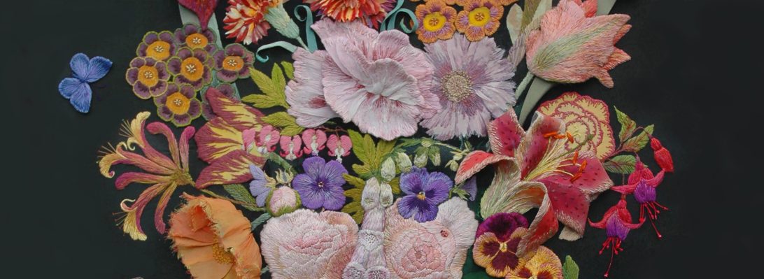
Panic Early – Design and Sample

“Panic Early ” has been my making motto for many years and the advice I always handed to students at the beginning of any project with a set deadline….now it is my turn to heed my own advice. As a hand embroiderer the idea of stitching in a hurry is a total nightmare.  So I tend to give myself a few days ‘wriggle room’ on any given deadline, I hate last minute making. So as my partner Rachel Kelly and I have about 3 more weeks to the deadline for a piece of work, I have decided to step up my input and get to grips with the rest of the tree design and sampling (with a plan B as well – watch this space) so that as soon as the Easter vacation is over we can just roll into the manufacture of the fabrics. The actual piece of work has been in the making for about 2 months now (see the last 2 posts) and the idea to make the Daphne Tree is at least 15 years old and I am about to see it come to fruition in the next 2 weeks, when it is due to be exhibited at a group exhibition called ‘Pairings’ the Museum in the Park in Sroud

The design drawing above, although sketchy, is looking fairly comprehensive, although to anyone who hasn’t seen the full scale pattern on the tables at Heart Space Studios will have their doubts about my progress.

As a hand embroiderer I am used to developing my original design ideas as I make them. Working from a fairly comprehensive design drawing with stitched/dyed/fabricated samples, hand stitching then affords time to contemplate the work in progress, so subtle shifts of colour or even whole areas can be re-assessed –  sometimes a piece of work can take several months of steady work to complete. The initial research is a  fairly rapid process compared to the execution of the finished piece. Now I have to plot the whole piece in advance of starting the work so that I can calculate just how much stitching time will allow…we have hit on the idea of working with paper computer print-outs that Rachel send to me as she designs them -so that I can develop the design and get the scale sorted out, while we wait for the fabric to arrive to be printed and the departments to open up after Easter

 My pairing partner, Rachel, works in a completely different  way – she is a digital printer, so everything she makes has to be mapped out first on a computer and programmed so that she can manipulate everything she needs at the final printing stage. She gives herself a range of options to choose from – making her work spontaneous in a totally different way than mine…..in fact my way of working isn’t spontaneous at all, it could be said to be organic or even vegetative in its development. She takes a long time to prepare; I take a long time to make; she can print metres of  piece of cloth in a day; I can take months to cover half a metre.

And as we are playing a game of consequences to make this work, in that we each react to the others new idea or  image, I have to play by the rules and just make  new ways to to do my stitched work within the time span. But what wonderful choices I am given, beautiful bouquets of exquisite flowers, some with hidden birds that I can cut out and embellish, but at the moment just working with paper makes the stitched results rather crude, but gives me ample opportunity to play with the colour and composition.

Eventually we will have the cloth to print on and cut out and sew beautifully – and the vellum will be laser etched hopefully later this week ready for me to start sewing it all together. Meanwhile I have to carry on sampling all the ways I can make a piece of vellum transform into a sheet of paper which then becomes a printed chintz design on cotton. I have started to sample dyeing the shoji paper leaves to applique onto the cotton fabric – hand stitching is the answer   as all of this is too big to go under a sewing machine – did I mention that this work is 3 metres from the toes to the top?

Drawing Consequences

I have often said that drawing is my first language, English my second and Stitching my third, and I can’t now remember a time when I did not draw. So it is a real pleasure that my latest work (working title – the Daphne Tree)  that I am making for an exhibition Pairings, with my partner Rachel Kelly has involved all types of drawing, from scribbled notes on the scrap paper made on trains to laser etched vellum.

Rachel and I are making a single piece of work using the idea of the game of consequences; we are reacting to each others work, developing a figure turning into a tree. I drew the figure, Rachel drew the “bark on shoji paper, then I sent the collaged bark drawing back to her and so we go on…but before this second step I had to make several large drawings to establish the figure – she needs to look like she is being stretched and frightened and also looking sort of tree shaped….I had problems with the legs – getting the stretch in the calves was crucial – the first drawings were useless they looked like she was floating. I always use cheap rolls of lining paper used for decorating for any large scale rough drawings

I had to work on her feet, they were supposed to be burrowing into the ground taking root, the drawings look really nasty like she has been burned, but they are starting to look forceful and like they could penetrate the earth. in fact they look like they have been dug out of the earth….But it is the head that has to be looking as if it is in shock at the moment that it is turned into tree bark and the hair to leaves.

The final drawing for this transition or metamorphosis, has to be exact for it to be then transferred and later translated into other materials and different types of drawing – and this re-drawing with a tracing wheel is just as crucial as all the drawings that have gone before.

So eventually Rachel and I have met up to develop the drawings, I have taken my large sheet of vellum, that I have been kindly given to work this project with, by Kemin Nahkatarvike oy the Finnish Leather and Fur manufacturing company. We are now sampling all sorts of other material that we may use in the final piece – we need to sample all the stuff to see how we can laser these drawings onto the various surfaces…but first more drawings are  developed by Rachel – on a computer.

The results were not exactly what we wanted – well not for this project ….

The drawing into hand – made paper was more successful even though we lost some of the surface petals  – but we had to hand-draw and cut the stencil that acted as a shield for the burnt area of laser etching

laser drawing on hand made paper with embedded petals

But meanwhile Rachel and I were busy thinking and drawing out the next stage of the work – this is only the trunk of the tree – now we had to imagine the canopy. I had scribbled some ideas down on the train to Manchester, I don’t know what it is about trains but they always make me very imaginative, I get lots of ideas on train journeys.

I drew this in Biro – I really like Biro to draw with as it can make a very elegant mark; but actually it was all I could find in my handbag to work with. It shows how I envisaged the next stage of the work – the canopy. But when I got to Manchester we had to really start to consider the various stages for the design drawings, so we stretched out our combined drawing along side the samples we created with the laser

Then while Rachel dealt with the computer drawings – did I mention that she is a technological wonder woman? I dealt with the tracings of the original figure.

I had to make quite a few different typed of marks to translate into the separate systems that we needed to translate the original drawings into  computer aided drawings

When we met up between tasks or at lunch, we talked of the next stage – how will we develop the canopy? I thought we could applique some printed versions of old flower bird or leaf designs  from our separate practices,  as used in old American chintz patchworks and quilts. And chintz seems to be where we are going next…but the during her morning train journey into work Rachel drew this( below)  in her note book.

And now we are at last ready  to start to introduce the missing element for us both – colour, but that needs a new set of research drawings….

Live Pairings Project – Metamorphosis

Image

Yet another first for me – I have been invited to make a piece of work for an exhibition in the Select programme for  Stroud International Textiles . I have often visited the Stroud textile festivals and even posted my observations last year and the year before. For about a month the whole of the town of Stroud in Somerset, England, is taken over by textiles to be viewed in exhibitions, talks, workshops or bought at specialist markets, generally a must-go-to see show every spring.

I have been invited to make a piece of work for an exhibition called Pairings, where several partnerships of makers have been put together to develop work. This is a result of the Stitch and Think project that was the major part of my research post at UWE. Bristol,  Alice Kettle, a Senior Researcher Fellow and applied artist using machine embroidery has been conducting a similar project at MMU ( Manchester metropolitan University) and she invited several members of the research group to join in this fascinating project. Over the past several months I have been preparing work to make a combined textile based on the idea of Metamorphosis. My partner, chosen by Alice, is Rachel Kelly, a textile designer specialising in Wallpaper and an associate lecturer at MMU. Rachel has been asked to incorporate new technology within her making processes – this should very interesting for a hand embroiderer.

Rachel interacting with wallpaper

When we first discussed the work I explained about my ideas around metamorphosis; we would have to change our ways of working to develop this work and as her work incorporates lots of motifs to make your own interchangeable wallpaper designs the idea seemed a perfect fit – Rachel agreed – luckily. We decided also to make a joint piece of work – not easy when we live and have our own studios more than 200 miles apart. We discussed what we had in common, she read the blog and I read her website. she thought we should concentrate on drawing and I recognised that she was an avid colourist – so we set to work. After some initial difficulty getting started, I suggested that we make work by the game of “consequences” one person draws something folds the paper down and the next person draws the next bit…..you can follow this interaction on our joint blog that starts this weekend.

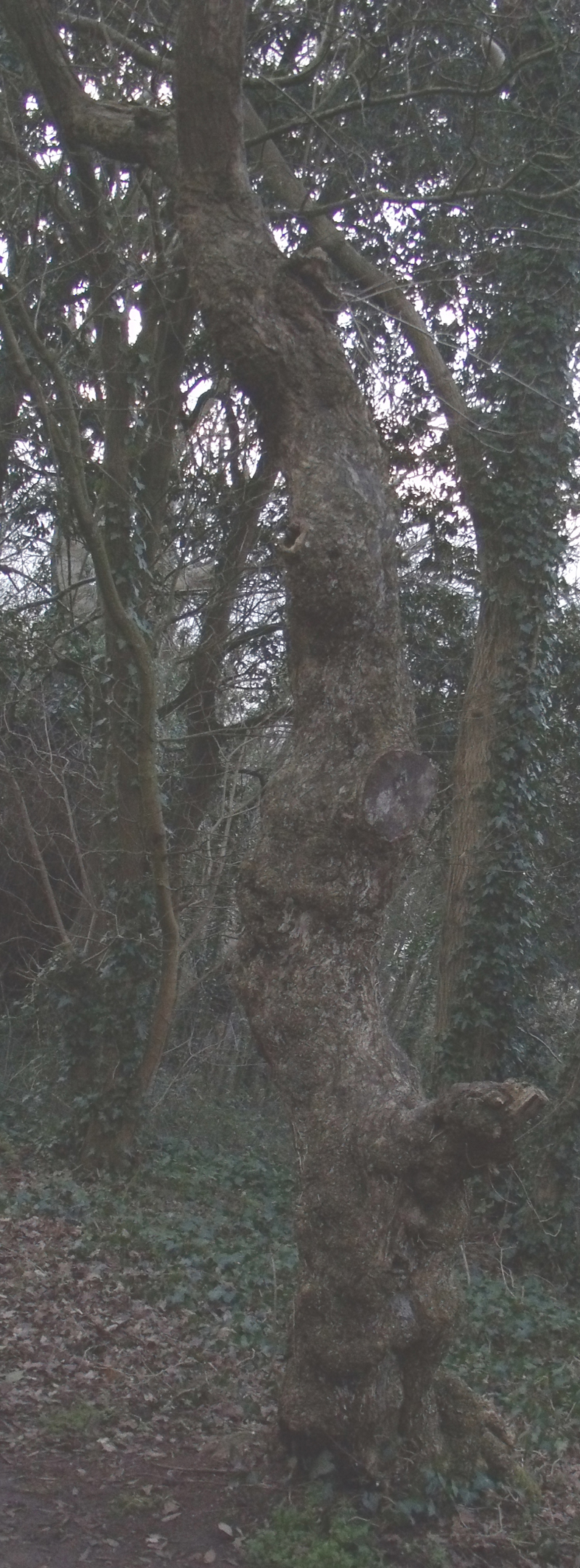
So to begin – I sent Rachel 2 images of a tree I had seen in the local wood, it looks like an animal stretching upwards with a rump for a tail from one side and from the other, a side view of a voluptuous woman. I have been observing the tree for about 20 odd years now and I call it the Daphne tree, I take visitors to see it and I never pass it without an acknowledgement. I kept thinking I must do some work with this. I really feel that the Greek myths of metamorphosis, mainly observed by the poet Ovid,  are true parables of the human condition; how often do we wish to change ourselves in some way or another – it is the hardest thing to do – and as the saying goes, “be careful what you wish for

I started by drawing the tree from either side, quick pencil sketches just to make a start by recording what I could see and the camera couldn’t quite capture. The dogs got bored quite quickly and it was very damp, my paper was really limp and my drawings extremely scribbly, I sent them to Rachel via email.

They were enough to get me started though, I next asked Sophie, my administrator at Heart Space Studios to pose for me from the tree images that I showed her.

then I drew from the photographs as the pose was really difficult to hold for her.

I really did not like this drawing, too beautiful, too glamorous; she looks like a glamour model …yes Daphne was a nymph but this needed attention so I drew over a photocopy and got rid of the breasts…

but she is still too lovely, too refined, this won’t help the feeling I want to establish and what is that? –  Below is a Ted Hughes poem, from his  book ‘ Tales from Ovid’ published in 1997 this is another woman turns to tree story – Myrrha, from the poem ‘Venus and Adonis’ –  Myrrha calls to the gods to help her and her prayer was answered…

The earth gripped her ankles as she prayed.

Roots forced from beneath her toenails, they burrowed

Amongst deep stones to the bedrock. She swayed,

Living statuary on a tree’s foundations.

In that moment, her bones became grained wood,

Their marrow pith,

Her blood sap, her arms boughs, her fingers twigs,

Her skin rough bark……

I have never forgotten that passage of sheer terror when I first read the poem, and some of this somehow needs to be conveyed…so back to the drawing board. So if you wish to follow this developing project go to the joint blog that Rachel and I have set up, www.haighahdkellypairings2012.wordpress.com where we are posting our ongoing work and immediate reactions to one another..

Drawing Embroidery

This little heart has been made for a project for the new Heart Space Stitch Club. I designed several small felt hearts that could be made in an evening and taken home. I offered everyone a choice of colours between bright pinks and rich reds with sequins and beads and silver thread embroidery, it is Christmas after all.

One of the makers was amused at the frivolity of her choice of materials, excusing herself by saying it was a only a gift for a child. But then I explained that she had made a perfect symbol for protecting a child, the heart is now a universal symbol for love and the mirror would divert the ‘evil eye’; traditionally shisha mirrored embroideries were used to decorate children’s garments

So imagine my feeling when looking carefully at the images I had taken throughout the evening I saw the maker’s eye gazing out of her tiny stitched mirror.

This struck me as the perfect way to introduce the collection of embroidered garments I had organised for the Drawing Club the following weekend.

The fabrics I had chosen for the drawing class were an wonderful array of embroidery in wools and cottons and silk and silver, mirrors, buttons, shells and coins on dyed and printed grounds, all made by hand and traditionally worn for festive occassions by people of the desert communities in Pakistan and Rajahsthan and Gugarat in India. I had also brought in some books that deal with the symbolism for these fabrics, amongst them one of my favourite resource books, Amulets by Sheila Payne.

But where to start with such a myriad of pattern, texture and colour, I said to try to be faithful to the colour and the students soon set to work colouring and cutting to form backgrounds for the detailed drawings.

These are all worn and faded fabrics, so some of the first studies were surprisingly subtle, chalks applied to darker grounds give a broken faded effect. For the first exercise I asked the class to describe the embroidery in as much detail as they could, just to get them focused. This is after all, primarily, an observational drawing class.

Describing the details made lively descriptive drawings and collages. I liked the inventiveness when students started to make 3D collages for describing tufts and fringes.

However not all the colours were difficult to attain, several people had brought in their own materials and some of the hand-made papers were really good colour matches. As one member of the group had requested a workshop featuring collage I had provided lots of coloured tissue papers with paints and inks in silver, plus silver- well silver coloured, metal leaf.

Then the drawings, themselves  started to become collages, so they were being made in a similar way to the fabrics – by being separate pieces stitched together and then embroidered.

I had asked the class consider how to recreate the effects of the light bouncing from the mirrors, several different techniques were tested, silver inks, paints, foils and fibre tipped pens, that all gave different results.

the application of silver foil was particularly successful at rendering the reflecting light.

There were several fabrics that were not mirrored, but with strong embroidery patterns that were developed into bold drawings.

and also some very large but subtle collages captured the beauty of worn fabrics

Eventually new and fresher studies started to emerge, the students were starting to express more than the look but also the spirit of the materials.

 But at the end of the afternoon, we looked at all the studies alongside the actual fabrics and were amazed at the way that they belnded together, it was difficult to tell which were fabrics and which papers, not the intention of the exercise but interesting, considering the free way in which the drawings had been assembled.

Drawing Faces

The Sunday Drawing Club that I conduct at Heart Space Studios, continues to surprise and fascinate me..this week 2 old and trusted classes in totally different ways of drawing portraits  – with  difference. In the morning we began by using make -up to draw with, so no long sampling sessions to get the skin colours, but a real battle to manipulate the media.

We started with self portraits….the difficulty for most women who are attuned to wearing make up is that they draw what they want to see, as if they are applying make up to the page for the same reasons they apply it to their own faces – to enhance themselves instead of using it as another drawing media.

Mike did not have this problem but found the blending particularly difficult as modulating make-up on paper is surprisingly hard, some of the foundation lotions are really greasy and do not blend happily with one another .

The slow build up of the subtle colours, above, was interesting to watch because eventually the tacit knowledge of applying make- up for years results in carefully modulated tonal drawings. But eventually  gestural drawings developed as people started to realise the potential of media. the drawing below has been made without using the techniques to apply  of make- up.

Everyone started drawing only using their fingers….

The next stage is to sketch in the eye brows and mouth using appropriate coloured make up…eyes brow pencils and lipsticks

So now to draw other people….

the group split into couples or threesomes…and took turns at drawing one another – this is so much harder and much patience and ingenuity is needed to be a good sitter and drawer both at the same time.

The gradual build up and refinement of the drawings was developed slowly when the students were “allowed” the use of more conventional media…I am a strict mistress when I teach drawing.

The necessary degree of concentration for this way of working  shows in both drawing and model above, but  also look at the mouth. I had talked about how Hans Holbein completely captured the character of his sitters by drawing very precisely the line of the shut mouth…this example is well observed.

But for some unfathomable reason all the people who drew bespectacled partners omitted the glasses from their drawings!

The in the afternoon session, something completely different,  I started everyone stitching the eyeball but no drawing allowed only stitch – I am even stricter when I teach stitching.

The complete change of media and type of drawing really achieved some remarkable results, slow but immensely concentrated studies resulted from the short session. Often stitching is a release for people who imagine they cannot draw, no-one ever has high expectations for the outcome of this exercise.

Not all the people who come to the group are stitchers, so it was fascinating to see how they tackled another unusual drawing media.

At the end of the day we had made a good start on the stitched work and several people vowed to finish them, I will post them later if they do. But I am interested in the variety of stitches applied to this exercise and I feel that some of the group could develop their own work using stitch – but I would think that wouldn’t I? In fact I would like to have another class that involved both of the day’s exercises on one portrait…maybe later in the year.

The W.I. Taster Sessions: Drawing + Batik

The Clifton, Bristol branch of Women’s Institute recently asked Heart Space Studios if we would organise a special series of textile classes for their members – so we have put together 3 classes to demonstrate how to develop drawings into designs for textiles.

We chose to draw from flowers – very W.I. and to develop studies to take onto the Batik class – it didn’t quite work out that way – but the results are extremely promising.

The idea was to give the members tasters with a view to developing a whole series of evening classes built specifically for them. I taught the first drawing class and the results were really inspiring, large and luscious drawing emerged for the close studies…

I had chosen 2 types  flowers, those with full faces of interesting detail, Anemones – above, Daisies

and Cabbages – as September roses were not really blousey enough for my purposes….

the drawing below really captures the strange colours and growth patterns of the cabbage…

other flowers were chosen for their silhouettes, Lilies

and long stemmed Anemones

And because of the studio’s spot lights we were getting some wonderful shadows thrown onto the papers, perfect line drawings for the next class in Batik.

the same lights also caused the rapid wilting of the more elderly anemones but they, like tulips die very gracefully.

this drawing below really captured the quality of the flower, both the full faced and the silhouette.

So I was really looking forward to seeing how the group translated these studies into Batiks…..and they completely ignored them, choosing instead some (very attractive) flower photographs that the tutor, Debbie Bird, has brought with her “just in case”……….

however once Debbie had explained how to set about developing  a linear version of the images to enable drawing with a melted wax line, they soon got going to develop more interesting textile studies….

And the colours soon started to flow once the wax line was dry enough to contain the liquid, it is always fascinating to see the cclolour belled to the edge of the line, you wait with baited breath to see if it will escape your initial drawing with the djanting.

Debbie showed various techniques to apply the dye to wet or dry silk.

but the dry results are always fascinating to see –

and some of the Batiks did at least resemble the original flower studies of the previous drawing session or so I like to think!

The last class will be a “show and tell” by  3 Heart Space Tutors’  of their drawing/research books and folders that demonstrate how the process of drawing and sampling in many different media, results in finished textile based work that is both personal and original.

Post Script:and did they sign up for the more paying drawing and craft classes – of course not!

Drawing Club

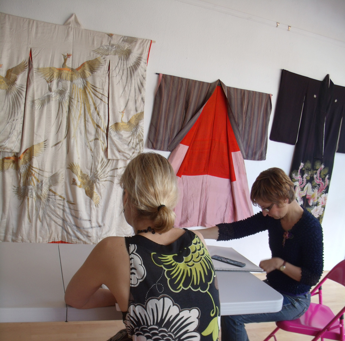
I have started a drawing club at Heart Space Studios, the first workshop was at the weekend and as I have put up a small exhibition of the kimonos that I brought back from Japan, to advertise my kimono making courses, I decided that the first class would be drawing my collection of oriental costumes.

As you can see my collection is very old, very damaged but very beautifully coloured and embroidered. I have used the collection many times for drawing classes and students always find new ways to respond to these lovely old silk clothes.

The first drawings are often tentative as people are often really nervous when starting to draw, particularly as this group of students had only just met, but the responses were fluent and quick to emerge.

After the first critical overview I suggested that everyone concentrates on getting the colour is the priority for the next drawing of the same fabric, not so easy but still a searching is apparent in the drawing that gives it a life of its own.

This often results in a change of focus and makes the subsequent line drawings much cleaner and concise, and not necessarily in pencil. The dragons were very popular. The drawings below have such a curious mixture of terror and comedy, the gold line drawing looks like a piece of graffiti – such energy and character.

Meanwhile in the front of the studios, where we have a wall as a gallery for hanging exhibitions to advertise our courses, other students were working from the displayed kimonos, the glamorous wedding robe got a lot of attention for the initial drawing session.

The resulting drawings are really, really tiny in comparison to the actual robes, but attention has been paid to interpreting the colours and giving direction to the stitching.
These intense drawings are really difficult to achieve in the small amounts of time I allow for each study – I make sure that to begin with no-one gets enough time to complete anything, I want people to react to what they are seeing, really look to draw in-depth.
The drawing above looks more like the real feathers of a crane than the gold embroidery it emulates. I particularly admire the directional drawing of the stitching, you can tell she is a textile artsist; and the subtlety of the erased pencil lines to describe figured silk is a really imaginative drawing technique.
A change of media often results in a change of scale – see below the difference between pencil crayons and pastels. I often get students to experiment with scale to find out if they naturally draw big or small –  oh and the change of coloured ground makes a big difference as well – colours glow off black.
and a change of scale can also be realised by standing to draw rather than sitting when you have only the arc of your wrist to make marks, the arc of an arm is much wider when standing.
 However, sometimes drawing large releases more than just your reach – below Drawing as Therapy.
this ‘jaunty, exhuberant flower’ is in response to this minute and exquisite embroidered flower on the tassel tag of a Chinese skirt. The artist assured me that she felt a lot better by the end of the day ….she was drawing for some other purpose than the one I had proposed – no problem, I’ll rein her in at the  next workshop.
And this is why I want to run a drawing club, not just individual classes – so that I can work with a group of people and get to know what they like and dislike, how they react to different stimuli, pull them out of their comfort zone to extend their experiences, let them play with lovely materials, fabrics and media  – and over the months  develop their range of drawing skills and experiences; to have the luxury to let them alone when they need space to think and really mess around, but then to push them to try something else when they feel they have finished.
Sometimes a piece of fabrics gets to everyone in completely different ways, above is a pastel drawing of a Chinese skirt, the artist is really trying hard to describe the colour of a soft and faded old pink silk lying next to its green lining….
The colours are completely wrong but the effect is ravishing…now what is this about? He had decided he had finished the drawing – I could tell this before he told me – as he was scraping in some black ground colour – where non existed. But I suggested he look again at the blue silk banding on the skirt to ground the drawing rather than invent a colour to surround it – the effect was immediate and I feel he has started on a journey of really working with colour, playing with the effects of broken/nuanced colour over solid ground colours…
However some fabrics are so simple, strong and vibrant that even in a bundle they cannot be denied their own character.
this vintage Art Deco dressing gown is truly inspired by kimono
But to return to drawing, observational fine line drawing. One of the last drawings of the day, inspired by a padded silk Chinese embroidered jacket, really shows true sensitivity to the garment.
and to finish where I started, here is a pastel study from a modern Chinese embroidered jacket, the student really had been having a bad drawing morning – trying to change the habits of a lifetime in one day – eventually she settled down to a whole afternoon of careful and precise study and here is the very satisfying result.

More Kimonos – drawing and embroidery

Since my last post I have been immersed in Kimonos. I have rediscovered my early fascination for these wonderful garments; wonderful to me because they are the perfect fusion of textile and clothing. Hang them on a stand or against a wall and they work as strongly shaped art pieces – wear them and they both reveal and conceal themselves and the wearer, the patterns undulating across the body in slow movements – hard to run in a kimono.

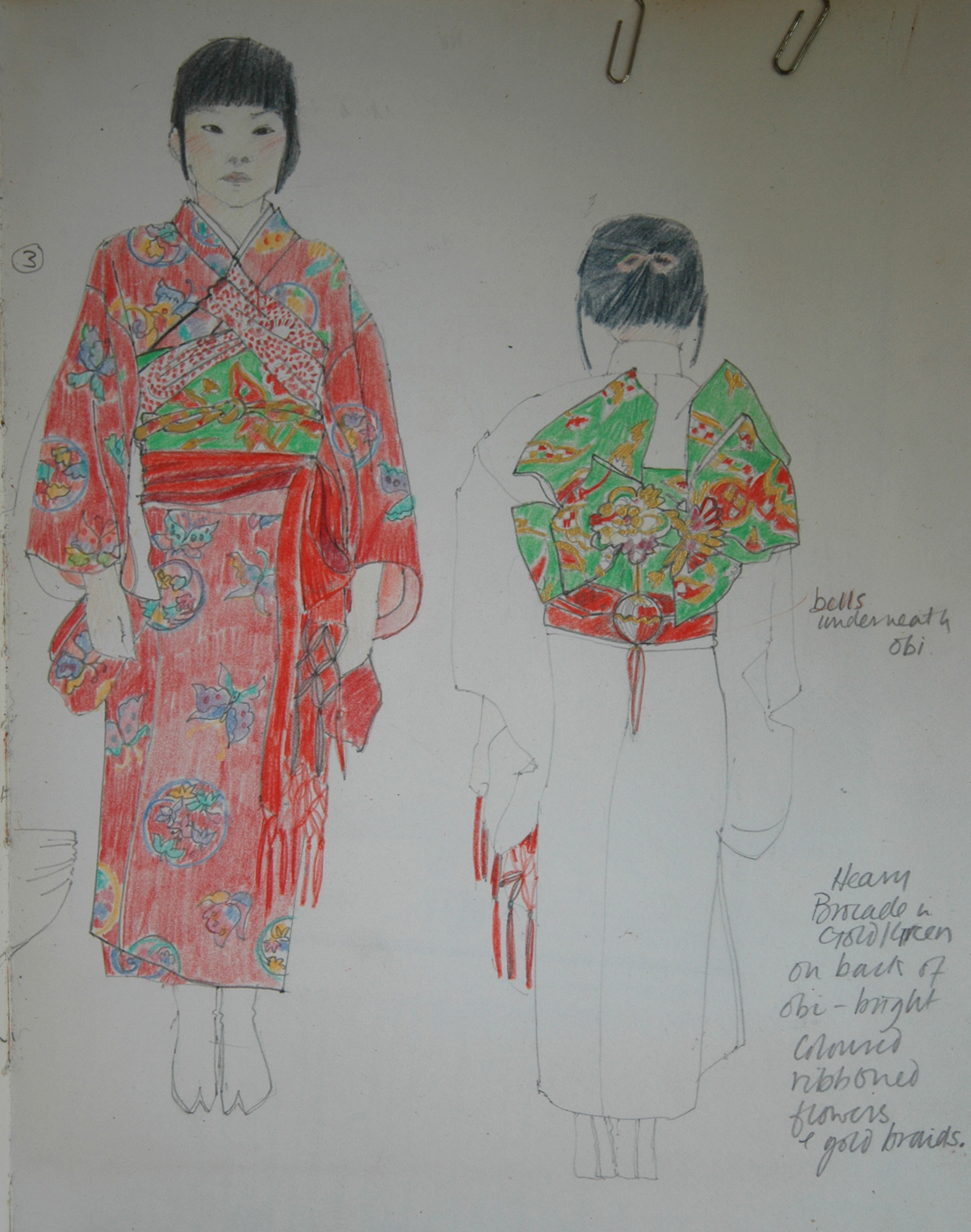
I have been searching through my records for my Japanese inspired embroidery slides. I had an exhibition on my return and showed embroideries, drawings and screen prints evolved from my hundreds of photographs and the day book drawings. Above is a neighbour’s child in her typical young girls’ red and white kimono. Japanese clothing has strict colour and pattern codes, they could not tell my age because I wore such a divergent range of clothes in different colours. I liked the way colours were described –  purples and deep blues are said to be Noble.

silk embroidered panel appliqued with traditional fabrics and my only successful attempt at shibori – the red ground of the kimono

However the fabrics I was attracted to were the brilliant silks in reds, pinks, yellows and gold, these glamorous fabrics were what I had come to see and tried to emulate..

This was hard as I had many techniques to master and I only had 5 weeks to assimilate the information…each Japanese textile apprentice takes 7 years to perfect their skill in one technique.

The only technique I came near to getting to grips with and which has stayed with me was silk embroidery in long and short stitch – see the Flora embroideries – and also I usually applique most of my embroideries together to make larger works out of different pieces of worked fabrics, this developed out of sheer necessity as I could never sustain any of the techniques to make more than a small sample.

However what the precise and perfectly placed stitches of Japanese embroidery enabled me to do was to stitch lively and nuanced versions of my drawings…and I am surprised now looking at this old work how my drawings did not change but my embroideries did. Check out the early sketch book drawing of the little girl in the red kimono at the top of the post and this later drawing for exhibition on my return. They are essentially drawn and coloured in the same way, crayoned first with defining pencilled lines, I still draw like this today and not surprisingly my handwriting is exactly the same.

Now look at the early canvas embroidery just prior to my visit. Here is my small scale, densely stitched canvas, enclosed space, rigid structures and very heavy stitching.

Yes it’s still solid stitching but look at the space and movement and white exposed ground on my first embroidery on my return, below and it is 4 times the size of the canvas embroidery…..

my scale, techniques and sense of space completely altered and suddenly nothing is centred…..it is flying around

Even on the large variable edition silk screen prints of kimono on stands, the Kabuki kites are whirling around

The next kimono post will get me back to the present ideas for the workshops at Heart Space Studios. But because of writing and researching for the blog, things have changed from what I first imagined I would teach …but that’s what ‘Re-Searching’ does for you – takes you further than your first thought into territories new and uncharted.

Heart Space and Flower Drawing

I have just given my  first “Flower Drawing for Stitching” class at Heart Space Studios –  to just 2 people – still early days for the new textile workshops but I have committed to teaching everyone, regardless of numbers, for the taster days, ie. one day workshops to whet the appetite for the longer 6 and 10 week classes. But the first thing I had to do was to go and buy the flowers – always a treat. I asked the local florist, Barry Toogood, for some dying tulips and he didn’t look at all fazed but immediately went to the back of the shop and produced 2 lovely bunches of floppy stemmed tulips – for free.

I also bought, ranunculas large pinks and whites, and a bunch of my favourite florists flowers ( on account that I cannot grow them myself) anemonies – in  MIXED COLOURS – these are difficult to find now as the style police seem to have gained control over anemone growers so that they are often sold in bunches of one single colour – what a ludicrous thing to do – surely what everyone loves about anemonies –  apart from the sooty black centres, the undulating stems and their ruff of brilliant green petals – is the wonderful mixture of glowing clashing colours; magenta, purple, crimson, palest mauve, softest pinks and whites suffused with lime and pistachio.

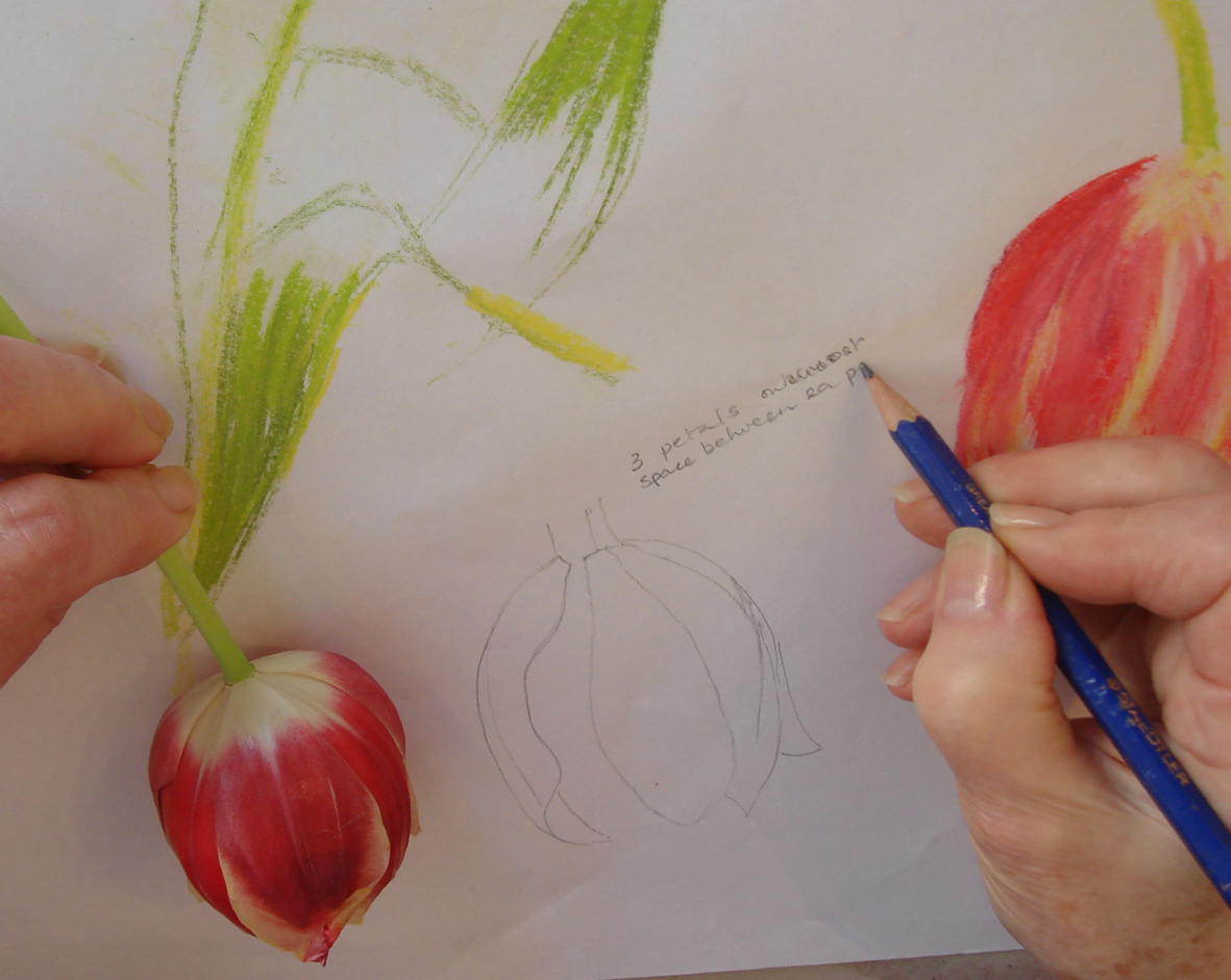
My two students had totally different attitudes to the flowers and the way they worked; but they both started off in exactly the same way when I asked them to choose one flower and just draw it for 10 minutes ( I always like to see just what people do when left alone, it tells me so much even though everyone is always very nervous when they start to draw in classes).

And 99% of people I teach always pick up a pencil, draw a shape and fill it in with colour, which is a waste of time and deadens the drawing by “filling in syndrome”

Occasionally, very occasionally, the colours are picked up first but I always start with the colours – I mean – what is your first response to most flowers, apart from scent which we aren’t dealing with here? So my first exercise in drawing classes is usually colour blocking then drawing outlines.

I must admit they were both very diligent with my ‘strict mistress’ teaching style, and were soon developing lively studies to develop embroideries later.

Choosing different media to suggest different surfaces also controls the scribbly or nervous “one of these lines must be correct”  type of drawing.

In the afternoon each student had to choose a drawing to stitch…and put the flowers away….this really tests the observational studies.

Ann White carefully made some line drawings and notes about petal sequences and the results of her studies carry her through to the applique stage where she was able to use her lovely marbled silk that she had brought with her from another course.

I learnt a lot from this class myself, timing is essential if students are to achieve a decent piece of work in a day…it proved impossible to finish such an intensive set of research and sampling in the time, even though these students were experienced before they came to the class –  so I need to adjust my way of working for the short classes but observational colurs and line drawing will always remain the starting point for flower embroidery.

But one of the real joys of teaching in this new studio, is meeting like-minded people, and to prove this point Sue brought a piece of vitreous enamel flowers on a trellis that she had made at another series of classes in Bristol.  I was so impressed and delighted and not a little envious of her work – as it seems much wittier  than my own enamel flowers – that they now hang in the Heart Space Studios window.