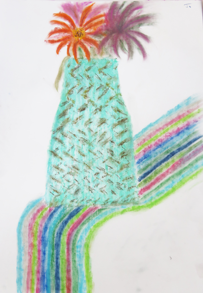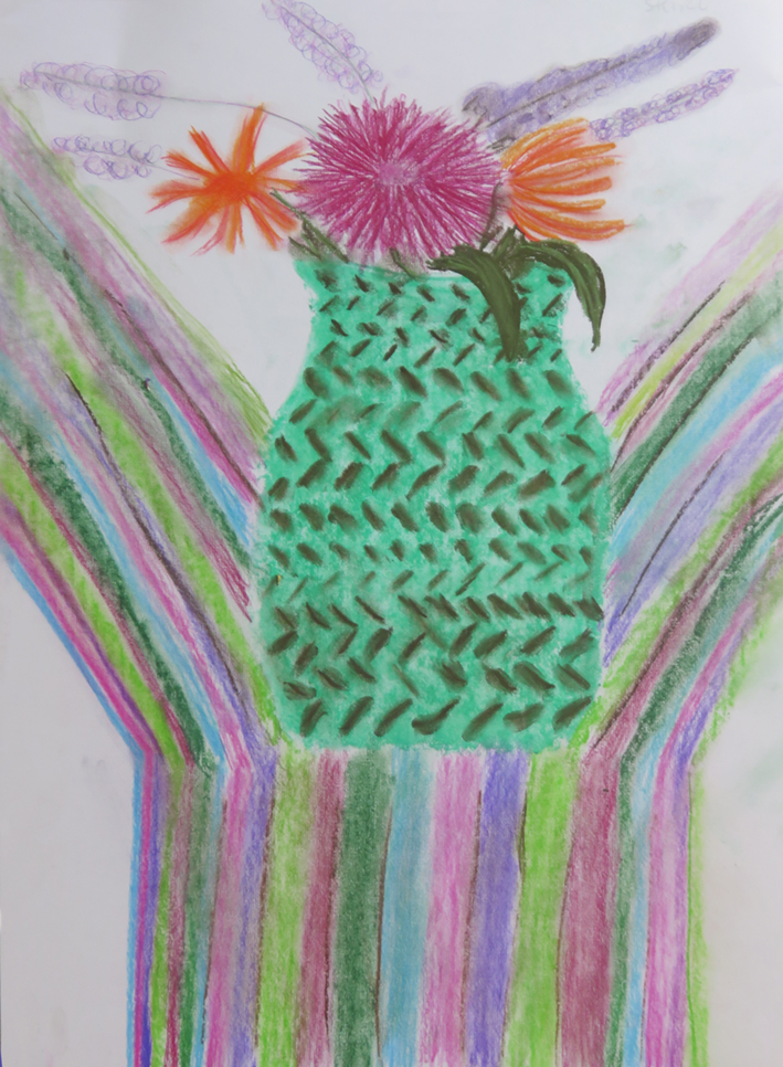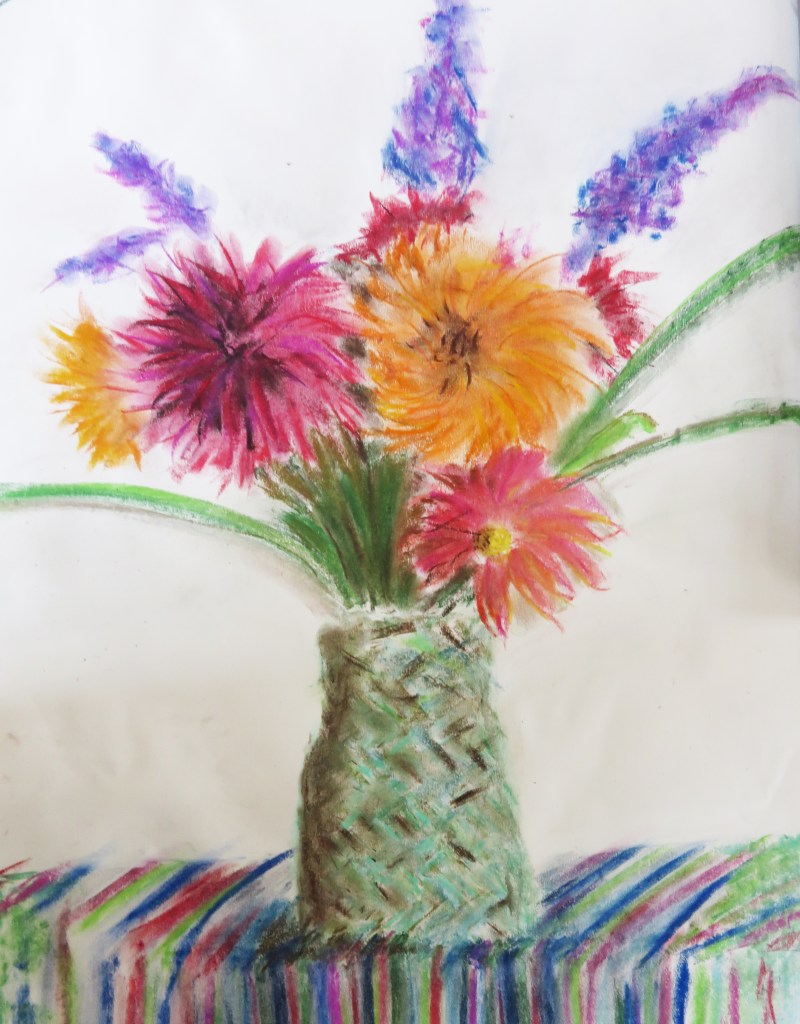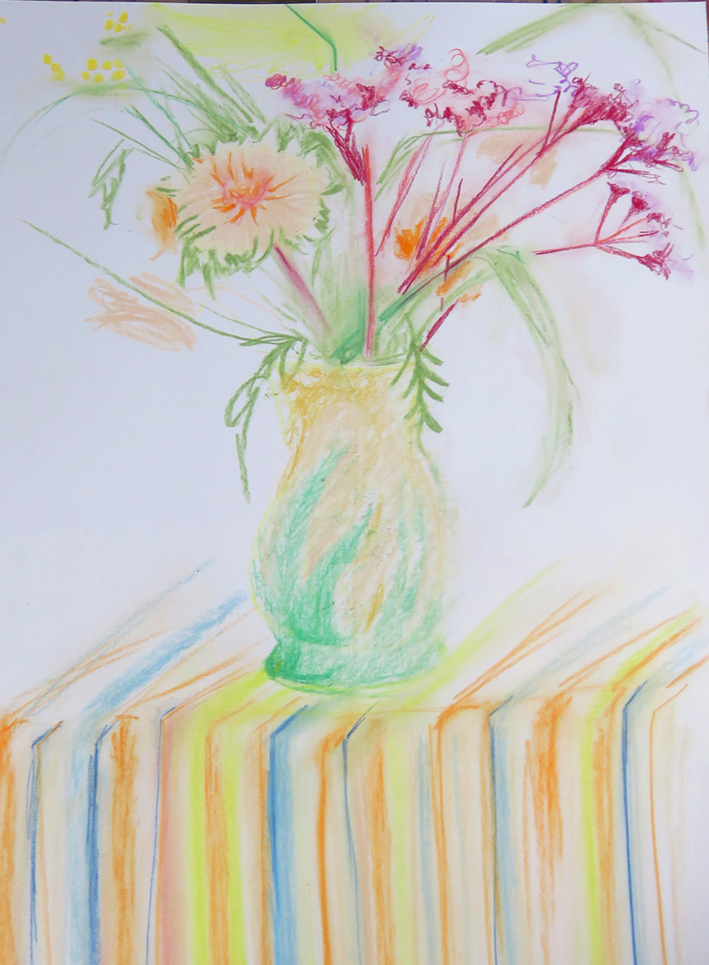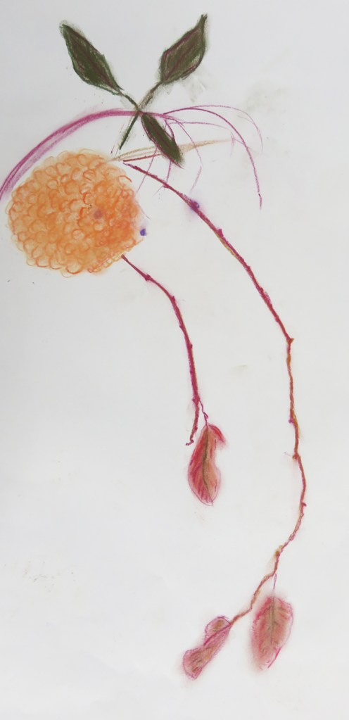
A vase of Tulips
I was commissioned to embroider ” a vase of colourful tulips” during my Hidcote exhibition, and I realised that tulips would not be in season in October …I decided to find the tulips within my own work.
Dog quilt continued: the Portraits
This is the next instalment of the dog quilt. I decided to stitch proper portraits, close up and personal of 3 dogs belonging to the designer who had originally commissioned the quilt. These dog embroideries were obviously really important to the success of the whole project, so I gave them the centre stage in the…
dog quilt: SERENDIPITY
Not how quilts are usually made I know, but this was created by the love of dogs, not the discipline of the patchwork quilt.
commission revisited
I not only could explain the ways of stitching the cast, I had kept all the materials and stitching samples, and there is a post that explains the whole 3 month long process.
More birds in Skirts
The last week of my exhibition Inspired to Stitch at Hidcote Gardens and this week ,taking stock of the whole experience, I find myself reflecting on, amongst other things, what sells and why.
birds in skirts
I gasped when I first saw these 2 topiary birds when visiting Hidcote to discuss my exhibition “Inspired to Stitch” for the Manor House gallery in 2025, where were the large bases of yew that they had perched upon for over 100 years? It was explained that the loss is in part due to necessary…
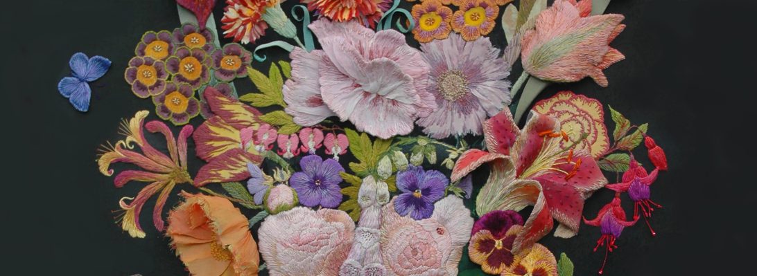
DRAWN to stitch: gardens & flowers
This is the foreword, kindly composed by Kaffe Fassett, for the first page of my latest book I made as a catalogue/ picturebook to accompany my latest exhibition Inspired to Stitch: Hidcote Revisited. at Hidcote gardens in Gloucestershire. It illustrates part of the story of my career in stitched textiles, from my first ever embroidered…
HIDCOTE REVISITED: NEW EXHIBITION
Invited to exhibit my embroideries at Hidcote Manor, a National Trust Garden in 2025, I immediately thought of my first visit in the 1970’s and the effect it has had on my stitched work ever since.
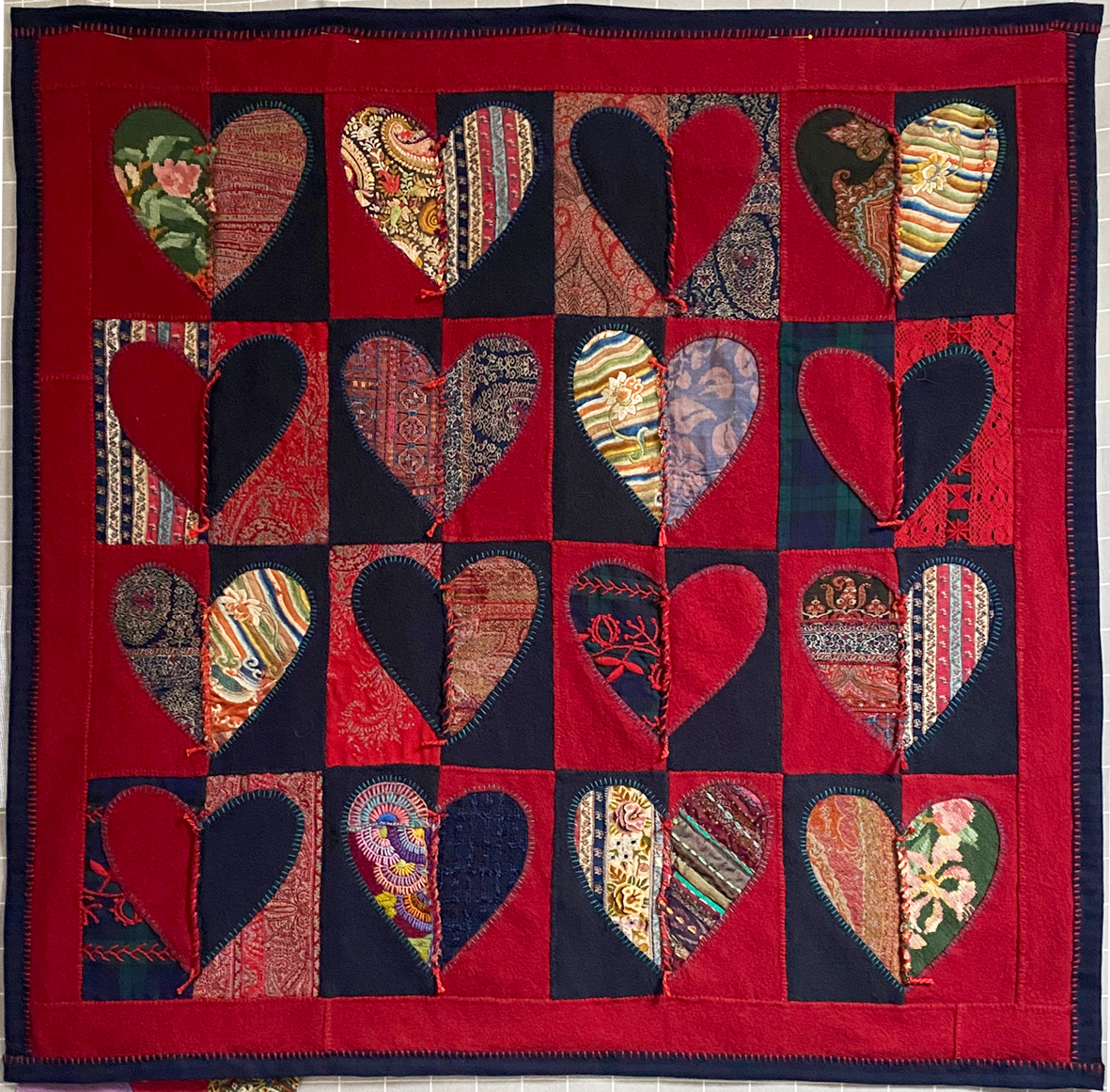
Flowers & Hearts
The Welsh Quilt Centre, Lampeter opened a week ago today where I am exhibiting a small show of personal work – work that I make and keep for myself.
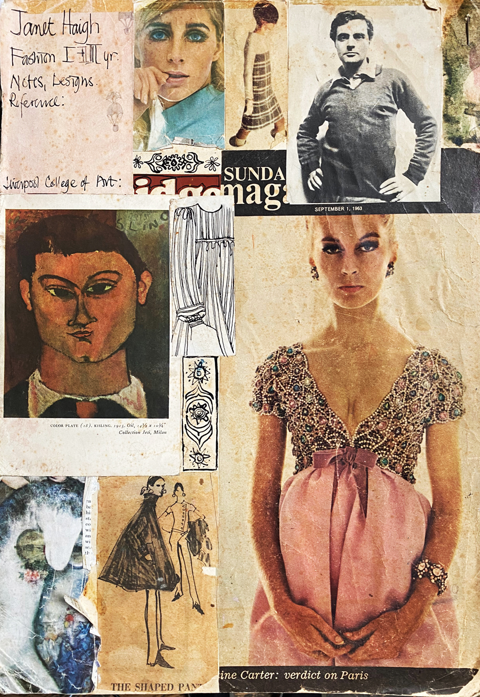
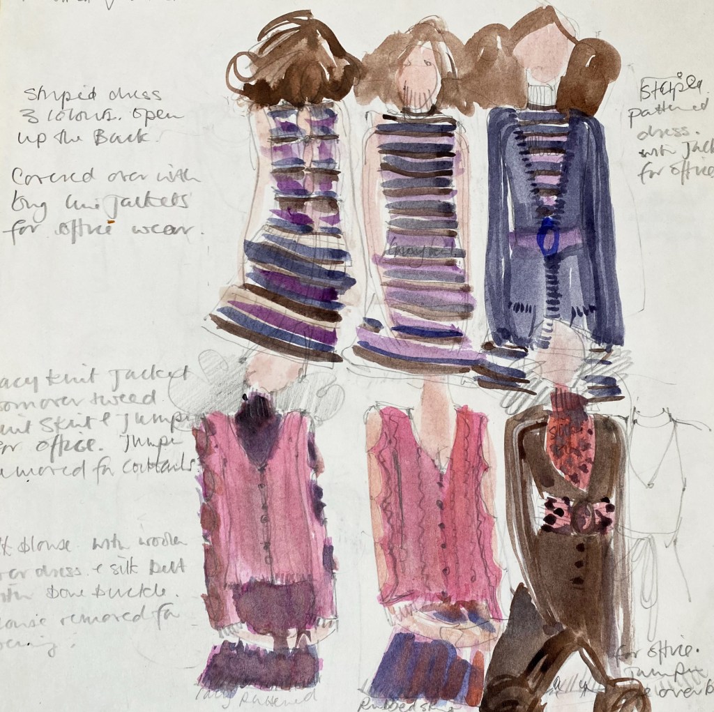
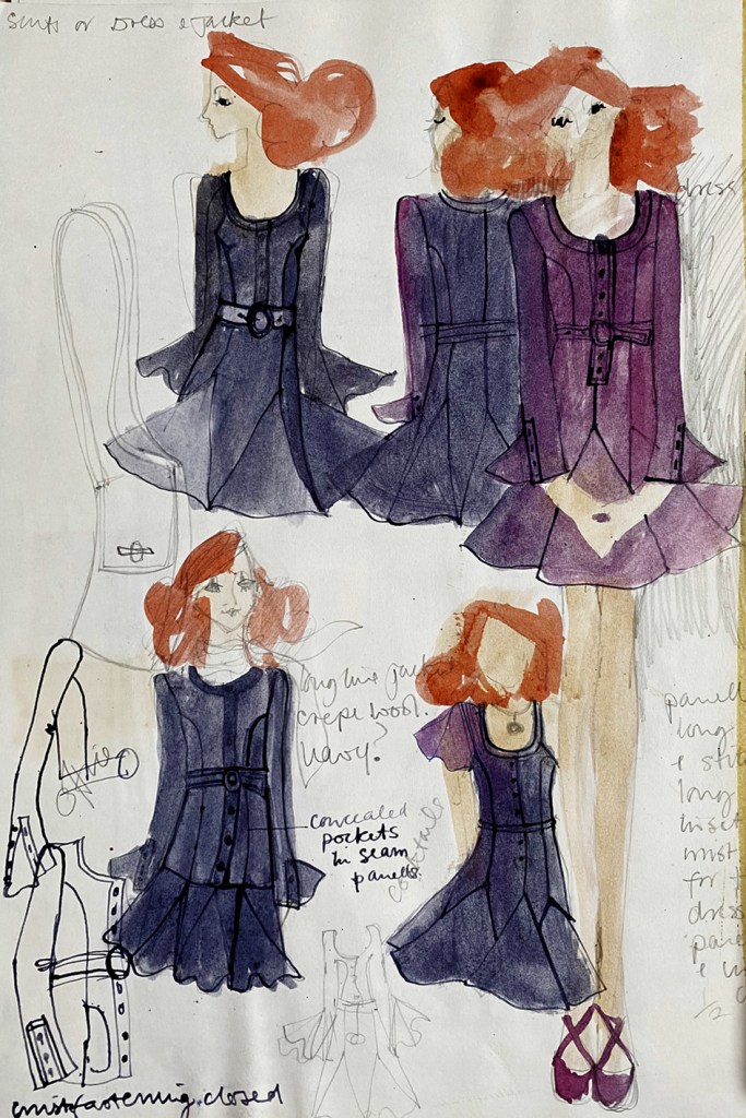
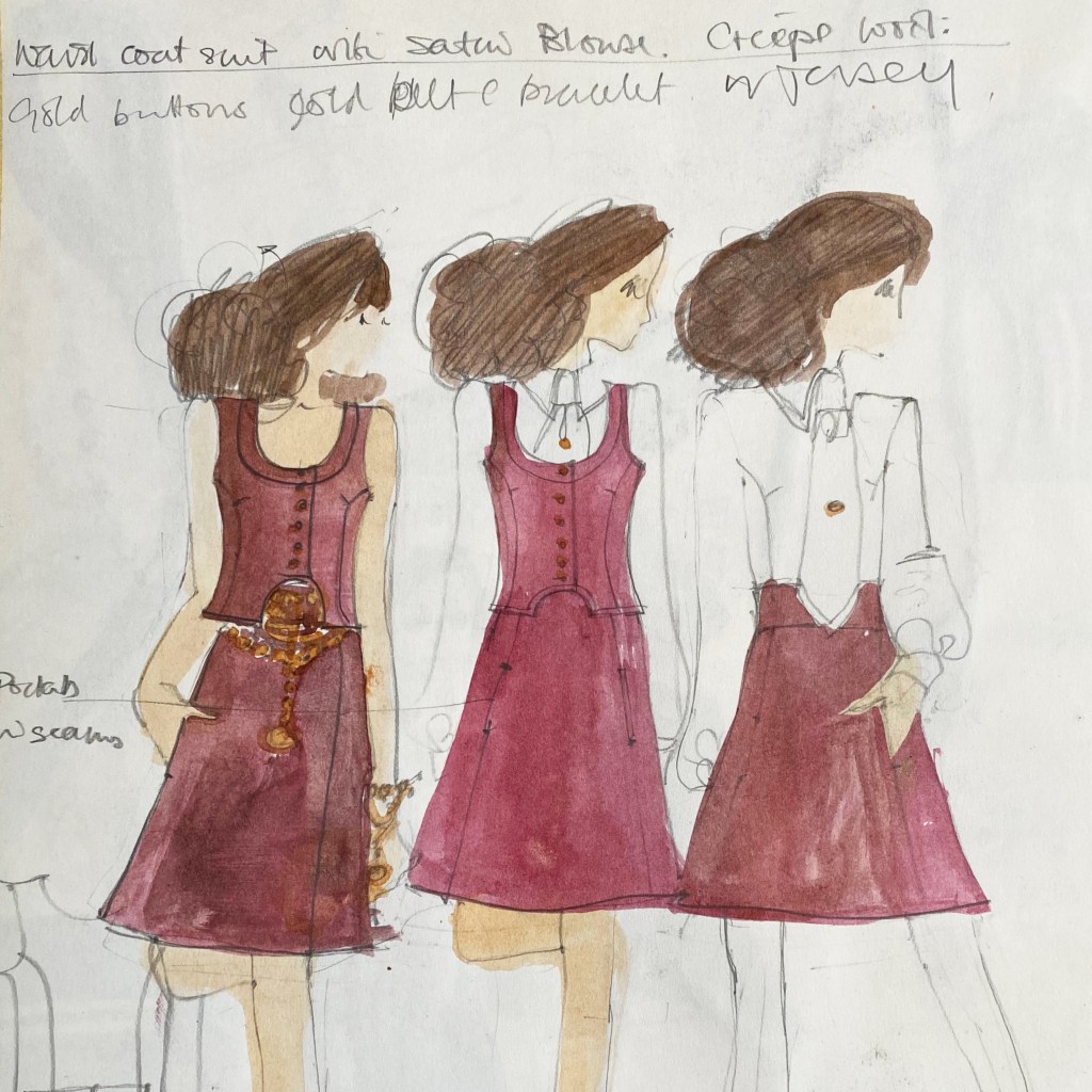
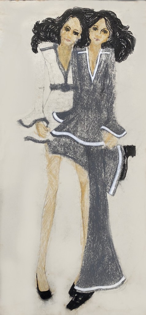
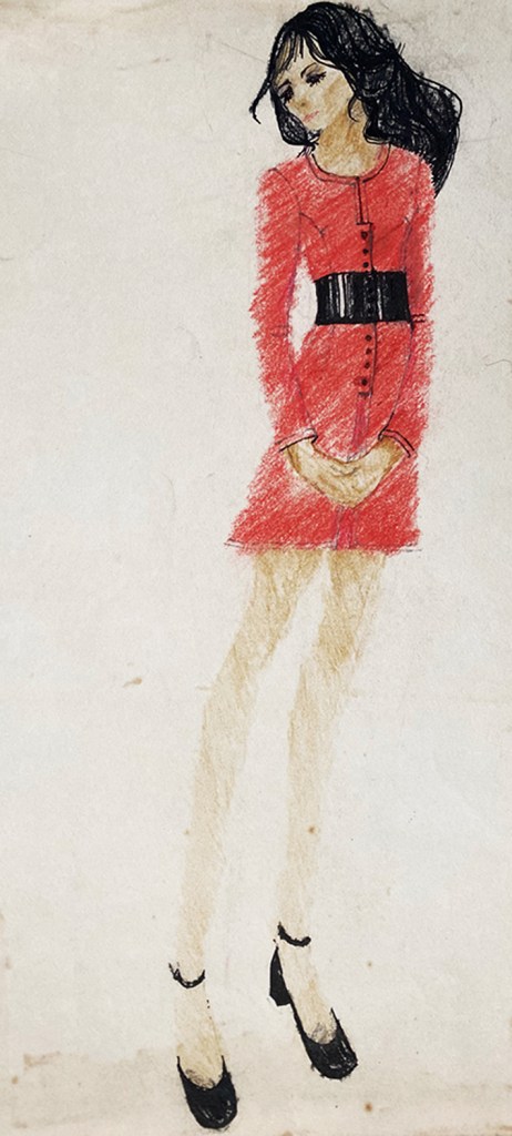
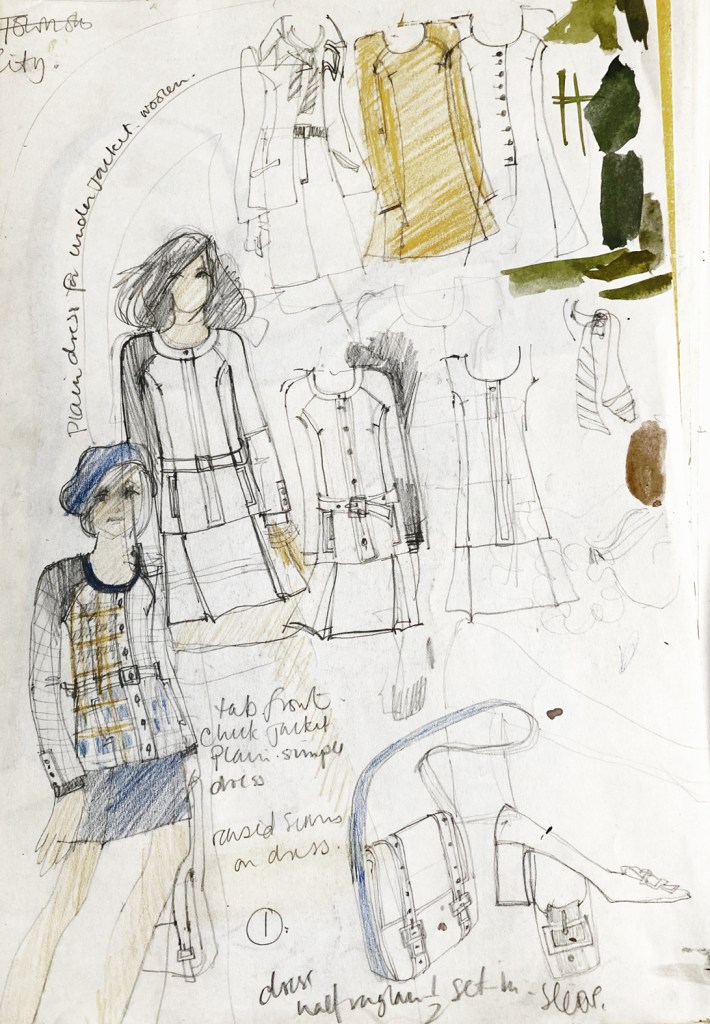
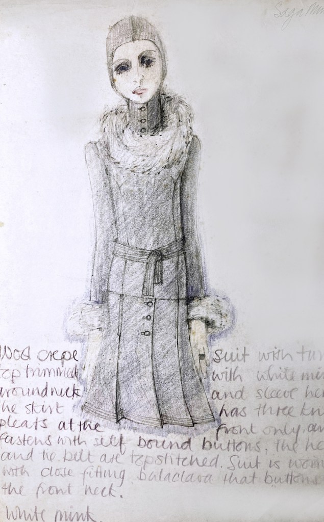
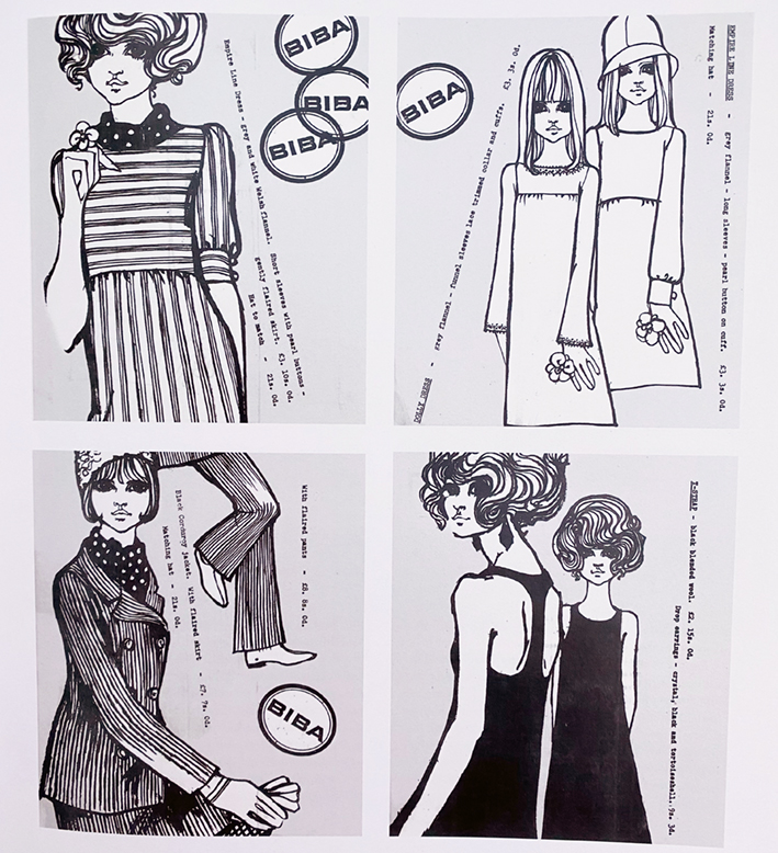
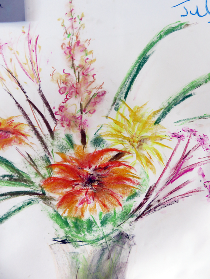
my 1960’s fashion sketch book
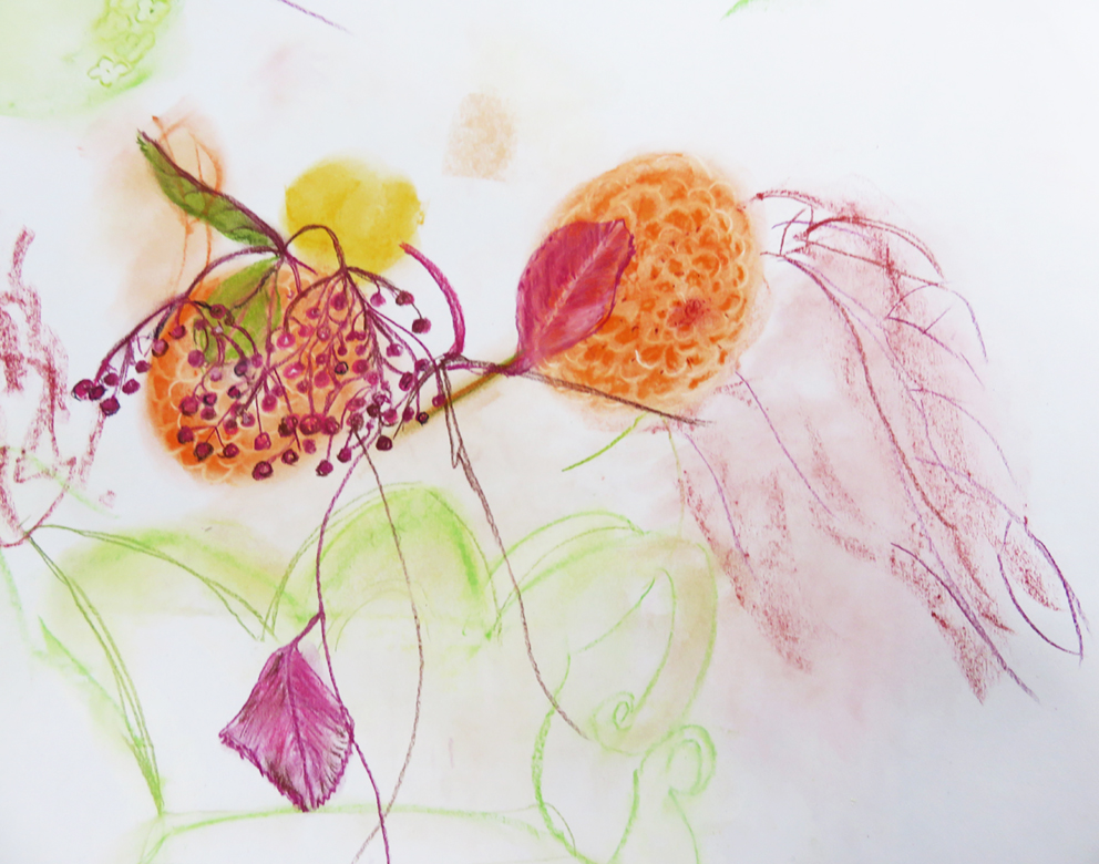
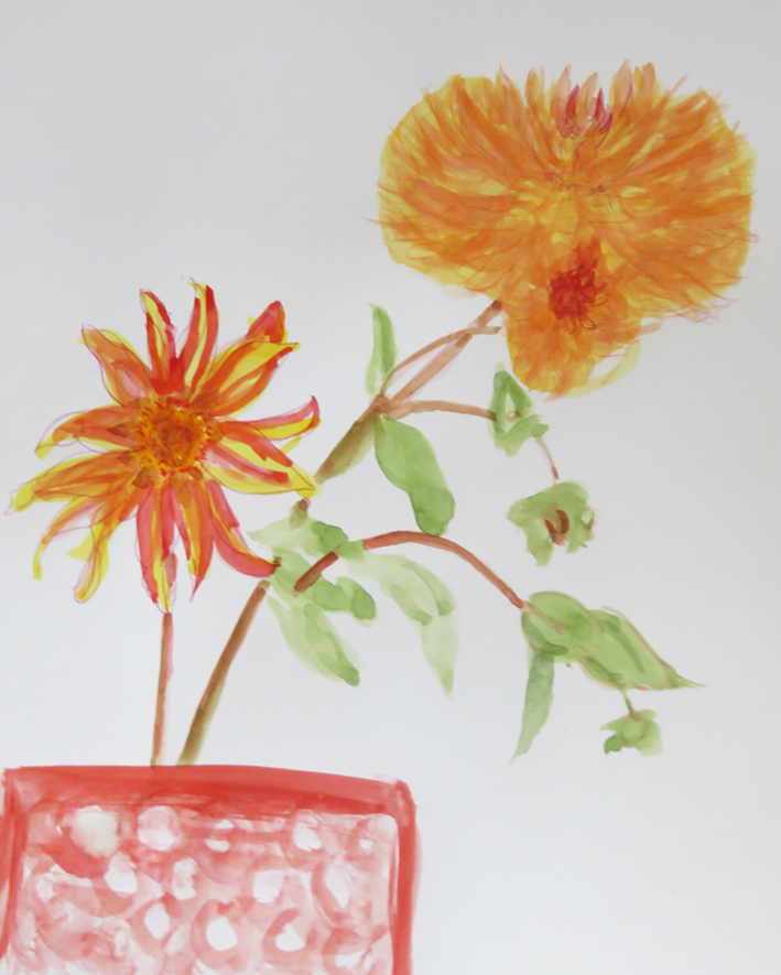
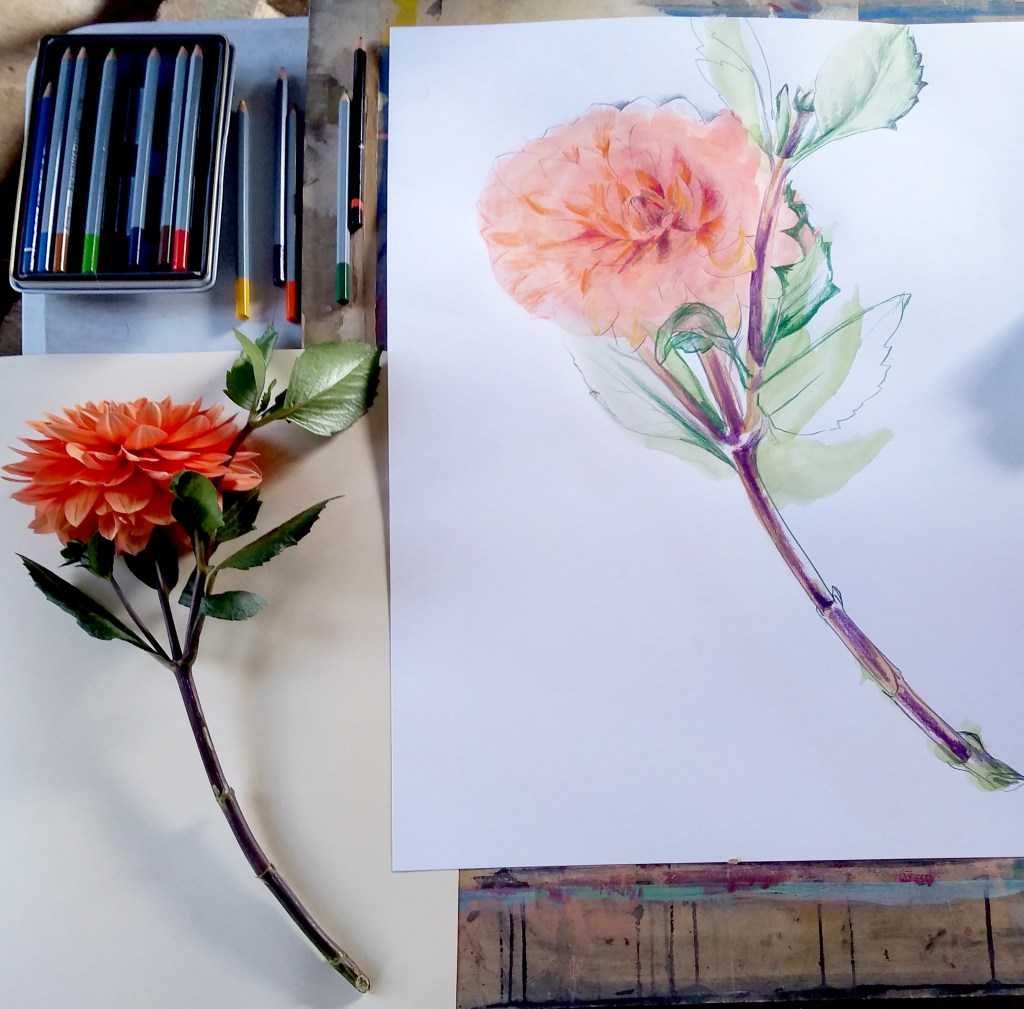
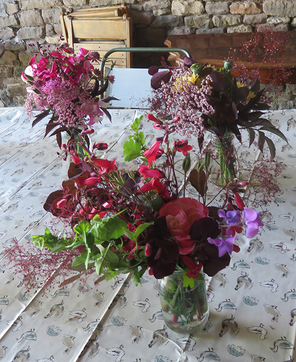
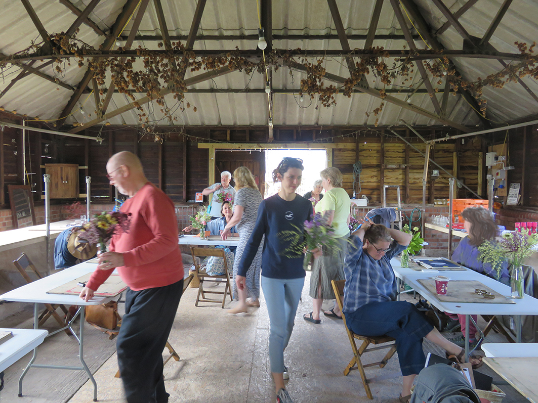
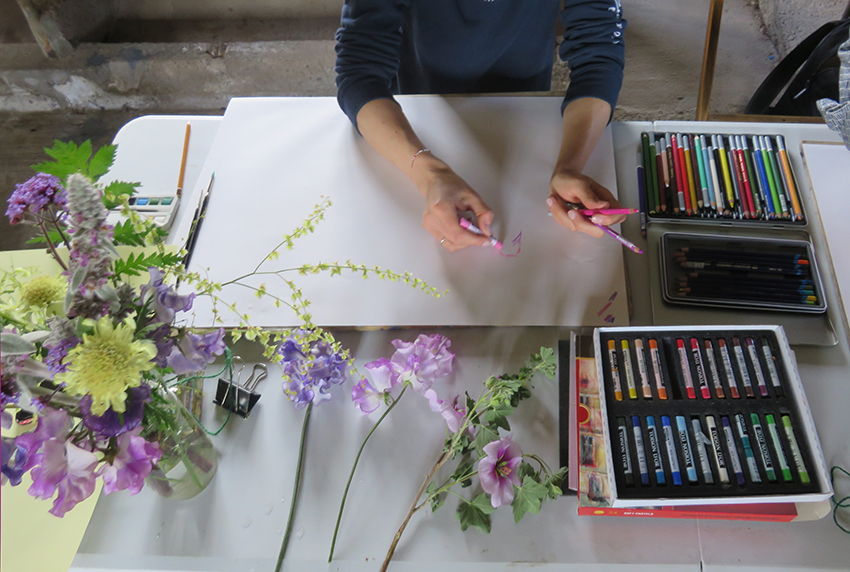
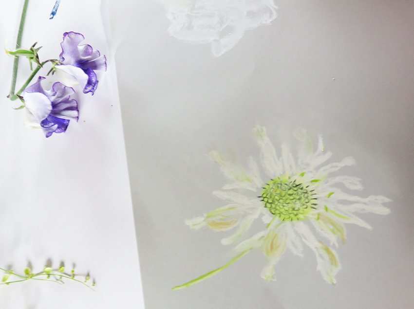
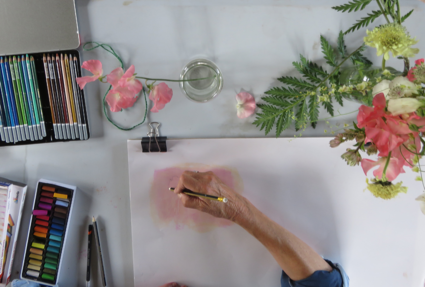
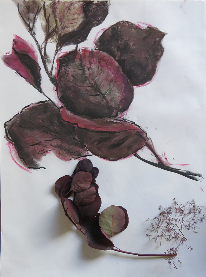
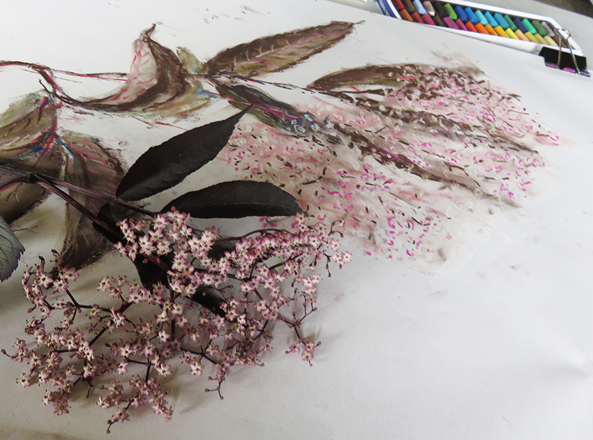
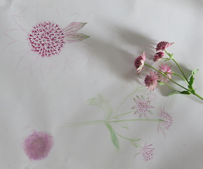
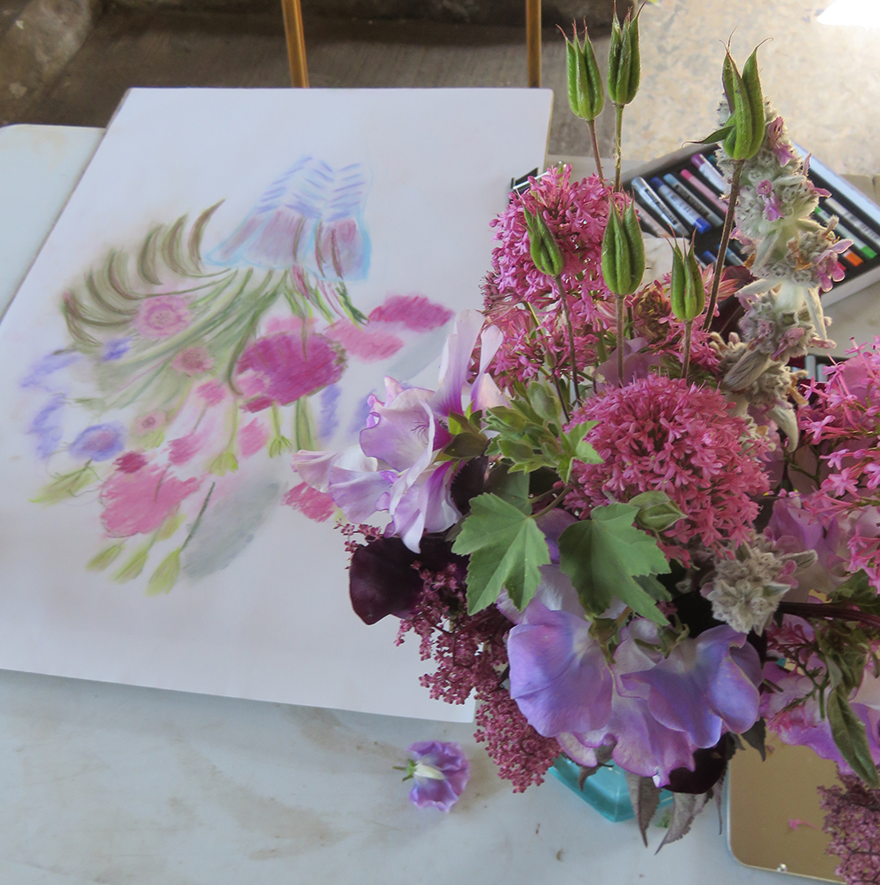
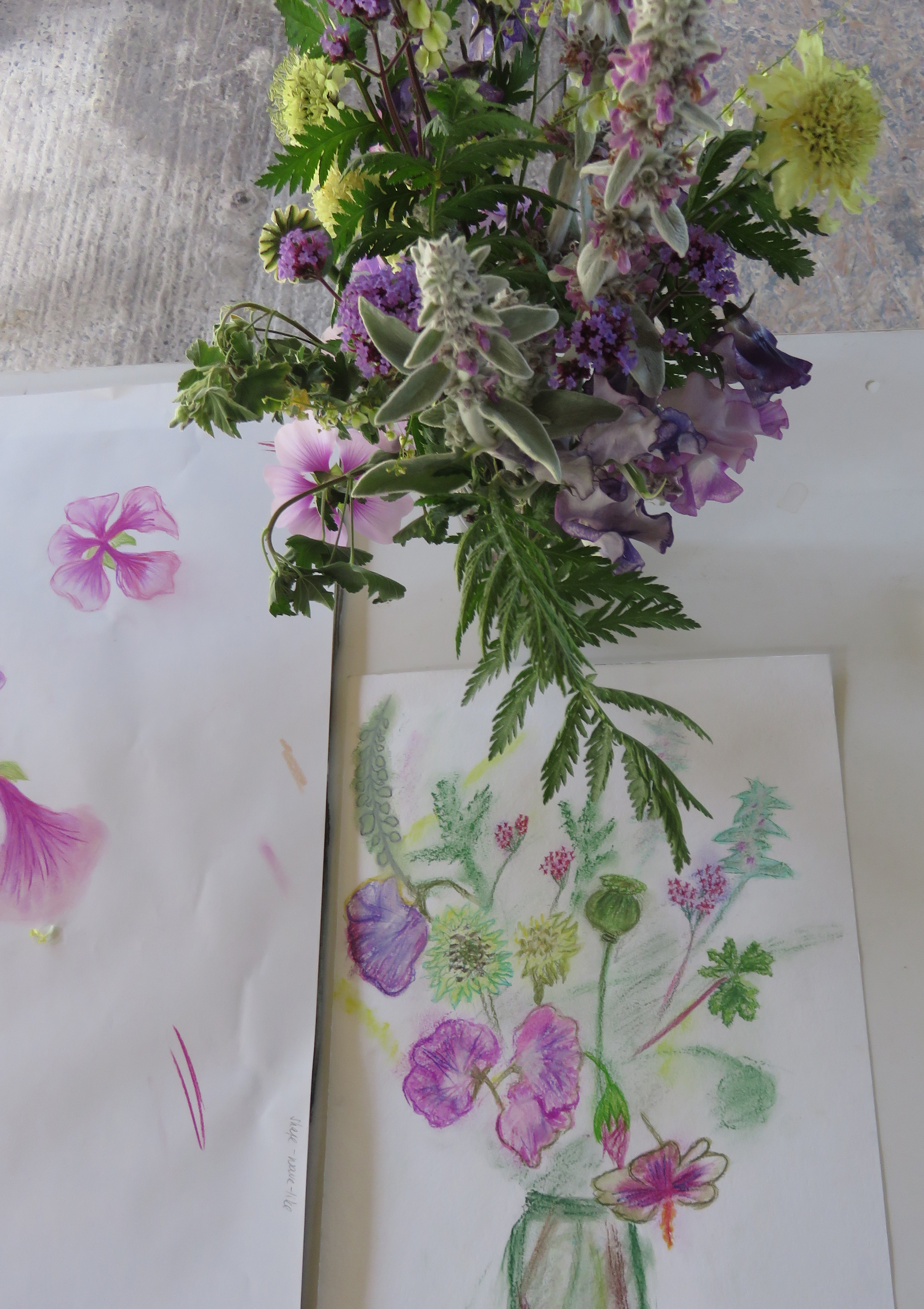
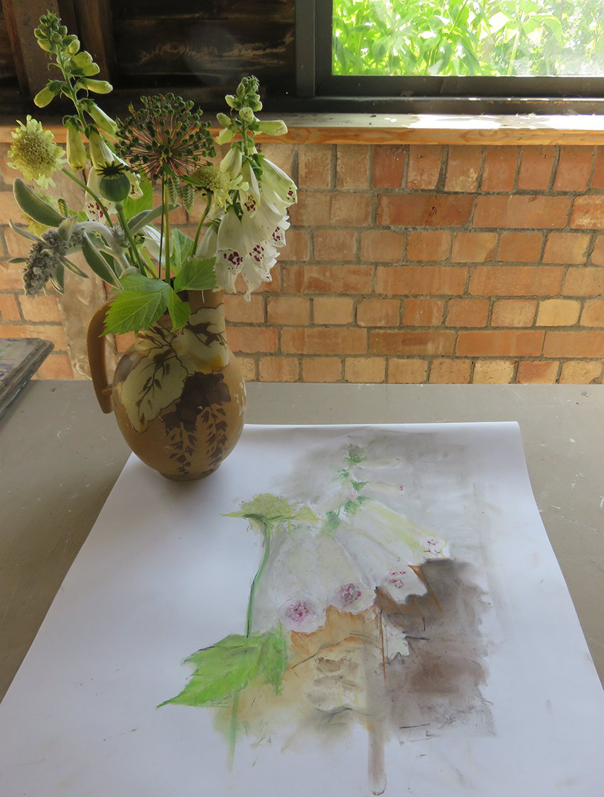
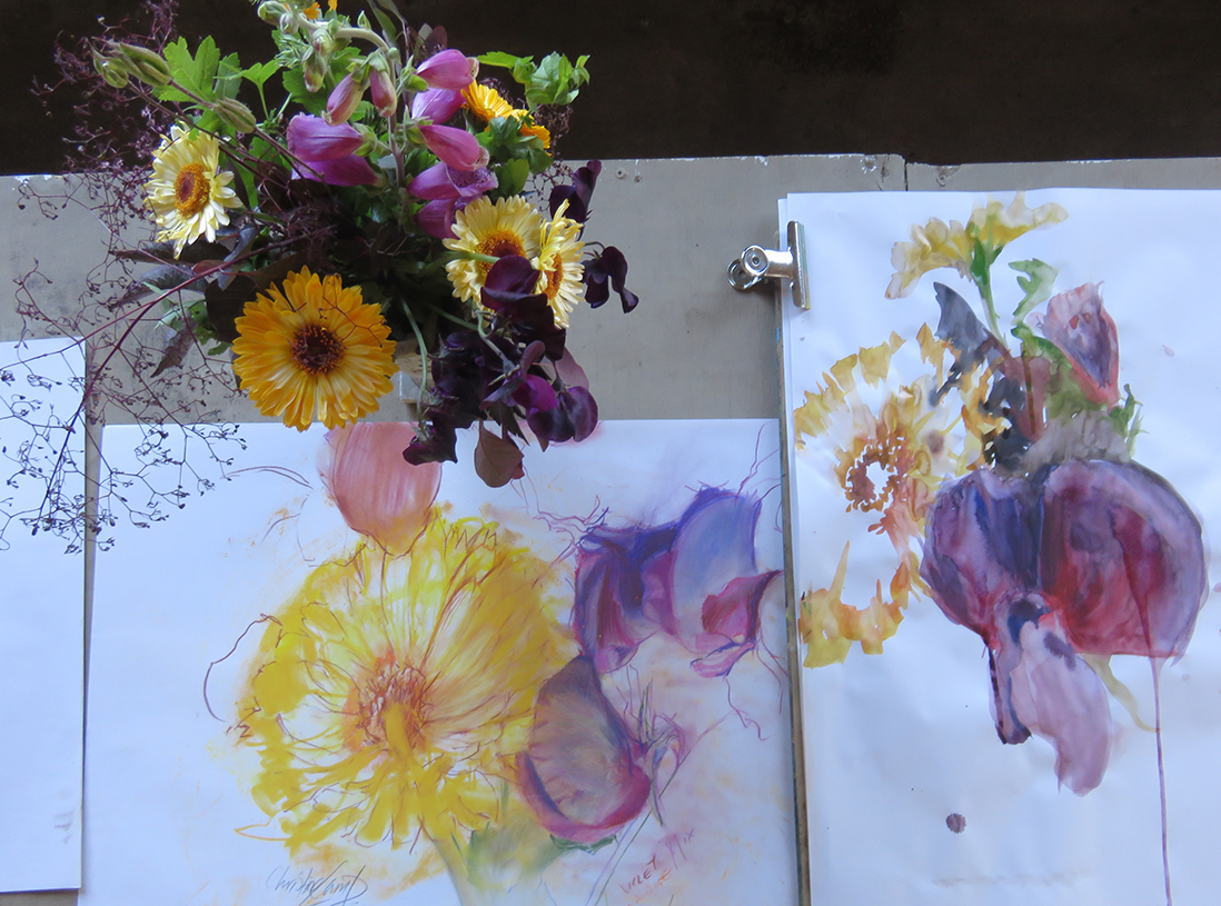
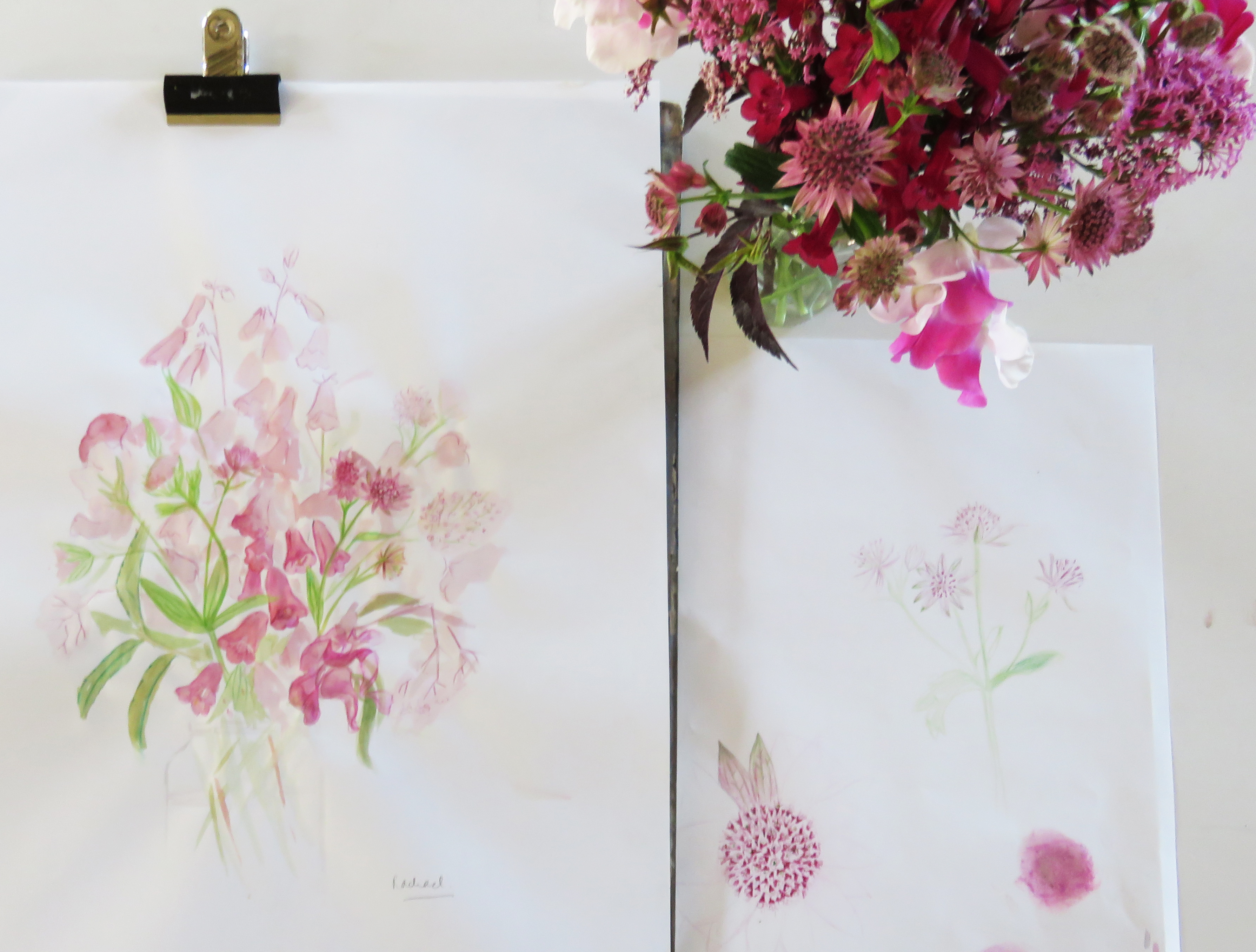
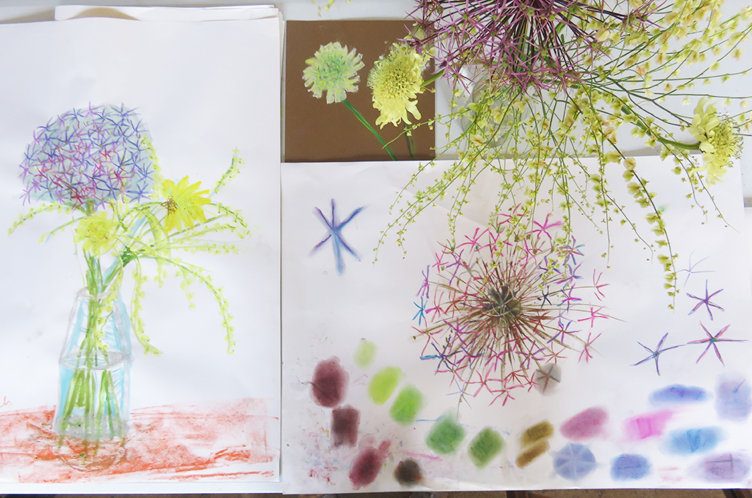
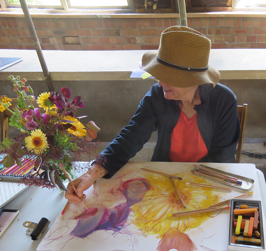
Invited to conduct a week long course of drawing flowers and then to develop the drawings into a small sketch book at Court House Farm in early June, when the cutting garden flowers are blooming. I checked out my collection of sketch books/ visual research journals (whatever they are currently called) I have kept all…
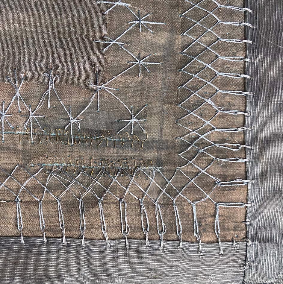
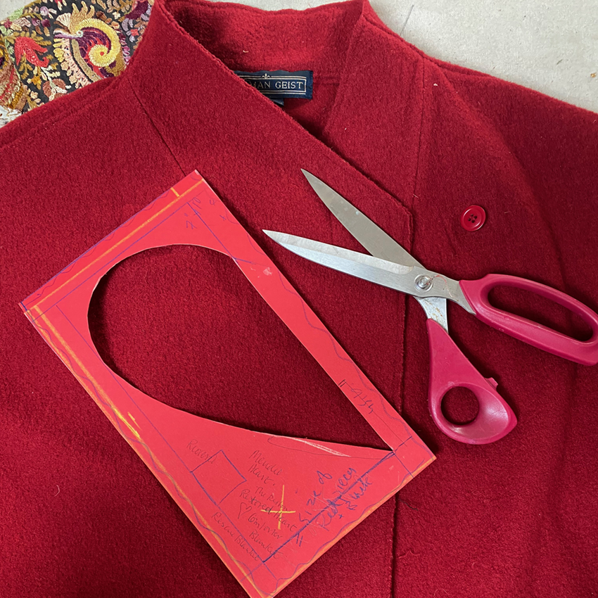
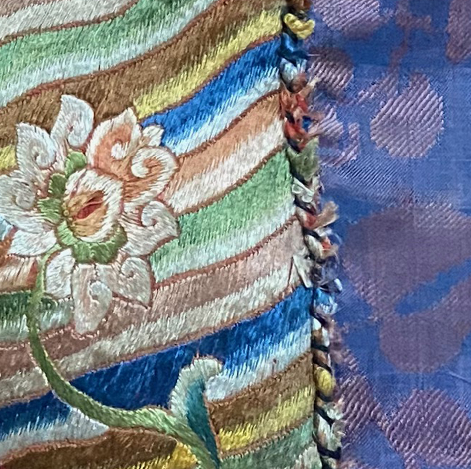
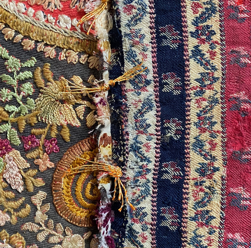
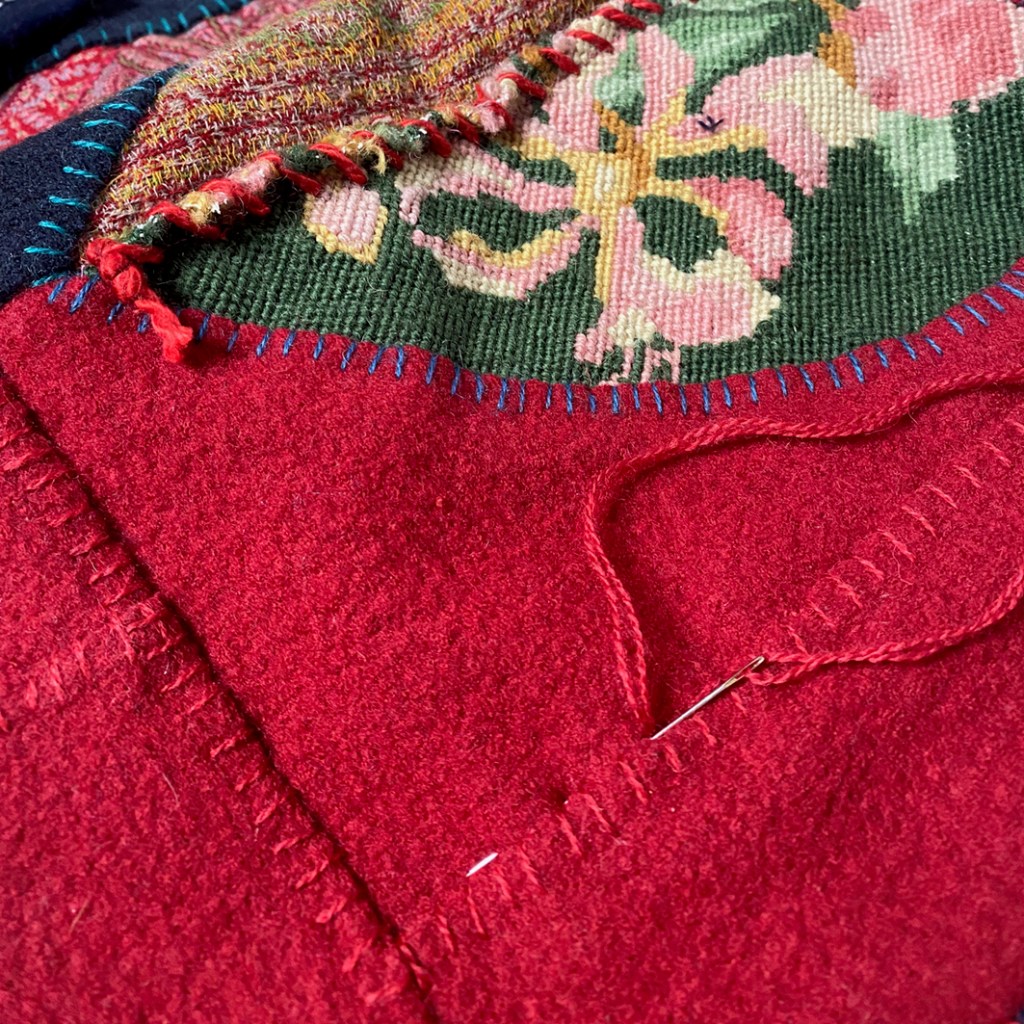
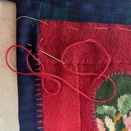
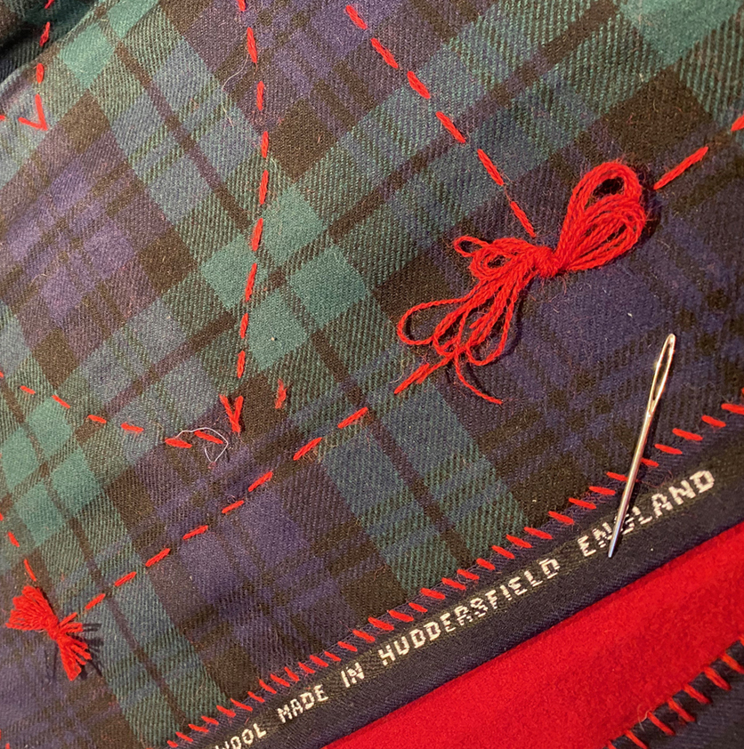
mending the mending….
The first area I felt confident to work was a rip, and I cut away the fraying fabric – a mistake – but hey ho, nothing ventured…
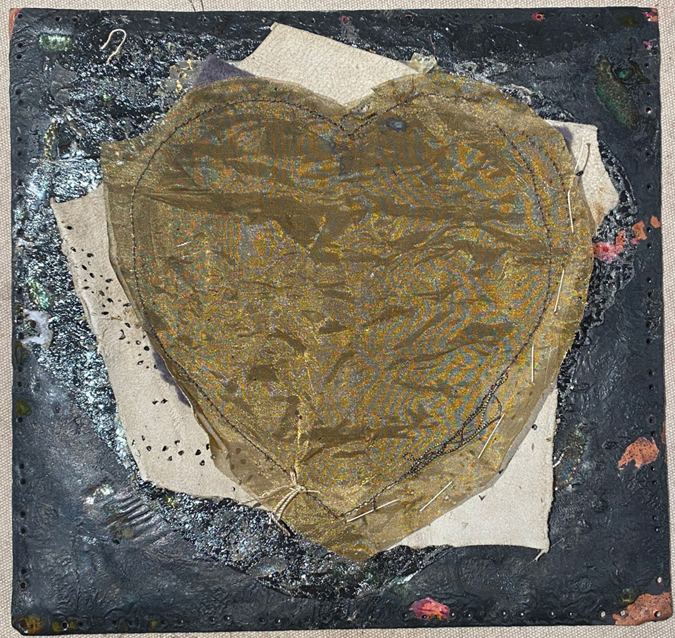
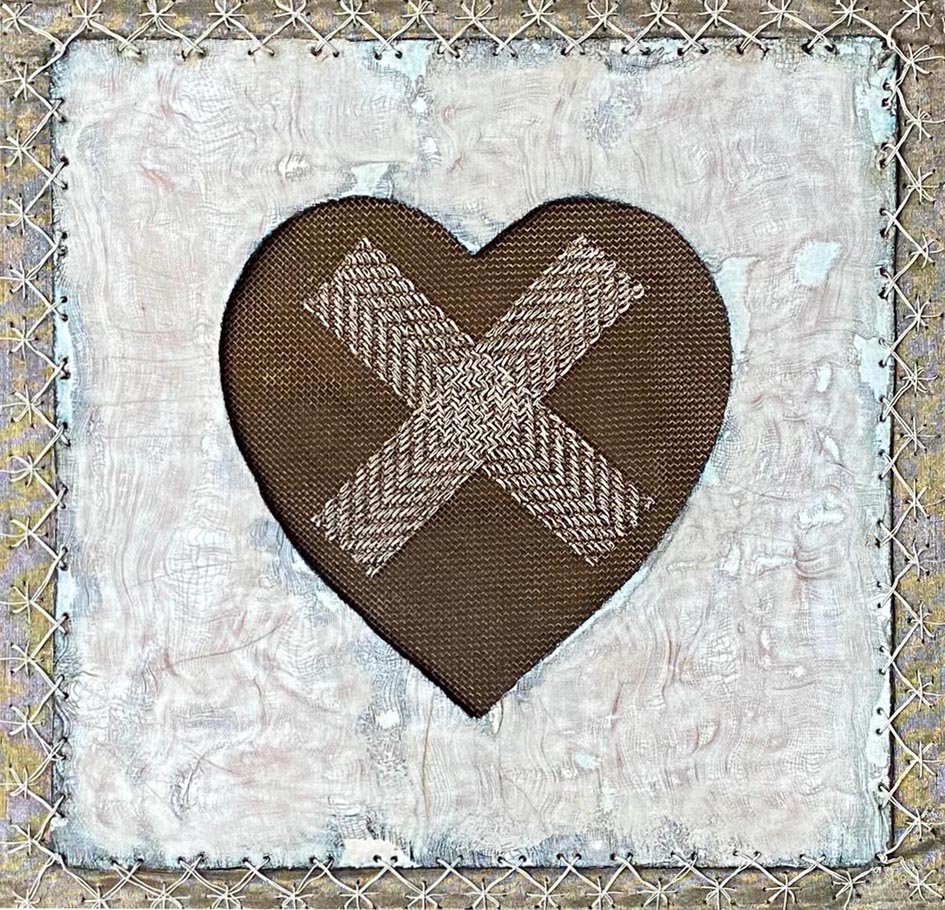
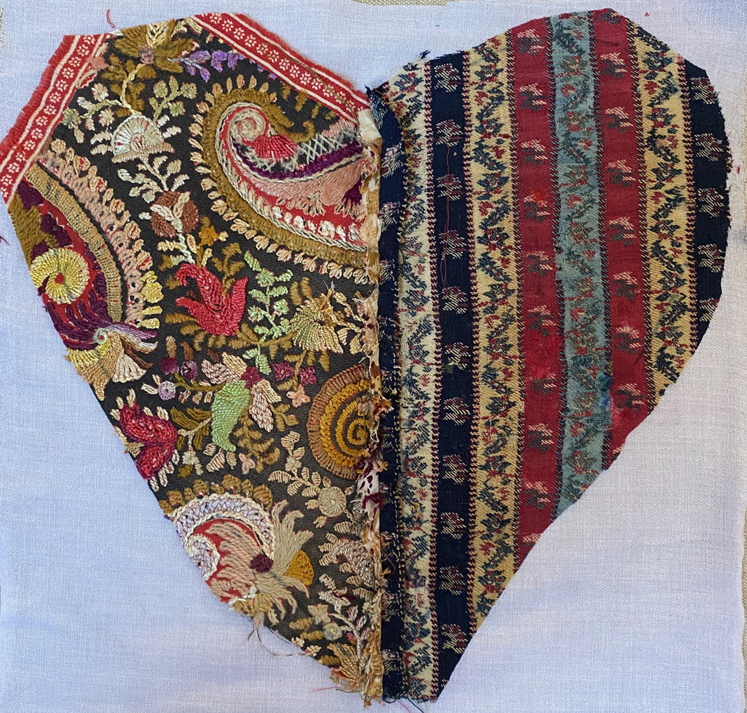
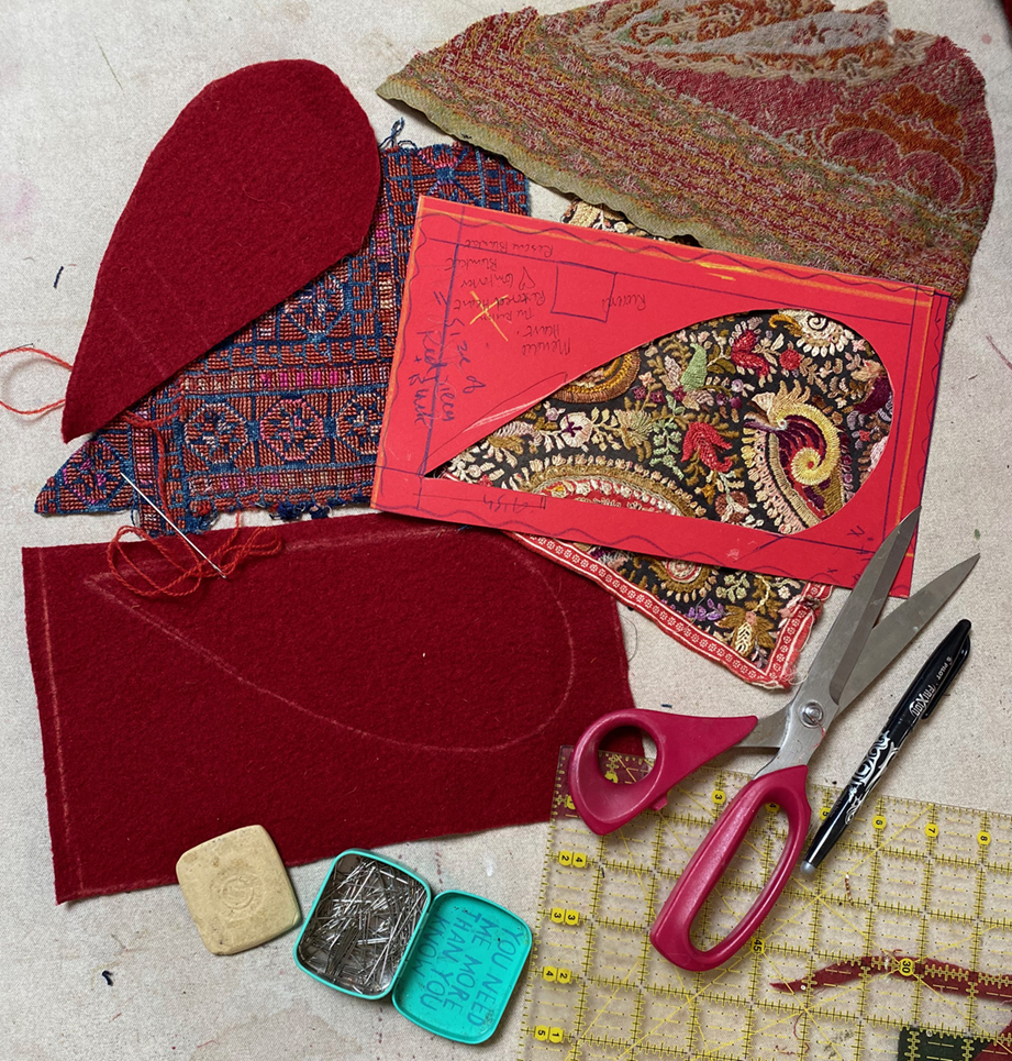
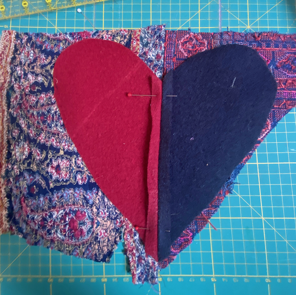
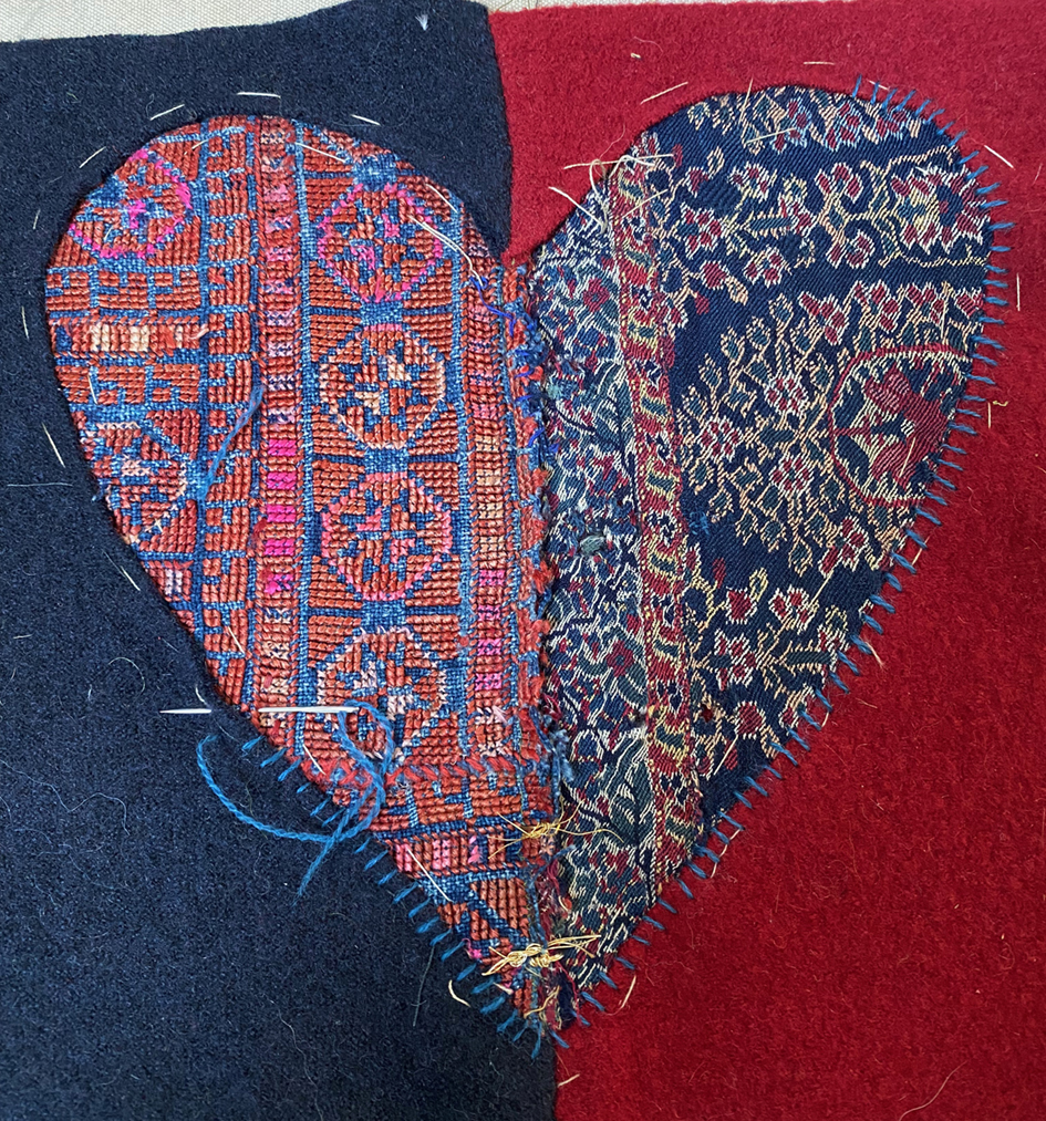
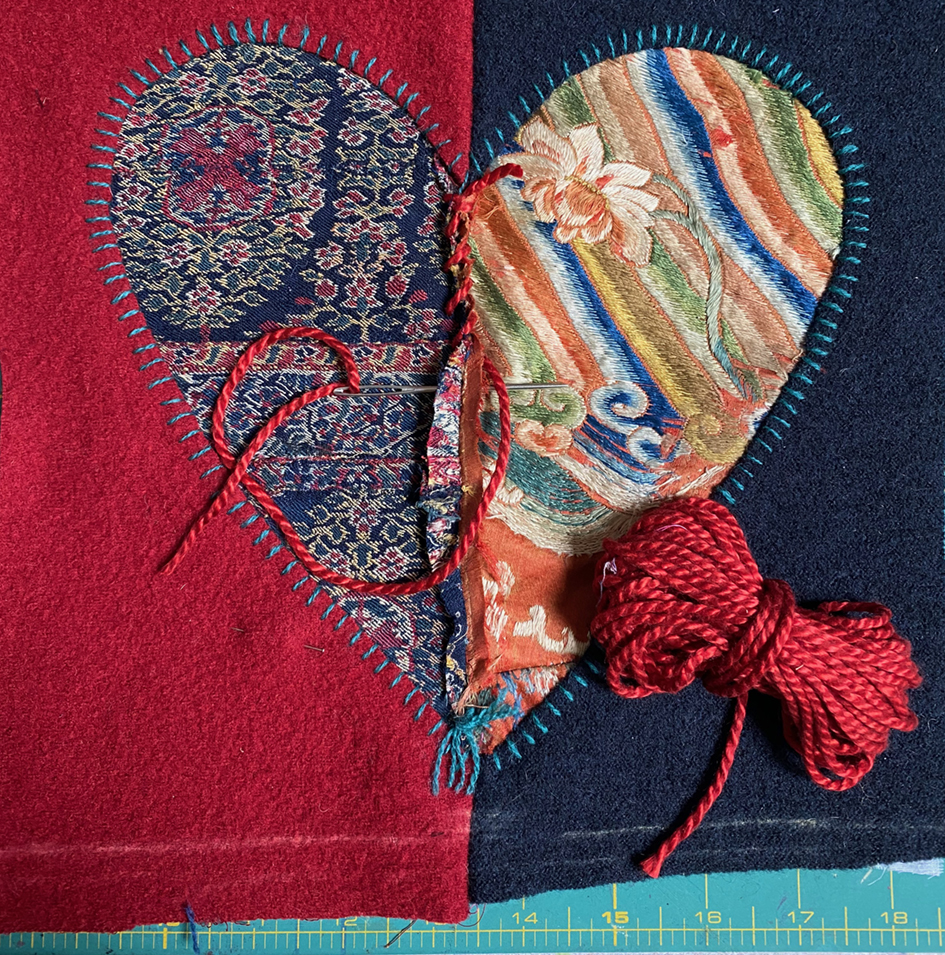
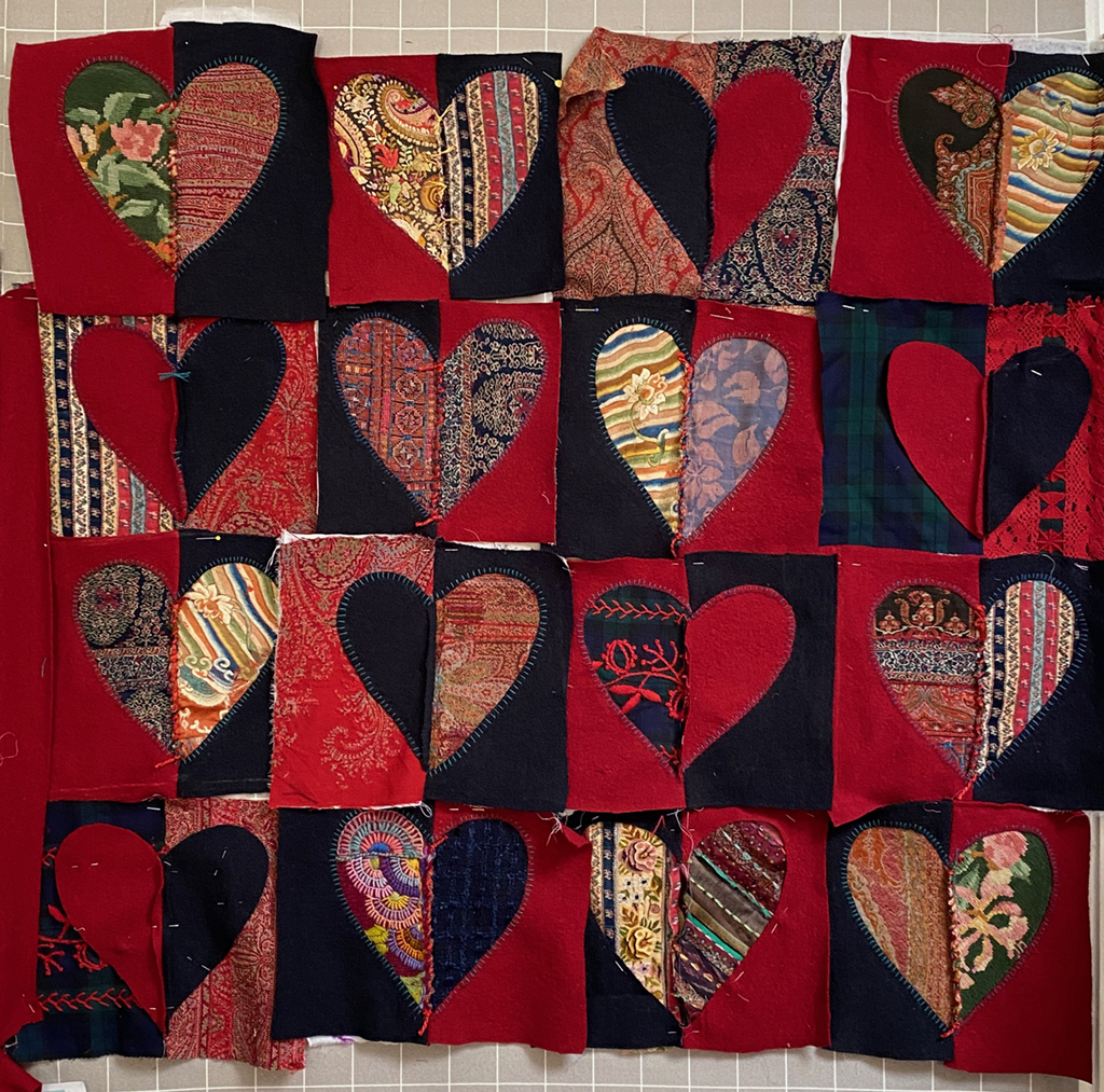
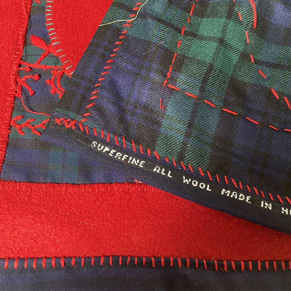
my badly stitched blanket
Choosing from my many truly delicious and damaged vintage fabrics, I cut out an oversized heart shape, and quickly realised that my original idea would like patterned porridge.
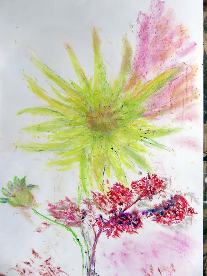
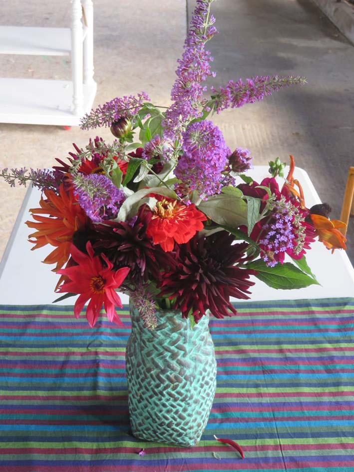
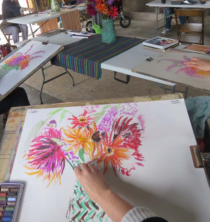
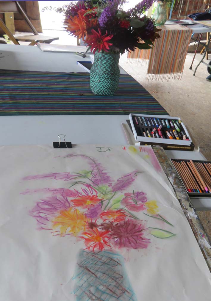
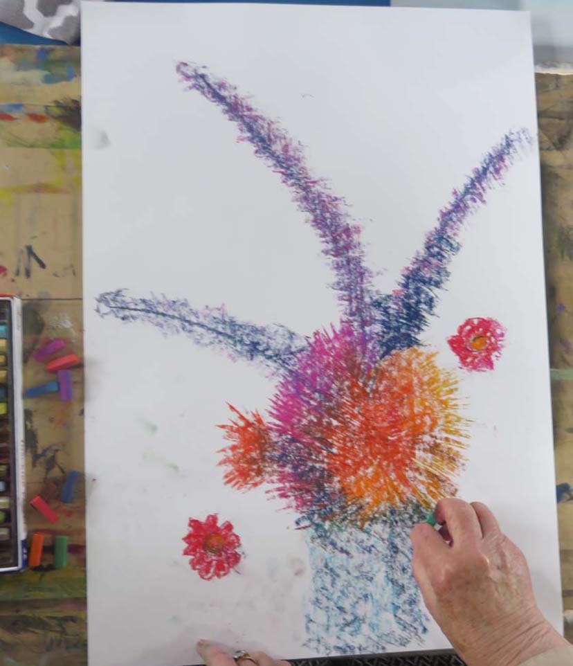
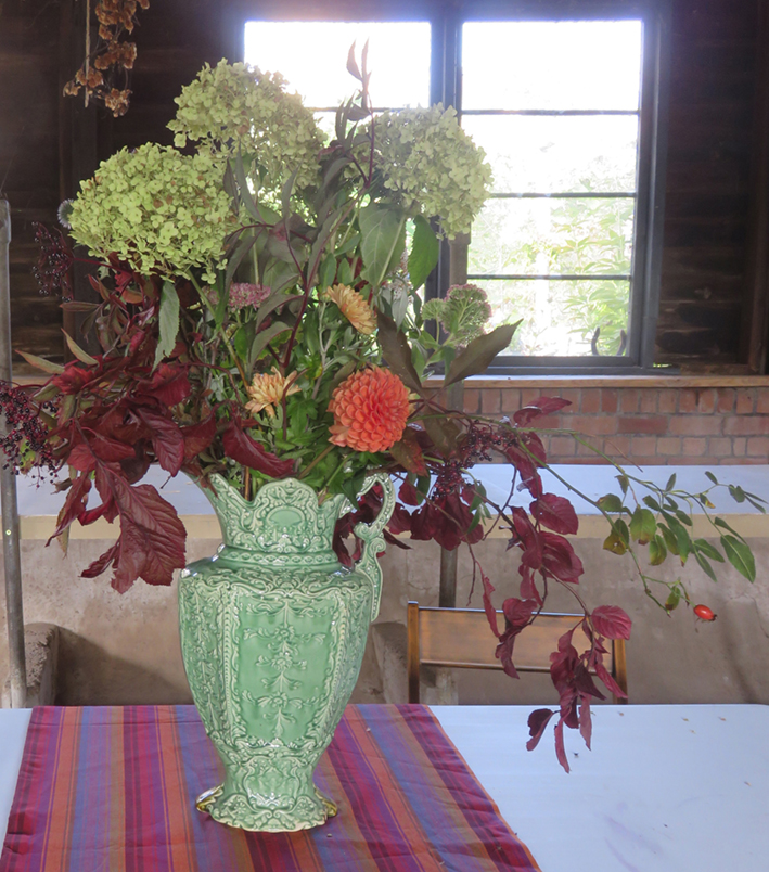
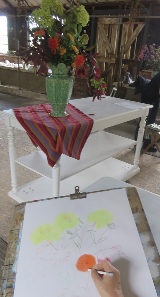
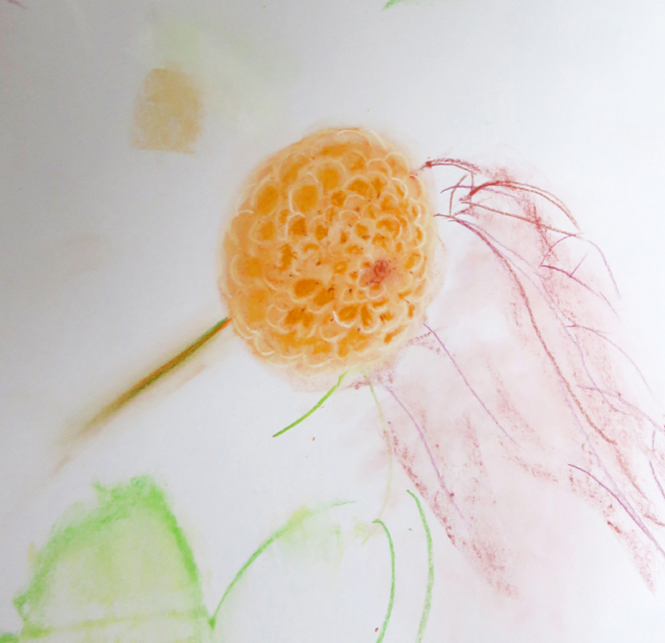
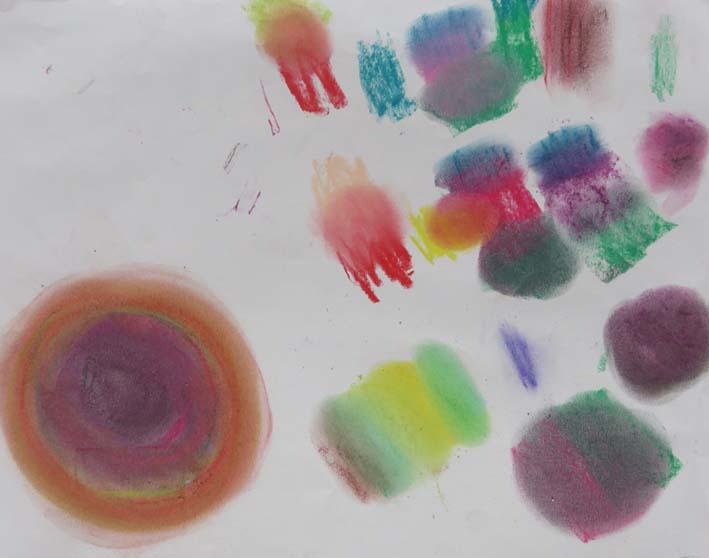
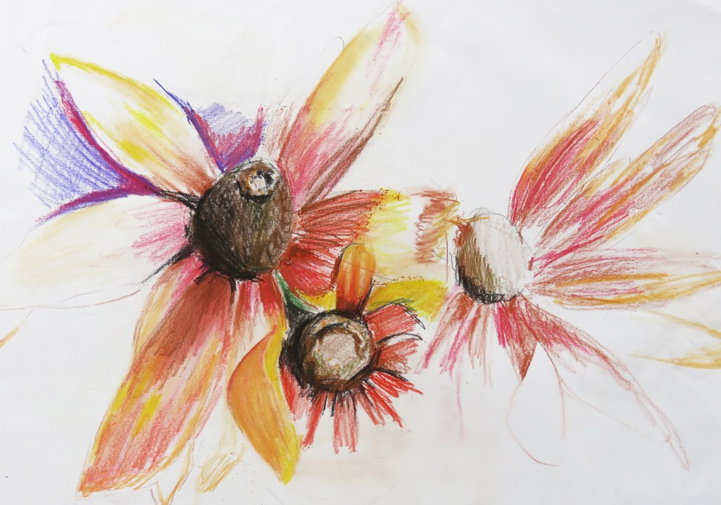
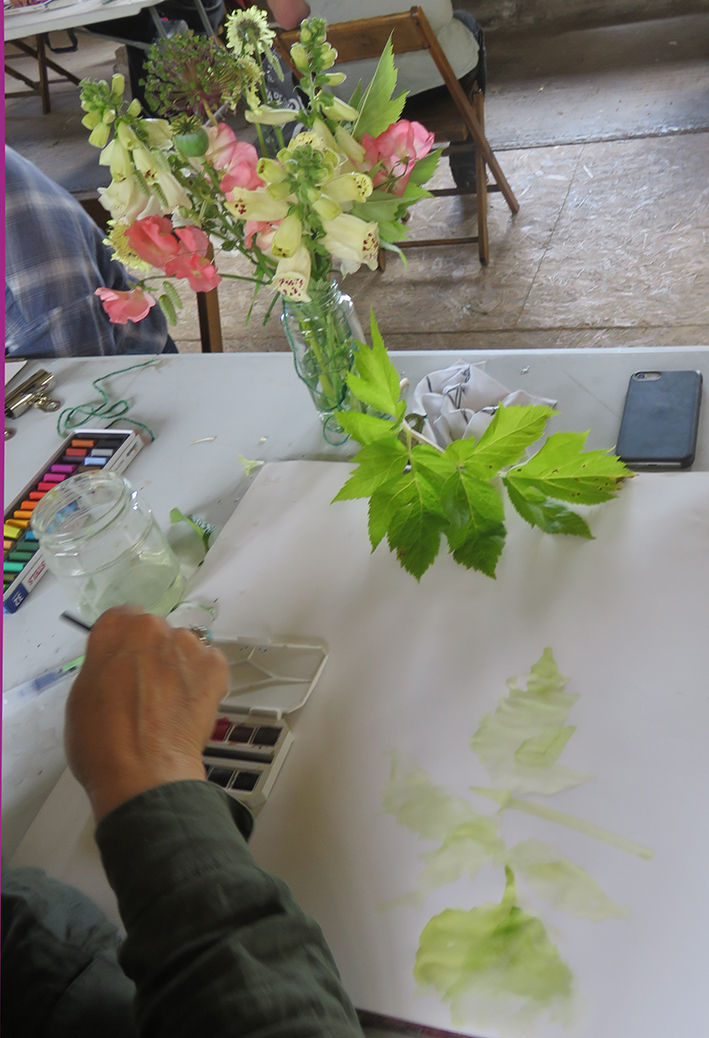
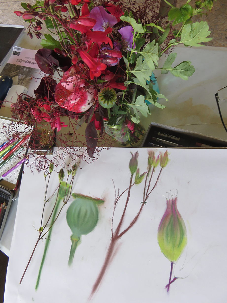
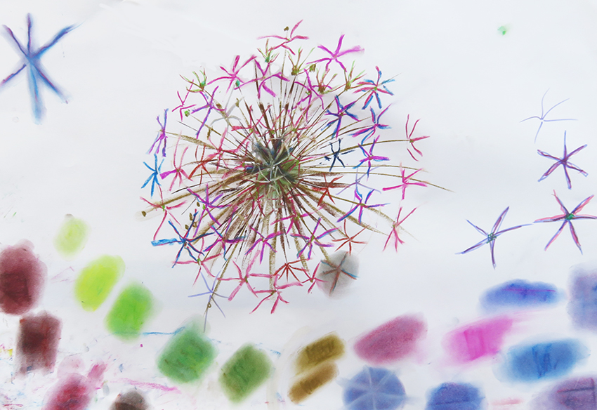
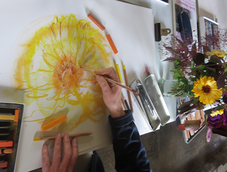
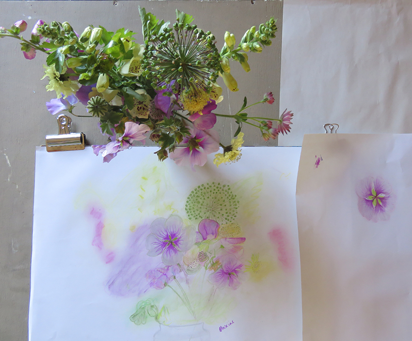
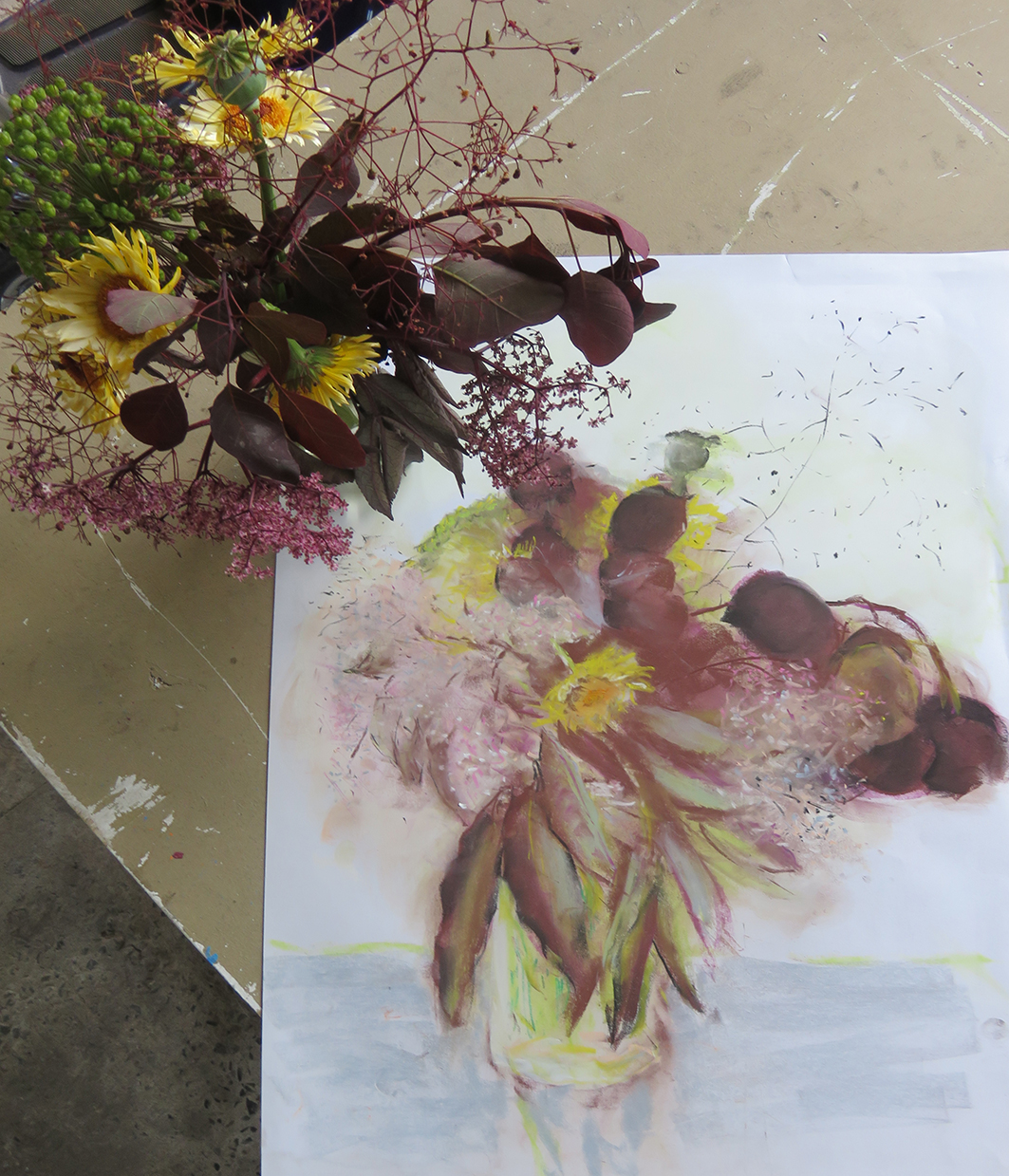
Autumn Flower drawing Class
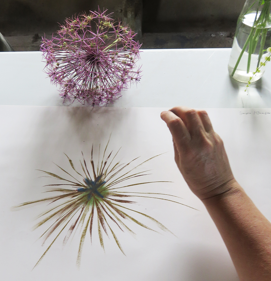
In at the deep end. I asked the class to choose a table to sit at and draw the whole display in front of them…in 20 minutes!
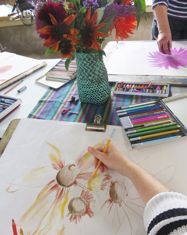
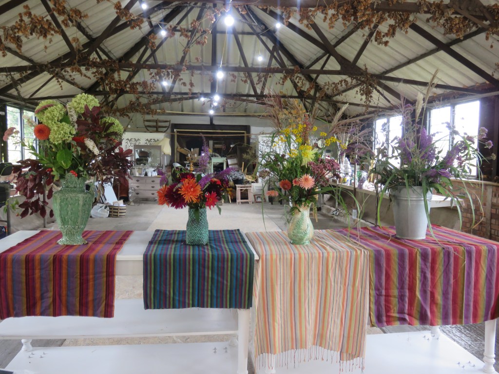
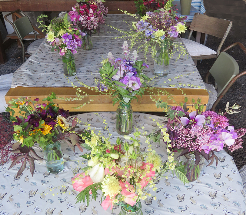
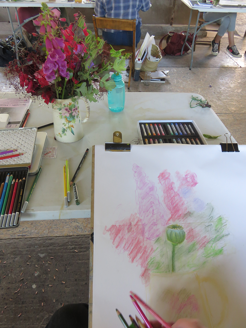
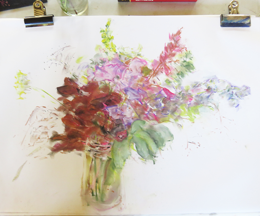
Drawing English garden Flowers
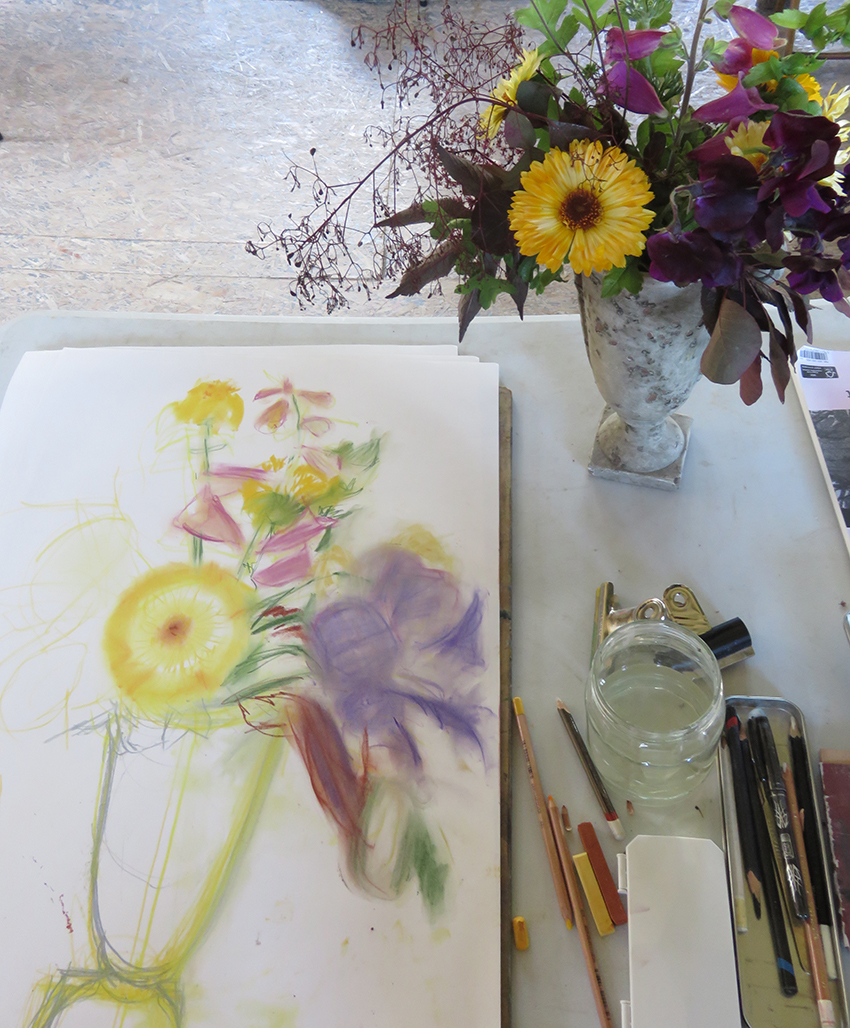
A perfect English summer’s day in June, and here we are for an RWA drawing school class: Drawing Flowers at Court House Farm. I have 12 people to introduce my own tried and trusted drawing methods of capturing the colours and forms of a bunch of flowers – well that is the morning’s workshop…try my…
Flowers for Our Times:
I was shocked, relieved, delighted and then excited to find that I had embroidered War, Scandal, Uncertainty, Instability and Sickness within 2 pretty bunches of flowers.
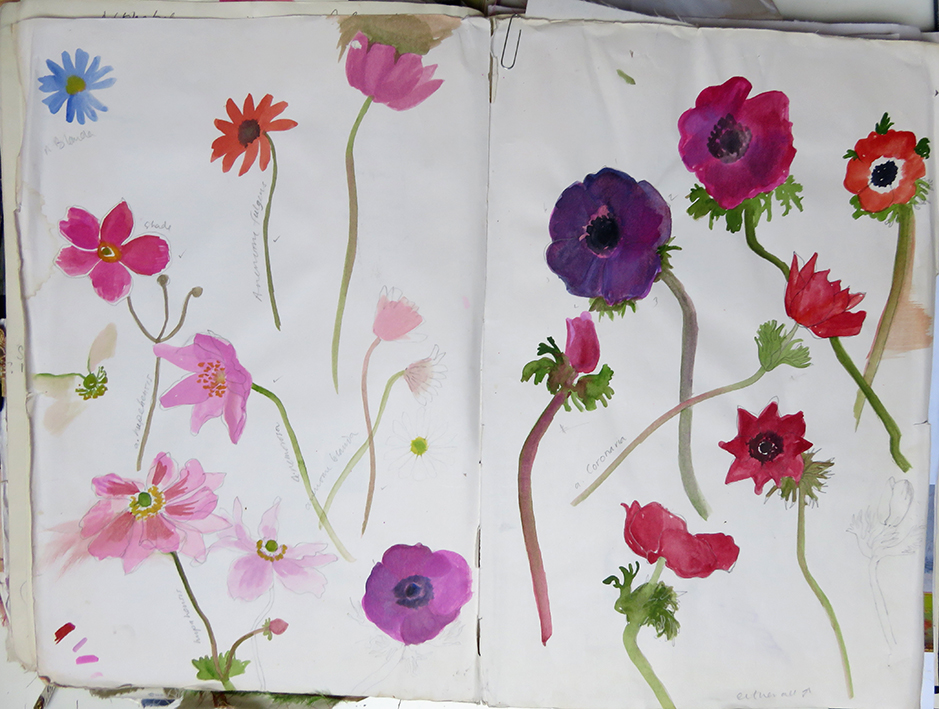
returning to my sketchbooks
I have returned to my old Flower research books for new embroideries to be printed
Rainbow Flowers – after winifred?
For several months, since March, I have been working on a new stitched sky – an image combining 2 photographs, the first of a wonderful brooding grey sky with different shades either side of the bow, and another of Denney Island in leaf in the middle of the Severn Estuary, they were made during different…
My Patchwork Quilted Room – Da Da.
at last after so long – the room finished enough for people to see it – with the doors and windows wide open and only 4 visitors at a time!
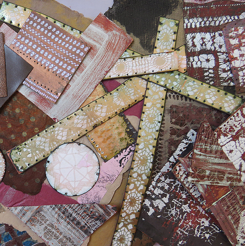
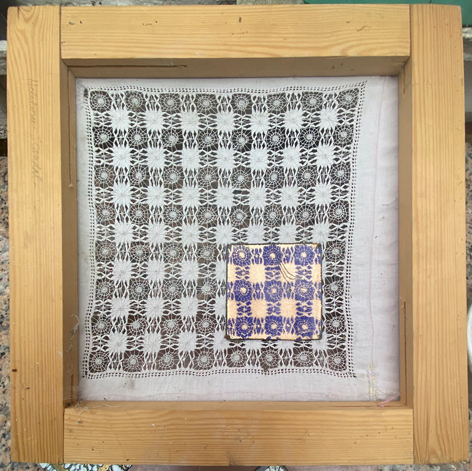
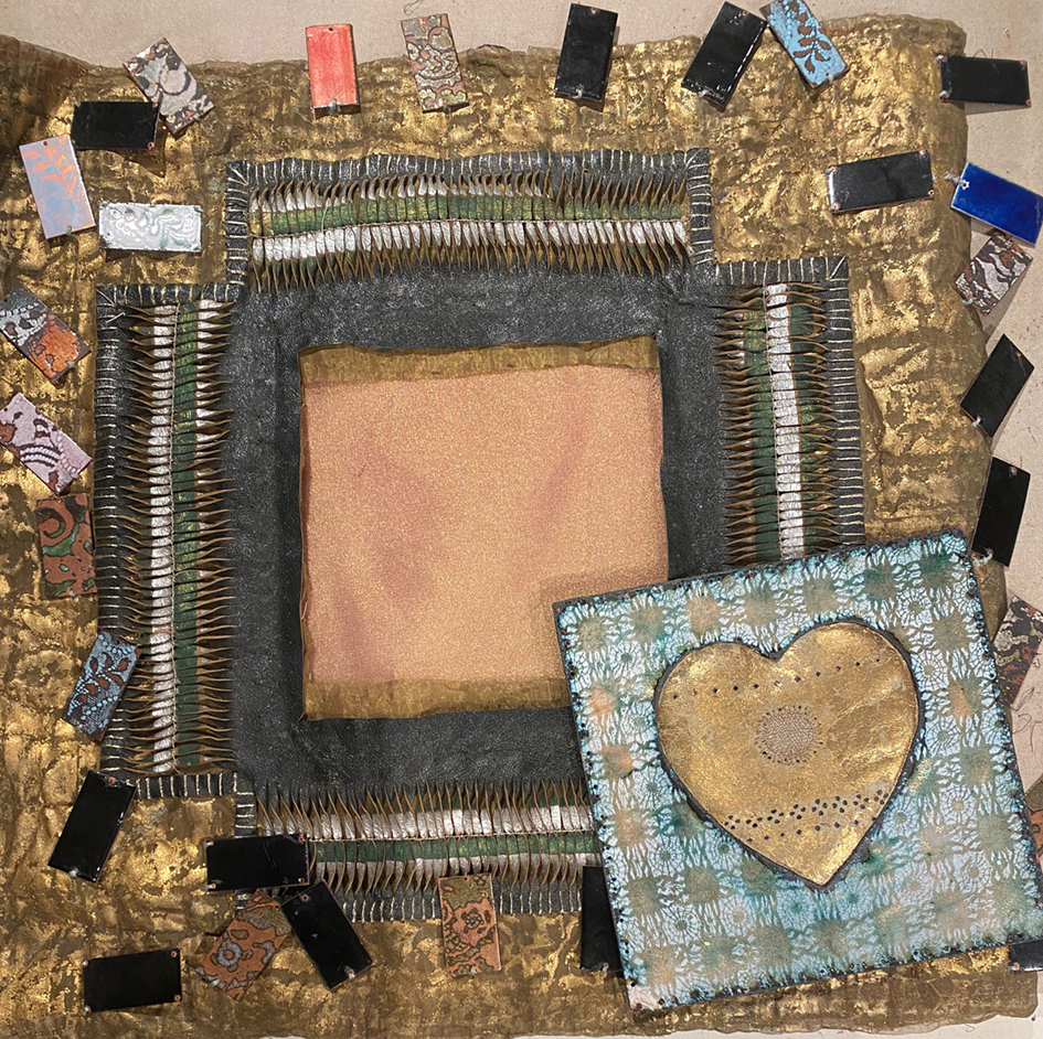
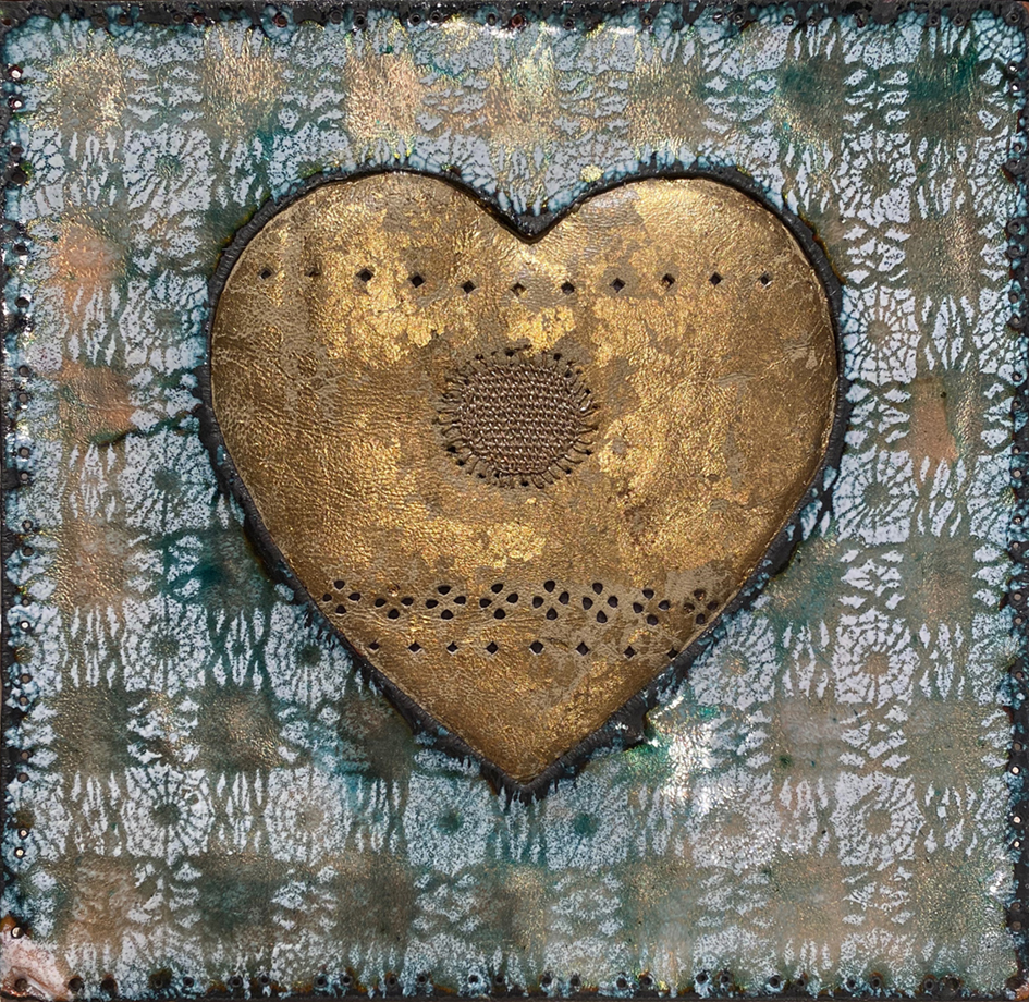
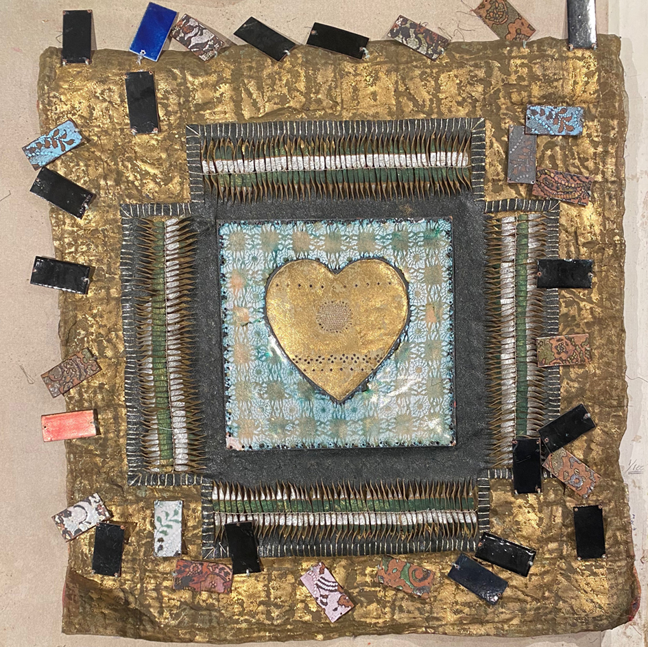
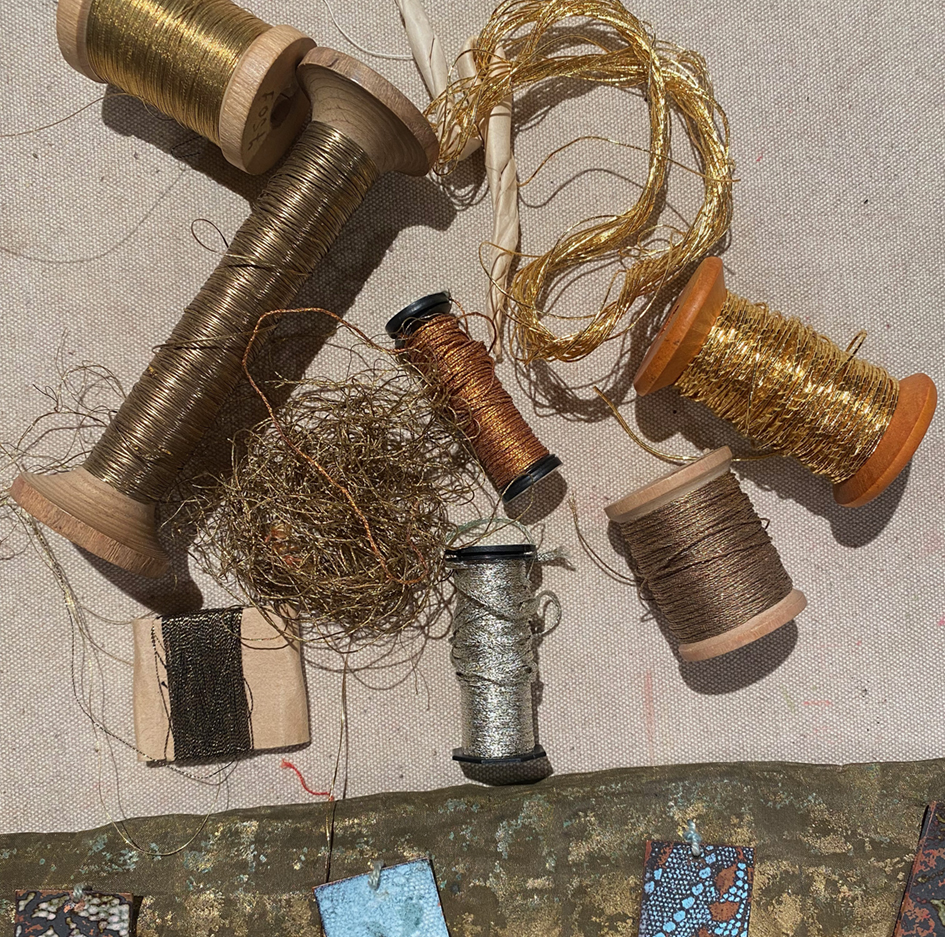
My Covid Project: Patchwork Enamel Fireplace
The patchwork walls are almost completed, just some finessing needed so time to think of the fire grate. We measure carefully and then cut 20 copper tiles ready to be decorated – using my favourite Drawn Threadwork stencils. I started to scribble lots of ‘back of the envelope’ ideas as to design layouts – but…
My Covid Project – Getting There:
So, by the beginning of March I had at last finished stitching all the patchwork panels, and between long bouts of quilting them, I managed to paint all the woodwork and window reveals in the sitting room. I had decided to make a strippy quilt for the chimney wall, partly to save time but really…
Cold Feet
somehow during lockdown the well-honed critical faculty I use for all projects, professional as well as personal, has deserted me.
Lockdown Patchwork Project
Determined to make the most of the new year 2021 winter lockdown in the UK, I decided to cover my damp (although supposedly cured) and now ruined sitting room walls…….with patchwork! And with real fabric. the left-overs from my work organising quilt making in the UK for Kaffe Fassett’s books of patchwork and quilting designs.…
Drawing Just Drawing
Here is a set of drawings that have lain in a research book for more than 10 years, the reason that I did them was in a university research project workshop – making our own brushes with the amazingly inventive American maker Bob Ebendorf. I made several brushes out of grasses, leaves and branches, picked…
My Last Dream Pillow: Don’t Look Down
this is a perfect portrait of how I feel right now – just coming out of the strictest lockdown period.
4th July 2020: My Covid Birthday Look
I also thought that I would prefer to wear something lovely to enjoy everyday, even if I saw no-one else but my husband and my dogs.
Drawing Drawing Drawing
I use drawing to express myself to myself. I feel that Drawing is the language closest to my heart;
My SECURITY Blanket
The finalised order tells a story about my working life over the last decade and more…hard to display – but here I am.
My Spooky Wooky Butterfly Dream
It is almost 20 years since I had this disturbingly beautiful dream but I have NEVER forgotten it. Re-visiting my sketch books archive, I found the original drawing that was hastily scribbled down when I thankfully I woke up. Now, I have decided to complete my long standing/stitching on-going work project “Make it Through the…
Stitching on a Roof Tile!
there was a call – out for local artists to help – decorate an old roof-tile in any way whatsoever
Appliqué Flowers Workshop
As part of the activities developed for the current Kaffe Fassett exhibition at the American Museum in Britain I am giving 2 separate day workshops to make a small panel of hand appliqué flowers. I am supplying the same fabrics used for the large scale appliquéd quilt that I made for Kaffe to celebrate his…
Quilt for Kaffe
It was the addition of the the ribbons, that tipped the balance … I suddenly saw it was now Kaffe’s.
nexus – meetings at the edge: exhibition
The night before the private view I had a dream that a giant version of the work featured on the poster ( see above) was writhing around the gallery walls and flashing strobe lights, while all the other pieces of work in the exhibition were equally massive and glowing while moving to – for want…
Patchwork Enamel
Out of the blue, last year, came an invitation from Diana Sykes, Director of Fife Contemporary, to apply to exhibit my work for a new exhibition, Nexus:Meetings at the Edge, to be held this year – 2018 at 2 venues, in April at the Kirkcaldy Galleries in Fife, then in September at Ruthin Craft Centre …
sleeping in the garden
My latest commission is to design and make a patchwork quilt to be placed on a bed in a show garden for this year’s RHS Flower Show at Tatton Park. This is the idea of plants-woman and garden designer, Julie Dunn, And I think that her design is really intriguing – to make a garden…
Serendipity – Lillian Delavoryas
My recent meeting with Lillian Delavoryas is, in her words “serendipitous” and in mine “bizarre”. During October 2017 I was visiting various friends who were taking part in the annual West Bristol Arts Trail . The artist, Anna Christy, recommended that I visit the studio of another friend of hers who, “used to design textiles”;…
Drawing Vintage Fabrics
I have been invited to deliver 3 day drawing classes at the Bristol Drawing School based at the Royal West of England Academy. I was asked to work with my collections of vintage embroidered textiles which include Chinese embroidered robes, Japanese kimono and Indian/Pakistani children’s clothing and tent hangings.. first I brought in the Chinese…
Kantha Club
although I was not aware of it at the time I wrote this blog this is the very last post for Heart Space Studios…we conducted many more parties, clubs and classes , we have now ceased trading as a class based studio – however I continue to make my work and explain many different ways…
Best in Show – Ally Pally
And so to Ally Pally for the annual Knitting & Stitching show, attentive readers of this blog will realise that this is where Heart Space Studios headed to advertise our new book at the invitation of The Cotton Patch, the home of all things patchwork and quilting in Birmingham. For a week I worked at…
Making Ribbon Beads
And so to Bath, to launch the Heart Space Studio book, ‘Little Ribbon Patchwork and Applique’ at the American Museum, with a workshop in the morning to show how to make ribbon beads.
It’s a Tough Job – But Someone Has To Do It
We are launching the new book, Little Ribbon Patchwork and Applique, on Tuesday 15th September at the American Museum, near Bath. Things are a tad hectic here, even my old dog Boysie is getting in on the act posing in the Heart Space Studio window for the Ribbon book display….and all of us who are working…
Little Ribbon Patchwork and Applique: the Story behind the Book
Little Ribbon Patchwork and Applique, inspired by and featuring Kaffe Fassett’s wonderful ribbons. And this is the English edition, and it is published by Heart Space Studios..
Almost Shaun the Sheep
The local high street community, including Heart Space Studios, has sponsored a sheep sculpture and he arrives in the first week of July….meanwhile Heart Space have decided to welcome him with a knitted yarn bombed lamppost and bunting.
Kantha Club
New to Heart Space Studios – Kantha Club; started as so many people who have been to our day classes, tutored by Susi Bancroft, have become fascinated by this simple method of hand quilting. We have 3 trial sessions being held once a month – each meeting is 3 hours long – enough to get…
Story Boards To Go
The second class in the mixed Media Sampler Course at Heart Space Studios began by looking and assessing the finished story boards; several people needed help to get everything organised but here are the results so far….Ceema (above) has refined her theme, she has kept the silvered wallpaper but added a lot of spirals an…
Story Boards
Story Boards are a visual statement of intent – so we will be drawing their attention back to them each time we sample a new technique over the coming weeks .
First Bristol Wool Fair
this is as far as I can get with the new improved WordPress system of editing – this is after 2 weeks of trying to get this post out – but I am leaving it now after yet another wasted day – so sorry………..Day 4 of trying to post this with a completely wonky WordPress…
Things With and Without Wings
The world is full of surprises. You invite a group of people to develop ideas together in a studio in order to make work for a themed exhibition over a period of 6 weeks, then they go away and come back 3 weeks later with something completely different – Hey Ho! BUT sometimes the things…
Things with Wings: Research Day
it was the buttons that made me ponder: why are there always masses of Beige Buttons left unused in any tin of buttons?
Crazy Fan Class
I have been getting out and about recently and have been taking a workshop at the American Museum in Britain, which is situated just outside Bath. I have been asked to deliver 2 day long workshops by their education officer, Zoe Dennington (who found me via this blog). Zoe asked me to use Crazy Patchwork…
Embroidery as Physiotherapy
I have had a few problems getting to grips – literally – with hand embroidering again (not to mention eating with fully functioning knife and fork ). So in order to get back to my normal working life of designing, stitching and teaching, and not being given any specific physiotherapy for my now fully mended…
Taking a Line for a Dance
“Taking a line for a dance” is a good way to describe what happens with free machine embroidery…the freedom with which the needle can stitch patterns, images and even writing very fast – is really fascinating to watch. First disengage the feed dog – I just love that name for the row of teeth embedded…
Printing Lino on Linen
I haven’t cut and printed Lino for oh…..well, since I left art college in the late 1960’s, so that’s almost………. lets’ move on! Checking out our really popular Lino Printing on Linen workshop at Heart Space Studios, run by Jacqui Watkins, I had an overwhelming urge to join in – the sensuous feel of cutting…
Valentine Hearts
The small but delightful exhibition that the Heart Space Studios staff made in the mixed media session are all framed and ready to go on the wall …. the first to arrive through the post was a box of stitched printed paper hearts from Susie Bancroft – so I set about mounting rows of them…
Paper Cut Hearts
In celebration of Valentin’s day the staff and tutors at Heart Space Studios got together to develop mixed media work based upon Paper Cutting. Debby Bird led the session – a chance for everyone to get to know one another better and swap information, materials and ideas. The project was to make selling exhibition of…
Left Hand Drawing
There are all sorts of things written about drawing with your weaker hand – you are more in touch with your inner being, using the opposite side of the brain unearths alternative visions etc. All I have to say is that it is very slow, very demoralising to begin with and completely exhausting – just…
Bling Slings
To celebrate my return to posting my blogs I am showing a small selection of decorative arm slings – yes dear readers I have a broken wrist, my right wrist; so there has been no writing, stitching and perhaps worst of all no drawing/doodling/scribbling for more than a month now. But I determined to make…
Crazy Barcelona
Crazy Barcelona – crazy patchworks everywhere, but not in fabric – in ceramic, stone and marble. OK then, crazy mosaics, but whatever you call them there is no better place to appreciate them than at Parc Geull, designed and built by Antoni Gaudi in the first 14 years of the 19th century. I have seen…