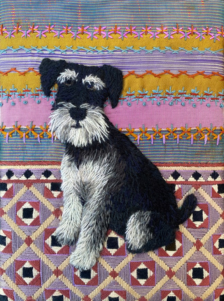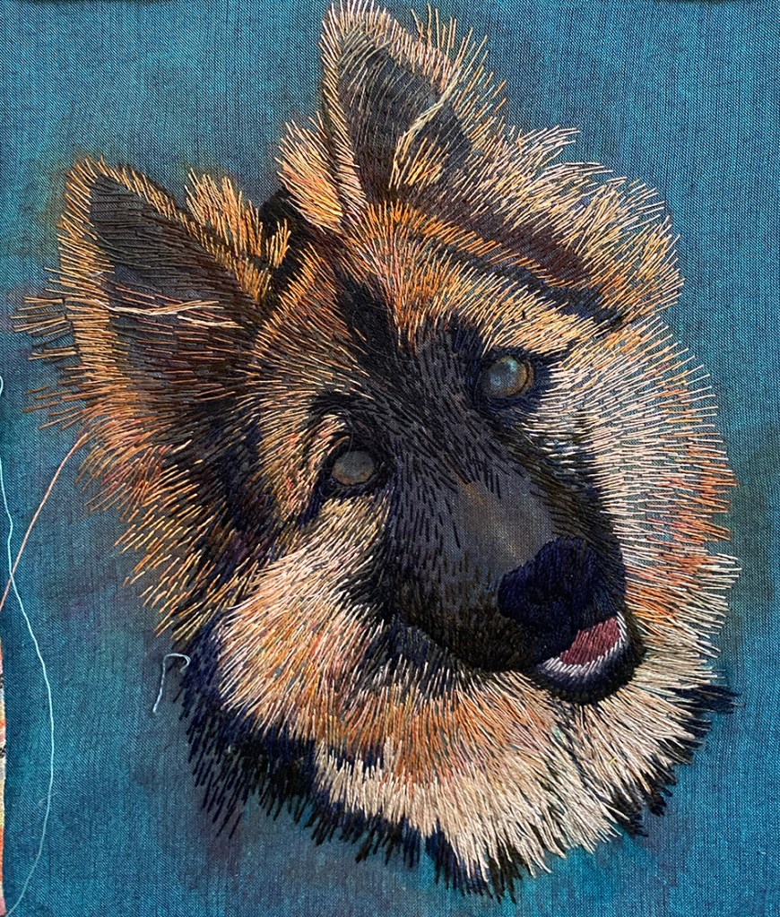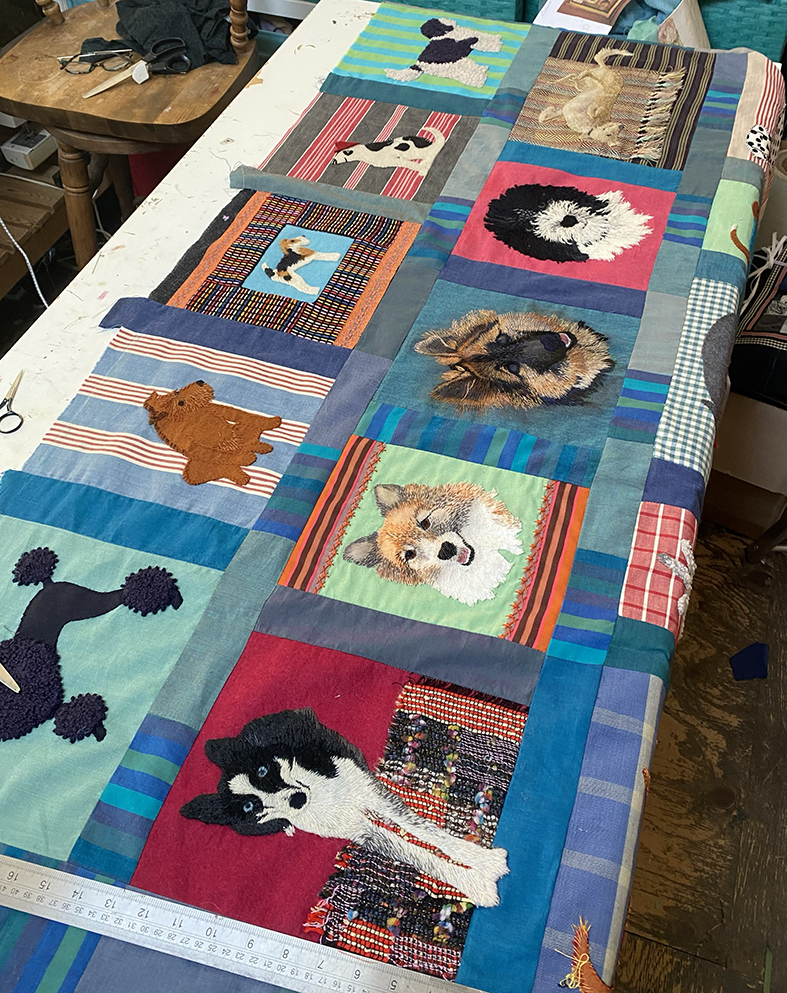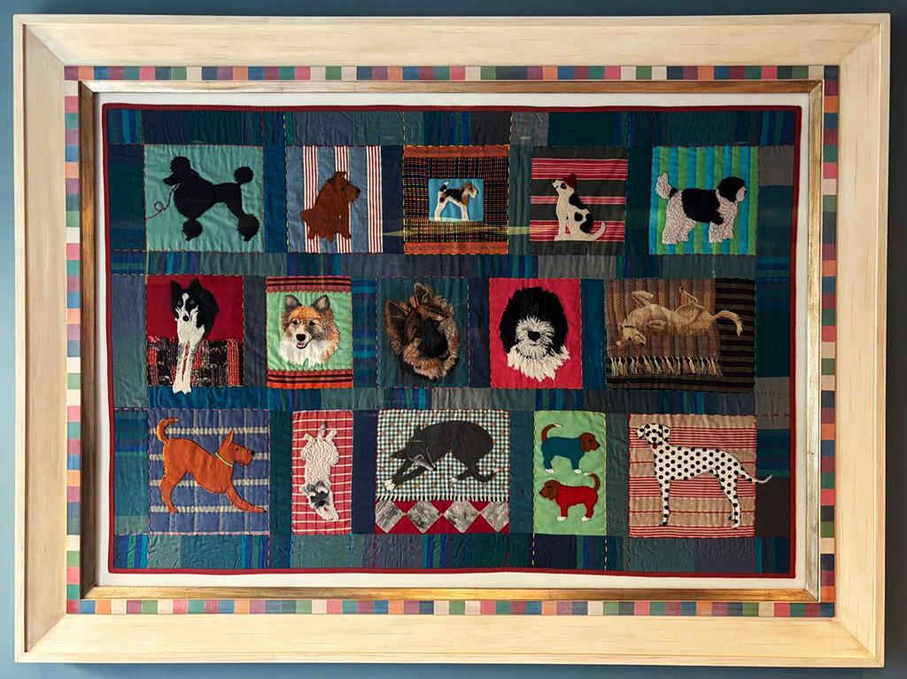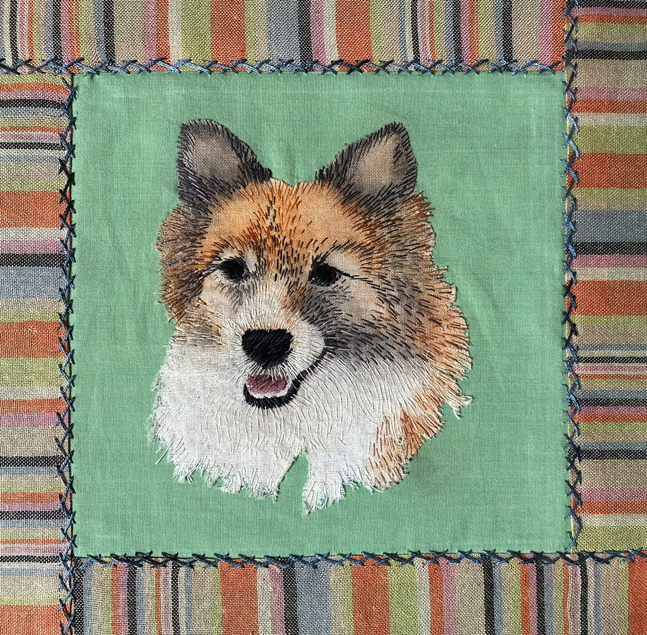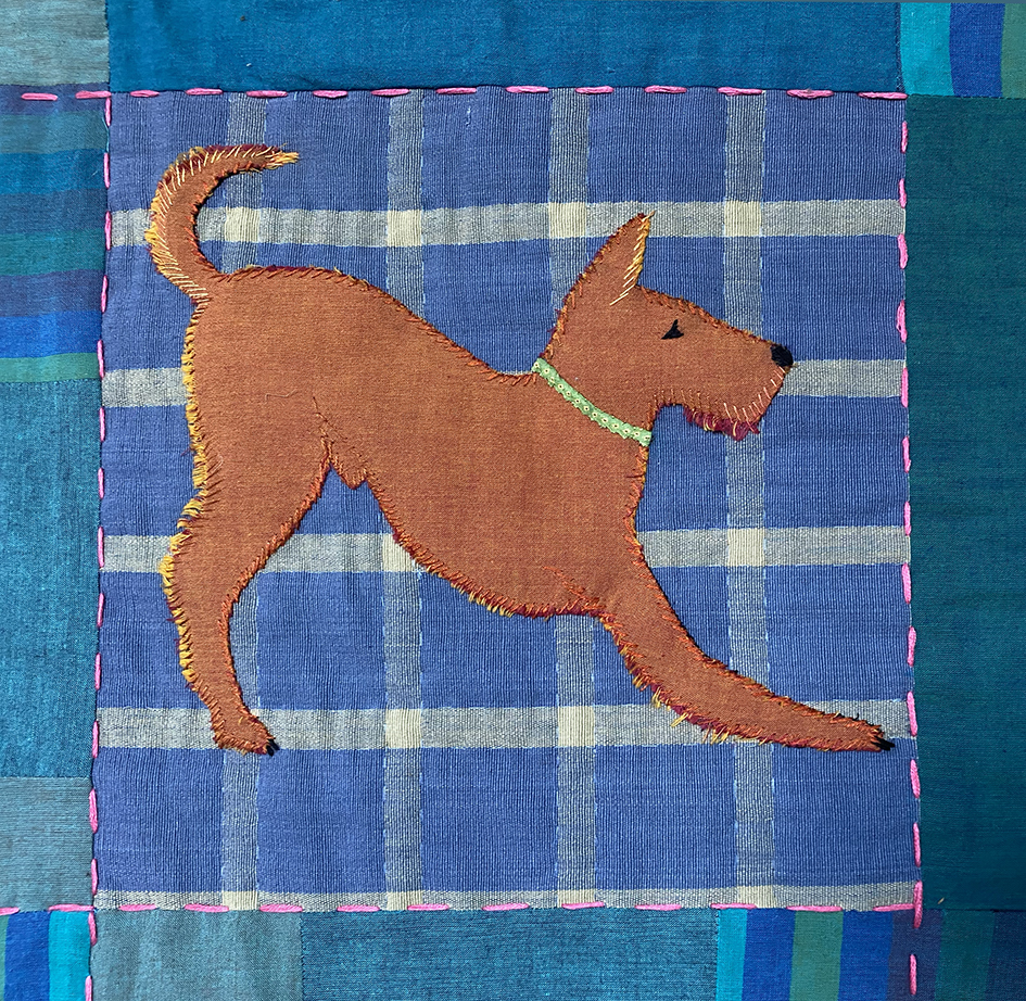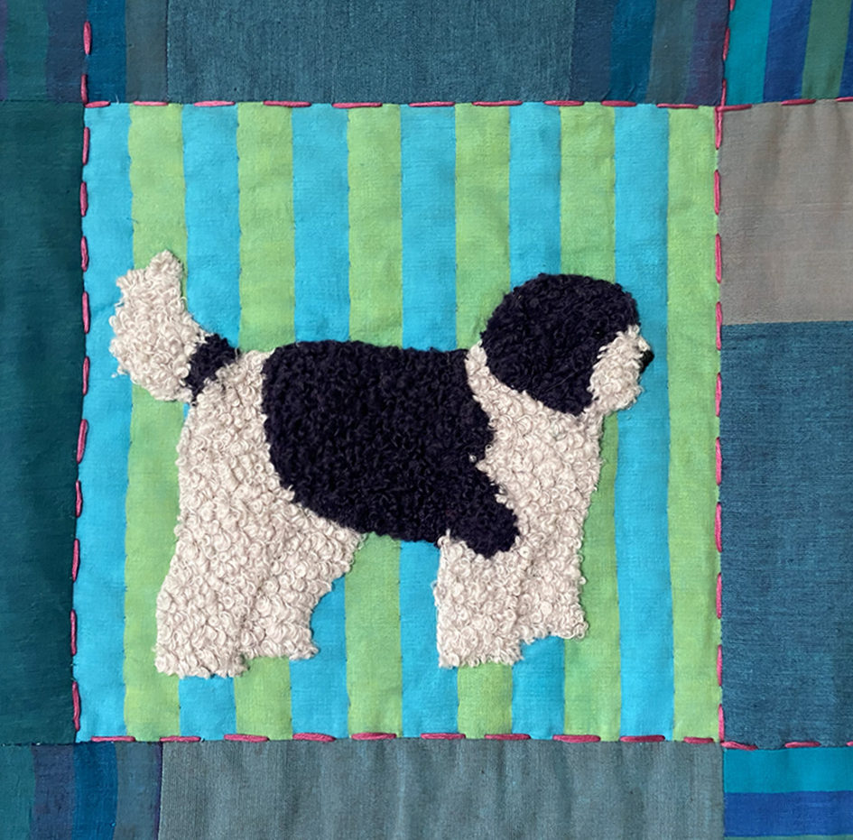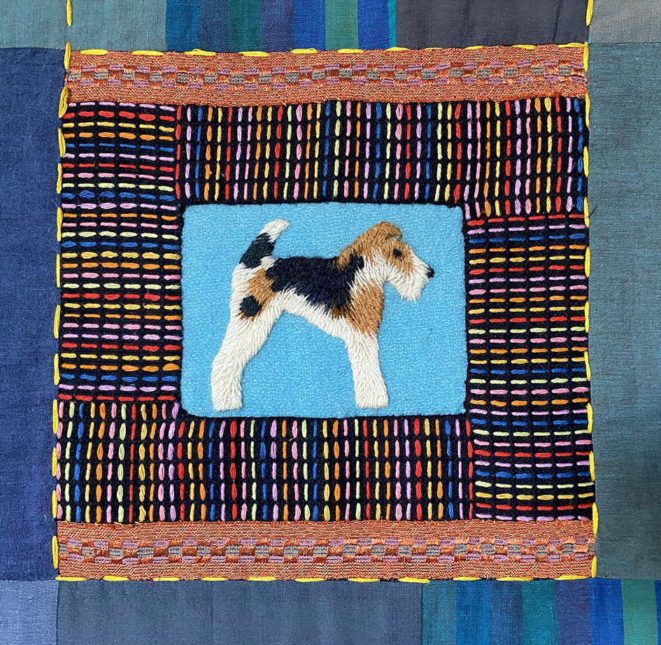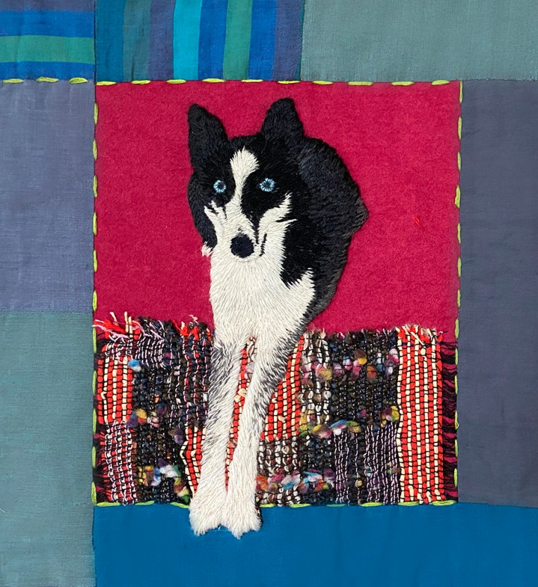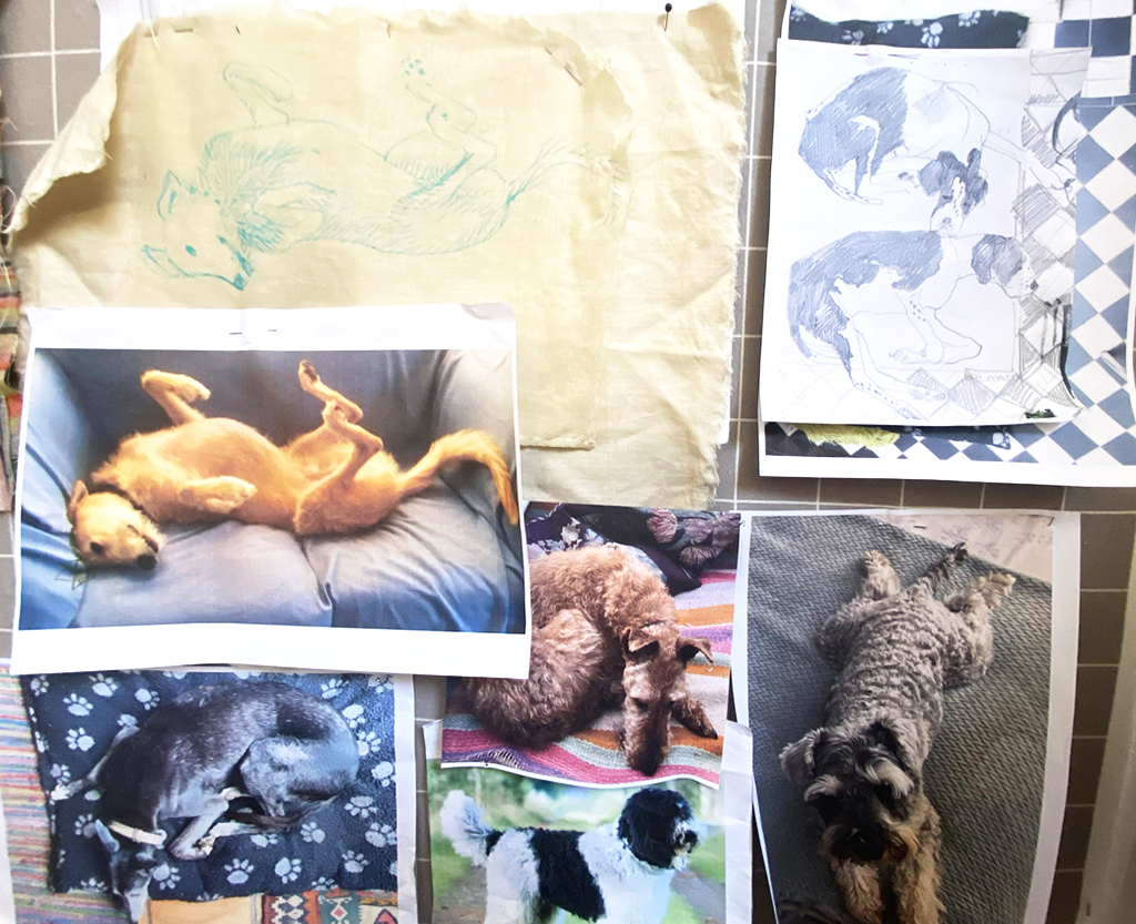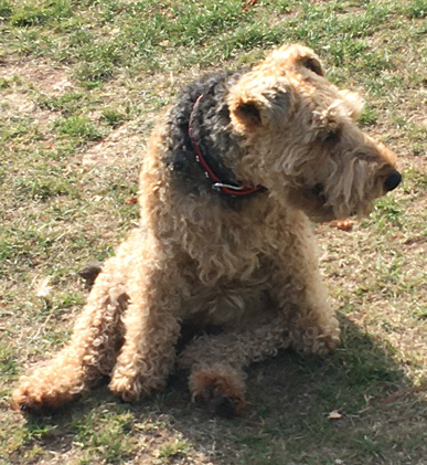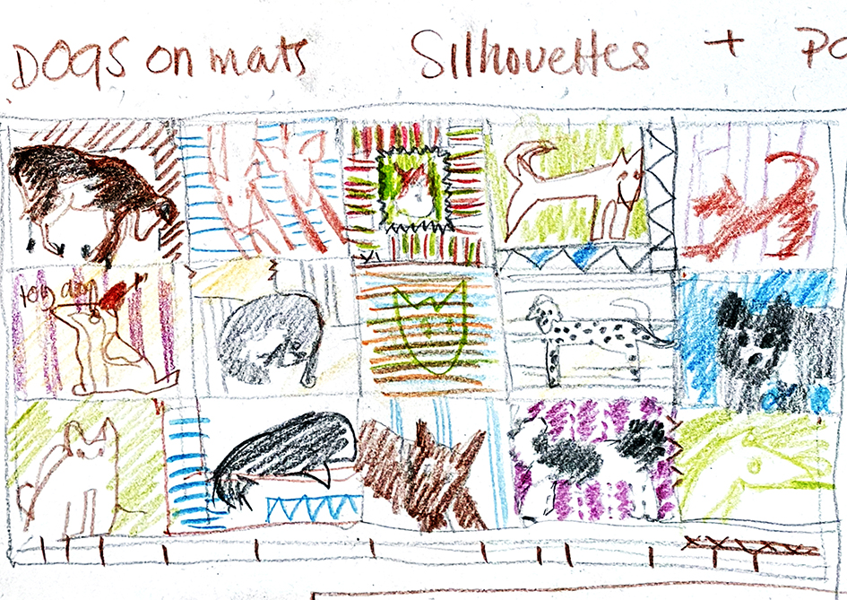
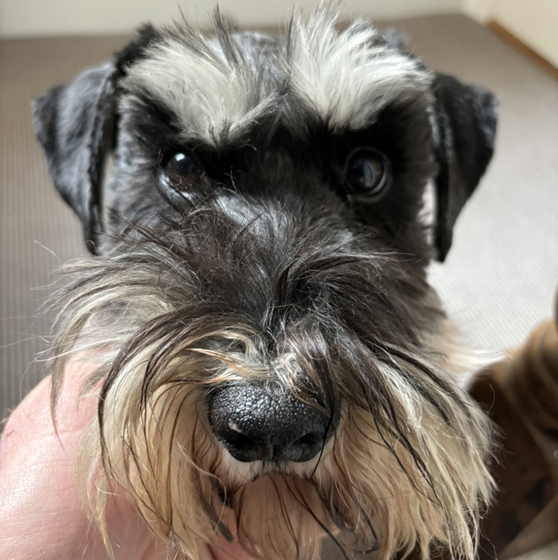
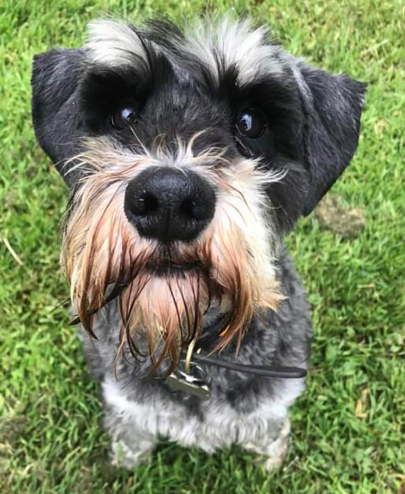
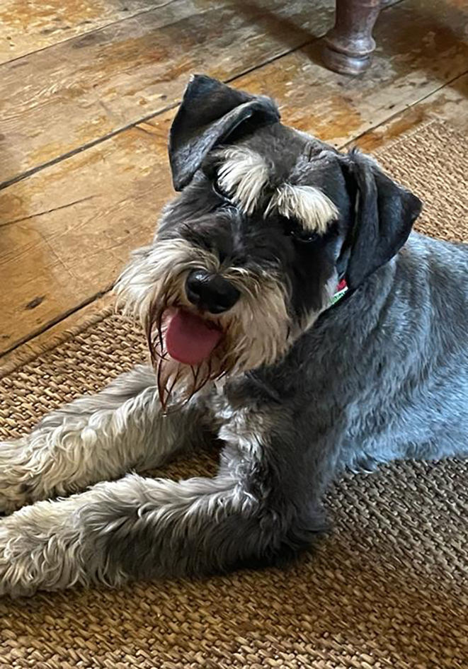
This is Dougal, a Miniature Schnauzer, in 2 very different images, of the many sent by Marcus Wells , who commissioned me to make a large scale quilt of dogs. He later asked me to portray his own dog, as a single embroidery. This for me is a perfect outcome to any work I undertake, when one piece engenders another; if only life was always like that! I never met Dougal but I spent a whole month with him in my studio and the first thing that I had to decide – which Dougal, the “Are you looking at me” Dougal? or the ” But you promised me a biscuit” Dougal.
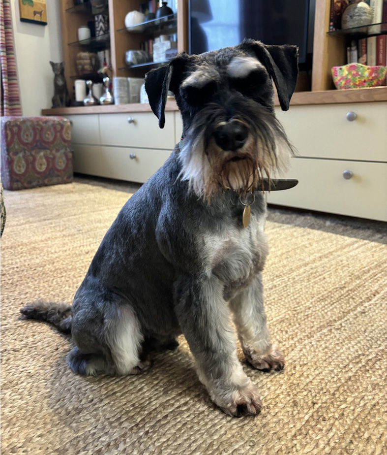
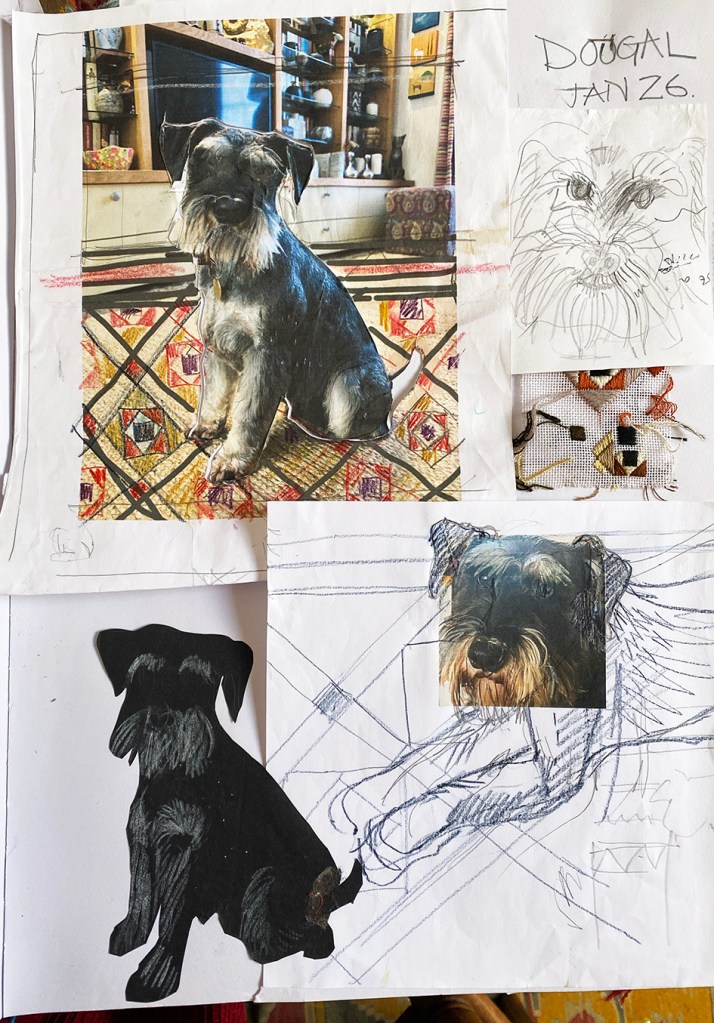
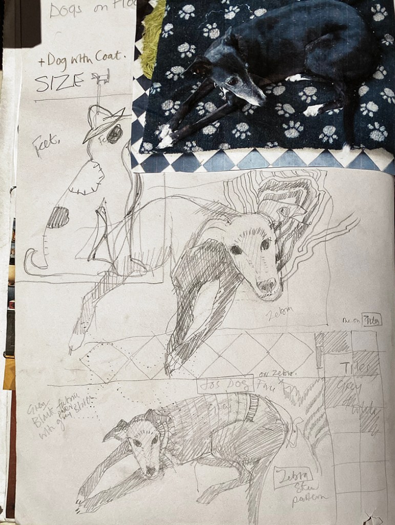
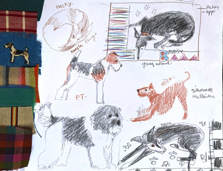
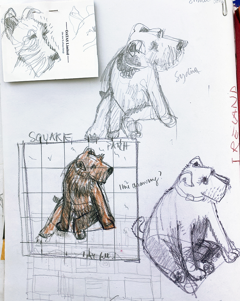
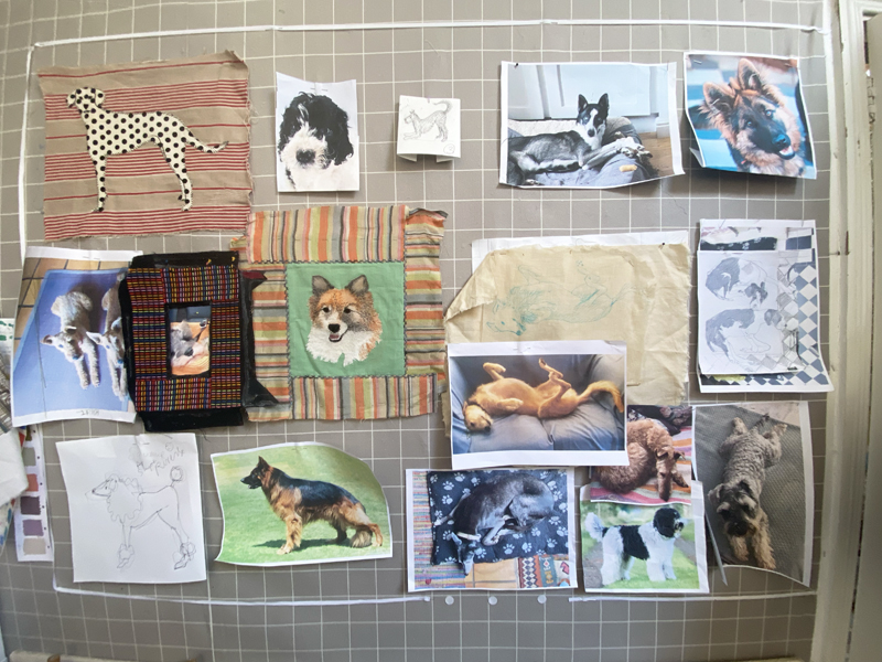
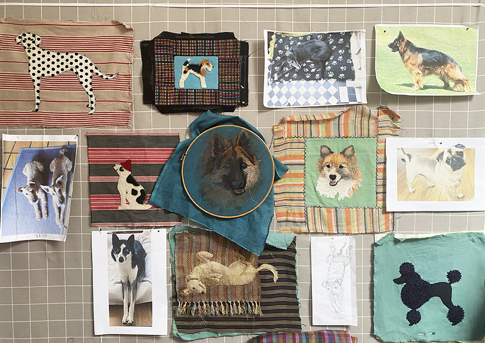
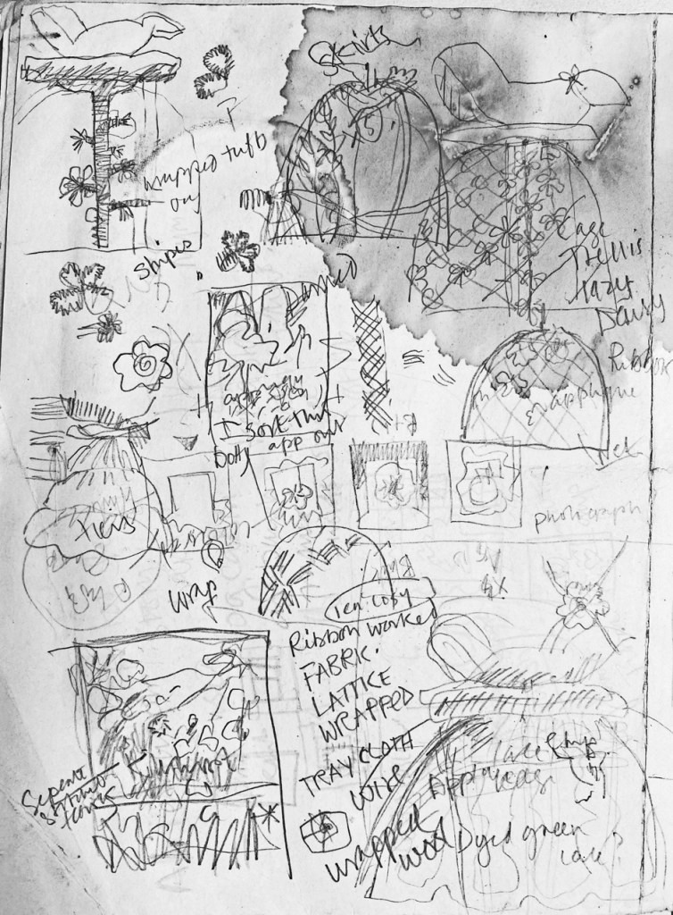
I decided to make a collage of a head that looked friendly (but maybe without the tongue) coupled to his smart alert sitting stance. Above is the collage as recorded in the first page of my research/sketch book for this project.
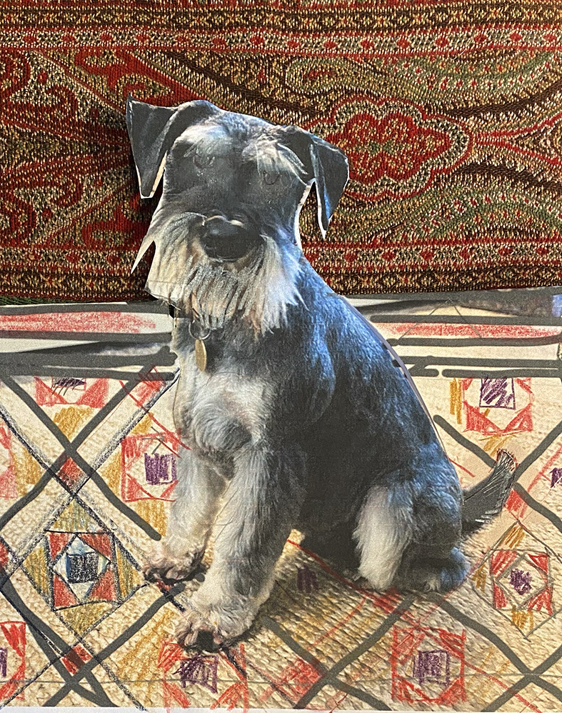
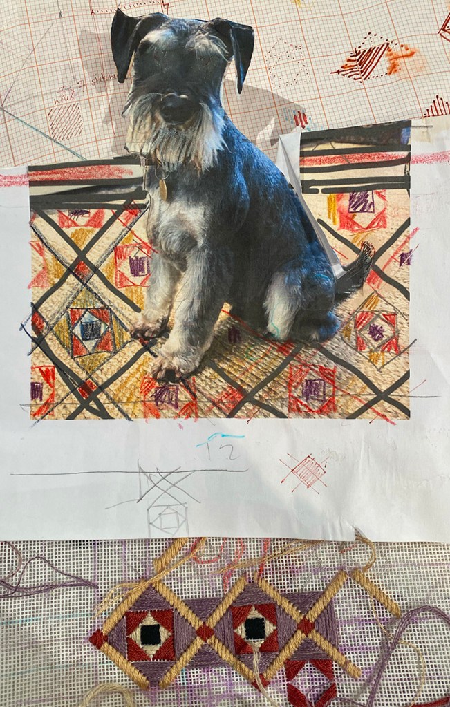
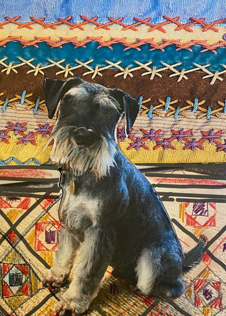
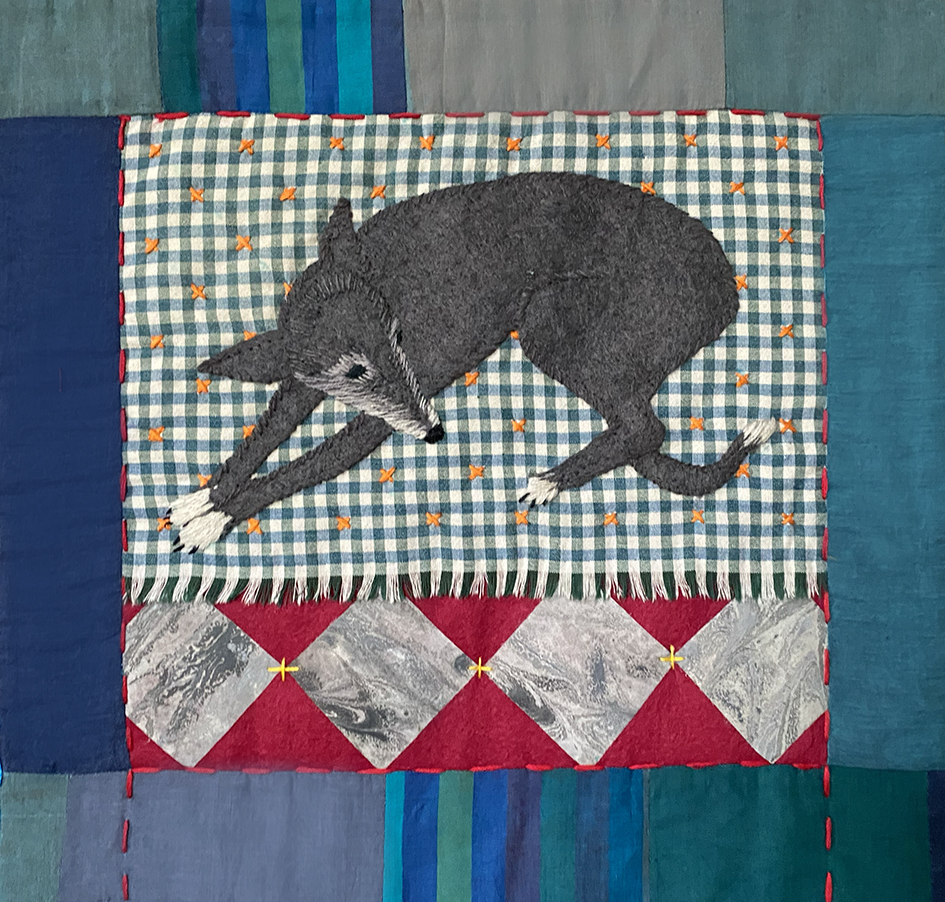
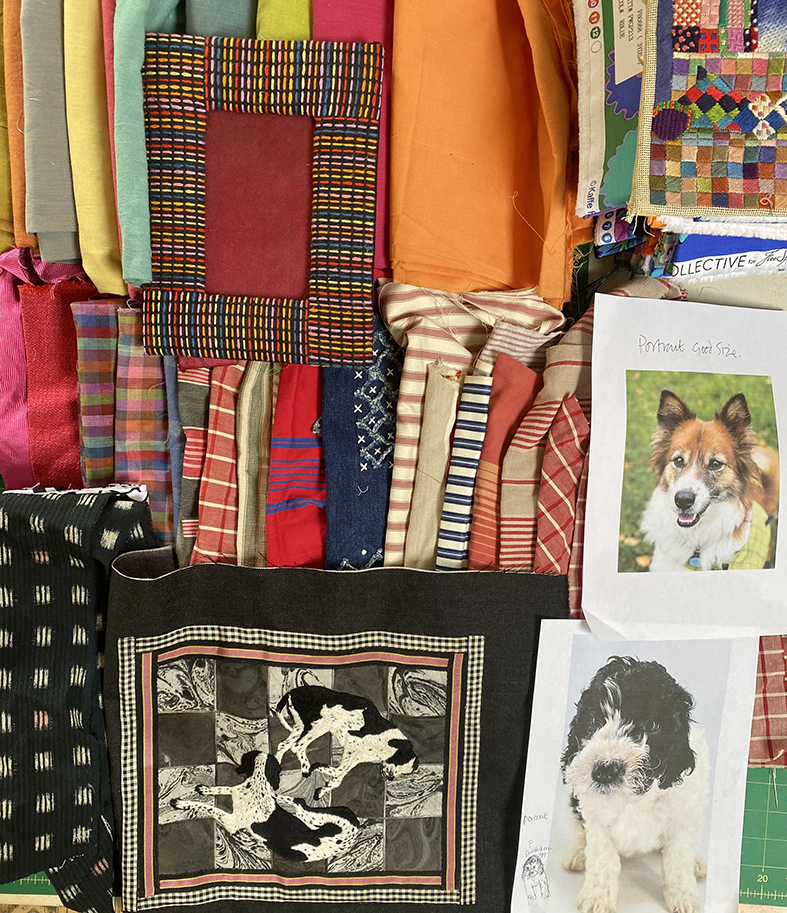
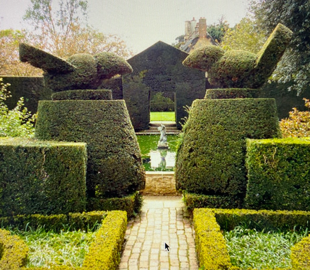
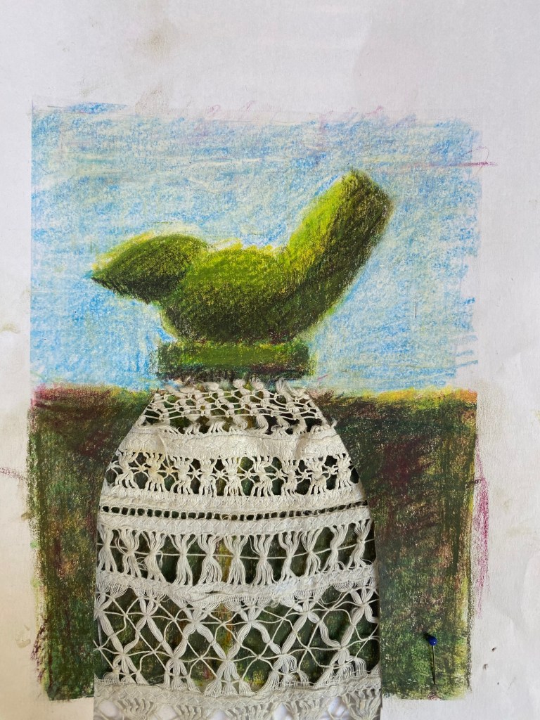
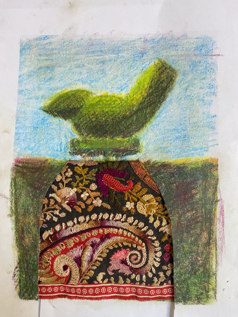
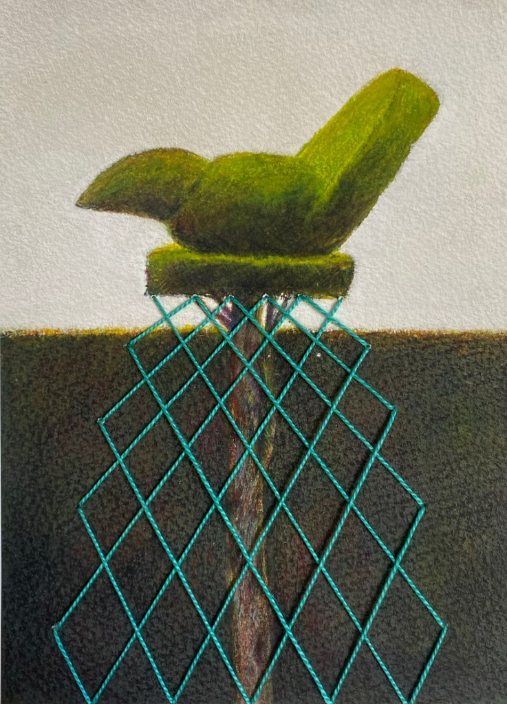
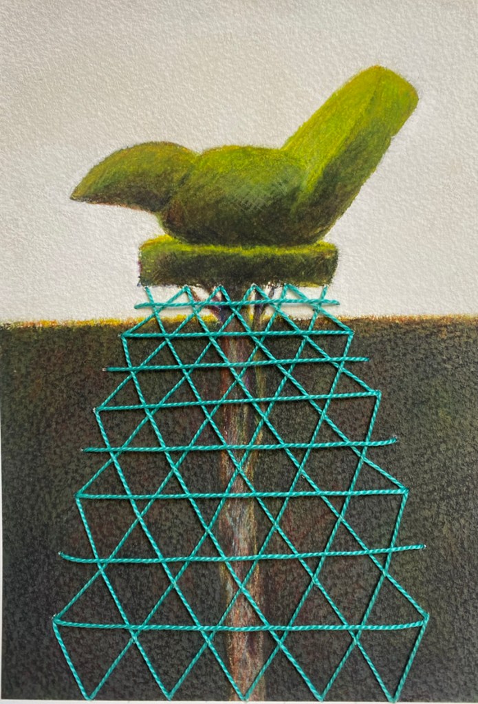
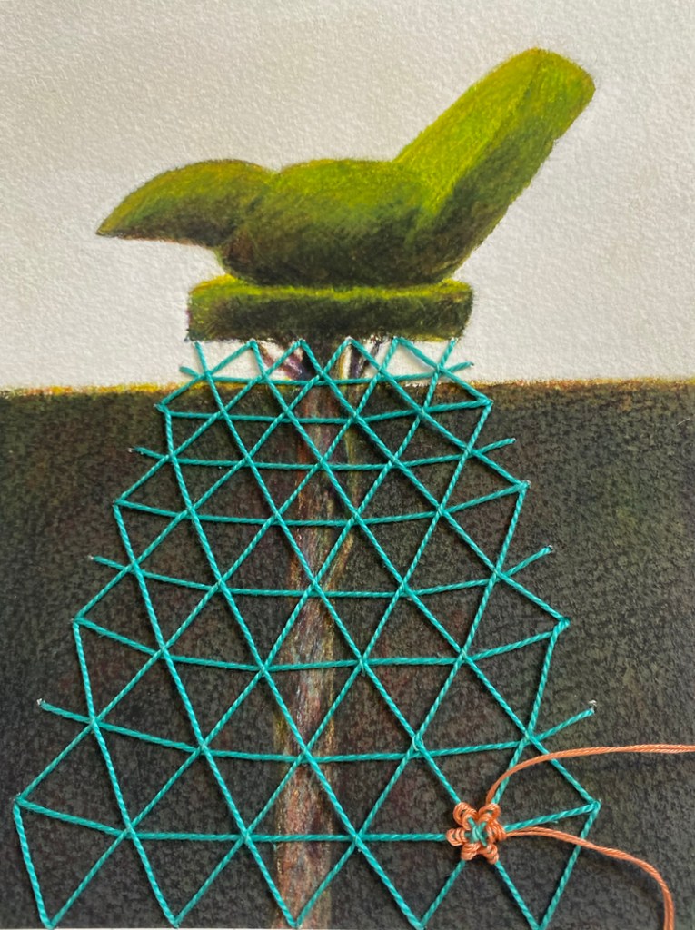
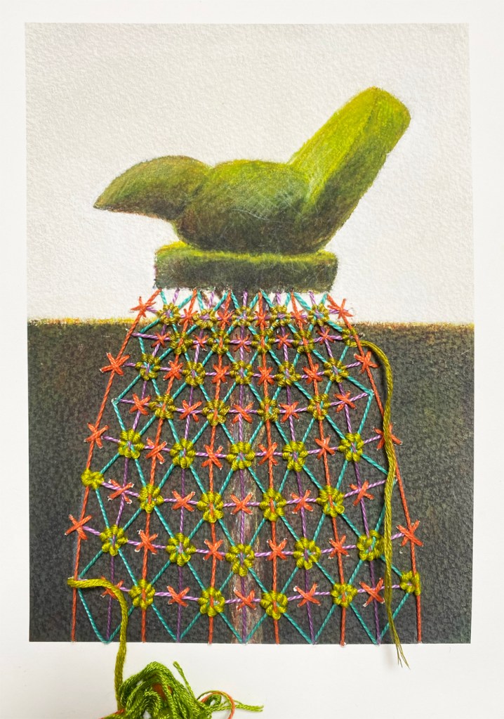
Marcus had requested a portrait with a background, as he liked all the different techniques that I had used in the dog quilt. I sent rough ideas for the whole image, asking him to choose between several backgrounds, including traditional Paisley or herringboned stitched ribbons. The floor that Dougal sits on is the tiled hallway of the house where he lives; and the best way to reproduce a strict geometrical pattern in embroidery is hand stitched canvas work. Meanwhile – Dougal needs attention.
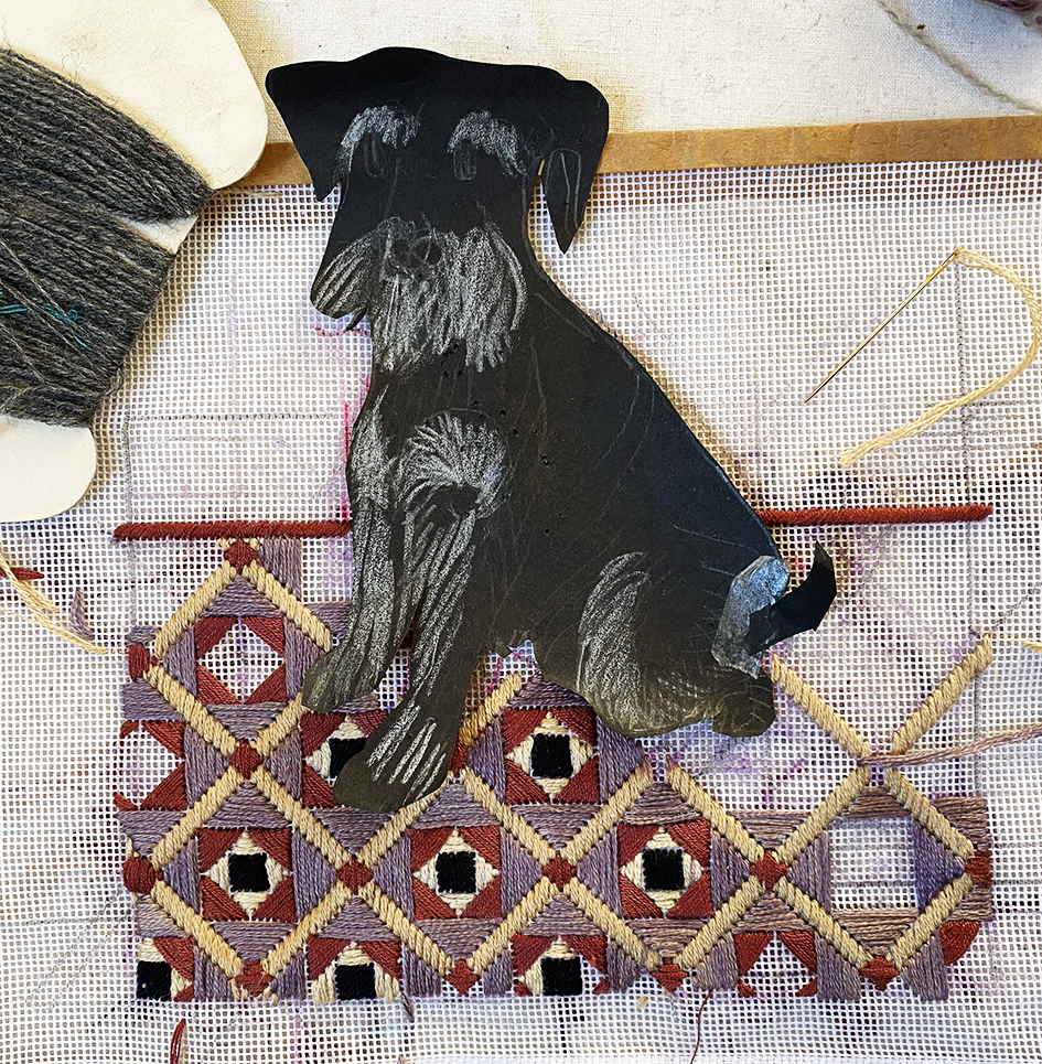
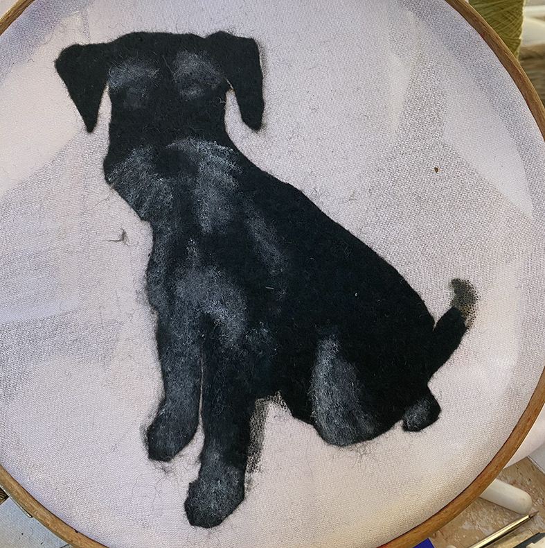
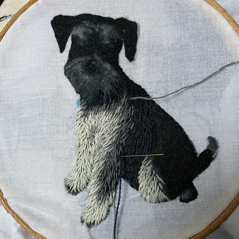
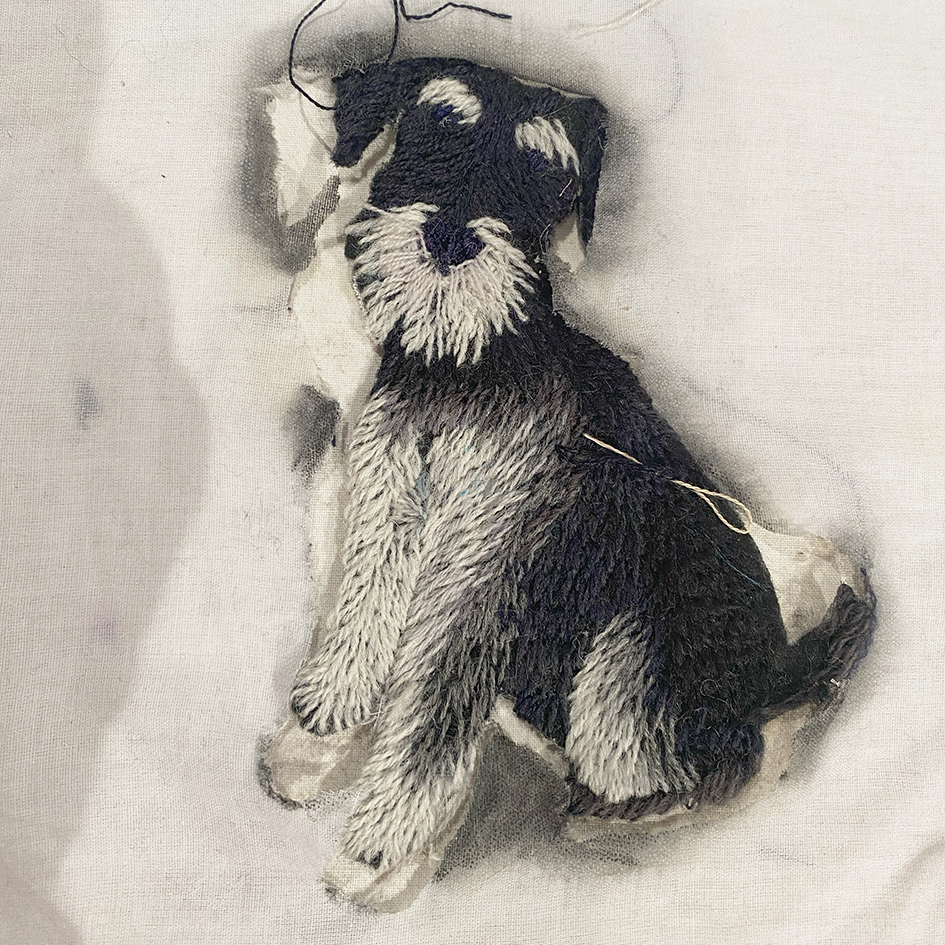
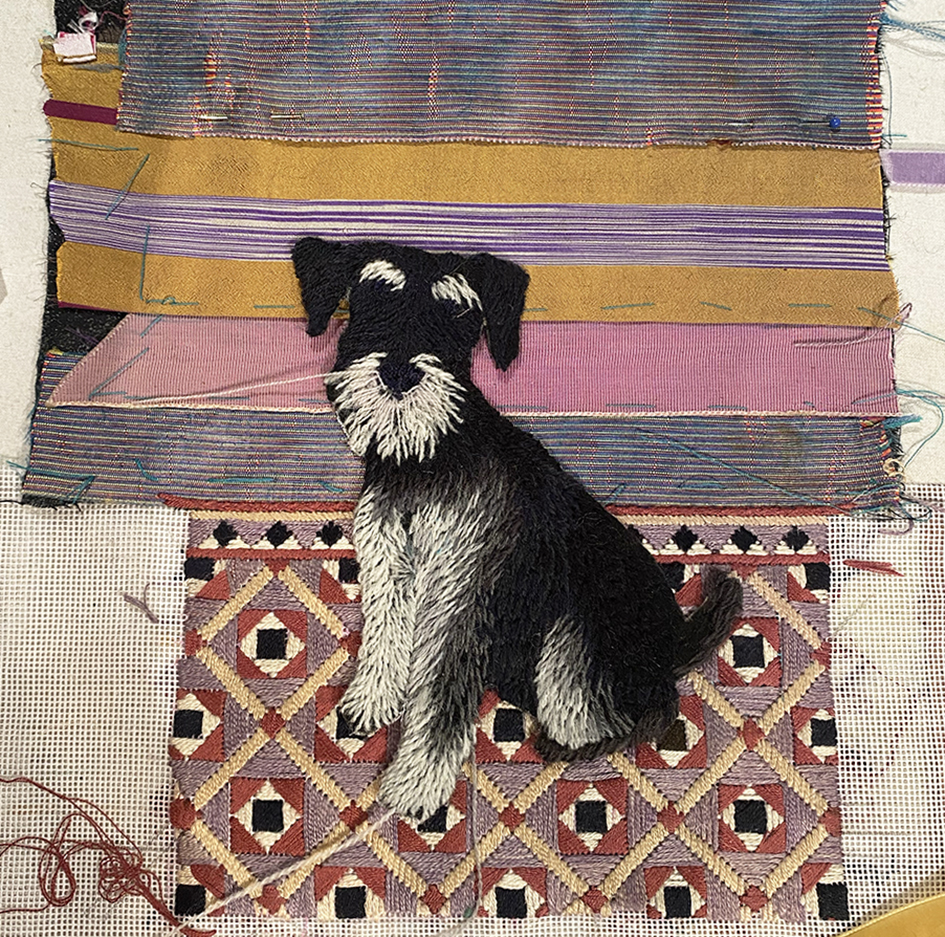
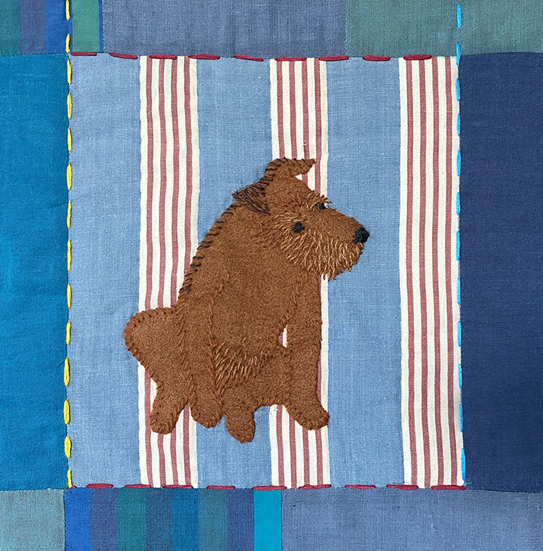
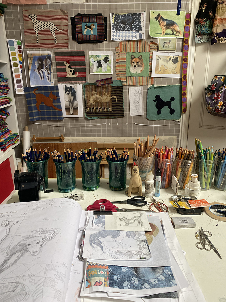
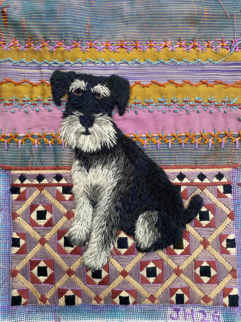
While I was slowly stitching the canvas work, I started embroidering Dougal. First a quick paper pattern to cut the dog shape out of felt and placed onto a piece of waste scrim. The dog coat was embroidered in fine crewel wools and cut away when finished. Placed onto the finished background of ribbons and canvas-work shows and oversewn into position. Now his eyes had to be stitched in – this took days of trying to get him to look at me….eventually I changed the shape of his eyebrows, rimmed his eyes, and there he was!
And here he is stretched and ready to be framed in great style by Marcus……watch this space.